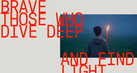
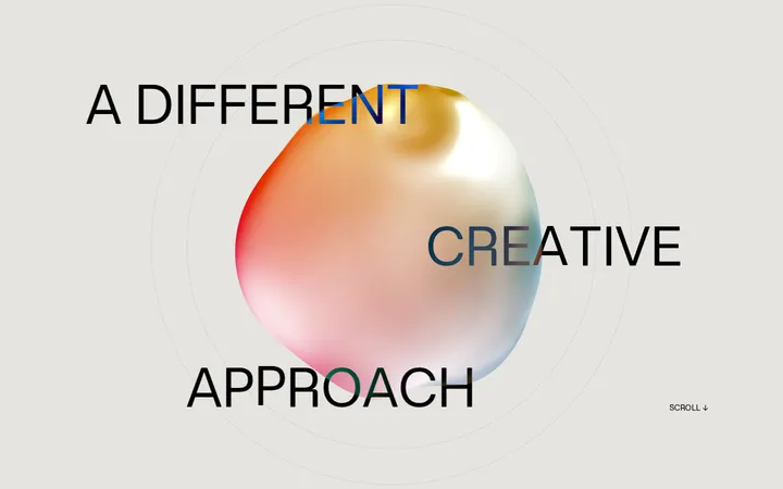
North star · Keep the warm stone field quiet so signal-red typography and cinematic imagery can carry the entire identity.
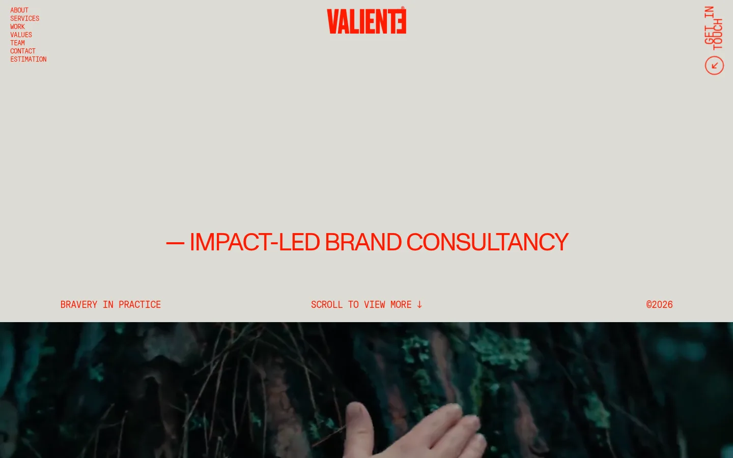
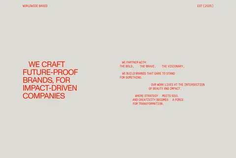
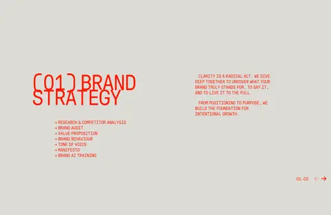
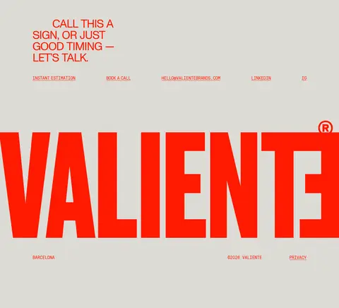
The page is anchored by a warm stone canvas (#dddbd6) and a single vivid signal red (#ff1a00), used consistently for navigation, headlines, links, labels, and the oversized VALIENTE wordmark. There are no decorative colour systems competing with the content; darker and varied tones come primarily from photography and video. GT Pressura supplies the distinctive uppercase, tightly tracked display voice, while Monument Grotesk adds a restrained contrast for larger secondary headings. The composition alternates between sparse text-led areas and cinematic media, using deliberate asymmetry, overlaps, and unusually expansive negative space. Work samples sit within the same neutral field rather than framed cards. Repeated editorial labels, arrows, and compact navigation details create wayfinding without introducing button-heavy UI. The result feels like a printed creative manifesto translated into a long scrolling page: flat, bold, image-conscious, and paced by large changes in scale and whitespace.
配色
点色块复制色值。用途说明来自对页面的实测位置(背景、文字、描边、按钮)与截图判读。
品牌色
强调色
页面底色 · Warm Stone主文字 · Signal Red强调 · Signal Red
文字
背景
对比度
WCAG
#ff1a00 Signal Red
#dddbd6 Warm Stone
2.81:1
不达标
#ff1a00 Signal Red
#dddbd6 Warm Stone
2.81:1
不达标
字体
字号阶梯:Custom(比例约 1.756,正文 20px)。示例用免费替代字体渲染,数值为实测。
Aa 设计
GT Pressura
网络字体 · 字重 400 · 占比 96%
免费替代:Space Mono
Display, navigation, body copy, captions, and project links
Aa 设计
Monument Grotesk
网络字体 · 字重 400 · 占比 5%
免费替代:DM Sans
Secondary large headings
角色
示例
字号
字重
行高
字距
特大标题
Oversized uppercase statements and the dramatic closing wordmark.
VALIENTE BRANDS
190px
400
0.65
-0.04em
一级标题
Large uppercase hero and major section statements.
VALIENTE BRANDS
95px
400
0.65
-0.04em
二级标题
Secondary prominent headings, set in a contrasting grotesk.
VALIENTE BRANDS
48px
400
1
-0.04em
三级标题
Compact uppercase project and service headings.
The quick brown fox 敏捷的狐狸
24px
400
0.82
-0.025em
正文
Uppercase introductory, explanatory, and team copy.
The quick brown fox 敏捷的狐狸
20px
400
1.2
-0.03em
辅助文字
Small uppercase project labels, metadata, and footer details.
The quick brown fox 敏捷的狐狸
14px
400
1
-0.043em
导航
Small uppercase primary navigation and utility links.
The quick brown fox 敏捷的狐狸
14px
400
1
-0.043em
间距与布局
基准单位 1px · 密度:宽松
200px版块间距
20px元素间距
—卡片内边距
1163px内容最大宽度
5px
20px
32px
60px
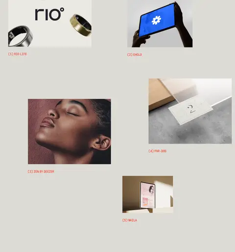
A long, spacious single-page composition, measured to a page max width of 1163px. Sections vary between a single-column canvas, two-column editorial text, three-column service content, and asymmetric image-led arrangements. The work gallery uses staggered, loosely distributed project images rather than uniform cards. Strong left alignment coexists with centered hero messaging and elements that intentionally extend across image edges. The measured section gap is 200px and element gap is 20px; preserve this spacious rhythm and avoid dense stacking.
圆角与层次
没有测到阴影:页面是扁平的,层次靠底色和描边区分。
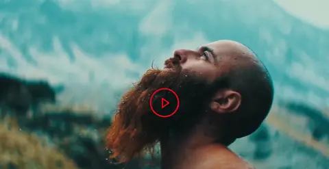
The page is predominantly flat: no measured shadows, gradients, or card surfaces define the interface. Keep project imagery flush against the canvas and use placement, scale, and overlap to create depth. Borders and radii are not part of the measured visual system; do not add card outlines or rounded containers. The play control is a simple red outlined circle over video.
组件
下面的预览按实测的按钮、输入框、徽标、卡片样式重建(字体用替代字体)。
Corner navigation
Small uppercase red text links clustered at the upper left, balanced by a vertical contact link and circular arrow affordance at the upper right.
Hero statement
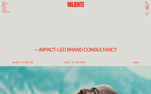
An open canvas with a centered red consultancy line and compact baseline labels for the practice, scroll cue, and year.
Video panels
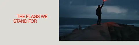
Wide or full-bleed cinematic footage, sometimes accompanied by a minimal red outlined circular play control.
Project links
Uppercase red project names and service details arranged near staggered images; measured link typography is 20px GT Pressura.
Editorial statements
Large, tightly tracked uppercase red phrases overlap or sit beside video and photographs, with smaller copy kept separate.
Contact footer
A concise contact invitation and a row of red links lead into the oversized red VALIENTE wordmark and small location, copyright, and privacy details.
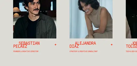
Imagery · Cinematic video is a defining counterpoint to the flat canvas: full-bleed or wide landscape scenes include people, nature, and dramatic light. Project work appears as a dispersed selection of product, portrait, and digital-interface imagery, without decorative frames. Team portraits are presented as straightforward photographs. Image colours may introduce dark greens, blues, skin tones, and product hues, but they remain content imagery rather than additions to the brand palette.
Reserve #ff1a00 for typography, links, and graphic accents.
Set display and utility text in uppercase.
Make large statements tightly tracked and visually assertive.
Alternate text-led whitespace with cinematic media.
Use asymmetry and overlap to compose editorial sections.
✕ 不该做
Do not add colours to the brand palette based on image content.
Do not introduce shadows, gradients, or elevated card styling.
Do not make every section a uniform grid of cards.
Do not crowd the page with dense copy or controls.
Do not soften the identity with rounded, decorative UI.
Do not let project imagery replace the quiet neutral canvas.
给 AI 的提示词
想快速出一个同风格的新页面,把这段话连同 DESIGN.md 一起发给 AI。
Build a new page in the VALIENTE BRANDS visual language. Use Warm Stone (#dddbd6) as the continuous canvas and Signal Red (#ff1a00) for the navigation, headings, links, labels, arrows, and graphic marks. Use an uppercase, tightly tracked GT Pressura-like monospace for most text, with a restrained Monument Grotesk-like sans for occasional secondary headings. Keep the layout spacious and editorial: combine concise copy, large statements, asymmetric image placement, and wide cinematic video. Let imagery supply its own colours without extending the brand palette. Prefer flat surfaces, unframed media, and deliberate overlap over cards, borders, shadows, or gradients. Maintain clear navigation and contact links, and use generous whitespace to create pace across the page.