North star · Keep the canvas quiet and let a single oversized, art-directed typographic statement dominate the page.
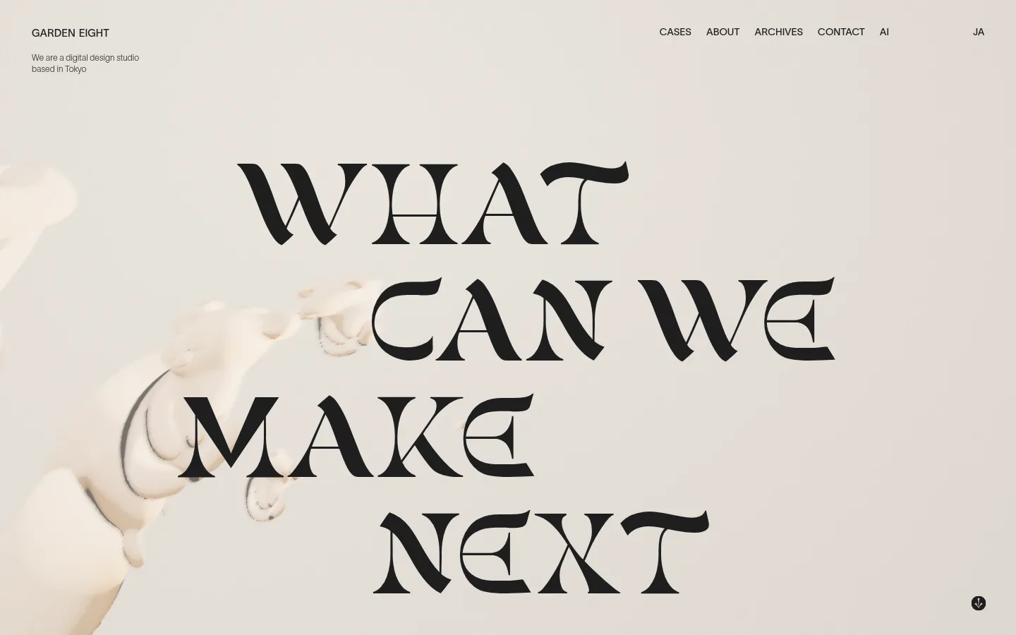
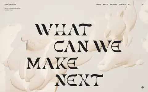
The first viewport is defined by a warm, pale canvas and a large, near-black display message. The measured palette records only #1e1f1f, but the screenshot clearly shows the actual hero field as soft ivory-beige with dark text; treat the measured dark value as a data mismatch, not a reason to render a dark page. The hero’s image is a softly lit, organic sculptural composition, low in contrast and nearly tonal with the background. A distinctive high-contrast, decorative display face carries the question across staggered lines, while compact sans-serif navigation and studio copy remain quiet at the top edge. The composition is intentionally spacious, with the headline occupying the central field and imagery extending broadly behind it. Navigation is distributed across the top, balanced by the studio name and short introduction at left. Keep the result flat and gallery-like: no prominent cards, borders, gradients, or raised controls.
A spacious, full-bleed hero uses a broad central field for the headline, with sculptural imagery spreading behind and around it. The measured page max width is 1080px, while the screenshot reads as edge-to-edge composition. Keep the studio name and short introduction at upper left, with navigation aligned across the upper right. The page is sparse, with generous separation between the header and the central statement; avoid dense grids or boxed content.
圆角与层次
没有测到阴影:页面是扁平的,层次靠底色和描边区分。
The page reads as a flat editorial surface rather than a layered interface. No measured shadows or gradients are reported, and the screenshot shows no prominent borders or card containers. Separate content through placement, tonal contrast, and negative space instead of elevation effects.
组件
下面的预览按实测的按钮、输入框、徽标、卡片样式重建(字体用替代字体)。
Top navigation
A compact uppercase row with studio identity at left and links such as Cases, About, Archives, Contact, AI, and a language option at right.
Studio introduction
A short, light sans-serif statement sits under the studio name at the top left, visually secondary to the hero.
Hero headline
A dramatic multi-line question set in oversized decorative display lettering, offset across the center of the composition.
Sculptural hero media
Soft ivory-toned organic forms fill the background and edges, blending with the pale field behind the headline.
Scroll cue
A small dark circular down indicator sits near the lower-right edge of the first viewport.
Imagery · Use a pale, softly lit, organic sculptural image with a near-monochrome treatment that blends into the ivory-beige field. Frame it broadly across the hero, allowing forms to enter from the edges and sit behind the type. Keep contrast subdued so the near-black headline remains the sharpest visual element.
Use a pale, warm editorial canvas despite the conflicting measured canvas value.
Make the display headline the dominant element.
Use sculptural imagery as a soft, low-contrast backdrop.
Keep navigation uppercase, compact, and unobtrusive.
Preserve broad negative space around the hero message.
Use flat presentation instead of card-like elevation.
✕ 不该做
Do not interpret #1e1f1f as the visible page background.
Do not introduce saturated accent colors without measured evidence.
Do not shrink the hero statement into ordinary heading scale.
Do not add prominent borders, shadows, or gradients.
Do not crowd the header or hero with extra interface elements.
Do not let the image overpower the headline.
给 AI 的提示词
想快速出一个同风格的新页面,把这段话连同 DESIGN.md 一起发给 AI。
Build a new Garden Eight-style studio page as a spacious editorial composition. Use Soft Black (#1e1f1f) for visible text and navigation; do not use it as the canvas, since that measured assignment conflicts with the screenshot’s pale ivory-beige hero. Place a compact uppercase navigation row along the top, with a brief studio introduction at left. Give the main area a huge, decorative, high-contrast display statement, arranged across staggered lines. Add broad, softly lit sculptural imagery behind the type, keeping it tonal and low contrast. Maintain generous negative space and a flat, gallery-like presentation: avoid cards, conspicuous borders, and shadows. Keep supporting text small and light, with the headline clearly carrying the visual hierarchy.