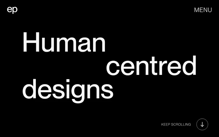
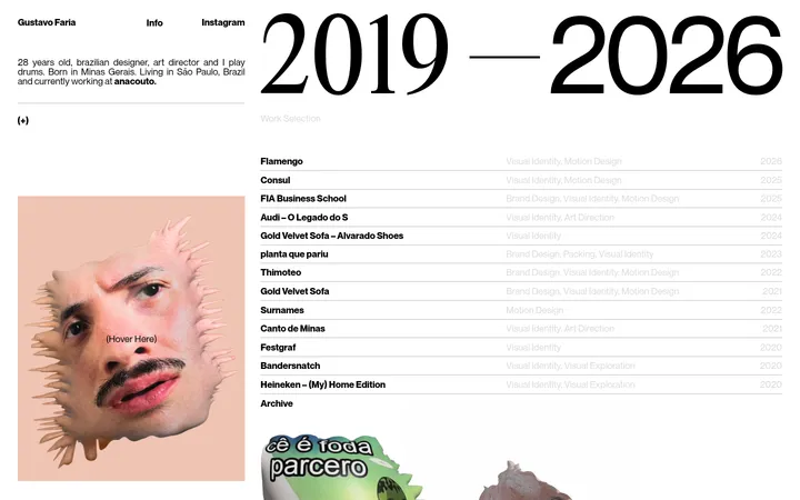
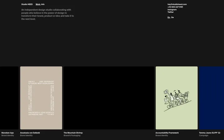
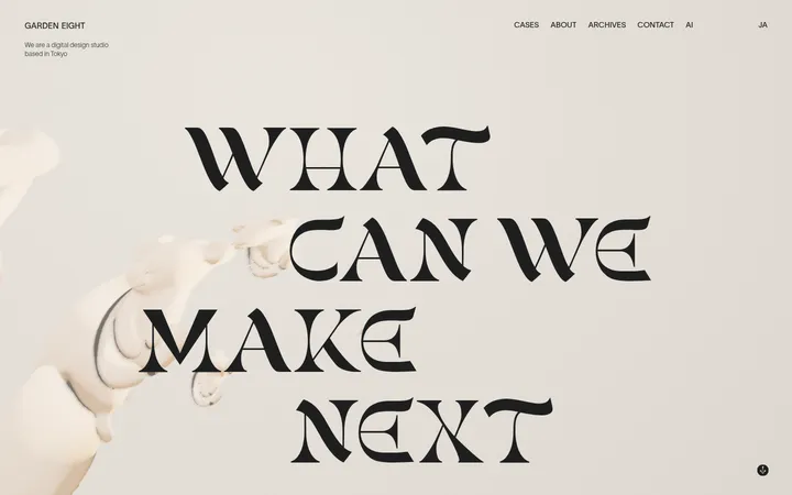
North star · Let one oversized typographic gesture dominate a warm, quiet canvas, then use precise rules and one playful portrait for character.
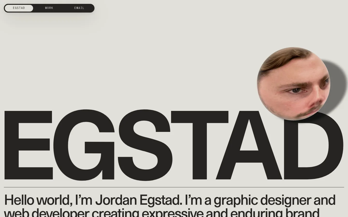
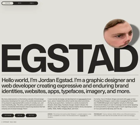
The page is built around a restrained three-colour system: warm gray #e2e0d9 establishes the dominant canvas, near-black #252422 carries the wordmark and nearly all copy, and white #ffffff appears as a contrasting surface in the measured page structure. Typography is the main visual event. EG Metaphor is used for the enormous, tightly composed EGSTAD display and the readable introduction; System85 supplies small uppercase navigation and eyebrow details. The layout uses a broad, left-aligned composition, with a thin dark rule separating the wordmark from the introduction and fine dividers organizing dense lower-page text. A small, distorted portrait overlaps the large lettering, introducing the page’s only conspicuous photographic colour. Navigation sits in a compact dark pill at the upper left, while the rest of the page remains largely flat and open. Preserve the contrast between monumental display type, quiet supporting copy, and the deliberately odd portrait rather than adding decorative effects.
Display wordmark, introduction, body copy, and standard links.
Aa 设计
System85
网络字体 · 字重 400 · 占比 3%
免费替代:Space Mono
Uppercase navigation, button labels, and eyebrow-style utility text.
角色
示例
字号
字重
行高
字距
特大标题
Oversized EGSTAD wordmark spanning the hero width.
Egstad
399px
400
1
0
一级标题
Large introductory heading beneath the wordmark.
Egstad
59px
400
0.97
-0.055em
正文
Compact paragraphs describing practice and selected work.
The quick brown fox 敏捷的狐狸
15px
400
1.34
0
辅助文字
Small supporting notes and fine-print details.
The quick brown fox 敏捷的狐狸
12px
400
1.33
0.02em
按钮
Uppercase labels on dark pill-shaped social buttons.
The quick brown fox 敏捷的狐狸
12px
400
3
0.03em
导航
Oversized EGSTAD wordmark, despite the nav role measurement.
Egstad
399px
400
1
0
链接
Inline portfolio, typeface, and resource links.
The quick brown fox 敏捷的狐狸
15px
400
1.34
0
眉题
Small uppercase utility labels and section details.
The quick brown fox 敏捷的狐狸
12px
400
3
0.03em
间距与布局
基准单位 2px · 密度:适中
—版块间距
16px元素间距
—卡片内边距
1408px内容最大宽度
3px
14px
16px
22px
25px
30px
The page uses a broad, nearly full-width composition, with the measured content max width at 1408px. The wordmark and introduction align to the left and occupy the dominant upper portion; a narrow navigation pill floats at the top left. A horizontal hairline anchors the transition from display lettering to the introductory copy. Below, the page becomes denser, arranging descriptive text in several editorial columns with fine rules and small utility details. Keep generous open canvas around the hero and tighter spacing within the lower information blocks.
圆角与层次
按钮 · 9999px
导航 · 9999px
xl · nav
Most content is flat: the wordmark and text sit directly on the canvas, and thin rules provide separation instead of card borders. The top navigation is a dark rounded capsule with a pronounced soft shadow. The portrait also floats above the lettering through its own shadow, creating the page’s principal layered moments.
组件
下面的预览按实测的按钮、输入框、徽标、卡片样式重建(字体用替代字体)。
Floating navigation pill
Compact dark capsule at the top left with EGSTAD, WORK, and EMAIL links; the current item sits on a pale inset pill.
Oversized wordmark
EGSTAD is rendered in near-black EG Metaphor, filling the hero width and acting as both identity and display graphic.
Portrait cutout
A rounded, distorted face photograph overlaps the right side of the wordmark and casts a soft shadow.
Introductory heading
Large, left-aligned EG Metaphor copy sits below a fine horizontal rule and explains the designer’s practice.
Editorial text columns
Compact paragraphs and inline links form dense lower-page columns, separated by fine rules.
Social buttons
Near-black pill buttons use pale uppercase System85 labels, including the measured INSTAGRAM label.
Imagery · The hero uses a cropped photographic portrait of the designer, distorted into a rounded, floating cutout that overlaps the wordmark. Its skin and hair tones are image content, not brand palette colours. A soft cast shadow separates the portrait from the canvas. The remainder of the visible page is typography-led, with no large photographic panels or illustrative backgrounds.
Make the wordmark dramatically larger than supporting text.
Use EG Metaphor for display and editorial copy.
Reserve System85-style lettering for small uppercase utility labels.
Keep dividers thin and layouts predominantly flat.
Use imagery as a playful, isolated interruption.
✕ 不该做
Do not add bright accent colours to the brand palette.
Do not place the wordmark inside a conventional card.
Do not crowd the hero with extra content.
Do not use heavy borders around every text block.
Do not turn the portrait into a full-bleed background.
Do not use bold, conventional corporate typography.
给 AI 的提示词
想快速出一个同风格的新页面,把这段话连同 DESIGN.md 一起发给 AI。
Build a new page with Egstad’s editorial portfolio character. Use Warm Canvas (#e2e0d9) as the dominant field and Soft Ink (#252422) for the main type, links, and rules; keep Paper White (#ffffff) limited to clean surface contrast. Make typography the primary graphic: use an EG Metaphor-like geometric sans for a very large, regular-weight display gesture and concise supporting copy. Set utility navigation and button labels in a small, tracked, uppercase mono-like face. Align content broadly to the left, use fine horizontal rules to separate editorial blocks, and let lower content become denser without losing clarity. Add at most one playful, isolated portrait or image detail with subtle depth. Keep most elements flat, reserving pill shapes and shadow for navigation or controls.