North star · Let oversized, image-filled project names carry the page, while every interface element stays quiet and secondary.
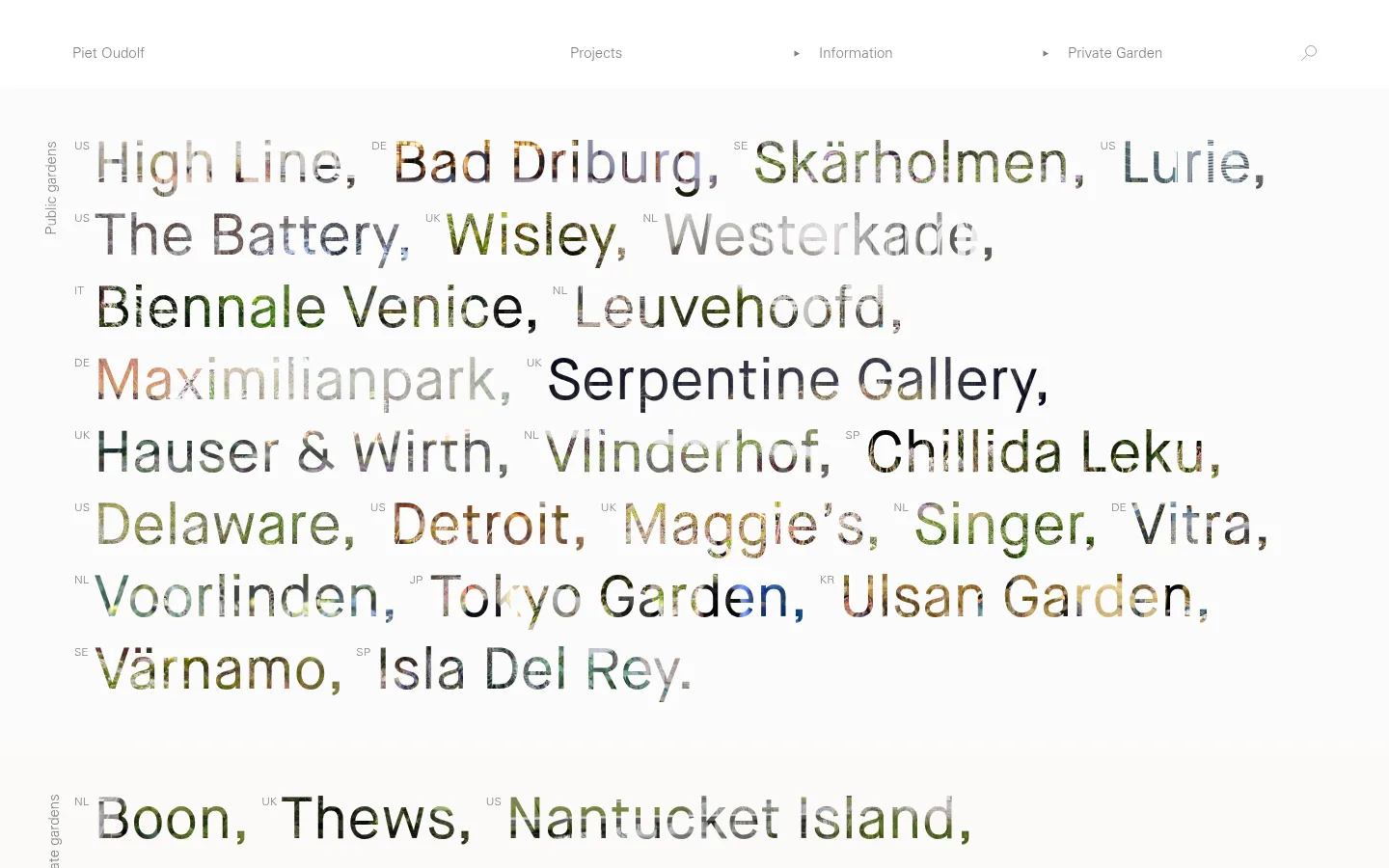
The page is built around a near-white canvas and a restrained gray interface: gray text carries navigation and project labels, while a thin gray hairline marks the navigation edge. The dominant visual feature is not a conventional photo gallery: garden imagery is clipped into large, lightweight project names, so photography and typography become one surface. A narrow vertical category label anchors each project band without competing with the names. The display face is airy and light, while the body and navigation use a practical, quiet sans serif. Large, left-aligned text and generous open space create an editorial rhythm across public and private garden sections. The project names wrap naturally across the available width rather than sitting in cards. A compact multi-column footer gathers address, contact, and navigation details. Keep surfaces flat, avoid decorative effects, and let image texture provide the only rich color.
Oversized garden project names and prominent section titles.
Piet Oudolf
60px
300
1.25
0
正文
Navigation labels and supporting page copy.
The quick brown fox 敏捷的狐狸
15px
400
1.87
0
辅助文字
Small country codes and compact footer details.
The quick brown fox 敏捷的狐狸
12px
400
2.33
0
导航
Primary navigation and brand wordmark.
The quick brown fox 敏捷的狐狸
15px
400
1.87
0
间距与布局
基准单位 4px · 密度:适中
40px版块间距
—元素间距
—卡片内边距
1290px内容最大宽度
3px
21px
40px
42px
60px
A wide, single-column project listing sits within a measured page max width of 1290px. Project names align left and span much of the available canvas, with narrow vertical category labels at the side and small country codes beside individual names. Public and private garden sections are separated by a measured 40px section gap. The page uses comfortable density: names have room to wrap, while navigation remains restrained and the footer switches to five columns for contact and site links.
圆角与层次
没有测到阴影:页面是扁平的,层次靠底色和描边区分。
The interface is flat, with no measured shadows, gradients, or card surfaces. A subtle gray hairline appears at the navigation boundary, but does not become a box around content. Separate sections with open space and alignment rather than layering panels or adding decorative borders.
组件
下面的预览按实测的按钮、输入框、徽标、卡片样式重建(字体用替代字体)。
Top navigation
A quiet horizontal header with the Piet Oudolf wordmark, Projects, Information, and Private Garden links, plus a search icon; use gray sans-serif text and a subtle lower rule.
Project name field
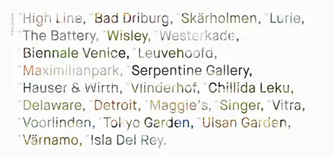
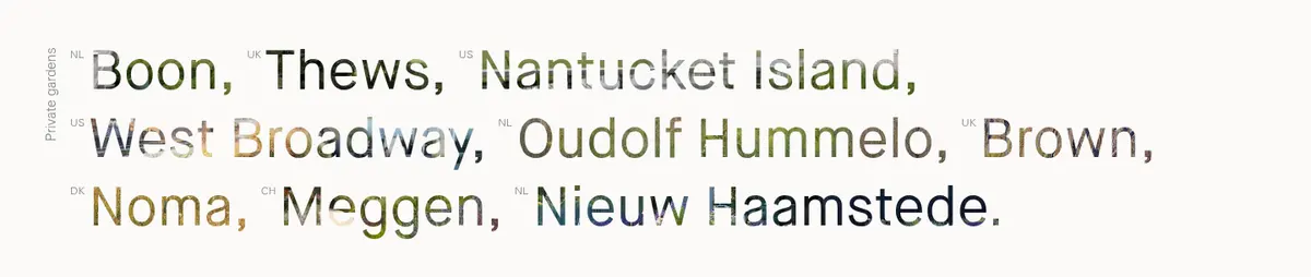
Large, lightweight project names flow across the page in a left-aligned field, with garden imagery filling the letterforms.
Category marker
Small vertical text labels identify Public gardens and Private gardens beside their respective project bands.
Country code
Tiny muted country abbreviations sit beside project names as contextual metadata, not as badges.
Footer columns
A compact five-column footer groups address, contact, project links, information links, and private garden navigation.
Text links
Links remain unboxed and use the measured #808080 text color, with no button-like fill or shadow.
Imagery · The defining imagery is garden photography clipped inside oversized project-name lettering, not a set of freestanding cards. The images bring varied greens, earth tones, and seasonal color into an otherwise pale, grayscale interface. Keep the photographic fill visible and detailed within the letterforms; avoid adding unrelated illustrations, 3D objects, or ornamental image frames.
Keep navigation and project text in restrained gray.
Let garden photography fill the oversized project lettering.
Align project bands and category labels consistently to the left.
Preserve generous open space between project groups.
Keep footer details compact and organized in columns.
✕ 不该做
Do not add bright interface accent colors.
Do not turn project names into cards or buttons.
Do not add shadows, gradients, or layered panels.
Do not use heavy display weights or condensed all-caps styling.
Do not let captions or navigation compete with the project lettering.
Do not replace the image-filled typography with generic thumbnails.
给 AI 的提示词
想快速出一个同风格的新页面,把这段话连同 DESIGN.md 一起发给 AI。
Build a new portfolio page in Piet Oudolf’s restrained editorial style. Use Gallery White (#ffffff) for the canvas, Soft Graphite (#808080) for primary type and links, Quiet Rule (#999999) only for a subtle hairline, and Pale Ash (#b3b3b3) for secondary labels. Set a quiet sans-serif navigation above broad, left-aligned content. Make the central project presentation oversized, lightweight text with garden photography clipped inside the letterforms; add small country codes and vertical category labels as supporting metadata. Use generous open space between sections, with no card framing, shadows, or gradients. Keep footer information compact in aligned columns. Typography should feel light and neutral, with natural wrapping and unforced tracking. Prioritize image texture and project names over controls or decoration.