North star · Keep the interface quiet and editorial; let food-distribution photography provide the color and operational proof.
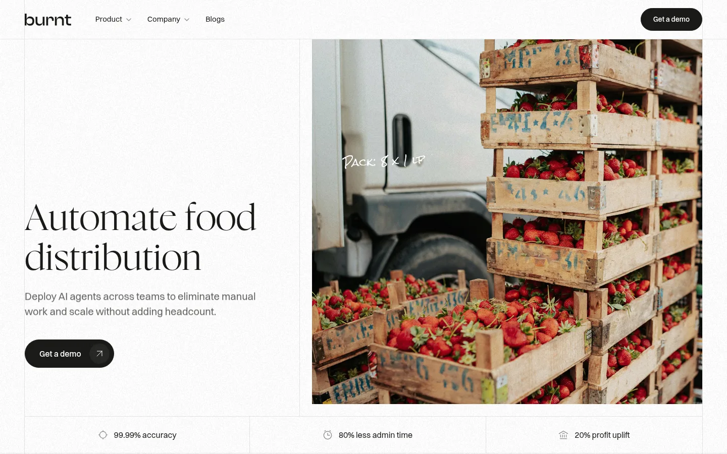
The page builds its identity from a restrained monochrome system rather than a bright technology palette. White (#ffffff) dominates the canvas, while near-black (#1a1a17) carries navigation, headlines, and pill-shaped calls to action; muted grays handle supporting copy and hairline dividers. Large Nyght Serif headlines give the SaaS proposition an editorial, almost print-like character, balanced by compact Switzer sans-serif navigation and body text. The first screen uses a clear split hero: a quiet text column sits beside a substantial photograph of strawberries in distribution crates, making the industry tangible before the product is explained. Below, generous white space, thin panel boundaries, and alternating image placements create a measured scroll rhythm. Product-interface imagery appears as supporting evidence rather than a decorative motif. Preserve the restrained palette and let real food operations photography supply warmth and color.
Navigation, body copy, buttons, captions, and small labels.
Aa 设计
Nyght Serif
网络字体 · 字重 300 · 占比 19%
免费替代:Cormorant Garamond
Display headlines and section headings.
角色
示例
字号
字重
行高
字距
特大标题
Oversized editorial display headlines, when used.
Burnt
72px
300
1
0
一级标题
Primary hero headline.
Burnt
62px
300
1.1
0
二级标题
Major section headings, such as workflow introduction.
Burnt
48px
300
1.2
0.01em
三级标题
Smaller feature or content-block headings.
The quick brown fox 敏捷的狐狸
26px
300
1.2
0.03em
四级标题
Compact supporting headings.
The quick brown fox 敏捷的狐狸
20px
400
1.5
0
正文
Introductory, explanatory, and feature copy.
The quick brown fox 敏捷的狐狸
16px
400
1.5
0
辅助文字
Uppercase compact labels and captions.
The quick brown fox 敏捷的狐狸
14px
500
1.5
0.03em
导航
Header navigation labels.
The quick brown fox 敏捷的狐狸
15px
400
1.5
0
眉题
Short uppercase section prefaces.
The quick brown fox 敏捷的狐狸
14px
500
1.5
0.03em
间距与布局
基准单位 8px · 密度:宽松
96px版块间距
8px元素间距
—卡片内边距
1342px内容最大宽度
2px
4px
6px
7px
8px
12px
16px
24px
28px
32px
40px
48px
64px
96px
Use a spacious, wide-page grid with a measured maximum width of 1342px. The first viewport pairs a left-aligned text panel with a large, edge-aligned food photograph; a narrow metric strip follows, separated into columns by fine rules. Keep text aligned to the grid and avoid dense card stacks. Sections use generous vertical breathing room, with open white panels and occasional alternating image placement. The measured page has a 96px section rhythm and an 8px base spacing unit; apply these as the underlying cadence rather than decorative gaps.
圆角与层次
按钮 · 9999px
没有测到阴影:页面是扁平的,层次靠底色和描边区分。
The visual language is predominantly flat: no measured shadows, with #e8e8e7 hairlines defining panel edges and section divisions. Dark pill CTAs sit directly on the white canvas, using a fine border rather than a lifted card treatment. Keep product UI imagery contained within its own image area; avoid extra floating layers or decorative depth.
组件
下面的预览按实测的按钮、输入框、徽标、卡片样式重建(字体用替代字体)。
Top navigation
White horizontal header with the Burnt wordmark, compact Switzer links, restrained separators, and a dark rounded “Get a demo” CTA.
Split hero
Editorial serif headline and muted supporting copy occupy the left panel; a large supply-chain photograph fills the right panel.
Primary demo button
Near-black pill button with white Switzer text and a small arrow treatment; use the measured dark fill and white foreground.
Metrics strip
Three concise proof points sit in a horizontal row, divided by thin gray rules with small muted icons.
Workflow feature panels
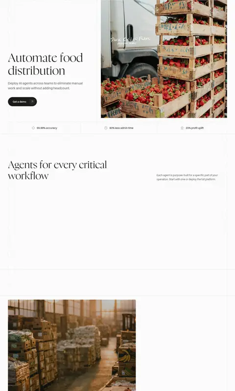
Open, lightly bordered sections combine short serif headings and explanatory copy with alternating operational photography or product imagery.
Product interface visual
Show the agent interface as a contained screenshot, preserving the product's own colors as image content rather than extending them into site chrome.
Imagery · Prioritize documentary-style photography of real food distribution: crates of strawberries, warehouse aisles, and people connected to the business. Use large rectangular crops that show recognizable operational context, with natural light and authentic textures. Product UI screenshots and founder video imagery support the story in later sections; keep them subordinate to the photography and avoid adding illustrative color schemes.
Set prominent headlines in a light editorial serif.
Use #1a1a17 for primary text and filled CTAs.
Separate panels with restrained #e8e8e7 hairlines.
Choose authentic food distribution photography.
Leave generous whitespace between major content blocks.
✕ 不该做
Do not introduce a bright technology accent as a core brand color.
Do not replace the editorial serif headlines with heavy geometric display type.
Do not crowd the layout with dense card grids.
Do not use shadows to create a floating-card interface.
Do not let product mockup colors redefine the page palette.
Do not crop operational photography so tightly that its context disappears.
给 AI 的提示词
想快速出一个同风格的新页面,把这段话连同 DESIGN.md 一起发给 AI。
Build a new page in Burnt’s restrained editorial SaaS style. Use Gallery White (#ffffff) as the dominant canvas, Warm Ink (#1a1a17) for headlines, navigation, and primary pill CTAs, and Soft Graphite (#5e5e5c) for supporting copy. Set major headings in a light, elegant serif similar to Nyght Serif; use a clean Switzer-like sans serif for body text and controls. Follow a spacious wide grid with thin Quiet Rule (#e8e8e7) dividers, clear alignment, and generous section pauses. Prefer a split composition pairing concise copy with large documentary photography of real food distribution. Keep interface screenshots contained as media, not as a source for site-wide colors. Avoid shadows, decorative gradients, dense cards, and unnecessary accent hues.