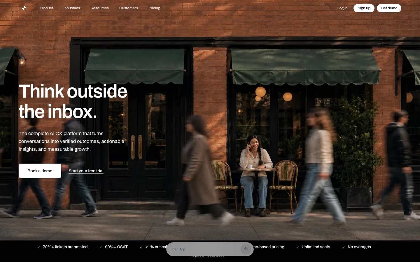
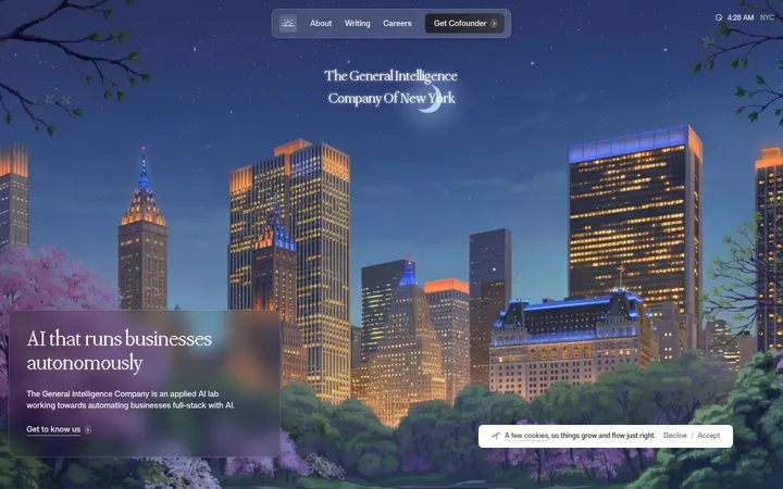
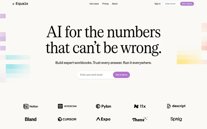
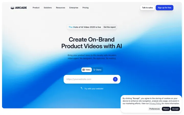
Applied Labs 用电影感全幅摄影与克制的编辑式界面,介绍其 AI 客户体验平台。暖调浅色区块、深色产品展示和少量蓝色点缀,让页面兼具亲和力与业务效率感。
North star · Let warm, human imagery introduce the story, then make every interface section feel clear, measured, and product-specific.
The page balances human warmth with a product-focused SaaS system. Its opening and closing photography uses brick, shadow, and real street scenes as immersive backdrops; these image colours are not the core interface palette. The interface itself relies on white canvas, warm pale section bands, near-black text, and charcoal product-story sections. Blue appears sparingly in links, badges, charts, and selected cards. Archivo carries headlines and body copy with medium weights and subtly tight tracking, while IBM Plex Mono gives captions and technical labels a compact, precise tone. Layouts alternate between broad centered statements, four-card feature rows, asymmetric product panels, and evidence-led chart or testimonial bands. Comfortable whitespace separates these blocks; thin warm-gray borders and rounded corners define cards without heavy shadow. Use the screenshots to preserve the clear contrast between photographic storytelling and crisp product UI.
配色
点色块复制色值。用途说明来自对页面的实测位置(背景、文字、描边、按钮)与截图判读。
强调色
表层色
中性色
功能色
页面底色 · Gallery White表层 · Warm Charcoal表层 2 · Soft Stone表层 3 · Cream Paper表层 4 · Roasted Ink主文字 · Near Ink次要文字 · Gallery White弱文字 · Muted Taupe描边 · Linen Line强调 · Signal Periwinkle强调 2 · Electric Blue
Headlines, body copy, buttons, navigation, and most interface labels.
Aa 设计
IBM Plex Mono
网络字体 · 字重 400 / 500 / 600 · 占比 17%
免费替代:Space Mono
Captions, technical labels, channel badges, and compact metadata.
角色
示例
字号
字重
行高
字距
一级标题
Hero headline and primary page statement.
Applied Labs
54px
500
1.11
-0.02em
二级标题
Major section headings introducing lifecycle, outcomes, and proof.
Applied Labs
44px
500
1.14
-0.02em
三级标题
Feature-card and product-story subheadings.
Applied Labs
34px
500
1.18
-0.02em
四级标题
Smaller product panel and supporting content headings.
The quick brown fox 敏捷的狐狸
26px
500
1.23
-0.02em
正文
Introductory copy, feature descriptions, and explanatory text.
The quick brown fox 敏捷的狐狸
18px
500
1.44
-0.01em
辅助文字
Compact technical labels, channel markers, and metadata.
The quick brown fox 敏捷的狐狸
11px
400
1.27
0
按钮
Primary and secondary CTA labels.
The quick brown fox 敏捷的狐狸
14.5px
500
1.24
0
链接
Inline links and secondary navigation actions.
The quick brown fox 敏捷的狐狸
14.5px
500
1.24
0
代码
Mono technical snippets and compact system-like labels.
const style = 1;
11px
400
1.27
0
间距与布局
基准单位 4px · 密度:适中
56px版块间距
10px元素间距
—卡片内边距
—内容最大宽度
2px
5px
6px
7px
8px
10px
12px
14px
16px
20px
24px
32px
64px
Use a wide editorial canvas with broad section bands and generous breathing room rather than a dense dashboard grid. The hero is full-bleed photography with left-aligned copy; subsequent sections alternate centered headings, four-column feature cards, paired content panels, and wide product or chart showcases. Align cards and text to consistent content edges, while allowing selected mockups to feel oversized or offset. Maintain comfortable vertical rhythm between sections and clear contrast between white, cream, cool pale, and charcoal bands. The measured spacing scale is available, but the page does not establish a measured max-width.
圆角与层次
按钮 · 8px
卡片 · 14px
图片 · 50%
徽标 · 9999px
导航 · 9999px
链接 · 16px
sm · other
hairline · card
sm · nav
md · badge
Keep most surfaces flat and let warm-gray hairlines define cards and product mockups. Cards have measured 14px radii, buttons 8px, and badges pill-shaped corners; use these distinctions consistently. A restrained small shadow appears in limited UI contexts, while the larger visual hierarchy comes from alternating dark and light bands, not stacked elevation.
组件
下面的预览按实测的按钮、输入框、徽标、卡片样式重建(字体用替代字体)。
Hero and navigation
Overlay a compact navigation row on full-bleed storefront photography. Pair a large white headline and short copy with a white primary CTA and understated text link.
Lifecycle feature cards
Present four warm, lightly tinted cards beneath a dark heading. Use concise titles, muted explanatory copy, small mono category labels, and restrained blue marks.
Outcome panels
Alternate pale and dark rounded panels for capabilities and measurable results; use thin borders, short feature lists, and compact pill labels.
Product mockup showcase
Set oversized white interface cards against a charcoal band. Combine Archivo product headings with small IBM Plex Mono labels and clean embedded UI.
Evidence chart
Use a cool pale section band, a concise risk-reversal message, and a white chart card with carefully limited blue emphasis.
Testimonial cards
Arrange customer quotes in a horizontal card sequence with alternating white, black, and blue surfaces, keeping the quote text prominent.
CTA buttons
Use compact Archivo labels, 8px corners, and high-contrast black-on-white or white-on-black treatments; keep secondary actions quieter.
Imagery · Use cinematic, full-width lifestyle photography for the hero and lower CTA, showing real urban storefronts and people in motion. Preserve the warm brick and shadow-rich photographic character, with text legible over the image. Product sections rely on clean, white UI mockups, diagrams, charts, and integration marks rather than decorative illustration. Treat image-derived browns as photographic content, not the interface palette.
该做与不该做
✓ 该做
Use Archivo for the main interface hierarchy.
Reserve IBM Plex Mono for compact labels and metadata.
Alternate warm light sections with deliberate charcoal product bands.
Keep blue accents limited to meaningful UI highlights.
Use thin warm-gray borders to define cards.
Let photography bring warmth without recolouring the interface.
✕ 不该做
Do not turn the interface into a brown palette based on the hero photo.
Do not use gradients as a dominant page treatment.
Do not crowd feature cards with long paragraphs.
Do not add heavy shadows to every surface.
Do not make every section dark or every CTA blue.
Do not use decorative illustrations where product UI or photography is needed.
给 AI 的提示词
想快速出一个同风格的新页面,把这段话连同 DESIGN.md 一起发给 AI。
Build a new Applied Labs page as an editorial AI SaaS experience. Use Gallery White (#ffffff), Cream Paper (#fdf8f2), and Soft Stone (#f3f0ee) for calm content bands; reserve Warm Charcoal (#3d3838) and Roasted Ink (#1c1a18) for focused product sections. Set primary copy in Near Ink (#020202), supporting text in Muted Taupe (#57534e), and fine borders in Linen Line (#ece8e2). Use Signal Periwinkle (#6b8eff) sparingly for interface emphasis. Set headings, body, navigation, and buttons in Archivo; use IBM Plex Mono for compact labels. Pair one immersive lifestyle image with crisp product mockups, chart evidence, and concise card layouts. Keep surfaces mostly flat, corners softly rounded, and the vertical rhythm comfortable. Preserve strong contrast and a clear separation between brand storytelling and operational product detail.