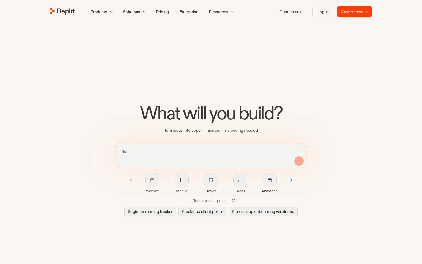
North star · Keep the canvas warm and quiet, then use orange sparingly to make the product’s next action unmistakable.
The page is grounded in a warm cream canvas (#faf6f1), with pale neutral section bands giving the template gallery a subtle change of pace. Saturated Replit orange (#ff3c00) is reserved for primary actions and small identity cues, while salmon accents appear in feature panels, testimonial shapes, and product artwork. Replit Diatype carries nearly all interface text: headings are compact and tightly tracked, with a light, confident display feel; body copy stays small and readable. The mono face is limited to uppercase eyebrow labels. A centered, generous hero gives the prompt composer room to lead, while subsequent sections alternate between balanced card grids, curated template imagery, and broad testimonial compositions. Cards have generous rounding and mostly flat surfaces; thin gray borders define controls without making the page feel technical or dense. Product screenshots and illustrations bring color and texture without displacing the calm canvas.
Primary interface typeface for navigation, headings, body copy, links, buttons, and cards.
Aa 设计
Replit Diatype Mono
网络字体 · 字重 500 · 占比 1%
免费替代:IBM Plex Mono
Small uppercase eyebrow labels and compact technical-style captions.
角色
示例
字号
字重
行高
字距
特大标题
Large centered homepage hero heading.
Replit
64px
400
1
-0.06em
一级标题
Primary section and page-level headings.
Replit
36px
400
1
-0.03em
二级标题
Feature, template, platform, and pricing section headings.
Replit
32px
400
1
-0.04em
三级标题
Card and feature titles.
The quick brown fox 敏捷的狐狸
26px
400
1.2
-0.03em
四级标题
Smaller card headings and emphasized supporting labels.
The quick brown fox 敏捷的狐狸
20px
460
1.4
0
正文
Descriptions, testimonials, and standard interface copy.
The quick brown fox 敏捷的狐狸
14px
400
1.71
0
辅助文字
Compact helper text and secondary annotations.
The quick brown fox 敏捷的狐狸
12px
400
1.4
-0.02em
按钮
Primary and secondary action labels.
The quick brown fox 敏捷的狐狸
14px
450
normal
0
导航
Top-level navigation and footer navigation labels.
The quick brown fox 敏捷的狐狸
14px
460
1.43
0
链接
Inline documentation and supporting text links.
The quick brown fox 敏捷的狐狸
14px
500
normal
-0.02em
眉题
Uppercase labels above feature content.
The quick brown fox 敏捷的狐狸
13px
500
normal
0.12em
代码
Mono-styled technical or compact uppercase label treatment.
const style = 1;
13px
500
normal
0.12em
间距与布局
基准单位 8px · 密度:紧凑
32px版块间距
8px元素间距
48px卡片内边距
650px内容最大宽度
2px
4px
8px
10px
11px
12px
16px
17px
24px
32px
40px
48px
80px
A restrained, centered composition opens with a large amount of breathing room around the builder prompt. The measured content max width is 650px, while later showcase and gallery sections expand into multi-column grids. The page alternates a warm canvas with a softly tinted gallery band, then returns to the canvas for platform cards, testimonials, pricing, and CTA. Headings are centered for hero and selected showcase blocks; template, pricing, and footer content align to the start. Overall density is compact within cards but spacious between major content groups.
圆角与层次
按钮 · 8px
输入框 · 6px
卡片 · 24px
徽标 · 8px
导航 · 6px
inset · button
The design is mostly flat: white and tinted cards sit directly on the canvas, with rounded corners providing the main separation. Thin neutral borders define inputs and compact controls. The measured button shadow is an almost imperceptible inset outline with a faint drop shadow; avoid heavy elevation or dramatic layered effects.
组件
下面的预览按实测的按钮、输入框、徽标、卡片样式重建(字体用替代字体)。
Prompt composer
A wide, softly outlined rounded input in the hero, with a plus affordance and circular orange submit control.
Primary action
Use Replit orange #ff3c00 with white text, compact padding, and the measured 8px button radius; rounded pill variants appear for Start.
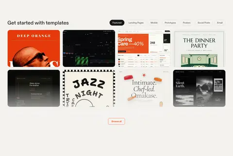
Template card
A dense gallery tile featuring a visual preview; arrange tiles in an orderly multi-column grid with rounded corners.
Feature panel
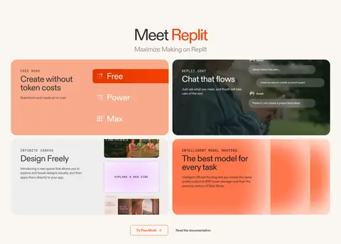
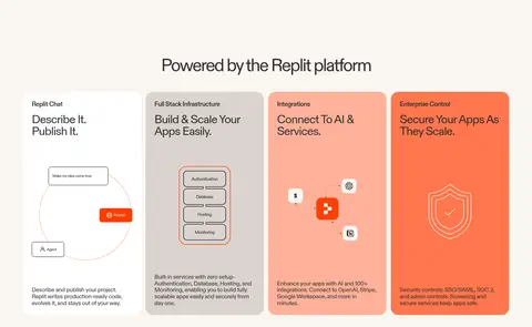
Large rounded blocks combine a short label, concise title, supporting copy, and interface or abstract product imagery.
Pricing card
White surface with a rounded container, concise plan name and price, and supporting detail grouped into a clear hierarchy.
Testimonial panel
A broad white quote card paired with warm salmon decorative shapes and cropped portrait imagery.
Footer columns
A compact brand and description area sits beside grouped navigation lists, separated from the copyright row by a subtle hairline.
Imagery · Template thumbnails are presented as a curated gallery of varied web and app designs, including editorial, dark-interface, and poster-like examples. Product feature cards combine interface previews, diagrams, and abstract orange artwork; the platform section uses illustrative icons and simple schematics. Testimonials add cropped portrait photography. Keep visuals contained within rounded panels and avoid letting their varied colors overwhelm the warm page canvas.
Reserve #ff3c00 for primary actions and distinctive brand cues.
Give the hero prompt and headline generous surrounding whitespace.
Use rounded cards to group product previews and supporting content.
Switch to a soft neutral band to distinguish gallery content.
Keep headings tightly tracked and body copy visually calm.
✕ 不该做
Do not turn the page into a dark interface.
Do not use orange as a full-page background.
Do not add heavy shadows or thick card outlines.
Do not crowd the hero with extra competing content.
Do not apply monospace styling to regular body copy.
Do not treat colors sampled from product imagery as core UI colors.
给 AI 的提示词
想快速出一个同风格的新页面,把这段话连同 DESIGN.md 一起发给 AI。
Build a new Replit-style page with a calm, product-led visual hierarchy. Use Warm Canvas (#faf6f1) as the main background and Soft Ink (#312e2e) for primary text; reserve Replit Flame (#ff3c00) for the main CTA and small brand accents. Use Replit Diatype or a close sans-serif substitute, with tightly tracked, regular-weight headings and restrained supporting copy. Open with a spacious, centered product interaction, then organize content into rounded feature panels, a visual gallery, and clear follow-on sections. Use white and pale neutral surfaces, thin borders, and very subtle elevation. Keep any brighter coral treatments inside feature artwork or testimonial panels. Maintain generous section breathing room and simple, readable navigation; do not add unmeasured decorative UI or heavy shadows.