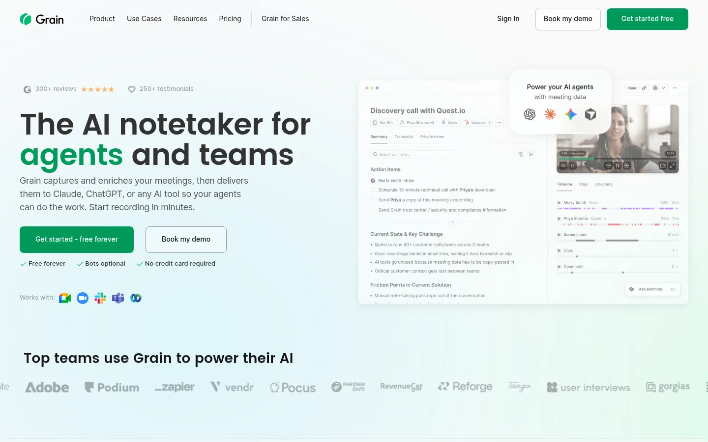
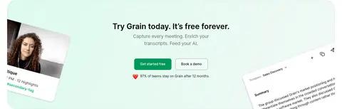
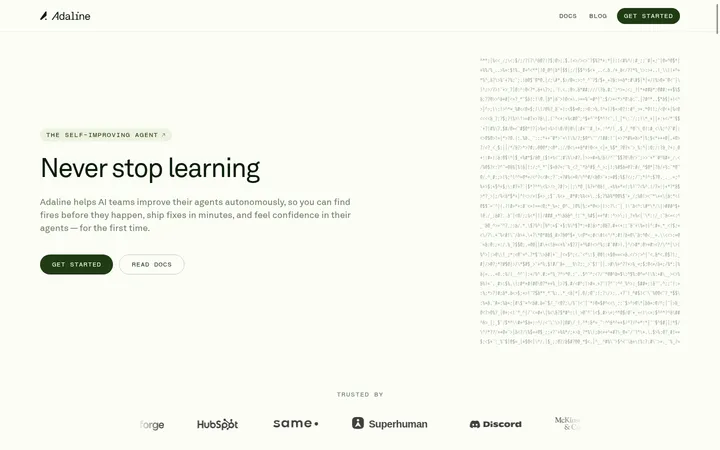
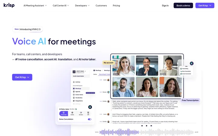
Grain 首页以近白画布和克制的绿色点缀,呈现舒展清晰的产品叙事。醒目的标题与丰富的产品界面展示,让 AI 会议工具显得直观、有条理。
North star · Keep the page quiet and spacious, using green sparingly to guide attention through product proof and primary actions.
The page is built on a near-white #fafafa canvas, with the opening hero gaining its own soft, cool-toned visual atmosphere through product imagery rather than a strongly coloured section band. Green #009959 is the key brand signal: it highlights a phrase in the hero, marks primary calls to action, and appears in small interaction details such as FAQ indicators. Near-black headings establish hierarchy, while several measured grey tones keep body copy, supporting labels, and footer details distinct without adding visual clutter. Poppins gives display and selected headings a rounded, assertive character; Inter carries navigation, paragraphs, controls, and dense interface copy. The layout alternates centered introductions and modular feature sections with two-column product demonstrations. Generous vertical breathing room separates long sections, and soft product screenshots, logos, and card surfaces make the page feel tangible. Fine borders and subtle shadows define edges without turning the design into a stack of heavy panels.
配色
点色块复制色值。用途说明来自对页面的实测位置(背景、文字、描边、按钮)与截图判读。
品牌色
表层色
中性色
功能色
页面底色 · Gallery Mist主文字 · Deep Ink次要文字 · Soft Graphite弱文字 · Slate Ink描边 · Cloud Line强调 · Grain Green
Navigation, body copy, feature descriptions, controls, captions, and most section headings.
Aa 设计
Poppins
网络字体 · 字重 600 · 占比 11%
免费替代:Poppins
Display hero headline and selected H1/H3 headings.
角色
示例
字号
字重
行高
字距
特大标题
Oversized hero headline, with selected words picked out in green.
Grain
60px
600
1.04
-0.017em
一级标题
Prominent feature and section titles.
Grain
38px
600
1.25
0
二级标题
Major section headings, including centered introductions.
Grain
32px
600
1.3
0
三级标题
Feature subheadings and smaller product-story headings.
Grain
28px
600
1.6
0
四级标题
Supporting headline or prominent explanatory copy.
The quick brown fox 敏捷的狐狸
20px
400
1.6
-0.02em
正文
Feature descriptions, paragraphs, and general page copy.
The quick brown fox 敏捷的狐狸
14px
400
1.5
0
辅助文字
Small labels, helper text, and interface metadata.
The quick brown fox 敏捷的狐狸
12px
400
1.43
0
按钮
Primary and secondary CTA labels.
The quick brown fox 敏捷的狐狸
14px
500
1.43
0
导航
Header navigation and menu labels.
The quick brown fox 敏捷的狐狸
14px
400
1.6
0
间距与布局
基准单位 8px · 密度:宽松
96px版块间距
12px元素间距
24px卡片内边距
864px内容最大宽度
2px
4px
8px
11px
12px
16px
19px
20px
24px
30px
32px
40px
48px
86px
96px
A spacious long-form homepage organized around a centered content frame measured at 864px max width, with a two-column hero and alternating feature splits. Section headings are often left-aligned above product demonstrations, while overview, metrics, integrations, and FAQ blocks use centered headings. A four-column capability overview and three-column results row provide compact contrast within an otherwise open layout. Sections have generous measured vertical rhythm, with image and UI media balanced against text rather than stretched as full-bleed backgrounds.
圆角与层次
按钮 · 12px
卡片 · 10px
图片 · 14px
导航 · 8px
链接 · 24px
sm · button, link
md · button
hairline · card
inset · section
Most sections remain visually flat against the light canvas. White feature cards and product mockups gain separation through pale borders, restrained hairline shadows, and occasional soft inset shading. Rounded corners soften CTA buttons, cards, and media, while overlapping interface windows and floating callouts create depth without heavy drop shadows.
组件
下面的预览按实测的按钮、输入框、徽标、卡片样式重建(字体用替代字体)。
Header navigation
A light, horizontal top bar with the Grain mark, compact Inter links, sign-in access, a bordered demo action, and a green primary CTA.
Primary CTA
Green #009959 fill with white medium-weight Inter text; measured button variants use softly rounded corners and generous horizontal padding.
Hero product composition
A two-column introduction pairs a large Poppins headline and short copy with overlapping meeting UI, video, and a floating AI-tools card.
Feature split
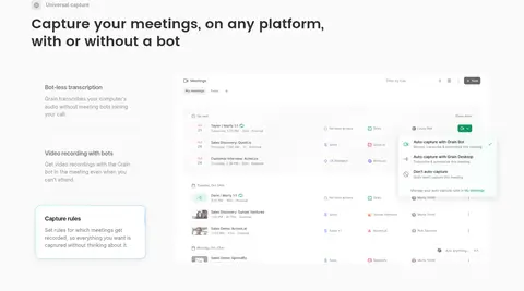
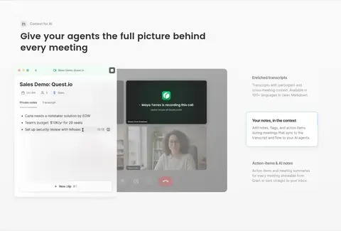
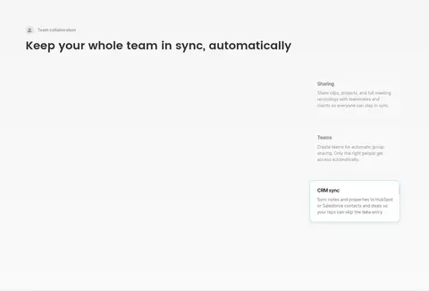
A left-aligned heading and compact feature copy share space with a large product interface image; text and media alternate emphasis across sections.
Capability cards
White rounded cards sit in a four-column overview row, using restrained borders or hairline shadows and concise feature labels.
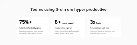
Results cards
Three centered metric panels use bold numeric proof, short labels, and quieter explanatory copy on a light background.
FAQ accordion
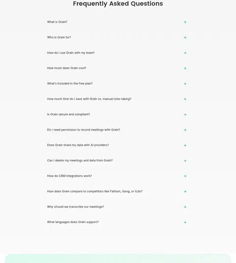
A centered section title sits above a single-column list of questions, each with a small green plus indicator and subtle separation.
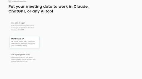
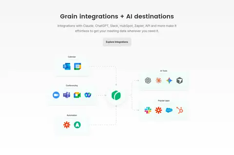
Imagery · Product interface imagery is the main visual evidence: meeting transcripts, recordings, action items, and integration screens appear as layered desktop-like UI. The hero combines a large interface capture with a video-call frame and a floating AI-tools card. Logos and app marks add colour in small clusters. Human photography appears within the product mockups, not as a dominant lifestyle campaign; the overall treatment is bright, soft, and lightly framed.
Reserve #009959 for primary actions and selective emphasis.
Pair Poppins display headings with Inter utility text.
Leave generous breathing room between major blocks.
Show product interfaces as polished, layered proof.
Use grey text and hairlines to soften secondary content.
✕ 不该做
Do not turn every section into a coloured band.
Do not use green as a large background wash.
Do not crowd the page with dense text blocks.
Do not make shadows dark or visually heavy.
Do not replace product UI with generic lifestyle imagery.
Do not apply display typography to every paragraph.
给 AI 的提示词
想快速出一个同风格的新页面,把这段话连同 DESIGN.md 一起发给 AI。
Build a new page in Grain’s calm, product-led visual style. Use #fafafa as the main canvas, Deep Ink #141414 for primary headings, Slate Ink #313232 and Soft Graphite #707070 for supporting copy, and Grain Green #009959 only for primary actions and selective emphasis. Use Poppins for display headlines and selected headings; use Inter for navigation, body copy, labels, and controls. Keep the content frame measured at 864px max width, with generous section spacing and alternating text-plus-product-interface layouts. Use bright, realistic meeting-product screenshots, small integration logos, softly rounded white cards, quiet Cloud Line #f0f0f0 borders, and restrained hairline shadows. Favor centered intros for overview and FAQ blocks, with left-aligned feature headings. Make the result feel clear, spacious, and credible rather than decorative.