North star · Keep the interface airy and editorial, using burgundy for hierarchy and action while reserving bright accents for small moments of attention.
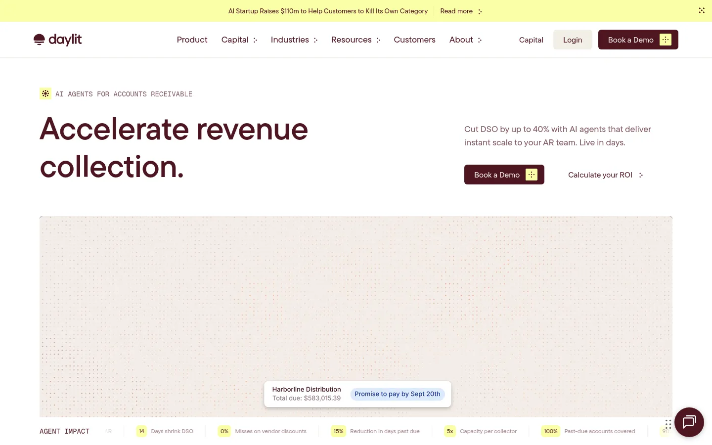
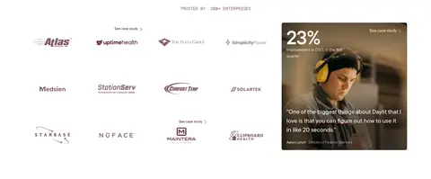
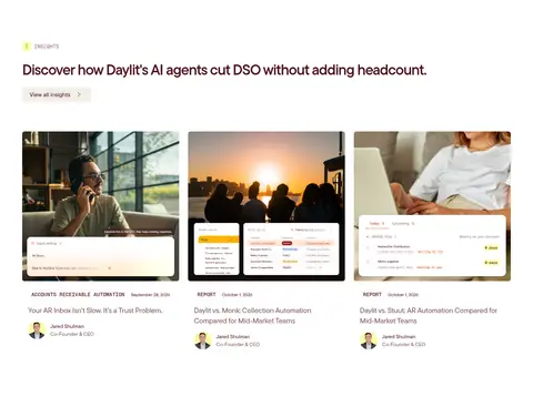
The page is built on a predominantly white canvas, with deep burgundy (#4d1520) carrying the brand voice across headlines, navigation, links, buttons, and the prominent dark feature and closing CTA bands. Warm off-white (#f2eee7) appears in subtle surfaces, fine borders, and the softly textured hero media; the pale lemon (#faffa7) is a small, high-contrast marker used for announcement and icon details, not a broad background. Tt Commons Pro Variable creates a friendly editorial hierarchy: large, tightly tracked headlines contrast with compact mono labels in Geist Mono. The wide page uses alternating two-column feature rows, centered proof sections, and multi-column content grids with generous white space. Photography and embedded finance-product interfaces make the AI story concrete. Cards remain visually quiet; separation comes from spacing, light hairlines, and rounded controls rather than heavy shadows.
Display, headings, navigation, body copy, captions, and most controls.
Aa 设计
Geist Mono
网络字体 · 字重 400 / 500 · 占比 4%
免费替代:Space Mono
Compact uppercase labels and report-style badges.
角色
示例
字号
字重
行高
字距
特大标题
Large promotional or section display headlines.
Daylit
64px
600
1.2
-0.01em
一级标题
Primary hero headline and lead page title.
Daylit
56px
600
1.15
-0.015em
二级标题
Major section headings and high-level content titles.
Daylit
48px
500
1.2
-0.01em
三级标题
Feature, FAQ, and editorial card headings.
Daylit
40px
600
1.2
-0.04em
正文
Explanatory copy, value propositions, and descriptions.
The quick brown fox 敏捷的狐狸
18px
500
1.5
0
辅助文字
Compact supporting text and card details.
The quick brown fox 敏捷的狐狸
16px
500
1.5
0
导航
Header navigation and prominent text links.
The quick brown fox 敏捷的狐狸
18px
500
1.33
0
代码
Uppercase eyebrow labels and report-style metadata.
const style = 1;
14px
400
1.71
0
间距与布局
基准单位 4px · 密度:适中
80px版块间距
12px元素间距
—卡片内边距
1320px内容最大宽度
4px
6px
8px
12px
14px
16px
20px
24px
32px
48px
58px
60px
80px
The page follows a wide, comfortable layout with a measured maximum width of 1320px. A compact announcement strip and horizontal navigation lead into an asymmetric two-column hero. Subsequent sections alternate centered proof moments, two-column feature splits, a three-column value grid, FAQ and editorial layouts, then a full-width closing CTA and multi-column footer. Maintain generous vertical separation, with an 80px measured section gap and 12px element gap as recurring references. Align most content to the left; reserve centered alignment for section introductions and CTA content.
圆角与层次
按钮 · 6px
输入框 · 6px
图片 · 6px
徽标 · 9999px
导航 · 6px
链接 · 6px
没有测到阴影:页面是扁平的,层次靠底色和描边区分。
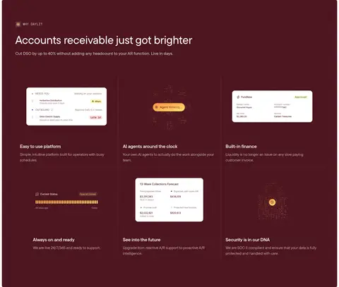
The interface is mostly flat, with whitespace and pale hairlines separating content rather than conspicuous shadows. Use measured 6px rounding for buttons, inputs, navigation, and media, and pill-shaped badges. Layer small finance-status UI panels over photography or textured media sparingly; reserve deep burgundy fills for clearly distinct feature and CTA bands.
组件
下面的预览按实测的按钮、输入框、徽标、卡片样式重建(字体用替代字体)。
Announcement strip
A narrow pale lemon notice band above navigation with compact text, a Read more link, and a small utility icon.
Primary CTA
Deep burgundy button with light text and a small lemon icon tile; use the measured 6px radius and restrained padding.
Feature split
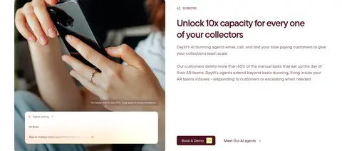
Alternating image-and-copy columns with a mono eyebrow, prominent heading, muted paragraph, and paired action links.
Report badge
Uppercase Geist Mono label with burgundy text, pale border, and pill-shaped outline.
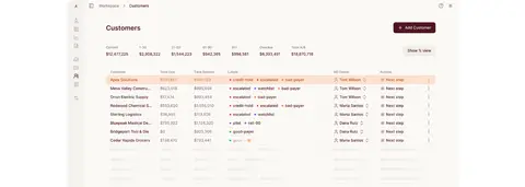
Product proof card
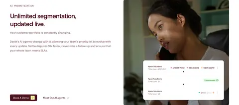
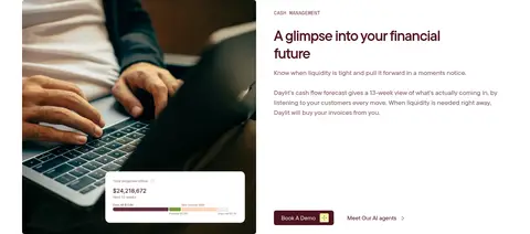
Photographic or pale interface panel layered with a compact invoice, forecast, or customer-status overlay.
FAQ accordion
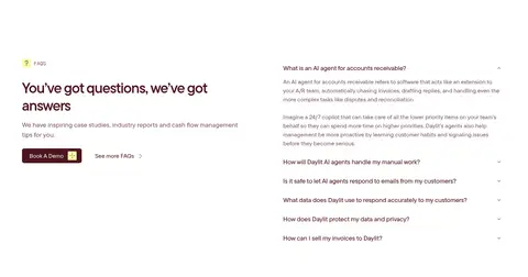
Open, text-led question list with burgundy questions, understated separators, and concise explanatory answers.
Dark CTA band
Centered light headline and supporting copy on a broad burgundy surface, ending with a lemon-accented action.
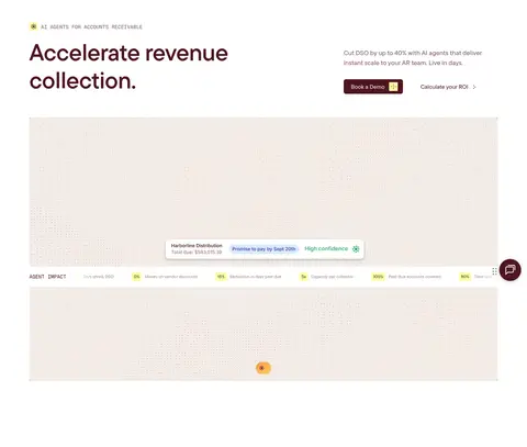
Imagery · Use warm, natural-light photography of people working with phones and laptops, paired with realistic product interface overlays and finance dashboard screens. The hero media is a broad, softly textured pale surface with a floating payment-status element; product screenshots should feel embedded in real workflows rather than presented as abstract illustration. Keep framing restrained and rounded, with soft cream tones and burgundy details. Small decorative marks can use the lemon accent, but photography and product UI remain the focus.
Use white space to give every section a calm, readable rhythm.
Set primary text and actions in Daylit Burgundy (#4d1520).
Keep Lemon Signal (#faffa7) to small markers and action details.
Pair feature copy with relevant photography or real-looking product UI.
Use mono uppercase text for short labels, not paragraphs.
Separate content with pale hairlines and spacing rather than heavy cards.
✕ 不该做
Do not turn the pale yellow accent into a large background field.
Do not add gradients, heavy shadows, or decorative borders without evidence.
Do not make every section a card or use dense dashboard layouts throughout.
Do not use bright saturated colors that compete with burgundy.
Do not set long-form body copy in mono or all caps.
Do not crowd the hero with multiple competing messages.
给 AI 的提示词
想快速出一个同风格的新页面,把这段话连同 DESIGN.md 一起发给 AI。
Build a new Daylit-style SaaS page with a wide, airy white canvas (#ffffff), warm supporting surfaces (#f2eee7, #fbf9f6), and a clear burgundy hierarchy (#4d1520). Use Tt Commons Pro Variable or DM Sans for the main interface, with Geist Mono or Space Mono for compact uppercase labels. Create an editorial hero with a large headline, concise supporting copy, and one dominant burgundy CTA; use Lemon Signal (#faffa7) only for small icons or notices. Structure the page with alternating two-column feature sections, proof content, restrained grids, and a strong closing CTA band. Use warm human photography and realistic finance-product UI overlays. Keep controls softly rounded, borders faint, and elevation minimal. Prioritize readable copy and generous whitespace over ornament.