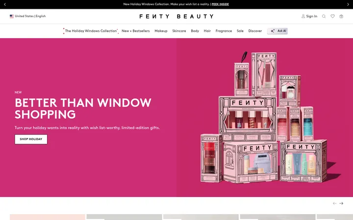
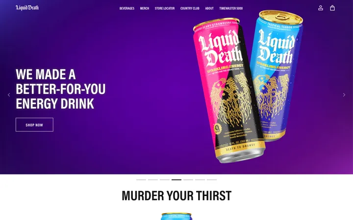
North star · Keep the interface nearly monochrome and let oversized candy imagery, assertive type, and one deliberate coral footer moment provide the drama.
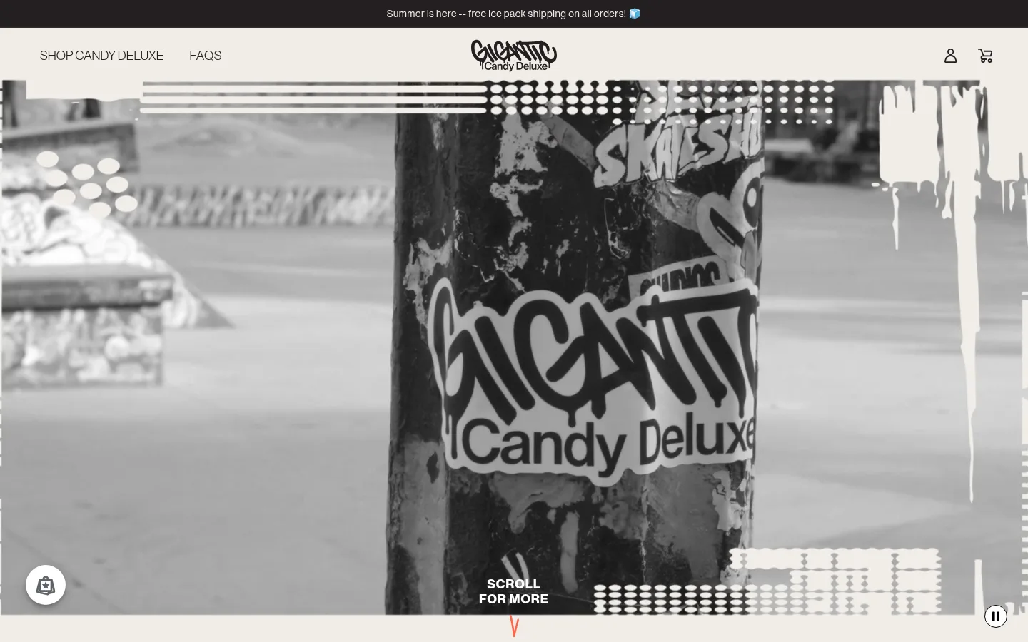
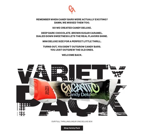
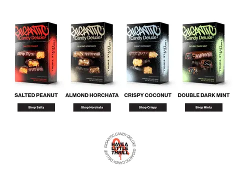
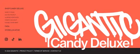
The page keeps its main canvas white and lets oversized product visuals and strong typography carry the identity. Deep charcoal (#231f20) anchors the announcement strip, navigation, text, and compact dark buttons, while white type reverses out against dark surfaces. The bright coral (#ff634b) is concentrated in the footer rather than scattered through the page; its warmer border counterpart appears as a fine accent. Electric blue link text is a measured exception, not a broad palette foundation. Neue Haas Grotesk Display supplies a consistent voice: uppercase, tightly composed headings contrast with smaller navigation and explanatory copy. The hero uses full-bleed monochrome video, followed by centered editorial copy, a dramatic variety-pack composition, and a four-item product lineup. Generous white intervals separate these dense visual moments. Packaging artwork carries many additional colors, but those belong to product imagery rather than the core interface palette.
Site-wide headings, body copy, navigation, links, and buttons.
Aa 设计
Arial
系统字体 · 字重 400 · 占比 2%
免费替代:Arial
Rare system-font fallback.
角色
示例
字号
字重
行高
字距
一级标题
Prominent uppercase headline or campaign statement.
Gigantic
32px
700
1
0.016em
二级标题
Light uppercase editorial section headings.
The quick brown fox 敏捷的狐狸
25px
400
1
0.05em
三级标题
Bold uppercase product and supporting headings.
The quick brown fox 敏捷的狐狸
24px
700
1.3
0.025em
正文
Emphatic short copy and button labels.
The quick brown fox 敏捷的狐狸
18px
700
normal
0.044em
辅助文字
Explanatory copy and small supporting notes.
The quick brown fox 敏捷的狐狸
16px
400
1.8
0.031em
按钮
Bold, tracked shop and action labels.
The quick brown fox 敏捷的狐狸
18px
700
normal
0.044em
导航
Compact header and footer navigation links.
The quick brown fox 敏捷的狐狸
14px
400
1.8
0.036em
眉题
Small uppercase introductory labels.
The quick brown fox 敏捷的狐狸
18px
400
1
0.05em
间距与布局
基准单位 2px · 密度:适中
55px版块间距
10px元素间距
—卡片内边距
1117px内容最大宽度
1px
4px
6px
7px
8px
10px
15px
16px
17px
19px
20px
28px
30px
32px
35px
40px
A centered header sits beneath a narrow dark announcement strip, with the logo visually centered between navigation and utility icons. The opening hero is full-bleed media. Below it, centered editorial copy and a large variety-pack feature lead into a four-column product grid. The measured content max width is 1117px, while the hero media spans the viewport. White space creates a comfortable section rhythm; the footer changes to a two-column composition.
圆角与层次
hairline · button
The interface is largely flat, with no measured shadow system and square-edged controls. Dark buttons and the announcement strip rely on contrast rather than elevation. Product images and overlapping campaign artwork create the main sense of depth; a thin coral-toned footer border provides a restrained edge.
组件
下面的预览按实测的按钮、输入框、徽标、卡片样式重建(字体用替代字体)。
Announcement strip
Narrow charcoal band above the header, carrying centered white shipping copy.
Main navigation
White header with shop and FAQ links on the left, centered logo, and account/cart icons on the right.
Video hero
Viewport-wide monochrome product video with a compact white scroll prompt near the bottom.
Variety pack feature
Centered campaign block combines uppercase copy, oversized typographic artwork, product packaging, and a dark shop link.
Product grid
Four evenly presented candy packs with uppercase flavor names and compact dark shop buttons.
Coral footer
Two-column footer pairs small shop and social links with a large white brand mark on coral, then a dark legal strip.
Imagery · The first screen is a full-bleed monochrome product video with graphic candy branding and a bottom-centered scroll cue. Further down, oversized product-pack imagery overlaps bold typographic artwork, followed by isolated pack shots in a four-item lineup. Packaging introduces vivid colors and textures; treat those as product photography, not interface colors.
Set primary interface copy in Cocoa Ink (#231f20).
Reserve coral for a deliberate footer or similarly focused moment.
Use bold uppercase display typography with visible tracking.
Let full-bleed product media define the hero.
Keep product imagery prominent and sharply framed.
✕ 不该做
Do not make packaging colors the site-wide palette.
Do not add gradients or decorative shadow layers.
Do not fill every section with colored backgrounds.
Do not use rounded, pill-shaped buttons.
Do not replace the centered logo-header arrangement with a generic left-aligned bar.
Do not overcrowd the white intervals between campaign sections.
给 AI 的提示词
想快速出一个同风格的新页面,把这段话连同 DESIGN.md 一起发给 AI。
Build a new Gigantic-style food ecommerce page with a white Gallery White (#ffffff) canvas, Cocoa Ink (#231f20) text, and restrained Candy Coral (#ff634b) reserved for one focused brand moment such as the footer. Use Neue Haas Grotesk Display or a close sans-serif substitute, with bold tracked uppercase display headings, compact navigation, and clear hierarchy. Place a narrow dark announcement strip above a white header with centered logo, left-side links, and right-side utility icons. Give the hero full-bleed product media, then use centered editorial copy, oversized campaign artwork, and an orderly product grid with square dark shop buttons. Keep the interface flat and spacious; allow product packaging to provide the vivid color. Avoid gradients, pill controls, and unnecessary decoration.