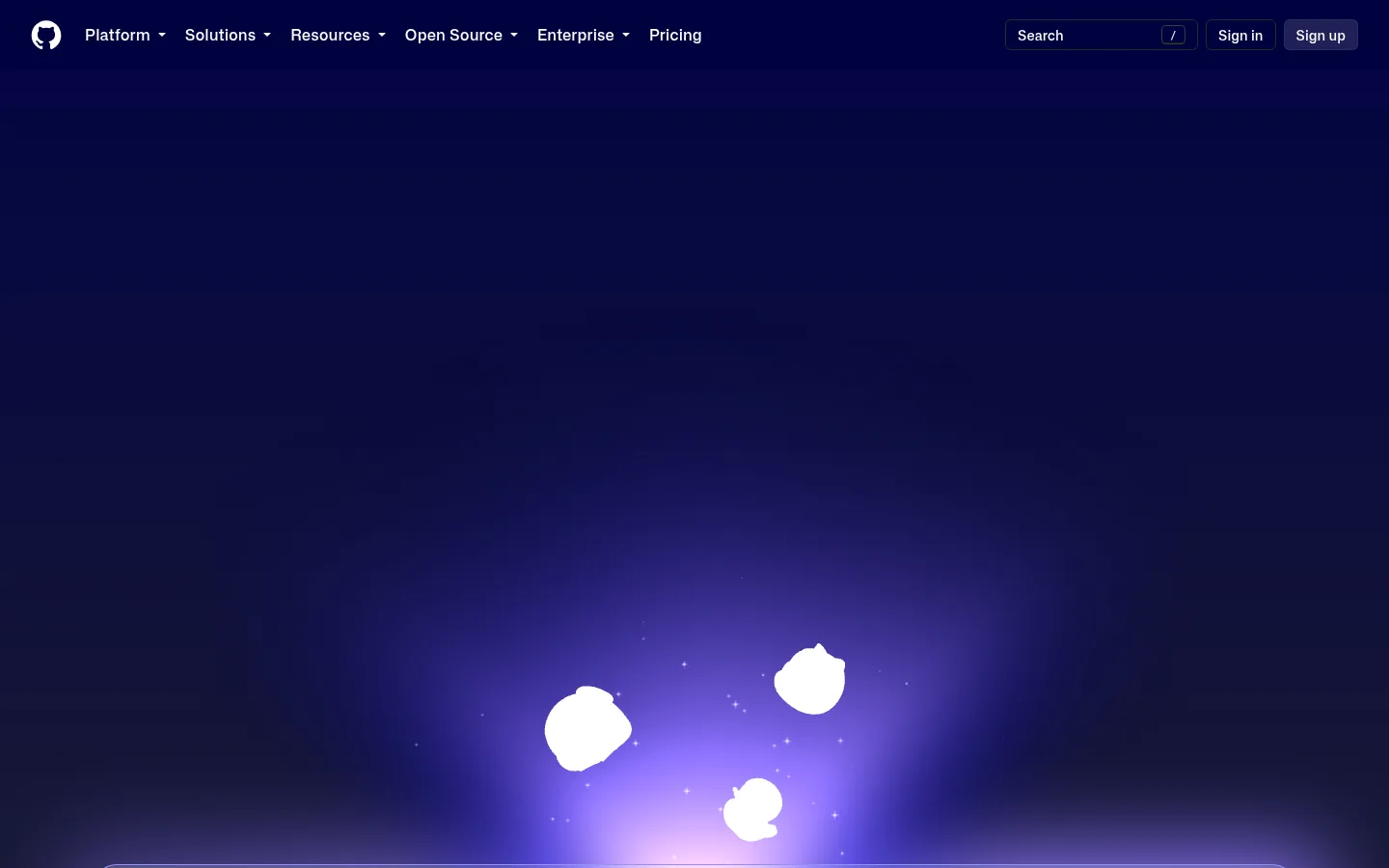
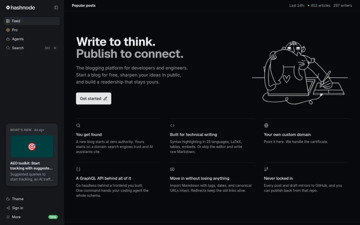
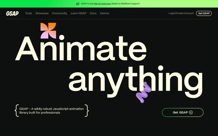
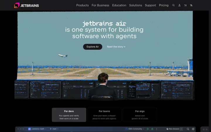
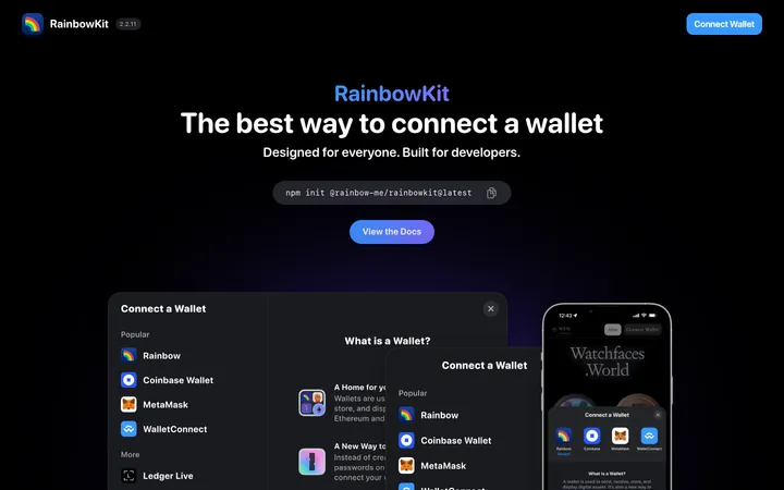
North star · Keep the interface nearly black and quiet, reserving luminous gradients and accent colors for product storytelling and clear actions.
The page is anchored by a near-black canvas, with deep navy-violet gradients concentrated behind hero and product media rather than used as flat brand fills. White headings and muted gray supporting copy create a high-contrast reading hierarchy; pale blue links and restrained green signup actions provide precise points of emphasis. Mona Sans supplies the clean, contemporary voice, with measured headings set firmly and body copy kept open and readable. Content alternates between centered introductions and broad two-column or multi-column modules, using thin charcoal dividers to organize long stretches of dark space. Product screenshots and interface mockups sit inside softly rounded frames, while atmospheric purple-blue light gives them depth without adding heavy card chrome. Generous section breathing room lets each feature story stand independently, then compact footer columns restore navigation density.
Main display and interface sans for headings, body, buttons, and navigation.
Aa 设计
Mona Sans VF
系统字体 · 字重 400 / 600 · 占比 20%
免费替代:Inter
Supporting headings, captions, links, and interface text.
Aa 设计
Mona Sans Mono
网络字体 · 字重 500 / 480 / 400 · 占比 3%
免费替代:Space Mono
Compact code-like labels and technical metadata.
角色
示例
字号
字重
行高
字距
一级标题
Primary hero or feature headline.
GitHub
40px
460
1.2
0
二级标题
Section titles and prominent content headings.
The quick brown fox 敏捷的狐狸
24px
600
1.5
0
三级标题
Supporting feature and customer-story headings.
The quick brown fox 敏捷的狐狸
22px
400
1.4
0
正文
Explanatory copy beneath headings and within feature panels.
The quick brown fox 敏捷的狐狸
18px
400
1.5
0.01em
辅助文字
Small labels, footnotes, and image or interface captions.
The quick brown fox 敏捷的狐狸
14px
400
1.5
0
按钮
Signup, subscribe, and other action labels.
The quick brown fox 敏捷的狐狸
16px
500
1.5
0.015em
导航
Header navigation and compact menu labels.
The quick brown fox 敏捷的狐狸
14px
500
1.5
0.015em
链接
Inline feature links and customer-story actions.
The quick brown fox 敏捷的狐狸
14px
400
1.5
0
代码
Compact technical labels or code-oriented metadata.
const style = 1;
12px
500
1.5
0
间距与布局
基准单位 8px · 密度:宽松
96px版块间距
12px元素间距
8px卡片内边距
1280px内容最大宽度
2px
4px
8px
12px
16px
20px
24px
32px
40px
44px
48px
64px
96px
Use a spacious centered content frame with a measured maximum width of 1280px and a measured base spacing unit of 8px. The page moves between centered feature introductions, wide media-led sections, and two- or four-column content and footer layouts. Keep section transitions generous, with a measured section gap of 96px, while content-level spacing stays tighter. Thin borders define card and column edges without enclosing every text group. The visual density is low across feature stories and higher in the footer link columns.
圆角与层次
按钮 · 9999px
输入框 · 8px
卡片 · 16px
图片 · 16px
导航 · 4px
inset · nav
The design is mostly flat, relying on charcoal hairlines and dark panel boundaries rather than strong drop shadows. Rounded media frames and overlapping product mockups create depth, while the purple-blue glow provides the most visible elevation. Keep navigation and content surfaces restrained; a subtle inset treatment is measured in the navigation.
组件
下面的预览按实测的按钮、输入框、徽标、卡片样式重建(字体用替代字体)。
Top navigation
Compact horizontal header with GitHub mark, white navigation links, search, sign-in, and signup controls against the dark canvas.
Signup action
Green (#08872b) action with white text; the measured signup button has a compact rounded treatment.
Feature link
Pale blue (#a2daff) text link used for product exploration and customer-story actions.
Product media panel
Dark framed interface imagery with rounded corners, fine charcoal edges, and atmospheric purple-blue light behind the media.
Feature split
Alternating text and product media in broad columns, separated from adjacent stories by thin dark rules.
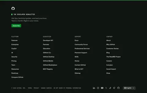
Footer newsletter
Newsletter heading and supporting copy above a green subscribe button, followed by dense multi-column site links.
Imagery · Favor product UI mockups, code and dashboard screenshots, customer marks, and occasional Octocat or character illustrations over conventional photography. Frame media in dark, rounded panels and let soft violet, blue, and lilac glows bloom behind it. Keep the surrounding page black so each interface image reads as a luminous focal point; treat screenshot colors as content, not as a replacement for the brand palette.
Reserve violet-blue gradients for hero and product media backgrounds.
Use white for key headings and navigation.
Apply pale blue to text links and selective emphasis.
Use green for clear signup and subscribe actions.
Separate long content with fine charcoal dividers.
Give feature sections generous breathing room.
✕ 不该做
Do not turn gradient colors into broad flat section fills.
Do not use bright accents for ordinary body copy.
Do not frame every text block as a card.
Do not add heavy shadows to otherwise flat content.
Do not let product screenshots dictate the overall palette.
Do not compress feature sections into a dense dashboard layout.
给 AI 的提示词
想快速出一个同风格的新页面,把这段话连同 DESIGN.md 一起发给 AI。
Build a new page in GitHub’s developer-platform visual style. Use Midnight Canvas (#000000) as the main background, with GitHub Charcoal (#0d1117) and Forest Black (#0f1511) only for measured dark surfaces. Set clear white headings and navigation, Soft Sage (#a4aea6) for secondary copy, and Glacier Link (#a2daff) for links. Use Action Green (#08872b) sparingly for primary actions. Place violet and lilac glow gradients behind product screenshots, not as broad solid fills. Use Mona Sans or a close sans-serif substitute, a centered wide content frame, generous section spacing, thin Divider Slate (#21262d) rules, and softly rounded media panels. Alternate centered introductions with modular feature splits; keep ordinary text areas mostly unboxed and the footer more compact.