North star · Keep the page bright and editorial, using orange sparingly to point toward meaningful product actions and insights.
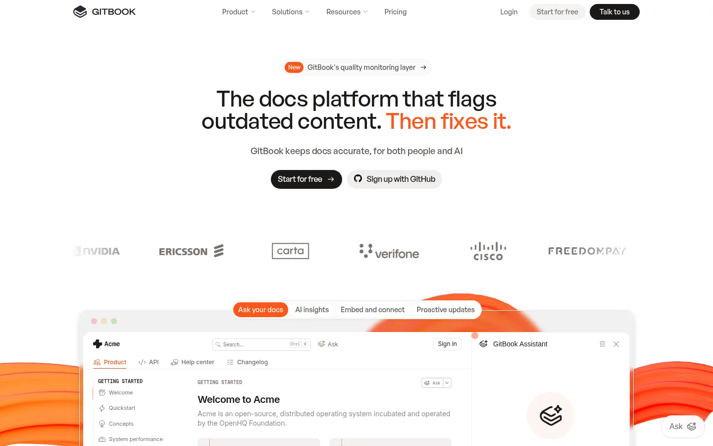
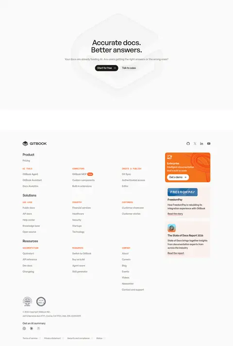
The page is built on a white canvas, with warm off-white bands and cards adding quiet separation rather than heavy blocks of colour. Near-black headlines and body text carry the hierarchy; muted warm grays soften supporting copy, while vivid orange marks selected phrases, badges, and product accents. General Sans gives large headings a compact, confident presence, with tight tracking and short lines; supporting interface details use restrained sans-serif styling. The centered hero gives way to a wide product preview, then alternating feature explanations, diagrams, customer stories, and enterprise content. Layouts stay airy and carefully aligned despite a substantial amount of content. Product screenshots and custom diagrams provide the visual texture: pale panels and fine outlines are punctuated by orange ribbons and highlights. Rounded buttons, cards, and media frames keep the technical subject matter approachable. Shadows are selective, mainly lifting product mockups and cards from the otherwise flat page.
Centered hero headline with an orange-highlighted closing phrase.
GitBook
45px
700
1
-0.02em
二级标题
Major feature, customer, and enterprise section headings.
GitBook
38px
700
1
-0.02em
三级标题
Feature titles and prominent supporting statements.
GitBook
32px
700
1.2
-0.02em
四级标题
Smaller content-group headings and card titles.
The quick brown fox 敏捷的狐狸
24px
700
1.2
-0.02em
正文
Feature descriptions, explanatory copy, and customer-story text.
The quick brown fox 敏捷的狐狸
16px
700
1.5
0
辅助文字
Short supporting notes, metadata, and compact labels.
The quick brown fox 敏捷的狐狸
14px
700
1.6
0
按钮
Primary and secondary action labels.
The quick brown fox 敏捷的狐狸
13px
400
normal
0
链接
Navigation, inline actions, and footer links.
The quick brown fox 敏捷的狐狸
14px
700
1.6
0
代码
Compact uppercase technical or category labels.
const style = 1;
12px
600
1
0.02em
间距与布局
基准单位 2px · 密度:紧凑
40px版块间距
10px元素间距
6px卡片内边距
1160px内容最大宽度
1px
4px
6px
8px
10px
12px
14px
15px
16px
20px
24px
40px
The measured content max width is 1160px, with a compact underlying spacing scale and a 40px section gap. The first viewport centers a narrow hero beneath a restrained horizontal navigation, then opens into a broad logo row and oversized product mockup. Lower sections alternate text and media, use centered headings for major transitions, and switch to multi-column feature and footer arrangements. Preserve generous visual whitespace between content groups even where the underlying component spacing is compact.
圆角与层次
按钮 · 9999px
卡片 · 16px
图片 · 8px
徽标 · 9999px
链接 · 9999px
hairline · other
md · card
sm · other
xl · card
Most sections remain flat against white or warm off-white surfaces. Use the measured 16px card radius and 8px media radius; reserve soft shadows for product mockups and selected cards. Warm hairline borders define delicate edges, while buttons use rounded pill silhouettes without heavy visual framing.
组件
下面的预览按实测的按钮、输入框、徽标、卡片样式重建(字体用替代字体)。
Pill action
Primary actions use a near-black fill, white label, and pill shape; secondary actions sit on pale neutral surfaces.
Hero announcement
A small rounded notice sits above the centered hero, with an orange status marker and understated supporting text.
Product preview
Large, rounded documentation UI mockup combines a pale frame, compact navigation, content pane, and assistant panel.
Feature split
Pair concise text and supporting diagrams or UI imagery in alternating two-column feature rows.
Customer story
Set a short quotation beside a customer portrait or logo, with compact attribution and a small dark action.
Logo rail
Present customer marks in a spacious horizontal row, generally monochrome and subordinate to the main content.
Imagery · Product UI previews and custom diagrams lead the visual narrative; they are framed as pale, rounded interface windows rather than full-bleed photography. Customer portraits appear within testimonial content, while enterprise illustrations use orange ribbons and small technical symbols. Treat screenshot details as product content, not as a source of extra brand colours; keep imagery crisp and let orange highlights provide contrast.
Reserve Signal Orange for selected highlights and product cues.
Set major headings in bold General Sans or a close substitute.
Keep the hero centered and product previews visually prominent.
Use warm pale surfaces to separate cards without heavy bands.
Apply rounded pills to primary actions and badges.
✕ 不该做
Do not turn the page into a dark theme.
Do not use orange as a full-page background.
Do not crowd the hero with extra copy or controls.
Do not add strong borders to every card.
Do not treat colours inside illustrations as the core brand palette.
Do not replace product-focused visuals with generic stock imagery.
给 AI 的提示词
想快速出一个同风格的新页面,把这段话连同 DESIGN.md 一起发给 AI。
Build a new page in GitBook’s restrained developer-platform style. Use Gallery White (#ffffff) as the main canvas, Warm Porcelain (#fafaf9) and Mist Panel (#f2f1f1) for quiet surface changes, and Soft Charcoal (#1c1917) for headings and dark pill actions. Apply Signal Orange (#fe551b) selectively to a key phrase, status marker, or meaningful product state; keep Peach Hairline (#ffccba) subtle. Use bold, tightly tracked General Sans-style headings with calm warm-gray supporting copy. Center the opening message, then make room for a convincing documentation or AI product preview. Organize the remaining content into alternating text-and-visual rows, customer proof, and a clear final action. Use rounded media and cards, generous visual breathing room, and restrained shadows. Keep interface details crisp and avoid decorative clutter.