North star · Let editorial serif headlines introduce each idea, then make the product tangible with clean, readable interface examples on a warm neutral canvas.
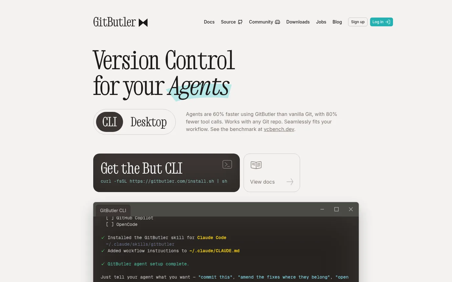
The page is built on a warm, pale canvas (#f3f2f1) with dark near-black text, creating an editorial feel rather than a conventional software dashboard. Large, distinctive serif headlines establish personality; Inter handles navigation, descriptions, and controls, while Geist Mono gives terminal examples a credible code-like voice. Teal is used sparingly for interactive emphasis and then expands into broad, softly tinted comparison and conversion panels. Content sits in a centered column with generous breathing room between sections, while feature grids and comparison tables become more compact and structured. Product evidence is shown directly through terminal-window screenshots, interface cards, video thumbnails, and community portraits, not decorative stock photography. Fine neutral borders, rounded controls, and selective shadows separate objects without making the page feel heavy. Overall, expressive type and real product UI balance clarity with character.
配色
点色块复制色值。用途说明来自对页面的实测位置(背景、文字、描边、按钮)与截图判读。
品牌色
强调色
表层色
中性色
功能色
页面底色 · Warm Canvas表层 · Stone Hairline表层 2 · Mist Aqua表层 3 · Signal Teal表层 4 · Paper White主文字 · Softened Ink次要文字 · Muted Umber弱文字 · Paper White描边 · Stone Hairline强调 · Signal Teal强调 2 · Soft Teal强调 3 · Quiet Periwinkle
文字
背景
对比度
WCAG
#1c1917 Softened Ink
#f3f2f1 Warm Canvas
15.64:1
AAA
#1c1917 Softened Ink
#cac6c3 Stone Hairline
10.31:1
AAA
#1c1917 Softened Ink
#d3f3f3 Mist Aqua
14.89:1
AAA
#1c1917 Softened Ink
#25b1b1 Signal Teal
6.66:1
AA
#7c716a Muted Umber
#f3f2f1 Warm Canvas
4.24:1
AA-large
#7c716a Muted Umber
#cac6c3 Stone Hairline
2.8:1
不达标
字体
字号阶梯:Custom(比例约 2,正文 15px)。示例用免费替代字体渲染,数值为实测。
Aa 设计
Inter
网络字体 · 字重 400 / 600 / 500 · 占比 89%
免费替代:Inter
Navigation, body copy, captions, links, and general interface text.
Aa 设计
Geist Mono
网络字体 · 字重 400 / 600 · 占比 7%
免费替代:IBM Plex Mono
Code examples and terminal commands.
Aa 设计
But Head
网络字体 · 字重 400 · 占比 3%
免费替代:Cormorant Garamond
Display headlines, section headings, and expressive brand wordmark styling.
角色
示例
字号
字重
行高
字距
特大标题
Large editorial hero and campaign headlines.
GitButler
60px
400
1
0
一级标题
Primary page headline and prominent section titles.
GitButler
48px
400
1
0
正文
Explanatory copy, feature descriptions, and testimonials.
The quick brown fox 敏捷的狐狸
15px
400
1.6
0
辅助文字
Compact supporting labels and secondary metadata.
The quick brown fox 敏捷的狐狸
13px
400
1.2
0
导航
Header navigation links and menu items.
The quick brown fox 敏捷的狐狸
14px
500
1.2
0
链接
Small secondary links and inline navigation actions.
The quick brown fox 敏捷的狐狸
12px
400
2
0
代码
Terminal commands and code-like product demonstrations.
const style = 1;
14px
400
1.5
0
间距与布局
基准单位 4px · 密度:适中
58px版块间距
12px元素间距
24px卡片内边距
—内容最大宽度
4px
6px
8px
10px
12px
14px
16px
20px
24px
32px
40px
Use a centered, constrained content column with generous outer margins and clear vertical pauses between major sections. The header is a compact horizontal row; the hero aligns its large left-led headline above a side-by-side product selector and supporting copy, followed by prominent install and documentation actions. Organize feature information into bordered grids and tables, then alternate those structured sections with wider tinted bands, media cards, and testimonial columns. Keep the overall density comfortable, with compact copy and room around headlines and product demos.
圆角与层次
按钮 · 9999px
卡片 · 8px
图片 · 16px
链接 · 20px
xl · card
inset · card
inset · button
The page is mostly flat, relying on fine neutral borders and pale surface changes to organize content. Reserve noticeable shadows for large terminal or product cards, where they suggest a physical window lifted from the canvas. Rounded controls and cards provide a softer edge without turning the layout into a floating-dashboard stack.
组件
下面的预览按实测的按钮、输入框、徽标、卡片样式重建(字体用替代字体)。
Navigation bar
Compact horizontal header with a serif wordmark, dark Inter links, and a small teal login action.
Editorial hero
Oversized regular-weight serif headline with selective italic emphasis, followed by concise supporting copy and a CLI/Desktop selector.
Install action
Prominent dark command panel with serif action text and a smaller monospaced install command; pair with a light documentation link card.
Terminal showcase
Wide charcoal terminal window with a restrained top bar, monospaced output, and soft shadow against the warm canvas.
Feature grid
Compact multi-column feature cards separated by thin stone-colored borders, with small icons, concise headings, and muted descriptions.
Comparison panel
Wide pale-aqua band containing a white, ruled comparison table and a short highlighted supporting note.
Media and testimonial cards
Video thumbnails and community quotes arranged in horizontal or paired layouts, with compact metadata and small portraits.
Conversion and download panels
Saturated teal workflow CTA and a pale aqua app-download area, paired with command actions, platform links, and contained illustration.
Imagery · Prioritize real product evidence: terminal windows, application UI, feature thumbnails, and interface cards. Frame terminal imagery as dark rectangular panels against the pale canvas, with a subtle shadow to lift it from the page. Video previews and community portraits add variety lower down. The closing download area includes playful illustrated character artwork; treat it as a contained supporting illustration, not the primary brand language.
该做与不该做
✓ 该做
Use the warm canvas as the dominant page background.
Set prominent headlines in an expressive serif.
Keep interface copy in clean, compact Inter.
Show terminal commands in a monospaced face.
Use teal for deliberate actions and highlighted bands.
Separate feature content with subtle neutral borders.
✕ 不该做
Do not turn the page into a dark dashboard.
Do not use teal as the background for every section.
Do not replace the editorial serif with generic bold sans headings.
Do not decorate product content with unrelated stock photography.
Do not make borders or shadows heavier than the content.
Do not crowd the hero or major section headings.
给 AI 的提示词
想快速出一个同风格的新页面,把这段话连同 DESIGN.md 一起发给 AI。
Build a new GitButler-style devtools page with an editorial, product-led visual system. Use Warm Canvas (#f3f2f1) for the main background and Softened Ink (#1c1917) for headings and interface text. Set large, expressive headlines in a regular serif with occasional italic emphasis; use Inter for navigation and body copy, and a monospaced font for terminal commands. Keep the content centered with generous section breaks, compact descriptive copy, and clear feature grids. Use Stone Hairline (#cac6c3) for restrained card borders, Paper White (#ffffff) for clean surfaces, and Signal Teal (#25b1b1) for primary actions. Reserve Mist Aqua (#d3f3f3) for selected comparison or download bands. Include believable terminal or application UI as the core imagery, with subtle card elevation; avoid generic stock visuals and excessive decoration.