North star · Keep the page anchored in dark, spacious contrast, and let the wallet UI and focused blue accents carry the visual energy.
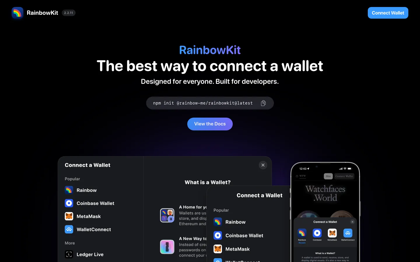
The page builds its identity on a very dark canvas, with near-black sections and white text creating a high-contrast frame for the wallet product. Vivid blue marks the primary Connect Wallet action and the large product-demo band; a blue-to-violet button gradient adds a small, focused flash rather than spreading colour across every control. The light closing section deliberately reverses the dark treatment. SFRounded gives headings and interface copy a friendly, compact feel, while SFMono distinguishes the install command as code. Centered content and a restrained page width keep the hero and developer explanation legible; the showcase imagery supplies most of the visual complexity. Wallet dialogs and phone previews overlap as product evidence, set against soft coloured glow. Section transitions are broad and clear, with rounded controls and few visible hairlines.
配色
点色块复制色值。用途说明来自对页面的实测位置(背景、文字、描边、按钮)与截图判读。
品牌色
强调色
表层色
中性色
功能色
页面底色 · Carbon Canvas表层 · Pure Stage表层 2 · Cloud Panel表层 3 · Cloud Type主文字 · Cloud Type次要文字 · Pure Stage弱文字 · Quiet Graphite强调 · Royal Field强调 2 · Electric Blue强调 3 · Rainbow Blue
Hero headline naming the wallet connection promise.
RainbowKit
52px
700
1
0.007em
二级标题
Major section headings, including developer and closing sections.
RainbowKit
40px
700
1
0.009em
三级标题
Supporting headings in explanatory content and product UI.
The quick brown fox 敏捷的狐狸
24px
600
1.17
0.015em
四级标题
Compact subheadings and labels within content.
The quick brown fox 敏捷的狐狸
20px
700
1.05
0.017em
正文
Introductory copy, explanatory paragraphs, and interface descriptions.
The quick brown fox 敏捷的狐狸
16px
600
1.31
0.022em
辅助文字
Muted supporting text and small interface annotations.
The quick brown fox 敏捷的狐狸
14px
500
1.29
0.025em
按钮
Primary wallet and documentation calls to action.
The quick brown fox 敏捷的狐狸
16px
700
normal
0
链接
Documentation, partner, and social links.
The quick brown fox 敏捷的狐狸
20px
700
1.05
0.017em
代码
Monospaced package installation command in the hero.
const style = 1;
14px
400
1
0.025em
间距与布局
基准单位 4px · 密度:宽松
128px版块间距
12px元素间距
—卡片内边距
944px内容最大宽度
1px
4px
5px
6px
8px
12px
16px
18px
19px
20px
24px
28px
32px
40px
48px
64px
The measured content max width is 944px, with the hero and developer explanation centered and major sections stacked vertically. The measured spacing uses a 4px base unit, a 12px element gap, and a spacious 128px section gap; preserve this broad breathing room rather than filling every band. The logo field uses a six-column arrangement, while the closing section shifts to a two-column layout. Keep the hero compact above a large product visual, and let full-bleed background bands clearly separate page chapters.
圆角与层次
按钮 · 50%
卡片 · 24px
图片 · 12px
链接 · 9999px
md · other
inset · button
hairline · other
lg · link
Use restrained elevation to separate wallet previews and floating dialogs from the dark canvas: measured medium shadows include rgba(0, 0, 0, 0.4) 0px 8px 24px 0px. Buttons may use a soft shadow or subtle inset highlight. Keep section bands mostly flat and avoid adding decorative borders where the screenshot has none.
组件
下面的预览按实测的按钮、输入框、徽标、卡片样式重建(字体用替代字体)。
Top navigation
Compact brand mark and version at the upper left, balanced by a bright blue Connect Wallet button at the upper right.
Hero install command
Centered dark rounded command field with SFMono text and a copy affordance, followed by a gradient pill-shaped View the Docs action.
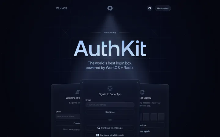
Wallet preview
Overlapping dark wallet dialogs and a phone mockup, with provider lists, product details, rounded corners, and soft shadow.
Partner logo cloud
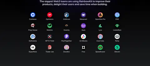
Short centered proof statement above a six-column set of compact partner marks on the dark background.
Interactive showcase
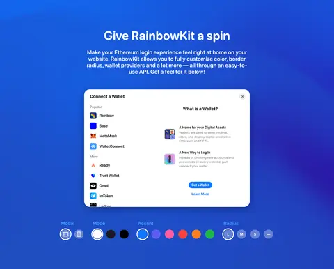
Bright blue full-width band with centered heading, explanatory copy, a light wallet dialog preview, and a row of customization controls.
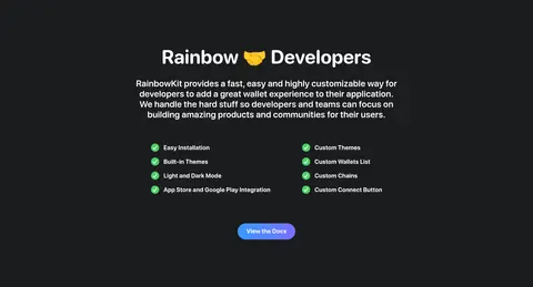
Developer benefits
Centered heading and paragraph, two-column checklist, and a compact gradient documentation button on a dark section.
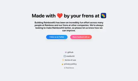
Closing credits
Light background with centered attribution, short copy, colored social buttons, and understated footer links.
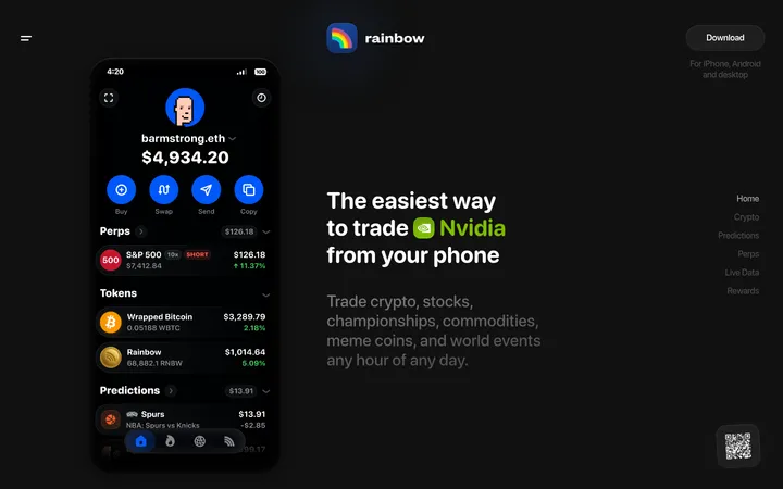
Imagery · The hero is led by layered wallet-connect dialogs and a phone mockup rather than lifestyle photography. Treat interface previews as polished product evidence: crisp dark cards, rounded edges, legible provider marks, and overlapping windows. A soft blue-purple glow sits behind the main demo, while the bright showcase band contains a light wallet panel and compact customization controls. Partner logos are small, evenly spaced marks.
Use near-black and charcoal as the main page foundation.
Reserve vivid blue for primary actions and the showcase band.
Center the hero and keep its message visually compact.
Show wallet UI as layered, legible product evidence.
Use rounded SFRounded typography for interface and headings.
Leave generous vertical breathing room between sections.
✕ 不该做
Do not turn the page into a uniformly bright blue layout.
Do not use a dense grid of bordered cards for every section.
Do not let provider icon colours define the brand palette.
Do not replace the wallet previews with unrelated stock photography.
Do not make the closing light section blend into the dark bands.
Do not add arbitrary borders or spacing beyond the measured system.
给 AI 的提示词
想快速出一个同风格的新页面,把这段话连同 DESIGN.md 一起发给 AI。
Build a new RainbowKit-style page with a near-black Carbon Canvas (#1b1c1e) and Pure Stage (#000000) foundation. Use Cloud Type (#ffffff) for clear hierarchy, Quiet Graphite (#8a8e8e) for secondary copy, and Rainbow Blue (#3898ff) for the primary wallet action. Use SFRounded or a close rounded sans-serif for headings and UI, with a monospaced install command. Center a concise hero, then make wallet dialogs and a phone preview the main visual proof, with soft overlap and subtle shadow. Separate chapters using broad full-width bands, including one Royal Field (#1f4fcc) showcase with a light product panel. Preserve generous measured spacing and rounded controls. Finish with a distinct Cloud Panel (#f0f1f5) attribution section. Keep provider colours confined to product imagery.