North star · Use a quiet, spacious editorial frame around precise market-data interfaces, reserving dark bands and blue accents for clear hierarchy.
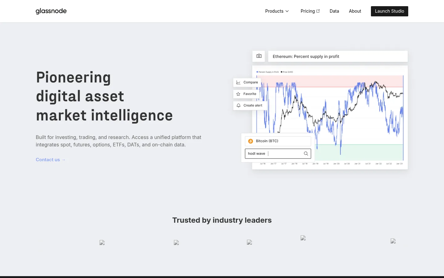
The homepage alternates pale gray and white sections with near-black bands, giving the long page a clear rhythm and separating platform, research, and company information. The hero uses a two-column composition: a bold, left-aligned headline and compact supporting copy sit opposite a floating market-chart interface. Inter handles navigation, body copy, labels, and interface text; the heavier Fraktion display face gives major headlines a distinctive editorial presence. Keep the measured hierarchy and comfortable spacing, with centered headings where sections introduce a system or company story. Use the blue-violet accent sparingly for links and highlighted data, and reserve the pale lavender band for the Vector feature. Thin gray borders define cards and controls; the interface remains mostly flat rather than heavily shadowed. Charts and product captures supply the detail, while simple card grids organize research and platform offerings.
Navigation, body copy, labels, controls, and secondary headings.
Aa 设计
fraktion
网络字体 · 字重 700 · 占比 2%
免费替代:Space Grotesk
Display headlines and the primary hero heading.
角色
示例
字号
字重
行高
字距
特大标题
Large display headlines introducing major homepage stories.
Glassnode
56px
700
1.2
0
一级标题
Primary hero headline and top-level page message.
Glassnode
51px
700
1.2
0
二级标题
Section titles, including platform and research introductions.
Glassnode
38.5px
700
1.2
0
三级标题
Feature and product-category headings.
Glassnode
32px
700
1.4
0
四级标题
Card titles and supporting content headings.
The quick brown fox 敏捷的狐狸
24px
700
1.4
0
正文
Paragraph copy describing products, data, and research.
The quick brown fox 敏捷的狐狸
13px
400
1.5
0
辅助文字
Compact metadata, footnotes, and chart annotations.
The quick brown fox 敏捷的狐狸
12px
400
1.5
0
按钮
Launch Studio and subscription form button labels.
The quick brown fox 敏捷的狐狸
14px
400
1.3
0
导航
Header navigation and footer link groups.
The quick brown fox 敏捷的狐狸
14px
400
1.5
0
链接
Contact links, research actions, and inline calls to action.
The quick brown fox 敏捷的狐狸
15px
600
1.5
0
间距与布局
基准单位 8px · 密度:适中
72px版块间距
16px元素间距
—卡片内边距
1208px内容最大宽度
4px
8px
10px
12px
16px
19px
20px
24px
32px
40px
48px
56px
64px
72px
80px
The page uses a centered content area with a measured maximum width of 1208px and a comfortable density. The hero is a two-column split, while later sections shift between centered introductions, multi-column feature cards, and product-focused layouts. Eight substantial sections alternate light, dark, white, and lavender backgrounds; this color rhythm does much of the structural work. Keep section spacing generous and internal layouts aligned to a consistent grid. Dark research and data-layer sections balance text with card or media groups rather than filling the viewport with uninterrupted copy.
圆角与层次
按钮 · 2px
输入框 · 2px
卡片 · 2px
图片 · 2px
链接 · 2px
sm · link
lg · link
hairline · other
The page is predominantly flat, with thin gray borders defining cards, controls, and media frames. Use only restrained, soft shadows for raised interface previews or link cards; avoid heavy depth effects. Slightly rounded corners keep components crisp and technical rather than soft or playful.
组件
下面的预览按实测的按钮、输入框、徽标、卡片样式重建(字体用替代字体)。
Header navigation
White horizontal header with the Glassnode wordmark, compact Inter navigation, and a dark Launch Studio button.
Hero split
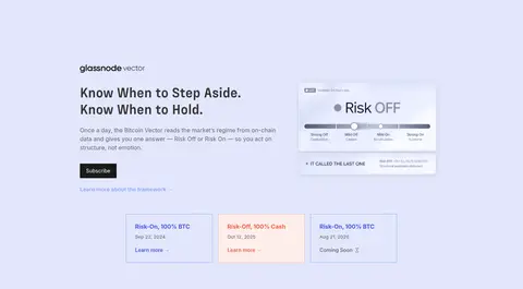
Pale-gray two-column introduction pairing a bold display headline and muted copy with a layered market-chart interface.
Data-layer panel
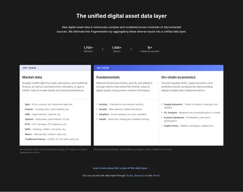
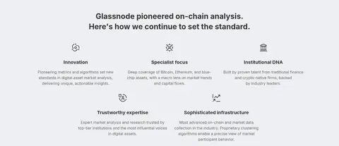
Near-black section with a centered introduction, compact metrics, and three white data-category columns.
Platform feature
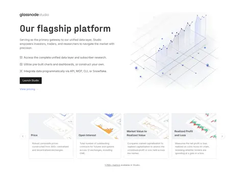
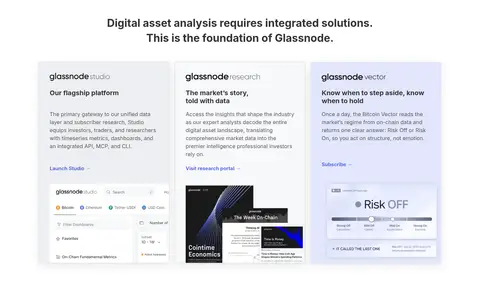
White product showcase with left-aligned copy and actions, a product illustration, and a row of bordered metric cards.
Vector feature
Pale-lavender feature band with a text-and-interface split and compact risk-state cards.
Research cards
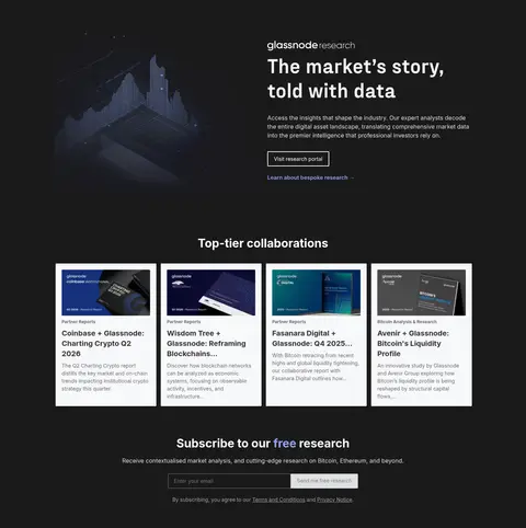
Dark research section presenting collaboration previews as white, bordered cards with cover images and dense editorial copy.
Newsletter form
Centered subscription block on the dark research background, pairing a short pitch with an email field and subdued submit control.
Footer
Graphite footer with the brand mark, grouped link columns, social icons, and low-contrast legal details.
Imagery · Use product-interface captures, market charts, and research-cover previews rather than lifestyle photography. The hero chart is presented as a floating dashboard with overlapping controls; other product visuals sit beside explanatory text or inside cards. Keep screenshots crisp and lightly framed, with chart colors treated as data accents. Small brand and partner marks may support trust, but should remain secondary to the platform interface.
Alternate light surfaces with deliberate dark section bands.
Use Fraktion for prominent display headlines and Inter for interface copy.
Keep hero copy and product imagery in a clear two-column split.
Use blue-violet accents selectively for links and data emphasis.
Frame interface cards with fine borders and restrained depth.
Keep research and platform content scannable in modular cards.
✕ 不该做
Do not replace the neutral palette with saturated backgrounds.
Do not apply accent blue to large areas of the page.
Do not add heavy shadows or pill-shaped components.
Do not crowd the hero with extra navigation or decorative copy.
Do not use lifestyle photography in place of product interfaces.
Do not make every section a centered card grid.
给 AI 的提示词
想快速出一个同风格的新页面,把这段话连同 DESIGN.md 一起发给 AI。
Build a new Glassnode-style digital-asset intelligence page with a calm editorial feel and precise product detail. Use Market Mist (#edeff2), Clean Paper (#ffffff), and Graphite Night (#1a1a1a) to structure alternating sections; reserve Vector Lavender (#e2e7fc) for a highlighted feature. Set major headlines in a bold display face similar to Fraktion and all interface, navigation, and body text in Inter. Start with a spacious split hero: concise copy on one side, a layered chart or dashboard on the other. Organize later content into data-category columns, product showcases, and research cards with fine Divider Gray (#dedfe1) borders. Apply Soft Periwinkle (#8fa5f6) and Signal Indigo (#4559dc) sparingly to links and data accents. Keep corners crisp, shadows subtle, and section changes clear through background bands rather than decoration.