North star · Let real product-board imagery lead, using spacious editorial framing and restrained brand color to make every section feel like part of one creative canvas.
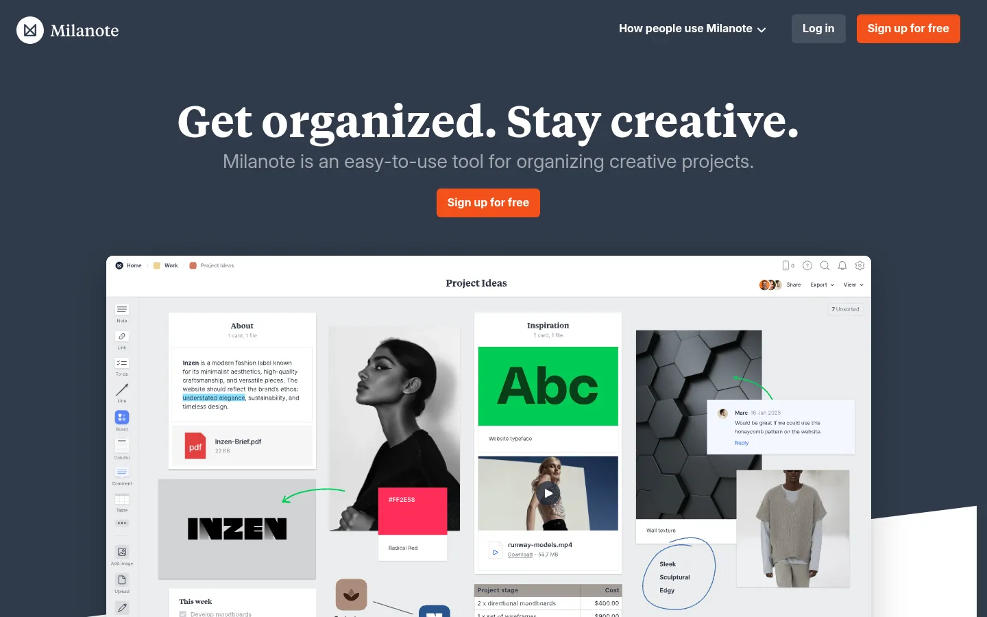
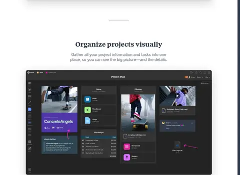
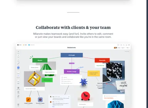
The page opens on a deep slate canvas, #303b4b, where white Tiempos headlines and muted supporting text frame an orange #f4511c signup action. A large product-board screenshot anchors the hero, then the page shifts into clean white feature sections with centered serif headings, short gray copy, and expansive interface imagery. The repeated showcase rhythm makes the product itself the primary proof rather than relying on decorative branding. A dark creative-work band groups category cards and customer logos; a saturated #1465ff device section adds a strong color break before the pale #ebedee signup area. Inter supplies readable body and navigation text, while Tiempos gives display moments an editorial quality. Cards and screenshots sit in broad open space with subtle elevation, keeping the long page comfortable and visually legible. Bright hues inside board screenshots are product content, not the site’s core palette.
配色
点色块复制色值。用途说明来自对页面的实测位置(背景、文字、描边、按钮)与截图判读。
品牌色
强调色
表层色
中性色
功能色
页面底色 · Gallery White表层 · Studio Slate表层 2 · Cloud Gray主文字 · Studio Slate次要文字 · Quiet Graphite弱文字 · Mist Gray描边 · Soft Pewter强调 · Studio Orange强调 2 · Signal Blue
Hero headline and other oversized brand statements.
Milanote
64px
600
1.33
0
一级标题
Primary page or section headline emphasis.
Milanote
40px
700
1.33
-0.001em
二级标题
Feature-section headings and prominent content titles.
Milanote
28px
400
1.25
-0.001em
三级标题
Subsection headings and creative category titles.
The quick brown fox 敏捷的狐狸
24px
400
1.25
-0.001em
四级标题
Compact serif card or form headings.
The quick brown fox 敏捷的狐狸
20px
700
1.33
-0.001em
正文
Feature explanations and standard paragraph copy.
The quick brown fox 敏捷的狐狸
16px
400
1.5
-0.001em
辅助文字
Small labels and supporting interface details.
The quick brown fox 敏捷的狐狸
14px
500
1.43
-0.001em
按钮
Signup and other primary action labels.
The quick brown fox 敏捷的狐狸
16px
700
1.33
-0.001em
导航
Header navigation and major navigation actions.
The quick brown fox 敏捷的狐狸
16px
700
1.33
-0.001em
链接
Compact links and secondary form actions.
The quick brown fox 敏捷的狐狸
14px
500
1.43
-0.001em
间距与布局
基准单位 2px · 密度:适中
59px版块间距
6px元素间距
36px卡片内边距
—内容最大宽度
2px
4px
6px
8px
10px
12px
14px
16px
19px
20px
22px
24px
29px
32px
40px
48px
Use a long, single-column storytelling flow with generous horizontal breathing room and centered feature introductions. The hero places navigation above a centered headline, CTA, and oversized board screenshot. Repeat the pattern of short heading and copy followed by a wide product view, with small divider marks between some sections. Transition into a dense dark category-card band, a left-copy/right-device feature, a centered signup form, then a multi-column footer. Measured page width is not specified; preserve the screenshots’ broad, centered content framing rather than assuming a fixed maximum.
圆角与层次
按钮 · 6px
输入框 · 4px
卡片 · 10px
链接 · 24px
md · link
inset · input, link, other
xl · card, other
lg · card
Keep the overall design flat and spacious, using subtle borders and soft shadows chiefly to lift product screenshots, category cards, and signup panels from their backgrounds. Layer screenshot windows above the canvas without heavy frames. Reserve stronger depth for the large showcase imagery; avoid adding decorative shadows to ordinary text or section bands.
组件
下面的预览按实测的按钮、输入框、徽标、卡片样式重建(字体用替代字体)。
Header navigation
White wordmark and navigation sit on the Studio Slate hero; include a subdued Log in control and orange signup action.
Primary signup button
Use Studio Orange #f4511c with white bold Inter text, compact padding, and a softly rounded rectangular shape.
Product showcase
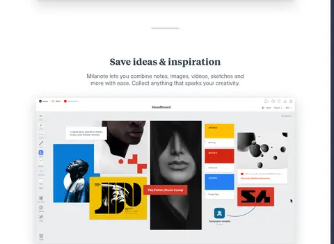
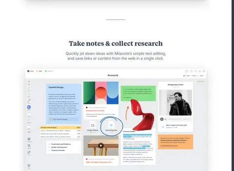
Center a wide, detailed Milanote board image beneath a short serif heading and concise muted explanation.
Creative category cards
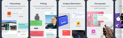
Place pale rounded previews in a horizontal band on Studio Slate, with category names and compact explanatory text.
Device feature
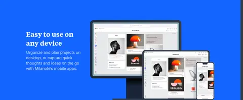
Set a Signal Blue #1465ff section with left-aligned white copy and overlapping device screenshots to the right.
Signup form card
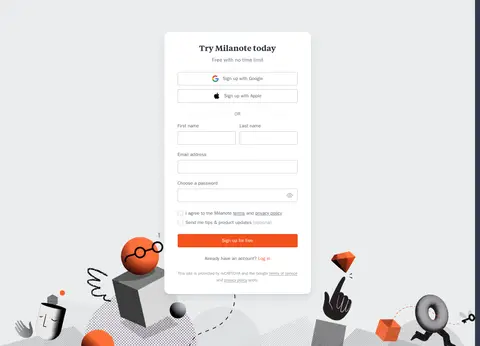
Center a white form card on Cloud Gray #ebedee; stack social signup, field rows, consent, and orange CTA.
Footer
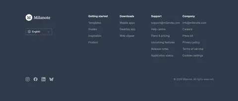
Use Studio Slate with white branding, subdued link columns, language control, and low-emphasis social and legal details.
Imagery · Use large, crisp product-board screenshots as the main feature media, framed like floating workspace windows with visible interface detail. Board content may include photos, notes, colorful cards, and dark or light themes; treat these as product material rather than brand palette. The creative-use band uses horizontal category previews and customer marks. The device section layers desktop, tablet, and phone mockups, while the signup area includes playful illustrated objects near its lower edge.
Lead with a dark slate hero and a clear serif headline.
Show the product interface large enough to read as a workspace.
Alternate showcase imagery with concise centered feature copy.
Use orange only for primary signup emphasis.
Reserve saturated blue for a distinct device feature band.
Keep white sections airy and visually calm.
✕ 不该做
Do not make the whole page dark; use light feature sections.
Do not treat bright colors inside board screenshots as brand colors.
Do not crowd feature copy with long paragraphs.
Do not replace product previews with generic decorative illustrations.
Do not add multiple competing CTA colors.
Do not use heavy borders or shadows throughout.
给 AI 的提示词
想快速出一个同风格的新页面,把这段话连同 DESIGN.md 一起发给 AI。
Build a new Milanote-style productivity page as an editorial product story. Start with a Studio Slate #303b4b hero, white Tiempos headline, muted supporting copy, and a Studio Orange #f4511c signup action. Use Inter for navigation and body text. Follow with spacious white showcase sections: concise centered introductions above broad, detailed product-board imagery. Treat vivid colors inside boards as content, not brand UI. Add a dark creative-category band, then a Signal Blue #1465ff device feature with layered mockups. Put the signup form on Cloud Gray #ebedee with a clean white card, and finish with a slate multi-column footer. Keep surfaces open, align content carefully, and use soft elevation only where screenshots or cards need separation. Preserve a calm, generous rhythm instead of packing every section with controls.