North star · Keep the canvas quiet and let real product interfaces, crisp typography, and selective cyan actions carry the story.
The page is built on a white canvas, with black text and thin gray borders doing most of the structural work. Cyan is reserved for high-intent actions and a late-page promotional band, so it stands out without competing with product content. Roobert provides a consistent sans-serif voice: bold, tightly tracked headlines contrast with softer, smaller explanatory copy. The homepage alternates centered introductions with spacious, image-led feature rows, keeping content within a restrained central column rather than stretching text across the viewport. Product interfaces appear as evidence of real workflows, often framed by quiet neutral space; customer quotes and workflow cards add structure without heavy decoration. Cards rely on hairline borders and modest rounding instead of shadows. A black AI section and black footer create deliberate tonal pauses, while the cyan CTA band closes the main content with a strong, simple finish.
配色
点色块复制色值。用途说明来自对页面的实测位置(背景、文字、描边、按钮)与截图判读。
品牌色
强调色
表层色
中性色
功能色
页面底色 · Gallery White表层 · Deep Ink表层 2 · Open Sky表层 3 · Paper Butter主文字 · Deep Ink次要文字 · Soft Graphite弱文字 · Mist Gray描边 · Quiet Silver强调 · Action Cyan强调 2 · Link Blue强调 3 · Open Sky
Site-wide display and interface type: headlines, body copy, navigation, links, buttons, and cards.
角色
示例
字号
字重
行高
字距
一级标题
Centered hero headline introducing Goodnotes for professional work.
Goodnotes
48px
700
1.2
-0.02em
二级标题
Major section headings for features, AI, customers, and workflows.
Goodnotes
40px
600
1.2
-0.02em
三级标题
Feature headings and smaller, strongly emphasized content titles.
The quick brown fox 敏捷的狐狸
24px
700
1.2
-0.042em
四级标题
Supporting subheads and longer explanatory statements.
The quick brown fox 敏捷的狐狸
22px
400
1.6
-0.016em
正文
Main explanatory copy beneath headlines and within feature sections.
The quick brown fox 敏捷的狐狸
18px
500
1.4
0
辅助文字
Compact card details, labels, and secondary interface text.
The quick brown fox 敏捷的狐狸
16px
500
1.3
0
链接
Navigation items, text links, and calls to explore more.
The quick brown fox 敏捷的狐狸
16px
500
1.3
0
间距与布局
基准单位 4px · 密度:适中
40px版块间距
16px元素间距
24px卡片内边距
856px内容最大宽度
4px
6px
8px
9px
10px
12px
14px
16px
20px
24px
30px
32px
40px
60px
Use a centered, restrained content column within the measured 856px page maximum, widening only for full-width color bands, dark sections, and footer content. The hero is centered; feature storytelling switches to staggered, alternating text-and-product layouts. The page has comfortable density, with measured 40px section gaps, 16px element gaps, and 24px card padding. Separate major ideas with whitespace rather than colored section backgrounds. Let customer cards and workflow panels form compact grouped layouts, then return to centered headings for new chapters.
圆角与层次
按钮 · 10px
卡片 · 10px
链接 · 8px
没有测到阴影:页面是扁平的,层次靠底色和描边区分。
The interface is predominantly flat: no measured shadows or gradients define the page. Use thin #bebebe or #e0e0e0 borders to separate cards and controls, with 10px rounding on standard buttons and cards. Product demonstrations create their own visual depth; avoid adding decorative shadow layers to the surrounding layout.
组件
下面的预览按实测的按钮、输入框、徽标、卡片样式重建(字体用替代字体)。
Primary CTA
A compact rounded Start Free button using #57d2ee with dark text; repeated in the hero, intermediate CTA, and header.
Product tabs
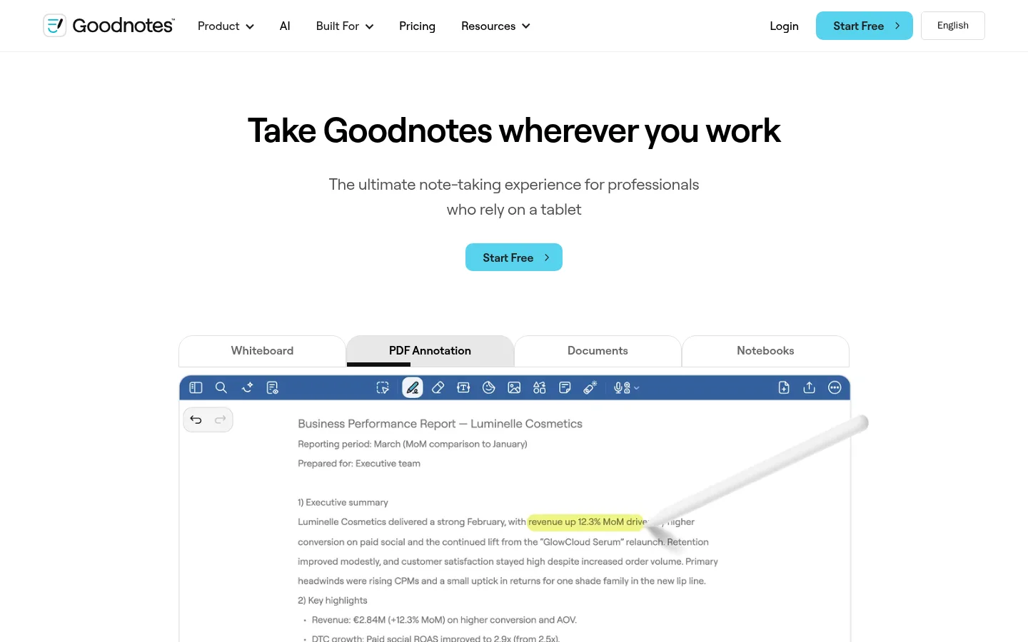
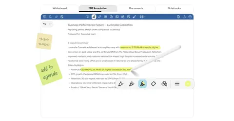
Four adjacent labels switch between Whiteboard, PDF Annotation, Documents, and Notebooks; the selected tab gains a stronger label and dark underline.
Product demonstration
A large, cleanly framed app screenshot shows the real note-taking interface and its toolbar, serving as the hero's visual anchor.
Feature story
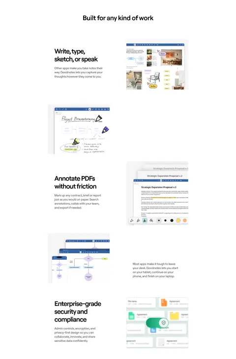
A headline and brief explanatory copy pair with product imagery in spacious alternating text-and-image arrangements.
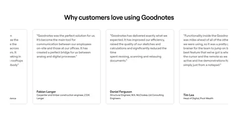
Testimonial card
Quote-led content inside a lightly bordered card with restrained rounding, compact text, and a distinct author attribution.
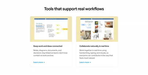
Workflow card
A bordered content panel combines a product preview, concise title, short description, and a small blue Learn more link.
Closing CTA band
A full-width #45bfdb section centers a short headline and a contrasting Start Free action before the black footer.
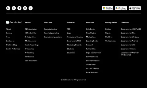
Dark footer
A black base organizes many small links into compact columns, with social controls and store badges above a thin divider.
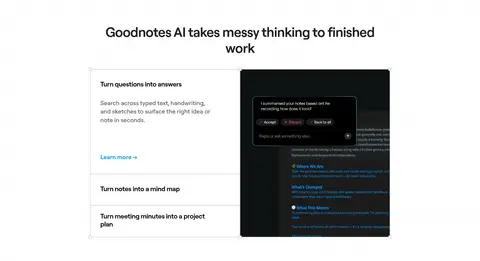
Imagery · Use product UI captures as the primary visual material: notebook pages, annotation tools, whiteboards, and workflow examples. Keep screenshots legible and framed within clean, mostly white surroundings. The hero uses an oversized product demonstration rather than lifestyle photography. Supporting images can contain color, but keep those colors within the interface artwork; the page chrome remains neutral. Reserve dark product imagery for the AI section and use a photographic background only as evidence within the security feature.
Show real product UI wherever a feature is explained.
Use thin neutral borders for cards and controls.
Alternate centered headings with spacious feature layouts.
✕ 不该做
Do not fill ordinary content sections with bright color.
Do not add shadows where flat borders suffice.
Do not let interface artwork dictate the page palette.
Do not crowd headings, copy, and product imagery together.
Do not use cyan as a large decorative accent outside CTA bands.
Do not make explanatory copy as heavy as headlines.
给 AI 的提示词
想快速出一个同风格的新页面,把这段话连同 DESIGN.md 一起发给 AI。
Build a new Goodnotes-style page with a quiet white canvas (#ffffff), near-black typography (#000000), and subtle secondary copy (#565656). Use Roobert if available or Inter as a close free substitute; make headlines bold and tightly tracked, with readable regular-weight body text. Reserve bright #57d2ee for primary actions and use #0299e0 for restrained text links. Organize content in a centered, narrow column with generous whitespace, alternating feature copy and authentic product-interface imagery. Use thin #bebebe or #e0e0e0 borders and modest rounded corners instead of shadows. Create contrast sparingly with a black product or footer section, and use #45bfdb only for a focused closing CTA band. Keep the page calm, product-led, and easy to scan.