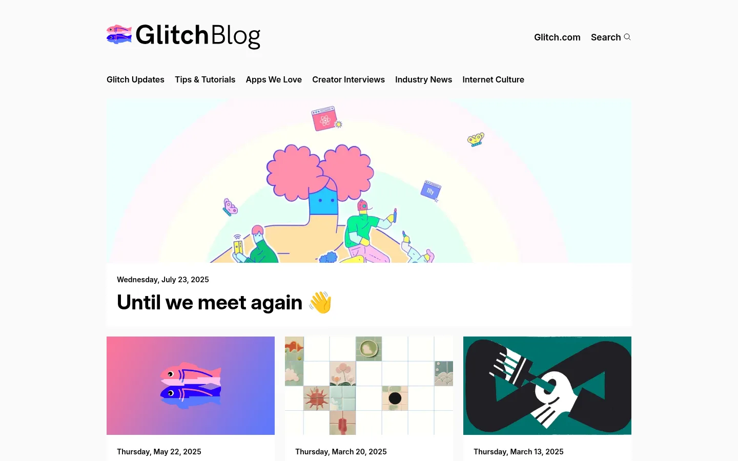
Glitch Blog 以克制的编辑式框架搭配色彩鲜明、富有个性的插画。头条文章引出紧凑的图片内容列表,亮粉色主要用于链接和小面积强调。
North star · Keep the interface neutral and editorial so the colorful creator-focused artwork, not the chrome, commands attention.
The page is built on a white canvas with near-black typography, giving the editorial content a clean, high-contrast frame. A restrained hot pink marks links and small interactive emphasis; it is not used as a large section background. The header combines the Glitch Blog mark with compact utility links, followed by a single-row category navigation. A broad featured story anchors the page, using a large, colorful illustration above a bold headline. Below it, a three-column archive grid presents varied article artwork at consistent visual weight, with dates and titles directly beneath each image. InterVariable supplies a cohesive sans-serif voice: heavy, prominent headlines and compact navigation and metadata. Generous outer margins and clear gaps keep the dense content feed from feeling crowded. The art itself carries most of the palette variation, while the surrounding interface remains flat, quiet, and consistent.
Headings, article text, navigation, links, and metadata throughout the blog.
角色
示例
字号
字重
行高
字距
一级标题
Featured story headline anchoring the blog feed.
Glitch
40px
700
1.38
0
正文
Prominent article text and headline-style content.
The quick brown fox 敏捷的狐狸
20px
700
1.38
0
辅助文字
Article dates and compact metadata.
The quick brown fox 敏捷的狐狸
14px
600
normal
0
导航
Category navigation and header utility links.
The quick brown fox 敏捷的狐狸
16px
600
normal
0
链接
Article titles, category links, and footer destinations.
The quick brown fox 敏捷的狐狸
16px
600
normal
0
间距与布局
基准单位 4px · 密度:适中
48px版块间距
8px元素间距
—卡片内边距
1080px内容最大宽度
4px
8px
16px
18px
20px
28px
48px
Center the content within a measured 1080px maximum-width frame. Place the brand and utility links in the top header, with category navigation immediately below. The featured story spans the content width before the archive shifts into three aligned columns. Keep article images and text aligned consistently within each card. The measured spacing uses a 4px base unit and a comfortable rhythm, with a 48px section gap and 8px element gap. The footer follows the feed as a distinct, simple closing band.
圆角与层次
没有测到阴影:页面是扁平的,层次靠底色和描边区分。
The page is predominantly flat: cards sit directly on the white canvas without measured shadows, rounded corners, or raised surfaces. Use spacing and image boundaries to distinguish stories. A subtle light-gray hairline separates the footer, while the theme input has a measured gray border.
组件
下面的预览按实测的按钮、输入框、徽标、卡片样式重建(字体用替代字体)。
Header
Brand mark and wordmark sit at the left; compact Glitch.com and Search utilities align opposite.
Category navigation
A horizontal row of semibold black category links sits below the header.
Featured story
A full-width illustrated lead image precedes its date and large, bold black headline.
Article feed cards
Three-column image-led cards pair rectangular artwork with date metadata and bold linked titles.
Article links
Semibold links use Glitch Pink (#ff00bc) as the measured accent.
Footer
A light, text-led closing area includes community copy, site links, and a compact theme input with a gray outline.
Imagery · Use expressive, colorful illustrations and artwork as the defining visual element. The featured story receives a wide, cropped image, while archive cards use varied artwork in consistent rectangular frames. Some images contain gradients, characters, or screenshots; treat those colors as editorial image content rather than additions to the interface palette. Avoid decorative image effects or heavy overlays.
Keep the brand and utility links in a clean header.
Align article images, dates, and titles consistently.
Use hot pink sparingly for links and emphasis.
Preserve generous space around the main content.
✕ 不该做
Do not turn illustration colors into interface colors.
Do not add shadows or rounded card treatments.
Do not use large pink background panels.
Do not crowd the feed with decorative chrome.
Do not make article metadata compete with headlines.
Do not replace the artwork with generic stock imagery.
给 AI 的提示词
想快速出一个同风格的新页面,把这段话连同 DESIGN.md 一起发给 AI。
Build a new editorial blog page in the Glitch style. Use Gallery White (#ffffff) as the canvas and Editorial Ink (#000000) for headings, navigation, and metadata. Reserve Glitch Pink (#ff00bc) for links and small emphasis; use Quiet Divider (#e4e4e4) only for subtle rules and Soft Graphite (#b4b4b4) for a restrained input outline. Set Inter or a close sans-serif alternative with bold story headlines and semibold navigation. Center content in a measured 1080px maximum-width frame. Create a compact brand header, a horizontal category row, one prominent illustrated lead story, and a three-column image-led article feed. Keep card surfaces flat and square-edged, with clear spacing rather than shadows. Finish with a simple footer and let original, playful artwork carry the color.