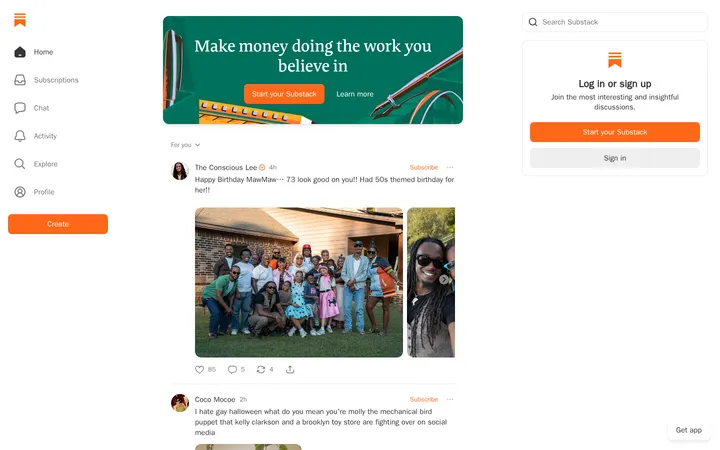
North star · Let expressive editorial typography and generous off-white space frame the stories, using color only as a restrained cue for collaboration.
The page is built on a warm off-white canvas (#f9f9f7), with pale sage panels and fine sage-gray rules providing structure without competing with the writing. Typography does most of the branding: distressed, heavy display lettering gives section titles a distinctive editorial voice, while lighter serif headings and clean sans-serif body copy keep the long-form content readable. Small colored dots and the occasional periwinkle or lime element signal writer identities and interface states; they are accents, not a general-purpose saturated palette. The layout is deliberately spacious, with a narrow content measure for explanatory copy and staggered, asymmetrical demonstrations of the writing process. Story cards and value rows stay quiet and lightly bordered. A compact charcoal footer closes the otherwise continuous light canvas.
配色
点色块复制色值。用途说明来自对页面的实测位置(背景、文字、描边、按钮)与截图判读。
品牌色
强调色
表层色
中性色
页面底色 · Paper Canvas表层 · Sage Mist表层 2 · Charcoal Close表层 3 · Story Periwinkle主文字 · Story Ink次要文字 · Paper Canvas描边 · Pencil Sage
Primary body copy, story links, buttons, and card text.
Aa 设计
ABCArizonaSansVariable
网络字体 · 字重 400 · 占比 18%
免费替代:Inter
Navigation, captions, and uppercase eyebrow labels.
Aa 设计
ABCArizonaFlare-Regular
网络字体 · 字重 300 / 400 · 占比 12%
免费替代:Cormorant Garamond
Light editorial section and subsection headings.
Aa 设计
ABCArizonaMixVariable
网络字体 · 字重 700 · 占比 7%
免费替代:DM Sans
Bold tertiary headings and emphasized value labels.
Aa 设计
ABCArizonaMix
网络字体 · 字重 500 · 占比 7%
免费替代:DM Sans
Medium-weight utility labels, including compact secondary controls.
Aa 设计
ABCCamera-Heavy
网络字体 · 字重 700 / 400 · 占比 2%
免费替代:Bowlby One SC
Oversized distressed display titles such as process and section headings.
角色
示例
字号
字重
行高
字距
特大标题
Distressed display treatment for major section titles.
Switch-Lit
67.5px
700
0.74
-0.001em
一级标题
Light serif heading for primary content introductions.
Switch-Lit
28px
300
1.07
0.011em
二级标题
Editorial serif subsection headings, including value content.
The quick brown fox 敏捷的狐狸
27px
400
1.11
0.004em
三级标题
Smaller light serif headings within content blocks.
The quick brown fox 敏捷的狐狸
24px
300
1.04
0.004em
四级标题
Bold short labels and compact card headings.
The quick brown fox 敏捷的狐狸
20px
700
1.15
0.025em
正文
Story descriptions, explanatory paragraphs, and card copy.
The quick brown fox 敏捷的狐狸
15px
400
1.27
0.033em
辅助文字
Small uppercase metadata and author details.
The quick brown fox 敏捷的狐狸
11px
400
1.36
0.091em
按钮
Primary action labels such as starting a story.
The quick brown fox 敏捷的狐狸
15px
400
1
0
导航
Header and footer navigation links.
The quick brown fox 敏捷的狐狸
15px
400
1.4
0.04em
链接
Inline story titles and content links.
The quick brown fox 敏捷的狐狸
16px
400
1
0
眉题
Compact uppercase category or section labels.
The quick brown fox 敏捷的狐狸
11px
400
1.36
0.091em
间距与布局
基准单位 2px · 密度:适中
60px版块间距
10px元素间距
—卡片内边距
613px内容最大宽度
6px
10px
12px
13px
15px
16px
19px
20px
29px
40px
60px
160px
Use a centered, narrow reading measure for explanatory copy, with measured page max width around 613px as the content anchor. The page is mostly a single column, but feature demonstrations and values use staggered or two-column arrangements. Library content expands into a denser multi-column row. Keep the section rhythm spacious and let large vertical gaps separate major chapters; align headings and rules to the content edge rather than centering everything. The footer switches to a compact three-column arrangement.
圆角与层次
按钮 · 6px
卡片 · 12px
链接 · 6px
sm · button, link
The interface favors flat surfaces over layered cards. Use fine sage-gray borders to define pale panels and value rows, with soft rounded corners on cards. Shadows are limited to subtle control lift, most apparent on pill-like actions. Avoid strong depth, heavy outlines, or stacked overlays; hierarchy comes from typography, whitespace, and panel contrast.
组件
下面的预览按实测的按钮、输入框、徽标、卡片样式重建(字体用替代字体)。
Primary story action
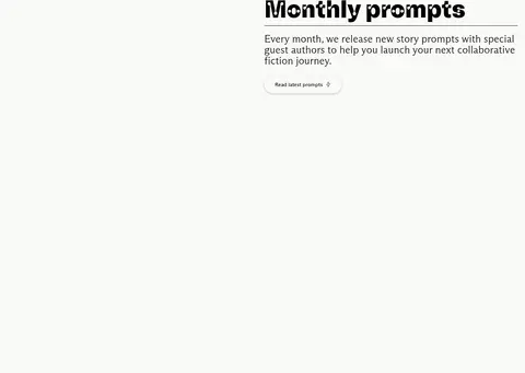
A light-filled, rounded CTA with black 15px sans-serif text and a restrained soft shadow; use it to invite a story start.
Story card
Pale sage surface with a thin sage-gray border and rounded corners; story copy and artwork stay quiet against the canvas.
Process walkthrough
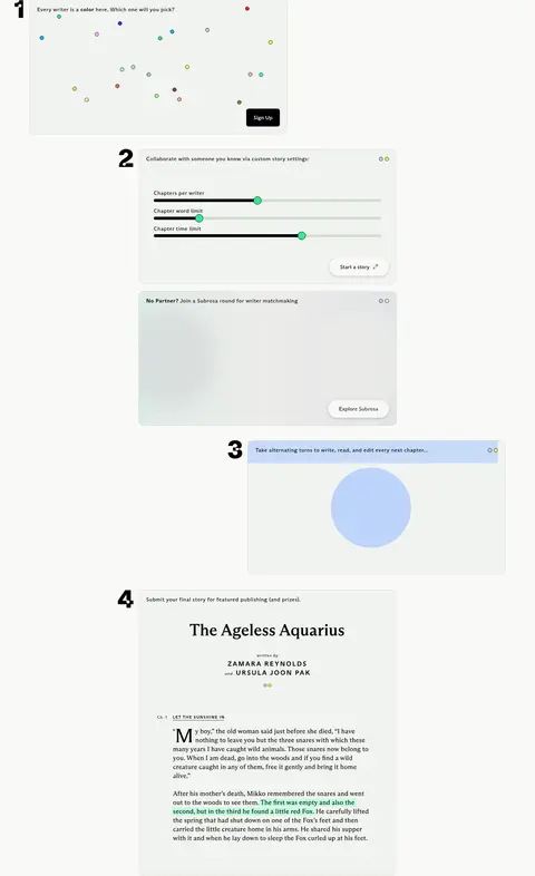
Numbered, staggered sequence of interface panels explaining writer selection, settings, matchmaking, and chapter editing.
Library controls
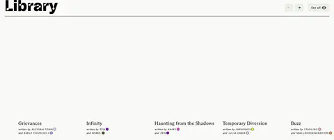
Compact bordered arrow controls and a small 'See all' action sit beside a display-style section heading.
Core values row
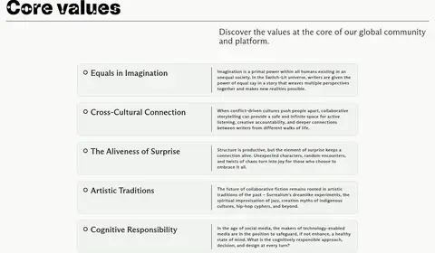
A pale, lightly outlined horizontal panel pairs a short value title with compact explanatory copy.
Footer navigation
A charcoal band uses pale text in compact columns, balanced by a centered brand mark and short descriptor.
Imagery · Imagery is sparse and mostly product-oriented: small screenshots and interface demonstrations explain the writing flow, while the story library uses cover or story artwork. Treat these assets as quiet, lightly framed panels on the off-white canvas. The visible process graphic includes small colored writer markers and a periwinkle interface highlight; retain such color inside the demo rather than spreading it through the surrounding layout. A small illustrative flourish appears near the closing quote.
Reserve distressed display lettering for short section titles.
Set explanatory copy in clean sans-serif text.
Use #f1f3ef panels and #d2ddd2 hairlines for quiet grouping.
Keep bright colors limited to writer and illustration details.
Create asymmetry with staggered demonstrations and spacious section breaks.
✕ 不该做
Do not turn the page into a saturated multicolor interface.
Do not add heavy shadows to cards or story covers.
Do not center every heading and content block.
Do not use the distressed display face for long paragraphs.
Do not crowd the narrow reading areas with dense grids.
Do not treat illustration-only colors as core UI surfaces.
给 AI 的提示词
想快速出一个同风格的新页面,把这段话连同 DESIGN.md 一起发给 AI。
Build a new page in Switch-Lit’s quiet editorial style. Use Paper Canvas (#f9f9f7) as the broad background, Story Ink (#000000) for type, and Sage Mist (#f1f3ef) panels with Pencil Sage (#d2ddd2) hairlines for content grouping. Give major section titles a bold, textured display face; pair them with light serif headings and readable sans-serif body copy. Keep content measures narrow, use generous blank space between sections, and vary alignment with restrained staggered layouts rather than making every block symmetrical. Treat Story Periwinkle (#bed4fb) and Prompt Lime (#edfe5e) as rare illustration or identity cues. Keep cards flat, borders delicate, controls softly rounded, and the footer as a compact Charcoal Close (#1c1c1c) band.