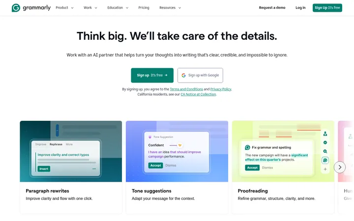
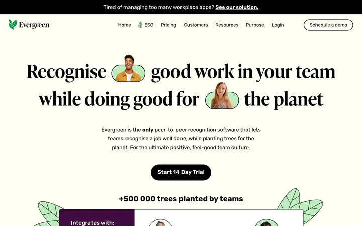
North star · Pair editorial-scale typography and authentic beauty-business imagery with calm pale surfaces, reserving lime for decisive actions.
The visual system balances warm editorial typography with a fresh, pale green-tinted surface. White is the main canvas, while #f0f7f6 marks long feature bands, metric areas, review cards, and the switching callout. Near-black #17150e anchors text, dark testimonial cards, FAQ, and a dramatic closing CTA. Lime #cccc25 is reserved for high-attention actions and the large closing gradient, which softens through #cacd78; greens such as #9ac196 and #aec7b0 appear in supporting gradients rather than as dominant interface colours. Basel Classic Book gives large headings a graceful display character; Basel Grotesk Book keeps navigation and body copy direct. The page alternates wide, airy sections with dense proof and feature cards. Full-bleed business footage and product imagery provide warmth and context, while rounded controls and restrained borders keep the interface approachable rather than glossy or heavily elevated.
Navigation, body copy, links, captions, and most interface text.
Aa 设计
Basel Classic Book
网络字体 · 字重 500 / 400 · 占比 5%
免费替代:DM Serif Display
Oversized display lettering and prominent homepage headlines.
Aa 设计
remixicon
网络字体 · 字重 500 / 400 · 占比 3%
免费替代:Material Symbols
Small interface icons and utility glyphs.
角色
示例
字号
字重
行高
字距
特大标题
Oversized campaign-style display lettering in major brand moments.
GlossGenius
144px
400
0.8
-0.03em
一级标题
Primary hero headline and large page-level statements.
GlossGenius
96px
400
0.95
-0.03em
二级标题
Section headlines such as feature and revenue stories.
GlossGenius
72px
500
0.97
-0.03em
三级标题
Feature-card and testimonial headline hierarchy.
GlossGenius
40px
500
1
-0.03em
四级标题
Supporting subheads within product and conversion sections.
GlossGenius
32px
500
1.1
-0.02em
正文
Main explanatory copy, card descriptions, and supporting paragraphs.
The quick brown fox 敏捷的狐狸
16px
500
1.2
0
辅助文字
Compact labels, proof details, and media or testimonial metadata.
The quick brown fox 敏捷的狐狸
14px
500
1.4
0
导航
Header navigation and utility links.
The quick brown fox 敏捷的狐狸
16px
400
1.5
0
链接
Inline Learn more actions and other text links.
The quick brown fox 敏捷的狐狸
16px
500
1.2
0
间距与布局
基准单位 4px · 密度:宽松
120px版块间距
4px元素间距
—卡片内边距
1344px内容最大宽度
4px
6px
8px
10px
12px
16px
20px
24px
48px
Use a spacious vertical rhythm with a measured page maximum width of 1344px and a 4px-based spacing scale. The homepage alternates centered single-column sections with multi-column feature and proof layouts. Keep headings and content aligned to clear section edges; center key stats, testimonials, and conversion messages. A large 120px section gap establishes the broad pacing, while compact 4px element spacing supports tightly grouped controls. The opening hero is full-bleed media, followed by white and pale mint section bands.
圆角与层次
按钮 · 9999px
卡片 · 8px
图片 · 8px
导航 · 9999px
链接 · 9999px
inset · button, nav, link
The interface is mostly flat, relying on alternating white and mint surfaces rather than stacked shadows. Cards use measured 8px or 16px rounding, with restrained borders where needed. Media and testimonial cards sit directly on their section backgrounds; the hero gains depth from its video overlay, not a prominent shadow. Keep layering focused on embedded UI and floating chat controls.
组件
下面的预览按实测的按钮、输入框、徽标、卡片样式重建(字体用替代字体)。
Pill CTA
Fully rounded controls use #cccc25 with #17150e text for the demo action, or #17150e and #f0f7f6 for dark actions. White trial buttons reverse the contrast.
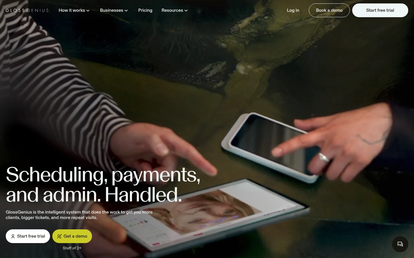
Video hero
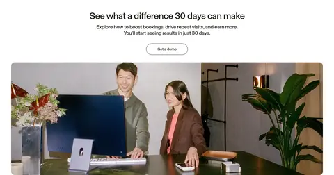
Full-bleed business footage carries a large lower-left headline, concise support copy, and adjacent pill-shaped conversion actions.
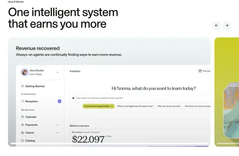
Feature carousel
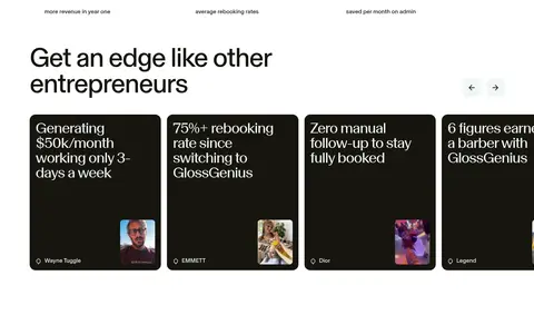
A white section combines a left-aligned heading, compact navigation controls, wide product-media cards, and a centered dark action.
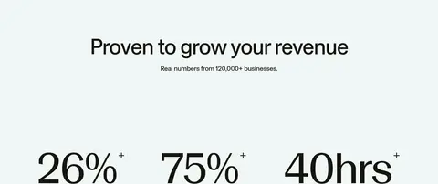
Revenue proof
A pale #f0f7f6 band centers the headline and business proof, with oversized numerical outcomes presented as a three-column row.
Customer story cards
Dark #17150e rounded cards pair light serif-style story text with small customer portraits and compact attribution.
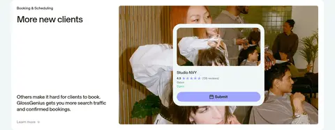
Split feature panels
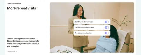
Pale mint section bands hold rounded white cards with text on one side and salon or product imagery on the other.
FAQ list
A near-black section uses light heading and question text in a two-column layout, with thin separators and plus-style row affordances.
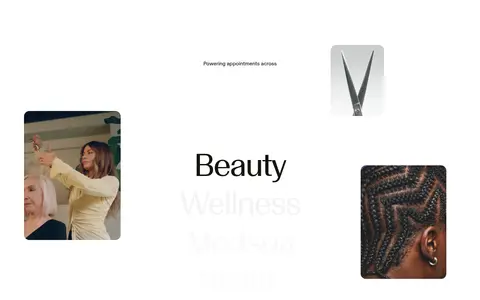
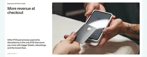
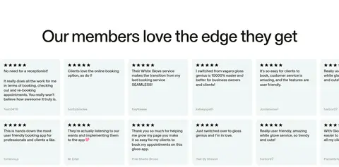
Imagery · Lead with full-bleed video of real beauty-business interactions, darkened enough for white overlay text. Use authentic salon, wellness, checkout, and product-use photography in broad media panels and feature cards. Product UI appears within screenshots and mockups; keep it legible but subordinate to the people and service context. Small portrait thumbnails and review tiles add social proof. Avoid decorative illustration as the page's main visual language.
Use #ffffff as the primary canvas and #f0f7f6 for broad section changes.
Reserve #cccc25 for a small set of prominent actions and the closing CTA treatment.
Use Basel Classic Book or a close display substitute for large editorial headlines.
Keep body and navigation copy in a clean, restrained sans serif.
Use authentic salon, wellness, and checkout photography as the dominant media.
Build generous pauses between sections and use compact spacing inside controls.
✕ 不该做
Do not turn the page into a uniformly tinted or dark interface.
Do not use lime for large amounts of body text or minor decorative details.
Do not add heavy shadows or layered dashboard-style cards.
Do not substitute generic abstract illustrations for real business imagery.
Do not crowd the page with dense copy or tight section spacing.
Do not promote incidental purple or blue gradient colours into core brand colors.
给 AI 的提示词
想快速出一个同风格的新页面,把这段话连同 DESIGN.md 一起发给 AI。
Build a new GlossGenius-style page with a calm editorial rhythm, not a generic SaaS dashboard. Use #ffffff for the canvas, #f0f7f6 for broad feature and proof bands, and #17150e for primary text and inverse sections. Apply #cccc25 selectively to the main conversion action; a broad CTA may soften toward #cacd78. Use Basel Grotesk Book or Inter for interface and body copy, and Basel Classic Book or DM Serif Display for prominent headlines with tight tracking. Create a spacious centered layout within the measured 1344px maximum, alternating single-column moments with split image-and-copy panels. Prefer authentic beauty-business photography or video, rounded cards and pill controls, subtle borders, and minimal shadows. Keep data and product UI secondary to the service imagery, and make each section’s purpose immediately clear.