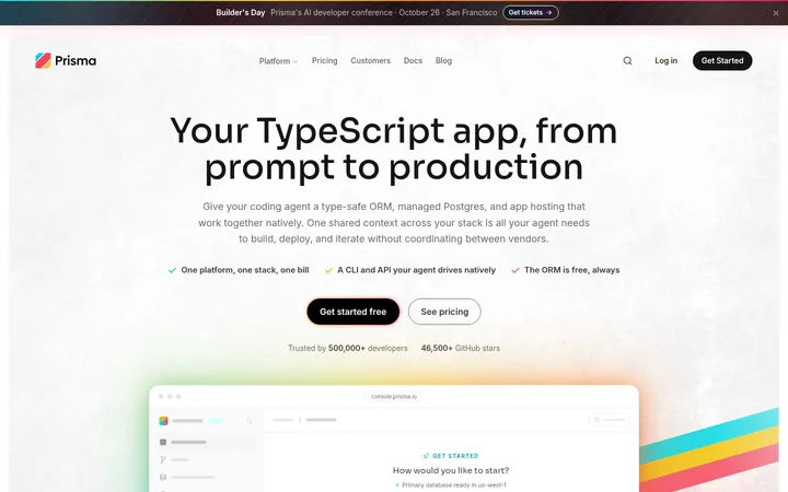
North star · Let generous white space and editorial typography lead, using teal as a precise action cue and product imagery as supporting evidence.
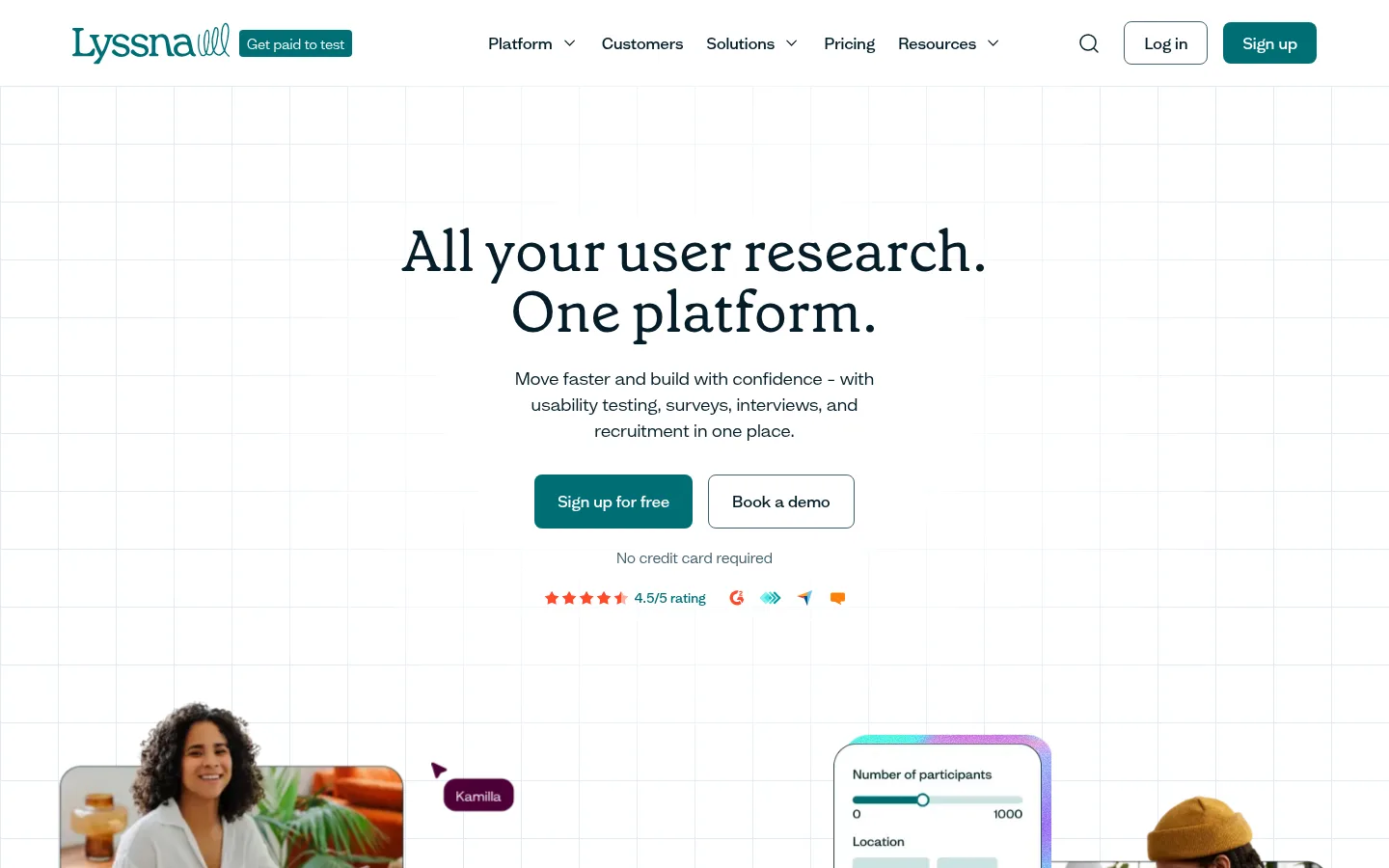
The page builds its identity around white space, dark-ink typography, and a focused teal accent. The hero uses a delicate pale-blue grid as a quiet canvas rather than a competing graphic, centering a large Grenette serif headline above concise sans-serif copy and paired actions. White remains the dominant surface; warm ivory marks a broad transition band, while deep navy-teal sections create deliberate contrast. Mint and brighter teal details appear in links, accents, and the footer, with some vivid gradients confined to product mockups and decorative illustrations rather than defining the core palette. Layouts alternate between centered editorial moments and structured multi-column content, with generous vertical pauses. Real people and interface screenshots make the research workflow tangible, while outlined cards, restrained borders, and soft rounded corners keep components approachable. The overall system feels calm, precise, and human without relying on heavy shadows.
配色
点色块复制色值。用途说明来自对页面的实测位置(背景、文字、描边、按钮)与截图判读。
品牌色
强调色
表层色
中性色
功能色
页面底色 · Gallery White表层 · Vanilla Veil表层 2 · Harbor Teal表层 3 · Deep Ink表层 4 · Pine Shadow主文字 · Deep Ink次要文字 · Slate Blue弱文字 · Mint Glow描边 · Harbor Slate强调 · Harbor Teal强调 2 · Reef Teal强调 3 · Mint Glow
Primary sans-serif for navigation, body copy, buttons, cards, and most interface text.
Aa 设计
GrenettePro-59491dde564b7ff5
网络字体 · 字重 400 · 占比 3%
免费替代:Lora
Editorial serif for display and main page headings.
角色
示例
字号
字重
行高
字距
特大标题
Large editorial hero and campaign-style display headlines.
Lyssna
60px
400
1.05
0
一级标题
Primary page headline and major section statements.
Lyssna
46px
400
1.2
0
二级标题
Feature and section headings in the content flow.
The quick brown fox 敏捷的狐狸
26px
500
1.25
0
三级标题
Subsection titles and feature-card headings.
The quick brown fox 敏捷的狐狸
22px
500
1.25
0
四级标题
Supporting headings and compact content labels.
The quick brown fox 敏捷的狐狸
20px
400
1.5
0
正文
Paragraphs, explanatory copy, and card descriptions.
The quick brown fox 敏捷的狐狸
16px
400
1.5
0
辅助文字
Compact uppercase labels and metadata.
The quick brown fox 敏捷的狐狸
13px
500
1.22
0
导航
Header navigation links and menu labels.
The quick brown fox 敏捷的狐狸
16px
500
1.5
0
间距与布局
基准单位 8px · 密度:适中
80px版块间距
4px元素间距
32px卡片内边距
1290px内容最大宽度
2px
4px
6px
8px
10px
12px
16px
20px
23px
24px
32px
75px
80px
The desktop page uses a wide centered content area, measured at a 1290px maximum, with a comfortable density and generous section pauses. The hero is centrally aligned over a faint square grid; logo rows and the how-it-works cards form horizontal bands, while feature content shifts to split layouts. Deep-color sections span the page to reset the rhythm. Keep content grouping clear, use broad margins, and avoid crowding interface screenshots or copy.
圆角与层次
按钮 · 8px
卡片 · 24px
图片 · 8px
徽标 · 8px
导航 · 12px
inset · other
The system is mostly flat: clear canvas changes, fine outlines, and generous whitespace establish hierarchy instead of prominent drop shadows. Cards use broad rounded corners and dark, precise borders where measured. UI panels may overlap photographs to suggest product depth, while the grid remains extremely subtle and backgrounds stay clean.
组件
下面的预览按实测的按钮、输入框、徽标、卡片样式重建(字体用替代字体)。
Primary signup button
Harbor Teal (#006e75) fill, white text, medium Mint Grotesk, rounded 8px corners, and measured 16px vertical by 24px horizontal padding.
Secondary action
White or transparent surface with a fine slate outline and dark text; visually quieter than the filled signup action.
Navigation
White horizontal header with dark medium-weight links, understated search and login controls, and a teal signup button.
Outlined testimonial card
White card with dark ink text, a 1px dark border, 24px radius, and measured 32px padding; no prominent shadow.
Product mockup
Rounded screenshot or survey panel layered beside people photography, with small controls and selective mint or gradient interface details.
Logo cloud
A horizontal strip of customer marks on white, separated from surrounding sections by ample breathing room.
Dark content band
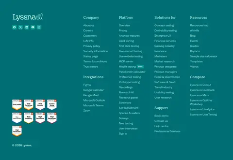
Full-width Deep Ink or Pine Shadow background, white headings, muted explanatory text, and restrained mint icon accents.
Imagery · Use real people in natural work settings alongside crisp product-interface mockups that show surveys, participant controls, and research workflows. Images sit in rounded frames and are layered with compact UI panels or labels. Keep photography bright and credible, with illustrations used sparingly for decorative accents. Colorful gradients belong primarily to mockup screens and campaign artwork, not as a blanket treatment for the page.
Set main headings in the measured editorial serif.
Reserve #006e75 for primary actions and brand emphasis.
Keep pale grid lines behind content, not over it.
Alternate open white space with purposeful dark bands.
Pair research interfaces with authentic human photography.
✕ 不该做
Do not make gradients the dominant page background.
Do not add heavy shadows to otherwise flat cards.
Do not use saturated teal for large areas of body text.
Do not compress the hero or remove its generous whitespace.
Do not use generic geometric sans-serif styling for every heading.
Do not let mockup colors redefine the brand palette.
给 AI 的提示词
想快速出一个同风格的新页面,把这段话连同 DESIGN.md 一起发给 AI。
Build a new SaaS page in Lyssna’s calm, editorial style. Use Gallery White (#ffffff) for the main canvas, Deep Ink (#061d29) for headings and body text, and Harbor Teal (#006e75) for primary actions. Set major headlines in the measured serif-like display face and use a clean sans-serif for navigation, paragraphs, and controls. Keep content centered within the measured wide page width, with generous vertical pauses and a faint Mist Grid (#e1ebf5) only where a grid backdrop is useful. Use warm Vanilla Veil (#fffded) for occasional transition bands and reserve dark full-width sections for contrast. Combine real people photography with rounded research-interface mockups. Prefer precise borders and flat surfaces over shadows; keep gradients inside interface art rather than spreading them across the page.