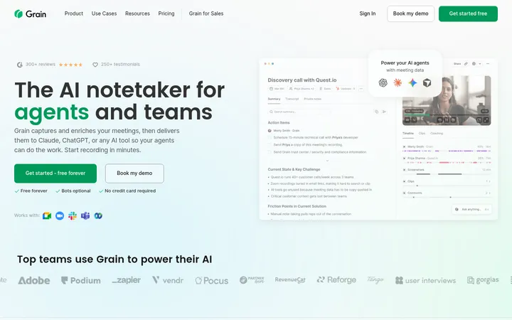
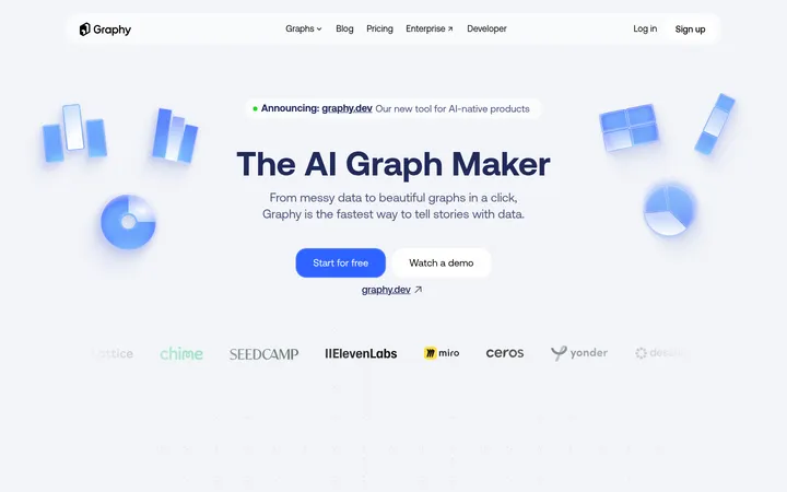
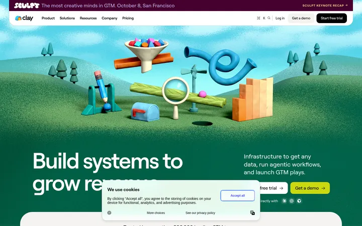
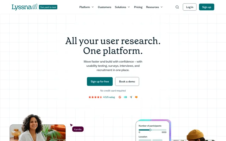
North star · Keep the page calm and legible: use white space and strong type for structure, reserving teal for actions, links, and meaningful product proof.
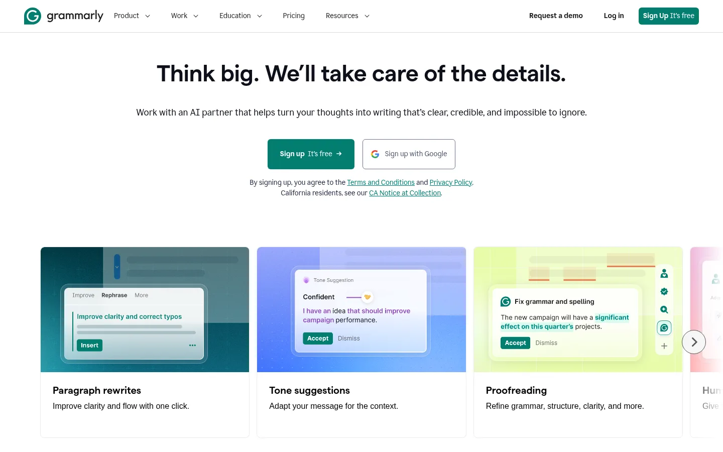
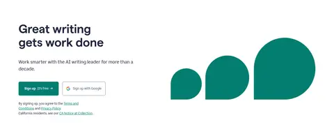
Grammarly’s homepage uses a predominantly white canvas to keep attention on large, dark headlines, product demonstrations, and clear calls to action. The core brand accent, #027e6f, appears in signup buttons, links, interface details, and the full-width enterprise results section; it provides contrast without turning the page into a heavily coloured experience. Matter headlines are bold, compact, and slightly tight in tracking, while Glyph supports navigation, body copy, controls, and footer links. The opening hero is centered and spacious, followed by a horizontally browsable feature-card row. Lower feature sections alternate text and product UI, while pricing and enterprise proof use aligned, card-based layouts. Product screenshots and animations are functional illustrations rather than a separate decorative art direction. Fine gray borders define cards and controls; the page otherwise stays flat, with generous whitespace and restrained corner rounding.
Navigation, body copy, links, buttons, captions, and much of the interface.
Aa 设计
matter
网络字体 · 字重 670 / 600 · 占比 7%
免费替代:Inter
Display headings and section titles.
Aa 设计
Inter
系统字体 · 字重 400 · 占比 4%
免费替代:Inter
System-font fallback and minor interface text.
角色
示例
字号
字重
行高
字距
一级标题
Centered hero statement; largest display headline.
Grammarly
52px
670
1.12
-0.01em
二级标题
Section titles, including feature, pricing, and enterprise headings.
Grammarly
46px
670
1.09
-0.01em
三级标题
Subsection and card-level headings.
Grammarly
36px
670
1.11
-0.01em
正文
Introductory copy and primary explanatory text.
The quick brown fox 敏捷的狐狸
20px
400
1.5
0
辅助文字
Small legal notes and supporting labels.
The quick brown fox 敏捷的狐狸
14px
400
1.25
0
按钮
Signup and other action labels.
The quick brown fox 敏捷的狐狸
14px
700
1.43
0
导航
Header navigation and compact menu links.
The quick brown fox 敏捷的狐狸
14px
400
1.25
0
链接
Inline links and supporting calls to action.
The quick brown fox 敏捷的狐狸
14px
400
1.5
0
间距与布局
基准单位 8px · 密度:宽松
96px版块间距
8px元素间距
40px卡片内边距
1280px内容最大宽度
4px
8px
12px
14px
16px
24px
32px
40px
48px
80px
96px
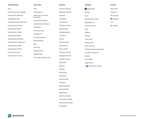
The page uses a wide desktop canvas with content aligned to a measured maximum width of 1280px. The hero centers its headline, supporting text, signup controls, and legal note; a horizontal carousel sits beneath it. Feature storytelling then shifts to two-column text-and-product layouts, followed by three-column pricing and a centered enterprise section. Sections have a spacious rhythm, with a measured 96px section gap and an 8px base spacing unit. The footer becomes a dense five-column link grid, contrasting with the open feature sections.
圆角与层次
按钮 · 6px
卡片 · 8px
图片 · 10px
链接 · 8px
没有测到阴影:页面是扁平的,层次靠底色和描边区分。
The design is mostly flat and does not rely on measured shadows. Thin gray borders distinguish pricing cards, controls, and other surfaces from the white canvas; card corners are gently rounded where measured. Product screenshots and media provide their own visual depth, while the teal enterprise band creates the clearest section-level contrast.
组件
下面的预览按实测的按钮、输入框、徽标、卡片样式重建(字体用替代字体)。
Header navigation
White horizontal header with the Grammarly mark, compact navigation links, account actions, and a teal signup button.
Hero signup
Centered headline and short supporting copy above primary teal signup and outlined Google signup controls, with a small legal note.
Feature carousel cards
Horizontal product-example cards with colorful UI artwork, rounded upper media, concise titles, and explanatory copy.
Feature split
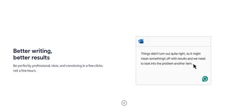
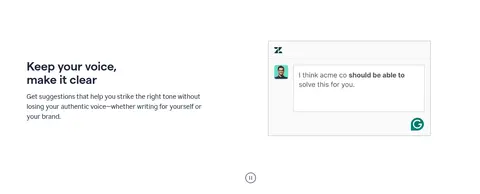
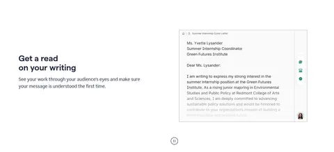
Two-column section combining a short heading and paragraph with a framed writing-interface demonstration.
Pricing cards
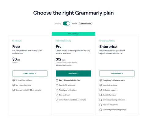
Three aligned plan columns, fine gray borders, plan descriptions, price, action, and checkmarked feature lists.
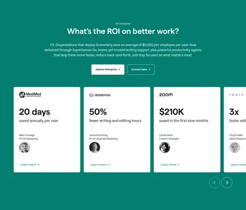
Enterprise results band
Full-width Grammarly Teal section with centered ROI messaging and horizontally arranged customer proof cards.
Multi-column footer
Dense five-column directory of product, learning, feature, company, and connection links on the white canvas.
Imagery · Imagery is primarily product UI: screenshots and animated interface examples demonstrate rewriting, tone, proofreading, and review features. The hero presents a horizontal row of rounded feature cards, with colorful interface captures set above short labels. Later demonstrations are framed within split layouts, while enterprise proof appears as customer testimonial cards. Treat screenshots as explanatory product illustrations, not as the source of the brand palette; preserve their varied colors inside their frames.
Reserve Grammarly Teal for primary actions, links, and key proof.
Set headlines in a bold, compact display sans-serif.
Center the hero and keep its copy concise.
Use product UI imagery to explain features.
Separate cards with fine gray borders and gentle rounding.
Preserve generous whitespace between major sections.
✕ 不该做
Do not flood ordinary sections with teal backgrounds.
Do not add decorative gradients or shadows absent from the measured design.
Do not make the page feel dense above the fold.
Do not substitute generic stock imagery for product demonstrations.
Do not use multiple competing accent colours for interface controls.
Do not turn small navigation and legal copy into display typography.
给 AI 的提示词
想快速出一个同风格的新页面,把这段话连同 DESIGN.md 一起发给 AI。
Build a new page in Grammarly’s visual style: use a bright Gallery White (#ffffff) canvas, dark Deep Ink (#0e101a) headlines, and Midnight Slate (#1f243c) for navigation and supporting copy. Apply Grammarly Teal (#027e6f) selectively to primary buttons, inline links, meaningful interface details, and any major proof band. Use a bold, slightly tight sans-serif for headings and a neutral sans-serif for body, navigation, and controls. Keep the hero centered and open, then use two-column feature sections with framed product-interface demonstrations. Use aligned, lightly bordered cards for pricing or proof, with restrained corner rounding and no decorative shadows. Maintain generous vertical spacing, concise copy, clear action hierarchy, and a denser multi-column footer. Treat colors inside screenshots as product imagery, not brand palette.