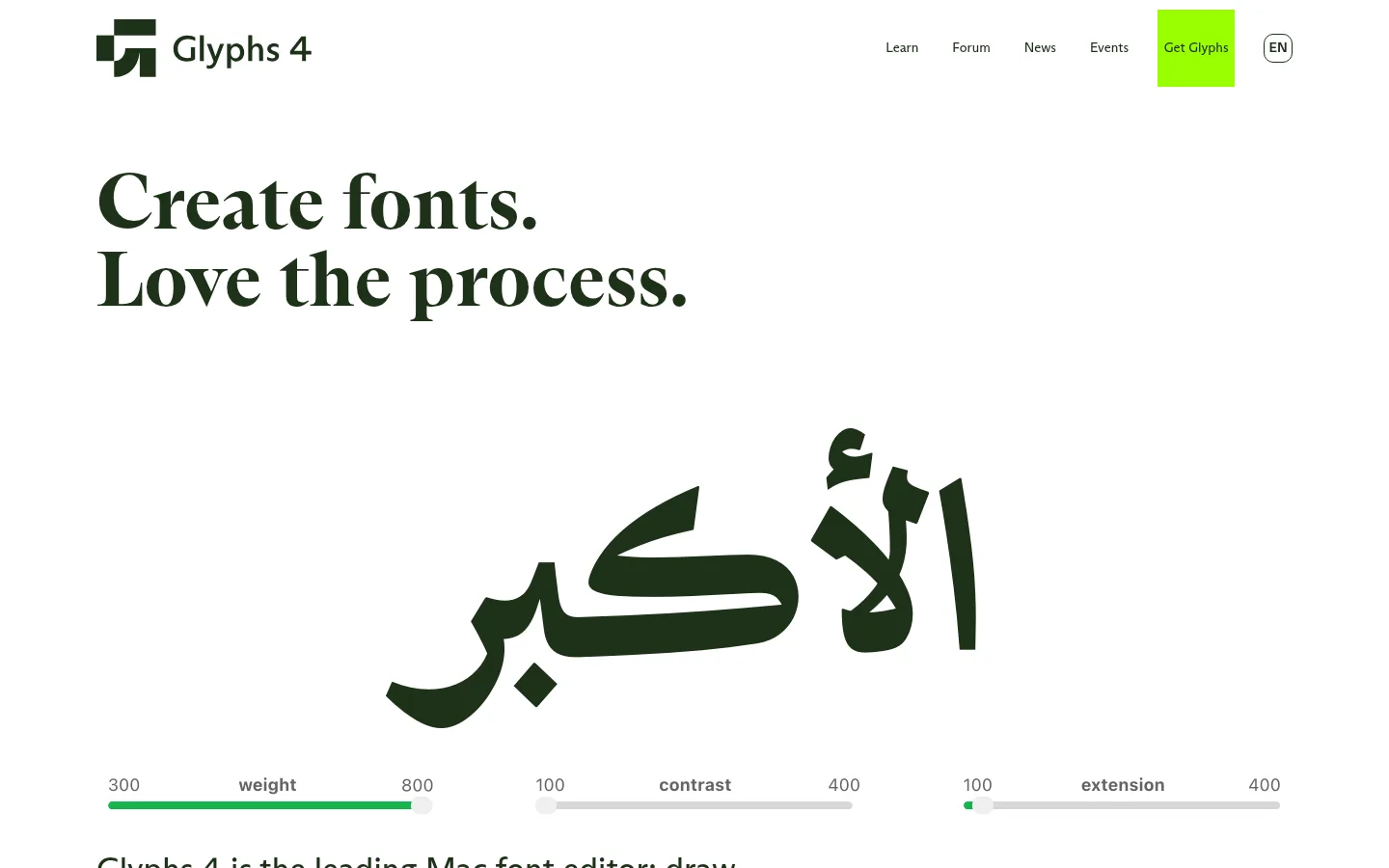
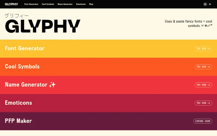
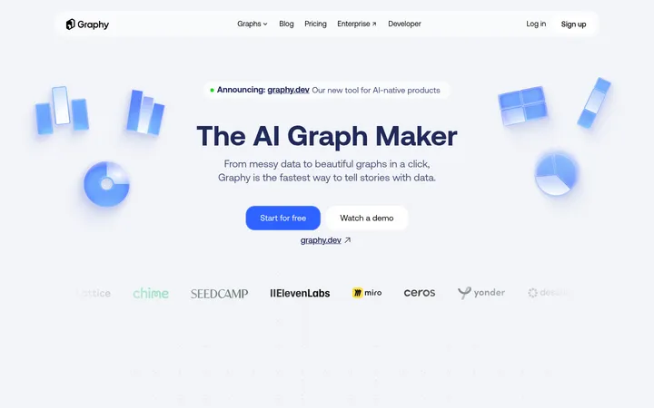
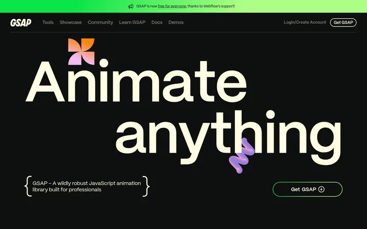
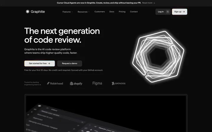
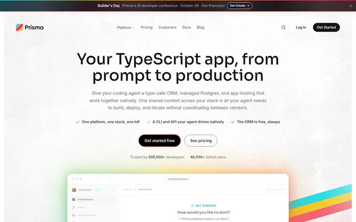
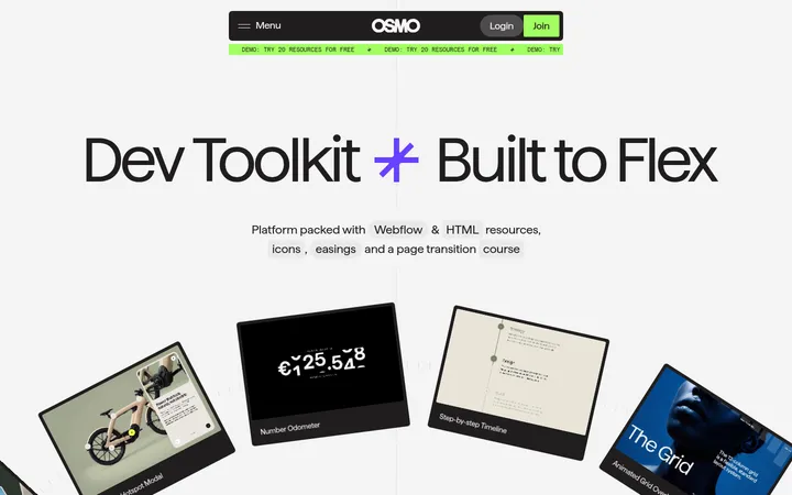
North star · Keep the page calm and editorial, using oversized typography and product screenshots on white, then reserve vivid colors for precise emphasis.
The page is built on a predominantly white canvas, letting oversized dark headlines and the product interface command attention. Deep green-black text anchors the typography, while lime, cyan, orange, and golden yellow distinguish calls to action and feature cards. These colors are concentrated into small, high-contrast surfaces rather than spread across the background; some sampled hues also belong to screenshots and illustrations, not the underlying brand system. Headlines use expressive serif letterforms, contrasting with restrained, readable supporting copy and compact navigation. The long homepage alternates spacious text-led moments with large, pale-framed application screenshots. Feature cards overlap or sit against those screenshots, creating a lively but legible rhythm. Testimonials use bright color blocks and portraits, while the final capabilities and support content returns to a white editorial layout. Generous whitespace and consistent alignment keep the bright accents from overwhelming the product story.
Measured font family for display through navigation roles; screenshots show expressive serif headlines and restrained interface copy.
角色
示例
字号
字重
行高
字距
特大标题
Oversized expressive hero or promotional display lettering.
Glyphs
80px
400
1
0
一级标题
Primary hero headline and major section titles.
Glyphs
50px
400
1.1
0
二级标题
Feature, testimonial, and editorial section headings.
Glyphs
34px
400
1.18
0
三级标题
Feature-card and smaller content headings.
The quick brown fox 敏捷的狐狸
24px
400
1.25
0
正文
Introductory and explanatory product copy.
The quick brown fox 敏捷的狐狸
20px
400
1.25
0
辅助文字
Screenshot credits, testimonial attribution, and compact supporting notes.
The quick brown fox 敏捷的狐狸
18px
400
1.4
0
按钮
Compact navigation and action button labels.
The quick brown fox 敏捷的狐狸
14px
400
1.43
0
导航
Brand wordmark and primary site navigation.
The quick brown fox 敏捷的狐狸
20px
400
1.25
0
链接
Inline resources and supporting content links.
The quick brown fox 敏捷的狐狸
18px
400
1.4
0
间距与布局
基准单位 4px · 密度:宽松
80px版块间距
40px元素间距
54px卡片内边距
1240px内容最大宽度
4px
10px
18px
20px
24px
25px
36px
40px
45px
50px
53px
60px
80px
100px
106px
Use a centered content area capped at the measured 1240px maximum, with spacious section gaps and a single-column editorial flow for the hero and most feature showcases. The hero headline aligns to the left while its type specimen occupies generous open space. Long product sections repeat a broad screenshot with an offset, overlapping color card. Multi-column layouts appear for the capabilities list and later documentation-style content. Keep overall density spacious, with distinct white intervals between blocks.
圆角与层次
按钮 · 5px
卡片 · 10px
导航 · 10px
链接 · 5px
inset · other
The design is mostly flat: white canvas, simple borders, and clear color blocks do the structural work. Screenshot panels use subtle pale outlines rather than heavy shadows. Layer feature cards over product captures to create depth; keep corners gently rounded on cards and avoid adding prominent drop shadows.
组件
下面的预览按实测的按钮、输入框、徽标、卡片样式重建(字体用替代字体)。
Primary navigation
Compact wordmark and plain links sit on white; the Get Glyphs action uses a lime fill with dark green text.
Hero specimen
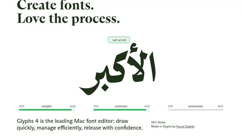
A large left-aligned serif headline leads into a dramatically scaled glyph specimen, with supporting product copy below.
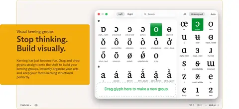
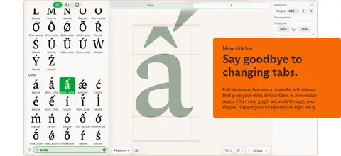
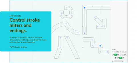
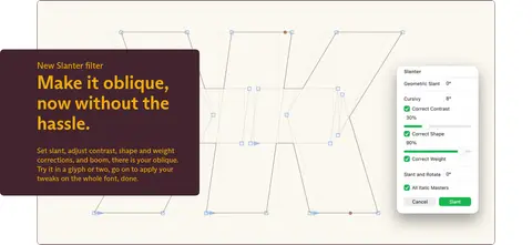
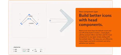
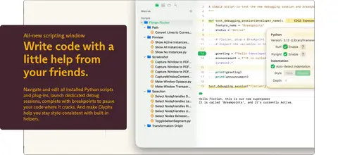
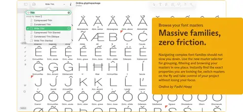
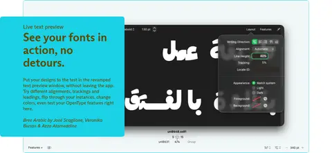
Product feature showcase
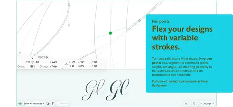
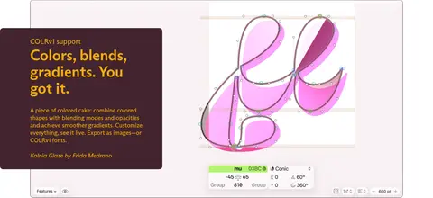
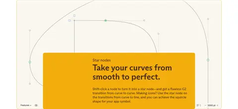
A broad pale-framed application screenshot pairs with an offset colored text card; cycle cyan, plum, orange, and golden yellow.
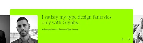
Testimonial panel
Portrait photography sits alongside a bright lime quote surface, serif testimonial text, attribution, and simple directional controls.
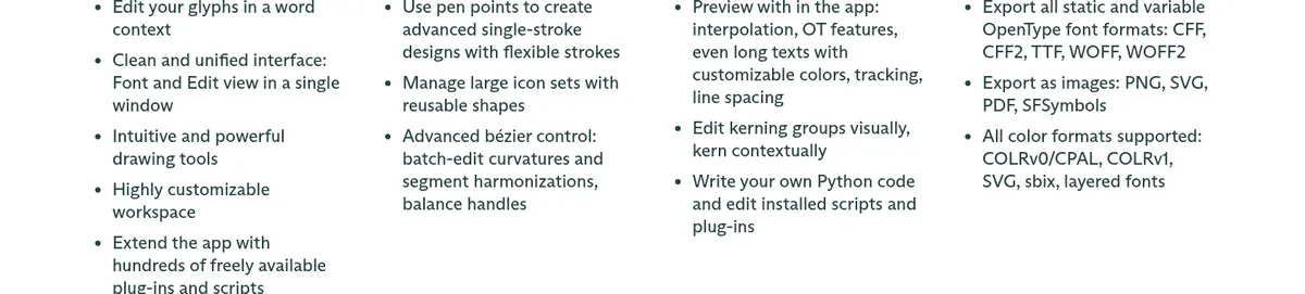
Capabilities list
An editorial heading introduces concise product benefits arranged into several aligned columns on white.
Text action button
Prominent secondary action uses a cyan fill, compact copy, and generous inset padding.
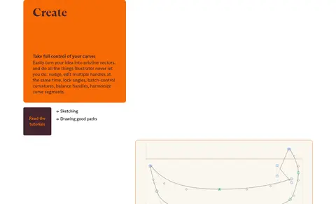
Support content card
Orange card introduces a capability, with a small dark tutorial action and nearby plain text links.
Imagery · Use authentic font-editor screenshots as the primary imagery: large interface captures show glyph grids, vector paths, controls, and previews. Frame them in pale, lightly outlined panels and let feature cards overlap an edge. The hero uses a dramatic specimen glyph, while testimonial sections pair grayscale portrait photography with vivid quote panels. Avoid decorative stock photography or unrelated illustration.
Keep the canvas white and the overall composition spacious.
Use large editorial serif headlines as clear section anchors.
Show real font-editor interfaces as the primary feature imagery.
Reserve lime for the primary action and select testimonial moments.
Use cyan, orange, plum, and ochre as localized feature-card colors.
Align copy and screenshots consistently within a centered content area.
✕ 不该做
Do not turn feature colors into full-page background bands.
Do not decorate the page with unrelated stock photography.
Do not add heavy shadows or dense ornamental borders.
Do not crowd the hero or reduce the headline's visual prominence.
Do not make every link or button equally bright.
Do not treat colors sampled inside screenshots as core brand surfaces.
给 AI 的提示词
想快速出一个同风格的新页面,把这段话连同 DESIGN.md 一起发给 AI。
Build a new page in the Glyphs visual style: an airy white editorial canvas with a centered, spacious content area. Use oversized serif headlines in deep Forest Ink (#1e3219) or Plum Ink (#42242e), then keep body copy restrained and readable. Anchor each product story in an authentic, large software screenshot framed with a subtle pale outline. Add one offset feature card in Interface Cyan (#1ad1e6), Signal Orange (#f66a06), Golden Ochre (#f2ad0d), or Plum Ink (#42242e), and reserve Glyph Lime (#9aff00) for the primary action or an occasional testimonial panel. Build rhythm through generous whitespace, alternating screenshot and copy emphasis rather than colored section bands. Keep borders quiet, shadows minimal, and the typography-led hierarchy unmistakable. Treat interface mock-up colors as product imagery, not a new brand palette.