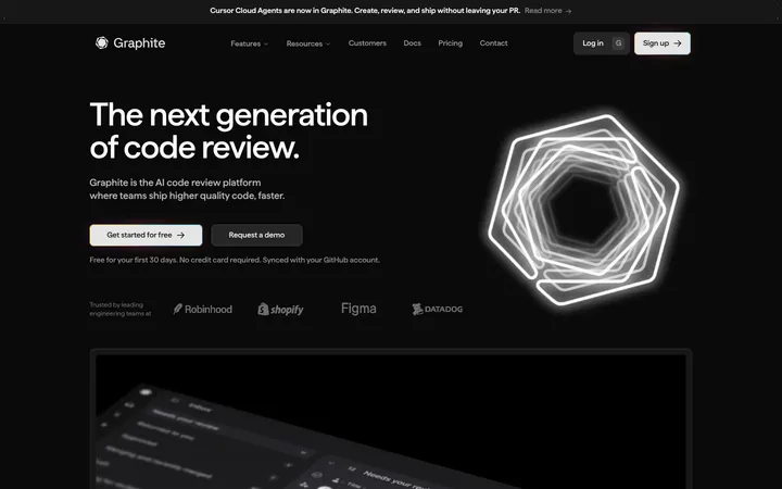
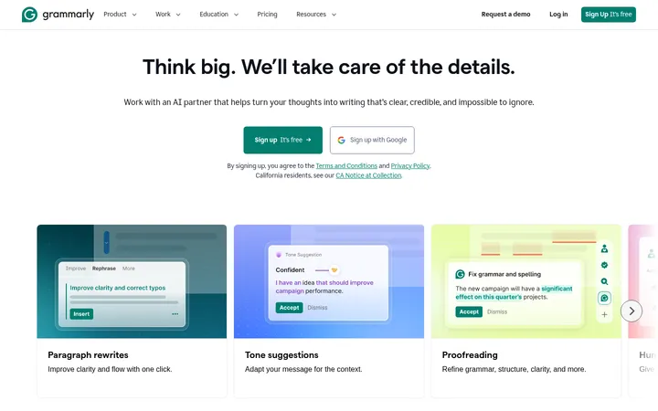
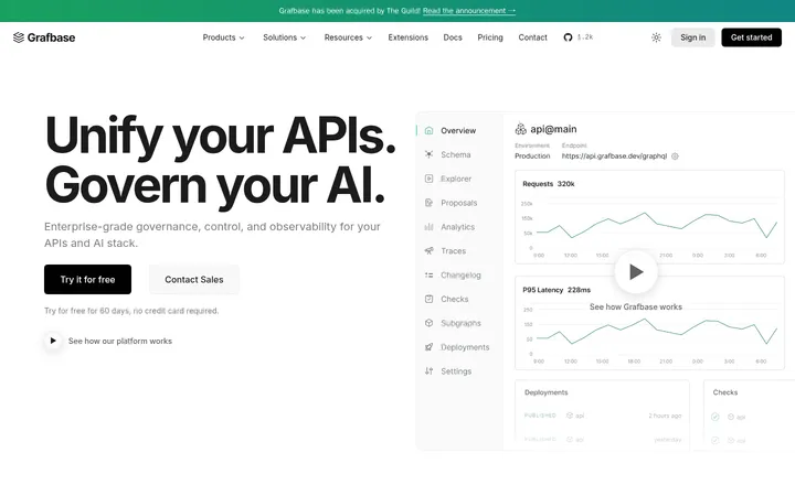
North star · Keep the interface calm and spacious, using vivid blue selectively to direct attention toward data and the primary action.
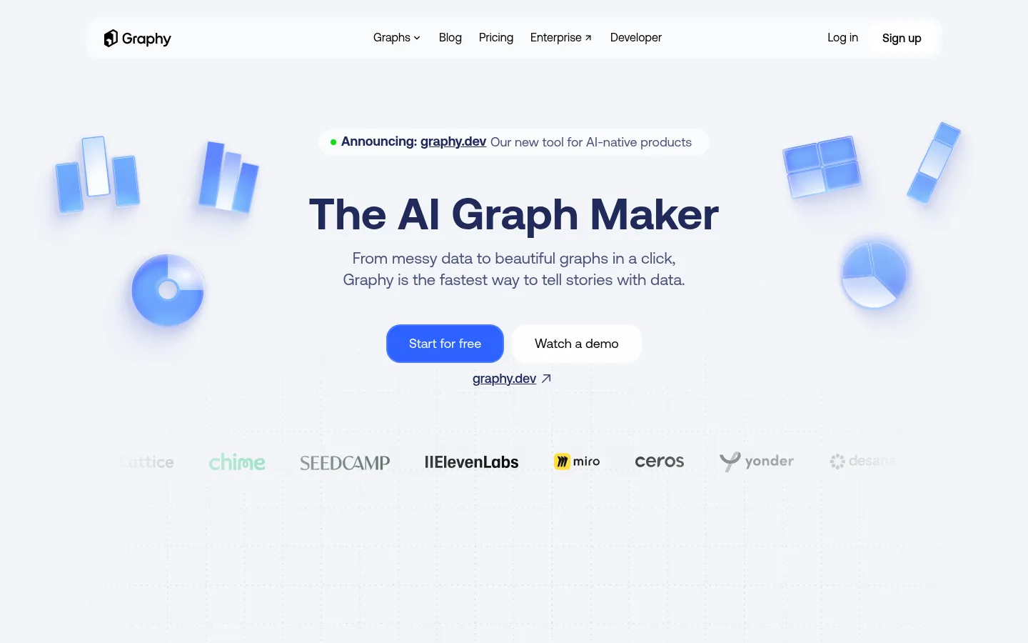
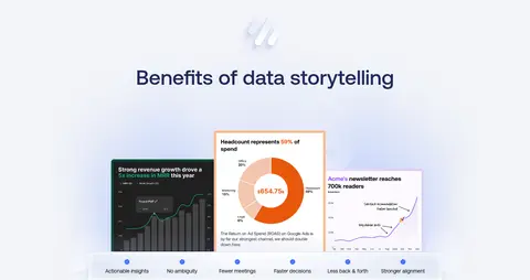
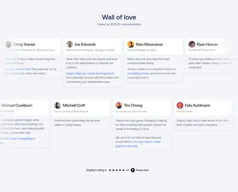
The visual system is led by a cool, pale canvas (#f2f4f8) that carries most of the page, with white surfaces used for the navigation bar, product cards and testimonial panels. Aeonik gives headings and body copy a clean, contemporary voice; large centered hero typography sets the hierarchy, while subdued blue-gray text keeps supporting copy calm. Saturated blue accents mark the primary action and selected text, while soft blue chart illustrations provide visual energy without changing the overall quiet tone. The hero uses a centered message and CTA framed by floating chart graphics and customer logos. Below, generous open space separates the benefits display, stacked product workflow cards and testimonial wall. Rounded cards and pill-like buttons soften the interface; restrained shadows distinguish content from the canvas rather than relying on strong borders. A contrasting deep-purple gradient closing section provides a dramatic final CTA.
Large centered hero title and major closing CTA headline.
Graphy
56px
400
1.15
0
一级标题
Primary page or section heading where a clear heading tier is needed.
Graphy
32px
400
1.2
0
二级标题
Feature and testimonial section headings.
The quick brown fox 敏捷的狐狸
24px
400
1.4
-0.033em
三级标题
Subheadings within workflow steps and content panels.
The quick brown fox 敏捷的狐狸
22px
400
1.35
0
四级标题
Smaller feature headings and card titles.
The quick brown fox 敏捷的狐狸
20px
400
1.2
0
正文
Hero description, product explanations and testimonial copy.
The quick brown fox 敏捷的狐狸
16px
400
1.6
0
辅助文字
Small supporting labels, metadata and fine-print descriptions.
The quick brown fox 敏捷的狐狸
14px
400
1.5
-0.05em
链接
Navigation links and inline actions.
The quick brown fox 敏捷的狐狸
16px
400
1.05
0
间距与布局
基准单位 2px · 密度:紧凑
40px版块间距
10px元素间距
16px卡片内边距
1200px内容最大宽度
1px
4px
6px
7px
10px
16px
20px
30px
32px
40px
The page uses a centered, constrained content area within a wide desktop canvas, with a measured maximum width of 1200px. The hero aligns its announcement, headline, description and actions centrally; chart artwork floats at the sides. Customer logos form a horizontal band below. Later content alternates centered section headings with product imagery and vertically stacked workflow cards, then spreads testimonials across a wide grid. Compact component spacing sits inside a deliberately generous section rhythm, leaving broad breathing room between major blocks.
圆角与层次
按钮 · 20px
卡片 · 8px
图片 · 50%
链接 · 9999px
md · other
md · other
lg · card
lg · card
The main canvas remains visually flat, with white cards and panels separated through subtle shadows rather than prominent borders. The measured card radius is 8px; pill-like primary buttons use a 20px radius. Some product surfaces receive soft layered shadows or white glow, while the dark closing CTA relies on its gradient and illustration rather than card elevation.
组件
下面的预览按实测的按钮、输入框、徽标、卡片样式重建(字体用替代字体)。
Floating navigation
A white horizontal navigation surface on the pale canvas, with the Graphy mark at left, centered product links and account actions at right.
Hero announcement
A small rounded white announcement label with a green indicator and linked product news above the centered hero title.
Primary CTA
Bright #2e62ff Start for free button with a measured 20px radius; pair with a white secondary demo action.
Chart artwork
Floating blue chart illustrations around the hero message, softly glowing and clearly decorative rather than functional controls.
Workflow panels
Tall white product cards with an 8px radius and subtle elevation, presenting numbered steps, short copy and embedded product examples.
Testimonial cards
Compact white cards in a broad grid, with small portrait, name, role and quote; use understated separation from the pale canvas.
Closing CTA
A deep-purple gradient band with centered Graphy branding, headline, supporting text, blue action and floating chart motifs.
Imagery · The hero and closing CTA use floating, softly glowing chart illustrations—bars, grids and circular charts—in bright blues. These are illustrative product motifs, not photographic imagery. Product screenshots appear within white, lightly elevated workflow panels and small chart examples; testimonial cards pair concise text with portrait thumbnails. Keep illustrations clean, slightly luminous and secondary to the headline, with screenshots framed as practical product evidence.
Reserve #2e62ff for the primary action and focused emphasis.
Center hero messaging and give it ample surrounding space.
Use white cards to frame product evidence and testimonials.
Pair Aeonik-like sans-serif headings with calm blue-gray body copy.
Keep chart illustrations soft, luminous and clearly decorative.
✕ 不该做
Do not turn the pale canvas into a high-contrast color-block layout.
Do not use saturated blue as a large full-width background.
Do not crowd the hero with dense copy or competing controls.
Do not add heavy borders to cards that rely on subtle elevation.
Do not let product illustrations overpower the page headline.
Do not apply the dark footer gradient to ordinary content sections.
给 AI 的提示词
想快速出一个同风格的新页面,把这段话连同 DESIGN.md 一起发给 AI。
Build a new Graphy-style SaaS page with a calm, data-storytelling visual language. Use Graphite Mist (#f2f4f8) for the main canvas, Gallery White (#ffffff) for navigation and content surfaces, Slate Iris (#616581) for supporting copy, Midnight Ink (#20295a) for strong headings, and Signal Blue (#2e62ff) for the primary action. Set a centered, spacious hero with a short announcement, clear headline, concise description and paired actions; flank it with soft blue chart illustrations. Use Aeonik-like sans-serif typography, rounded white product cards, restrained shadows and generous gaps between sections. Include clear product evidence and human testimonials. Finish with a distinct Night Plum (#28163d) to Deep Aubergine (#180d24) gradient CTA band. Keep illustrations subordinate, interactions obvious and the overall page light, tidy and product-led.