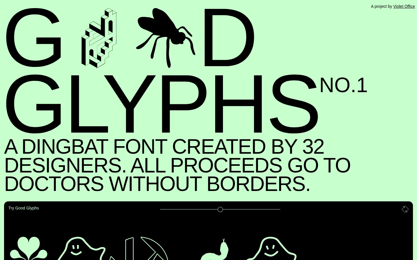
Good Glyphs以醒目的大字和亮绿色底色,展示设计师创作的装饰字形。页面将字体试用、贡献者作品与醒目的捐赠下载入口结合起来,为无国界医生组织筹款。
North star · Let the custom glyphs and oversized type carry the page, keeping every supporting element within the two-color system.
The page is built around a single, distinctive canvas green (#c7ffcd) and black (#000000), used consistently for backgrounds, typography, borders, and the inverse glyph-preview panel. Its opening is an oversized typographic composition: the custom dingbat font interrupts the wordmark, while a large uppercase sans-serif title and mission statement establish a blunt editorial voice. Typography does most of the visual work; Helvetica Neue ranges from light uppercase headings to compact body copy, with tight tracking on the main title. A black preview panel reverses the palette, showing glyphs in green, then hands off to pill-like donation controls and a long contributor gallery. The gallery uses a three-column desktop grid of transparent cards with fine black outlines, keeping each individual illustration prominent without introducing decorative color. Generous open green space around the hero contrasts with the compact, repeated gallery cells. The result feels direct, playful, and intentionally unpolished rather than glossy.
Wordmark heading, mission text, contributor labels, body copy, links, and controls.
Aa 设计
good-glyphs
网络字体 · 字重 400 · 占比 10%
免费替代:Noto Sans Symbols 2
Custom oversized dingbat characters within the hero wordmark and glyph previews.
角色
示例
字号
字重
行高
字距
特大标题
Oversized custom dingbat characters integrated into the hero wordmark.
Good Glyphs
288px
400
normal
0
一级标题
Large uppercase hero title, with tightly tracked lettering.
Good Glyphs
72px
400
0.9
-0.03em
二级标题
Light uppercase section headings and prominent donation action.
Good Glyphs
28px
300
1
0.025em
正文
Compact explanatory copy beneath the font preview and donation controls.
The quick brown fox 敏捷的狐狸
14px
400
1.5
0
按钮
Small labels on glyph buttons and donation amount controls.
The quick brown fox 敏捷的狐狸
14px
400
normal
0
链接
Contributor names and small project-credit or footer links.
The quick brown fox 敏捷的狐狸
14px
400
normal
0
间距与布局
基准单位 2px · 密度:适中
42px版块间距
—元素间距
—卡片内边距
1426px内容最大宽度
1px
4px
7px
14px
The desktop layout uses a centered page canvas that can expand to the measured 1426px maximum width. The hero and mission statement are left-aligned and nearly full-width, with content flowing vertically into a wide black preview panel. Donation controls follow in a horizontal row. The contributor area switches to a dense three-column desktop grid of repeated cards; maintain consistent gaps and a comfortable section break. The page is open and emphatically simple above the gallery, then becomes rhythmically modular.
圆角与层次
按钮 · 2px
卡片 · 14px
没有测到阴影:页面是扁平的,层次靠底色和描边区分。
The design is essentially flat: measured data reports no shadows or gradients. Separate areas with the black preview surface, thin black card and control outlines, and the shift between open hero space and the repeated gallery grid. Preserve the understated rounded card corners and avoid layered effects.
组件
下面的预览按实测的按钮、输入框、徽标、卡片样式重建(字体用替代字体)。
Hero wordmark
An oversized uppercase title on the green canvas, interrupted by custom glyph illustrations and accompanied by a small issue marker.
Glyph preview
A broad black panel containing green dingbat samples, a small label, and a fine horizontal slider with a circular handle.
Donation controls
Outlined pill-like amount choices followed by a large, uppercase DONATE & DOWNLOAD action.
Contributor cards
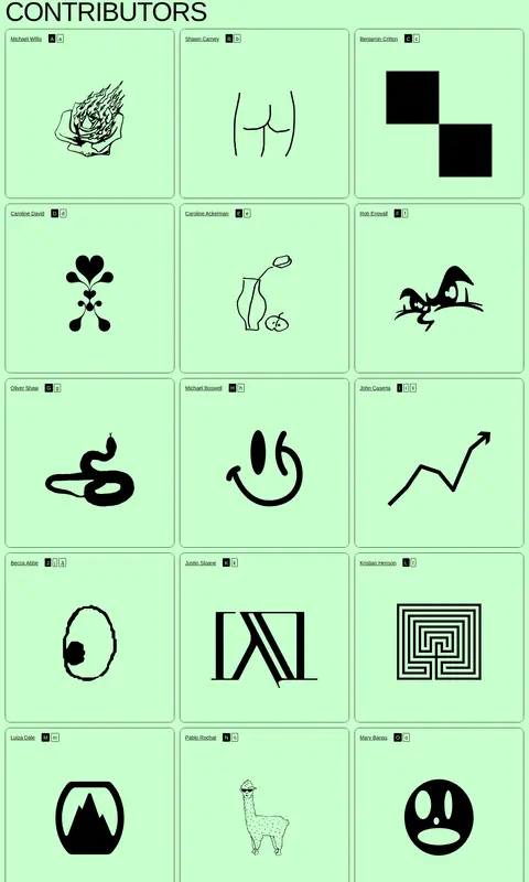
A three-column desktop grid of transparent cards with thin black borders, contributor names, glyph labels, and centered artwork.
Project credit
A small, understated credit link positioned at the upper-right of the hero.
Footer links
A compact row of small copyright, studio, social, newsletter, and contact links at the end of the gallery.
Imagery · There is no photography. The central visual material is the bespoke dingbat typeface: playful, monochrome pictograms displayed in a black preview strip and individually inside contributor cards. Artwork varies from fine line drawings to solid black silhouettes; keep it crisp, unframed by added effects, and visually centered within each cell.
Make the hero typography oversized, uppercase, and left-aligned.
Use custom pictograms as the primary visual content.
Present contributor artwork in a consistent desktop grid.
Use thin outlines and flat surfaces instead of shadows.
Keep supporting copy and footer links visually quiet.
✕ 不该做
Do not introduce extra brand colors.
Do not add gradients, drop shadows, or glossy effects.
Do not use stock photography in place of glyph artwork.
Do not soften the page with decorative textures.
Do not make the hero title small or conventionally restrained.
Do not give each contributor card a different background.
Do not let navigation or secondary copy compete with the artwork.
给 AI 的提示词
想快速出一个同风格的新页面,把这段话连同 DESIGN.md 一起发给 AI。
Build a new page in the Good Glyphs visual style. Use Glyph Green (#c7ffcd) as the uninterrupted canvas and Ink Black (#000000) for typography, borders, and the inverse showcase surface. Set a Helvetica Neue-like sans-serif for uppercase, editorial headings and compact supporting copy; use a bespoke symbol font or custom artwork for expressive glyphs. Lead with a large, left-aligned typographic statement, then give the main preview a broad black panel with green symbols. Follow it with simple outlined donation controls and a repeated contributor-art grid. Keep the layout flat, spacious around the hero, and more rhythmically dense in the gallery. Use fine outlines rather than shadows, keep artwork centered and monochrome, and ensure every supporting element reinforces rather than competes with the glyphs.