North star · Keep the page calm and spacious, reserving soft blue gradients for high-impact moments and letting product UI explain the workflow.
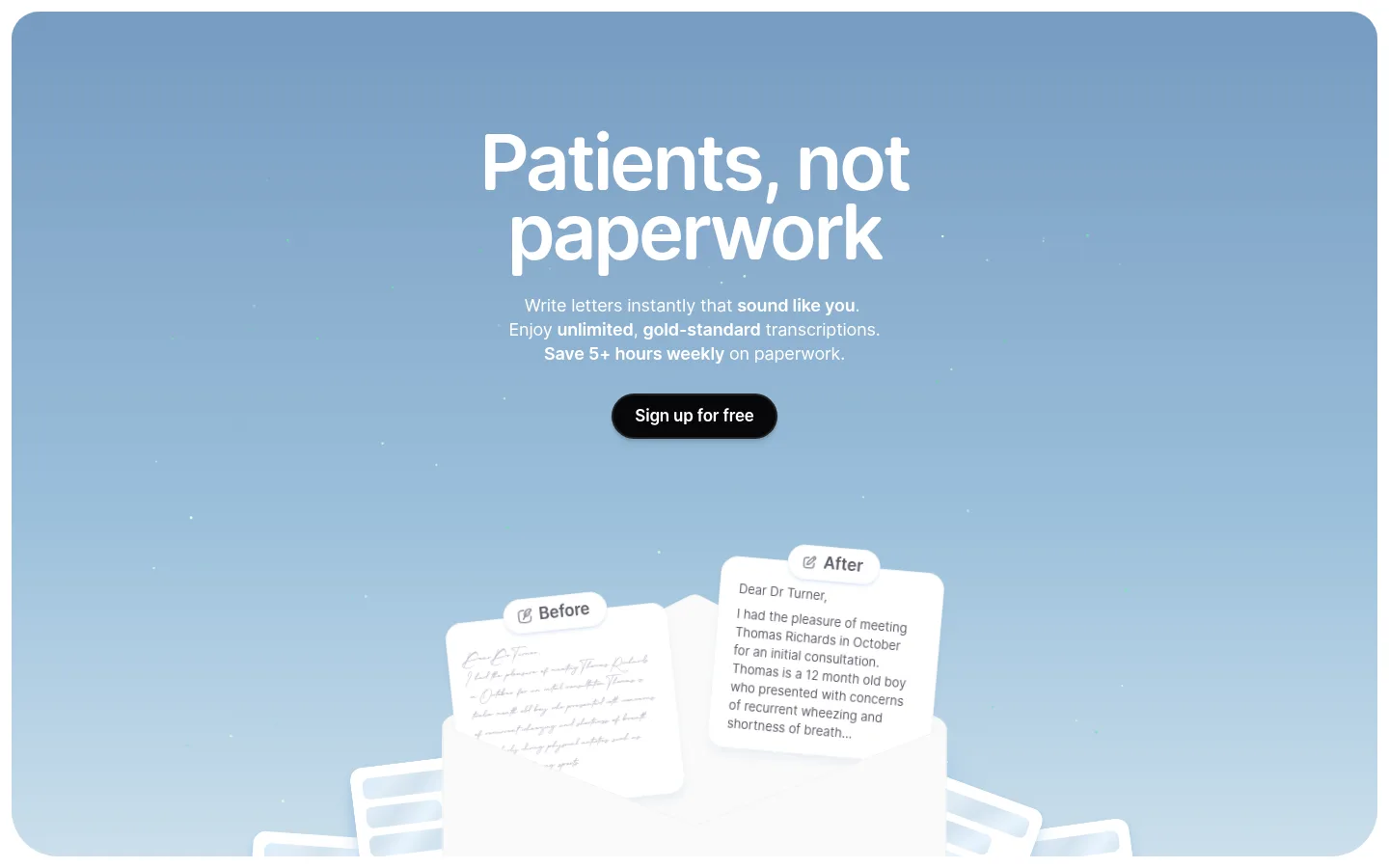
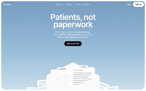
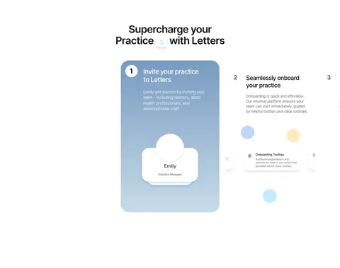
The page uses a white canvas as its primary visual field, interrupted by pale-gray product cards and large, softly rounded blue-gradient panels. The hero establishes the signature treatment: a blue sky-like gradient behind centered white copy and a black pill-shaped primary action. The gradient also returns in pricing and practice-onboarding content, while most feature sections stay white or very light gray so the product UI remains the focus. Open Runde carries the main interface, with compact, closely tracked headings and readable body copy; The Doctor FreeVersion adds a distinctive display voice in selected headings. Content is centered within a measured 658px page width, with spacious section breaks and occasional two- or three-column feature layouts. Product mockups, letter previews, and transcription controls appear as clean, softly layered illustrations rather than lifestyle photography. Rounded cards and subtle shadows provide separation without heavy borders.
Primary display, headings, body, and navigation typography.
Aa 设计
Open Runde Regular
网络字体 · 字重 400 · 占比 17%
免费替代:Nunito Sans
Regular-weight copy and secondary text.
Aa 设计
The Doctor FreeVersion
网络字体 · 字重 400 · 占比 7%
免费替代:Instrument Serif
Distinctive decorative display headings, including selected section titles.
Aa 设计
Open Runde Semibold
网络字体 · 字重 400 · 占比 5%
免费替代:Nunito Sans
Navigation and emphasized labels.
Aa 设计
Open Runde Medium
网络字体 · 字重 400 · 占比 4%
免费替代:Nunito Sans
Subheadings and medium-emphasis product labels.
Aa 设计
inter
网络字体 · 字重 400 / 500 · 占比 2%
免费替代:Inter
Minor interface or embedded product UI text.
角色
示例
字号
字重
行高
字距
特大标题
Oversized centered hero headline.
Letters
80px
600
0.9
-0.04em
一级标题
Primary page and major feature headlines.
Letters
44px
600
1.1
-0.04em
二级标题
Decorative section headings using the display serif-like face.
Letters
38px
400
0.9
-0.01em
三级标题
Feature-card titles and secondary section headings.
Letters
28px
500
1.2
-0.03em
正文
Explanatory paragraphs and supporting product descriptions.
The quick brown fox 敏捷的狐狸
18px
400
1.4
-0.01em
辅助文字
Small interface labels, notes, and supporting captions.
The quick brown fox 敏捷的狐狸
16px
400
1.4
-0.01em
导航
Header navigation links and menu labels.
The quick brown fox 敏捷的狐狸
17px
400
1.4
-0.01em
间距与布局
基准单位 4px · 密度:宽松
100px版块间距
10px元素间距
40px卡片内边距
658px内容最大宽度
4px
6px
8px
9px
10px
12px
16px
18px
20px
24px
28px
32px
36px
40px
52px
100px
Use a narrow centered content frame with a measured 658px maximum width for the core text and product storytelling. Arrange sections in a single vertical sequence with generous measured section spacing, then vary content between centered headings, two-column feature cards, and three-column supporting features. Keep the desktop header compact, align most headings centrally, and let the hero and pricing panels span broadly with rounded edges. The measured density is spacious; do not compress the long page into a tight dashboard.
圆角与层次
按钮 · 9999px
卡片 · 48px
导航 · 9999px
md · other, card
md · card
md · button
hairline · other
Favor flat white and pale-gray surfaces, using very subtle shadows to lift cards and mockups from the canvas. Cards have strongly rounded corners, while buttons and navigation pills are fully rounded. Borders are not a defining separator; use surface contrast, whitespace, and delicate shadow layering instead.
组件
下面的预览按实测的按钮、输入框、徽标、卡片样式重建(字体用替代字体)。
Hero gradient panel
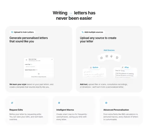
Large rounded blue-gradient field with centered white headline and supporting copy, a black pill CTA, and layered letter-preview artwork.
Pill navigation
Compact header links in Open Runde, with rounded sign-up treatment and restrained dark or muted text.
Feature cards
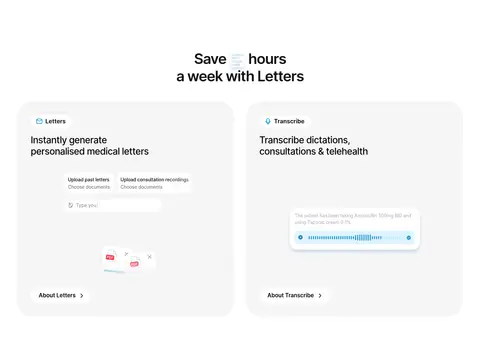
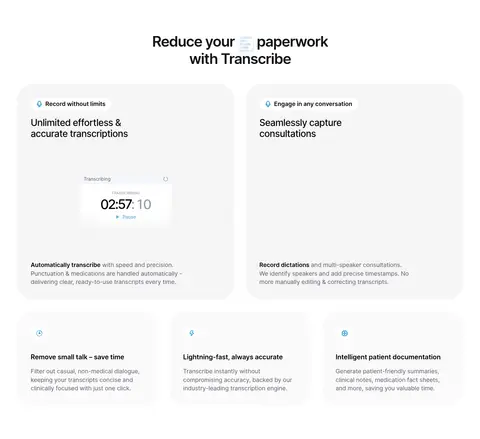
Two-column pale-gray cards with rounded corners, small labels, dark headings, and embedded product UI illustrations.
Supporting feature tiles
Small, softly separated feature blocks with a compact icon, concise title, and short explanatory copy.
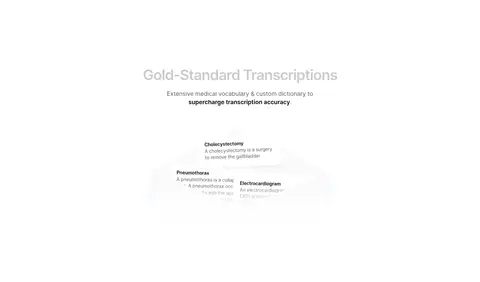
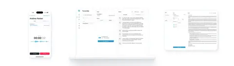
Product workflow mockup
Letter, transcription, or upload UI presented as a clean illustration with subtle shadows and ample surrounding whitespace.
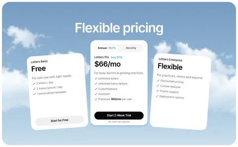
Pricing panel
Broad rounded blue-gradient section containing three white plan cards, with the central paid plan and dark CTA emphasized.
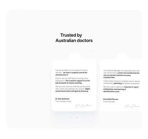
Trust and privacy cards
Light cards with small cyan-toned icons, concise reassurance headings, and muted supporting text.
Imagery · Use product-focused interface mockups: letter previews, transcription controls, document upload examples, and device screens. Render them as clean, pale UI illustrations on white or soft-gray card surfaces, with occasional layered paper-like elements. The hero and pricing blocks use blue sky-like gradients as the backdrop. Avoid relying on lifestyle photography; the visual evidence is workflow and interface.
Reserve blue gradients for hero and high-impact feature panels.
Keep section layouts centered and generously spaced.
Use rounded cards with subtle shadows, not heavy borders.
Let product-interface illustrations explain the workflow.
Use Open Runde for the primary typographic voice.
✕ 不该做
Do not turn the page into a dense admin dashboard.
Do not apply gradients to every card or section.
Do not introduce strong saturated colors absent from the measured palette.
Do not use heavy outlines or harsh dividers.
Do not use lifestyle photography as the main storytelling device.
Do not replace the rounded, calm typography with sharp condensed styles.
给 AI 的提示词
想快速出一个同风格的新页面,把这段话连同 DESIGN.md 一起发给 AI。
Build a new page in the Letters visual style: a bright, spacious medical SaaS experience on Gallery White (#ffffff), with Soft Ink (#070709) headings and Cloud Surface (#f5f5f5) product cards. Use Sky Signal (#779bc1), Horizon Blue (#9abfda), and Mist Blue (#cbdfec) as a restrained gradient treatment for a prominent hero or pricing section. Set the main type in Open Runde or a close rounded sans substitute, reserving The Doctor FreeVersion-style display contrast for selected headings. Center the primary content, allow two- and three-column feature layouts, and preserve generous section rhythm. Use rounded cards, pill-shaped CTAs, subtle shadows, and clean product-interface illustrations. Keep copy concise, maintain strong contrast, and make the workflow—not decorative imagery—the focus.