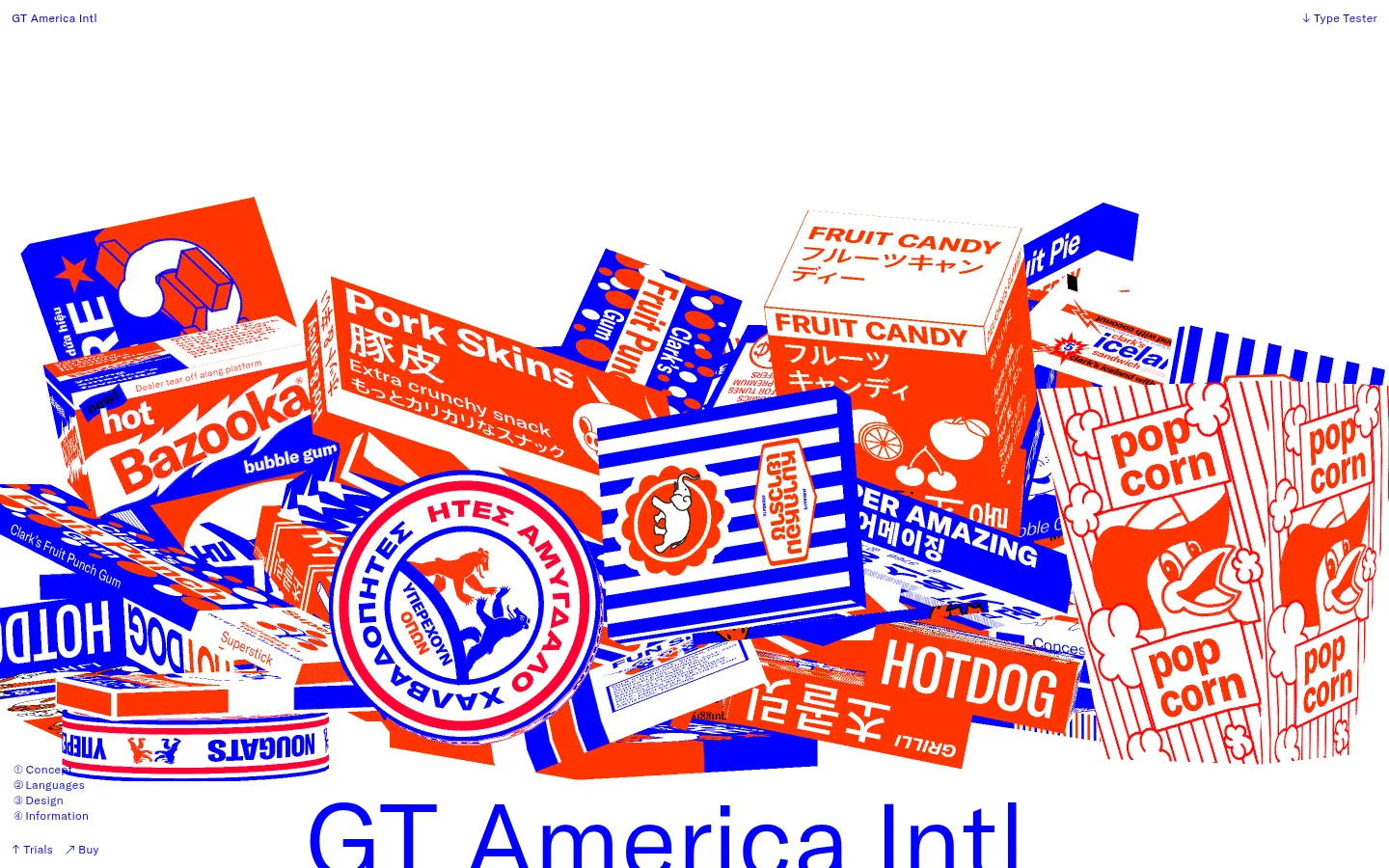
这是一个长篇字体样张页面,以超大标题、密集字形展示和醒目的彩色包装拼贴介绍 GT America Intl。页面后段切换为鲜明蓝色背景,突出多语言字库介绍与交互式字体测试。
North star · Let oversized GT America typography and specimen artwork carry the page, keeping the surrounding interface flat, spacious, and strictly blue, white, and orange-red.
The page is built around an unusually strict palette: pure white (#ffffff) dominates the opening and specimen sections, while saturated blue (#0000ff) supplies the navigation, text, outlines, and a large uninterrupted global-language section. Orange-red (#ff3500) is a selective typographic accent, especially visible in specimen glyphs; the much broader red, blue, and pastel range in the opening collage belongs to the packaging artwork, not the interface palette. GT America Intl is the expressive core: regular-weight display lettering moves from oversized editorial headlines to repeated alphabet samples, while its Mono cut handles compact uppercase labels and navigation. The opening collage is large, edge-spanning, and deliberately busy, contrasted with generous white space around the headline and between specimen sections. Most content stays left-aligned within a spacious page, with examples arranged in columns and grids. The visual language is flat and sharp: square corners, thin blue rules, no shadows, and restrained interface chrome.
配色
点色块复制色值。用途说明来自对页面的实测位置(背景、文字、描边、按钮)与截图判读。
品牌色
强调色
中性色
页面底色 · Paper White主文字 · Electric Blue次要文字 · Paper White描边 · Electric Blue强调 · Electric Blue强调 2 · Signal Orange
Monospaced technical or variable-font specimen text.
const style = 1;
18px
400
1.35
0
间距与布局
基准单位 4px · 密度:宽松
96px版块间距
24px元素间距
1px卡片内边距
1416px内容最大宽度
1px
3px
6px
12px
18px
24px
48px
60px
96px
A spacious, single-page editorial flow uses a measured 1416px maximum content width and a 4px-based spacing system, with a 96px section rhythm and 24px element gaps. Most sections are left-aligned, while type specimens shift into two-, three-, and four-column arrangements. The white specimen sequence gives way to one sustained, full-width blue section with split content and an interactive tester. Density comes from repeated glyphs and multilingual examples, not interface chrome.
圆角与层次
没有测到阴影:页面是扁平的,层次靠底色和描边区分。
The interface is flat, with no measured shadows and square-cornered controls. Blue hairline outlines define specimen cards and badges, while spacing and background changes establish hierarchy. The hero collage gains depth through overlapping printed artwork, not interface shadows or raised cards.
组件
下面的预览按实测的按钮、输入框、徽标、卡片样式重建(字体用替代字体)。
Text navigation
Small blue GT America Intl and Type Tester labels sit at opposite edges of the top area; navigation remains text-only and unboxed.
Specimen card
Glyph samples such as “Aa” use orange-red text inside a square blue outline, with no shadow or rounded corners.
Outlined specimen badge
Compact uppercase labels, including width names, use GT America Intl Mono with a thin square blue border.
Font controls
Text-first script and axis selectors use compact blue labels; selected controls sit among dense specimen information without heavy button fills.
Multilingual feature band
A full-width electric-blue section switches the background and foreground contrast for script availability, partner details, and testing.
Type tester
An interactive specimen area combines script selection, variable-font controls, and editable example text in a restrained, flat layout.
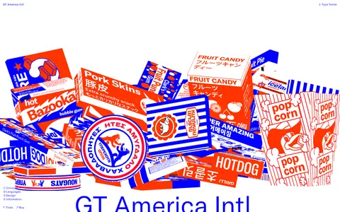
Imagery · The hero uses an edge-spanning collage of colorful illustrated food packages, with overlapping boxes and labels creating a deliberately busy contrast against the white canvas. Treat that palette as artwork, not as additional UI colors. Lower sections rely primarily on type specimens and script samples rather than photography; keep samples crisp, large, and framed by open space.
Reserve #0000ff for interface text, rules, and the global section.
Use #ff3500 sparingly for glyph-level emphasis.
Set specimen text in the measured GT America families when available.
Keep navigation small, text-only, and blue.
Use open spacing to separate large type demonstrations.
✕ 不该做
Do not promote collage colors into the interface palette.
Do not add shadows, gradients, or rounded cards.
Do not make the page feel like a conventional ecommerce product grid.
Do not replace oversized specimens with small decorative thumbnails.
Do not crowd the editorial sections with persistent controls.
Do not apply orange-red broadly to backgrounds or navigation.
给 AI 的提示词
想快速出一个同风格的新页面,把这段话连同 DESIGN.md 一起发给 AI。
Build a new long-form type specimen page in this visual language. Use Paper White (#ffffff) as the primary canvas and Electric Blue (#0000ff) for navigation, body text, rules, and any full-width feature band. Reserve Signal Orange (#ff3500) for occasional specimen glyphs. Lead with a striking, edge-spanning piece of illustrative artwork, then give the oversized title ample white space. Use GT America Intl for display, headings, body, and specimen samples; use its Mono cut for tracked uppercase labels. Keep layouts mostly left-aligned, moving into columns for alphabets, scripts, and font features. Favor square outlines, flat controls, and no shadows or gradients. Create generous gaps between editorial sections, then use a sustained blue band for multilingual details and an interactive tester. Treat colors inside artwork as illustration only.