North star · Let oversized, expressive type dominate a black canvas, and use precise HUD-like controls as its restrained frame.
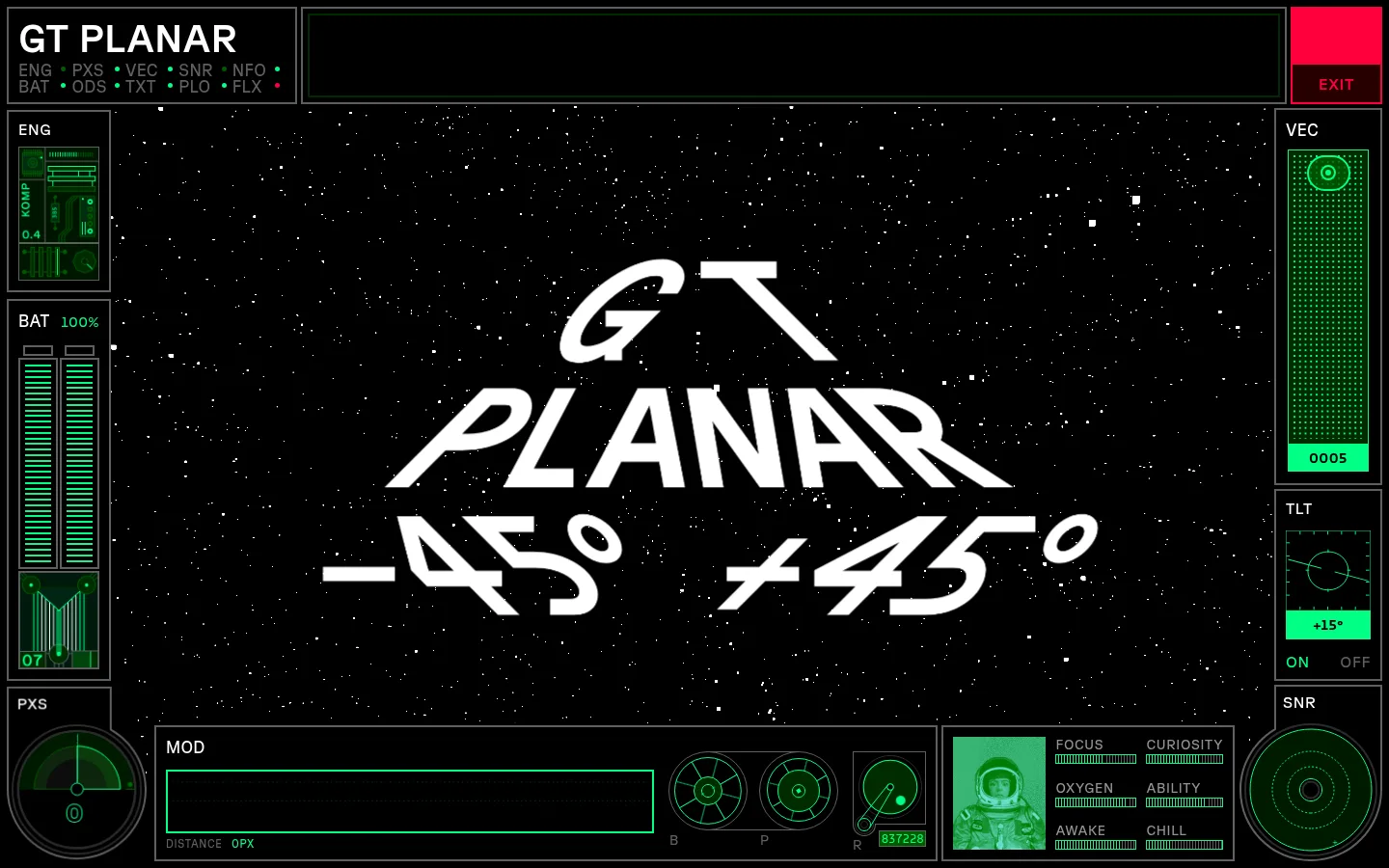
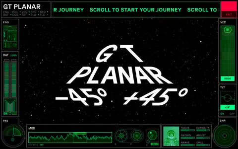
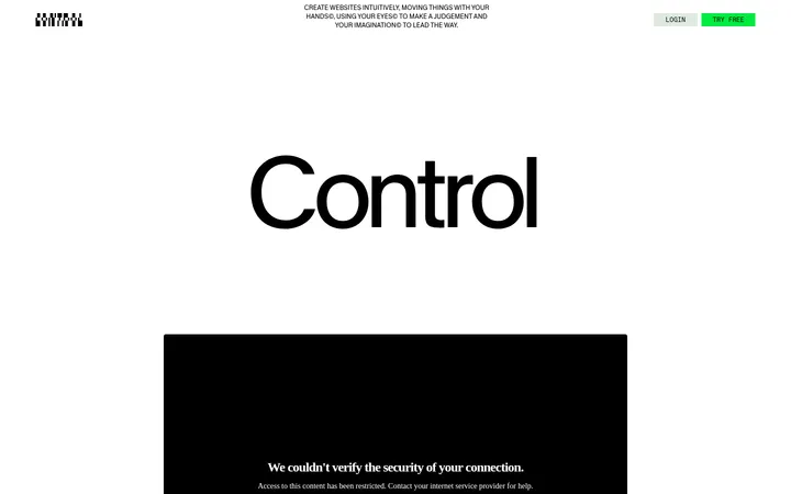
The page treats the typeface itself as the product and builds a dark, technical stage around it. Black (#000000) dominates the canvas, while white (#ffffff) letterforms carry the main visual message. The hero resembles a compact spacecraft HUD: thin gray outlines divide small instrument modules around a large central specimen, with green indicators and a sharp red exit control. Violet appears in the angle and weight controls, adding a distinct second interaction color. Typography is the primary imagery: GT Planar appears in oversized, lightweight forms, while compact uppercase labels and navigation text make the surrounding interface legible as equipment. The page is vertically paced with extensive black intervals between sparse content sections, allowing each specimen and headline to read as an exhibit. Hairline borders and rectangular panels create structure without shadows, gradients, or rounded-card styling. Treat other deep and bright palette tones as interface or specimen accents, not as broad background bands.
配色
点色块复制色值。用途说明来自对页面的实测位置(背景、文字、描边、按钮)与截图判读。
品牌色
强调色
表层色
中性色
功能色
页面底色 · Deep Console主文字 · Specimen White描边 · Panel Graphite强调 · Electric Violet强调 2 · Soft Signal强调 3 · Exit Red
All page typography, from hero specimen and section headings to labels and controls.
角色
示例
字号
字重
行高
字距
特大标题
Oversized hero type specimen and expressive display lettering.
Grilli Type
187px
300
0.9
0
一级标题
Primary uppercase page or section headline.
Grilli Type
146px
300
0.9
0.04em
二级标题
Large secondary section headline.
Grilli Type
115px
300
1.15
0
三级标题
Compact uppercase feature or subsection heading.
Grilli Type
40px
300
1
0.006em
四级标题
Smaller supporting heading within content.
The quick brown fox 敏捷的狐狸
24px
300
1.17
0
正文
Explanatory typeface-design copy.
The quick brown fox 敏捷的狐狸
17px
300
1.24
0.015em
辅助文字
Uppercase metadata and compact specimen captions.
The quick brown fox 敏捷的狐狸
16px
300
1.63
0.04em
按钮
Interactive angle, weight, and control labels.
The quick brown fox 敏捷的狐狸
17px
400
1
0
导航
Uppercase interface navigation and HUD labels.
The quick brown fox 敏捷的狐狸
14px
300
1.14
0.046em
眉题
Short uppercase labels introducing sections or controls.
The quick brown fox 敏捷的狐狸
16px
300
1.63
0.04em
间距与布局
基准单位 1px · 密度:宽松
150px版块间距
58px元素间距
5px卡片内边距
940px内容最大宽度
1px
2px
4px
5px
8px
10px
15px
20px
25px
29px
50px
58px
100px
Use a full-bleed black canvas. The opening viewport is dominated by a central display area enclosed by narrow instrument panels on both sides and compact controls along the bottom. Build those modules from straight-edged, outlined rectangles rather than rounded cards. Keep content largely single-column and left-aligned in later editorial sections, with generous vertical pauses between them. The measured content max width is 940px; the overall composition can still let the hero interface span the viewport. Density is spacious in the page rhythm, even when the hero HUD itself is information-dense.
圆角与层次
没有测到阴影:页面是扁平的,层次靠底色和描边区分。
The interface is mostly flat: the black canvas provides depth through contrast, while thin gray outlines separate rectangular modules. Measured shadows and gradients are absent. Use bright color and layered panel placement, not drop shadows, rounded cards, or soft surface effects, to distinguish controls from the background.
组件
下面的预览按实测的按钮、输入框、徽标、卡片样式重建(字体用替代字体)。
HUD hero frame
Frame the central oversized type specimen with thin gray-outlined side instruments and bottom readouts on the black canvas.
Specimen display
Use white GT Planar lettering at dramatic scale, with angle variants such as -45° and +45° as visual content.
Angle and weight controls
Set compact rectangular controls in electric violet (#6100ff), with dark violet (#29006c) backing for selected or recessed states.
Signal badges
Render small bright-green (#00ff85) value blocks with black text, like the measured +15° and 0005 readouts.
Outlined information panels
Use straight-edged gray (#606060) borders, uppercase white labels, and tightly arranged interface details.
Exit control
Keep the red (#ff003d) exit element small and isolated at the top edge of the HUD.
Imagery · The identity is led by typography and interface graphics rather than conventional photography. Treat the large GT Planar specimen as the hero image, surrounded by green gauges, readouts, and fine technical diagrams. Tiny photographic or illustrative imagery may occur inside a HUD module, but keep it subordinate and tinted or integrated like a screen element. Preserve strong contrast and the feeling of a live, instrumented display.
Keep the page canvas black and the main specimen white.
Make the typeface itself the largest visual element.
Use thin rectangular outlines to organize HUD modules.
Reserve violet and green for control states and instrument signals.
Set navigation and compact labels in uppercase.
Preserve generous black space between editorial sections.
✕ 不该做
Do not introduce broad pale background sections.
Do not replace the typography with generic product photography.
Do not use rounded-card styling or decorative shadows.
Do not spread accent colors across large, unrelated surfaces.
Do not make small HUD readouts compete with the hero specimen.
Do not fill the long vertical pauses with invented content.
给 AI 的提示词
想快速出一个同风格的新页面,把这段话连同 DESIGN.md 一起发给 AI。
Build a new page using GT Planar’s futuristic type-specimen style. Start with a near-black canvas (#000000) and make the typography the main visual asset: use oversized, lightweight white lettering (#ffffff), with uppercase headings and compact, tracked interface labels. Frame the hero specimen with narrow HUD-like modules, thin graphite borders (#606060), muted gray labels (#949494), and dense technical readouts. Use Electric Violet (#6100ff) for controls and selected states, Laser Green (#00ff85) for active indicators and badges, and Exit Red (#ff003d) only as a small signal. Keep panels square-edged and flat; do not add shadows, gradients, or rounded cards. After the hero, use restrained, left-aligned editorial sections separated by broad stretches of black space. Keep decorative screen details subordinate to clear page content.