North star · Keep the shopping interface quiet and precise so cinematic product imagery carries the visual impact.
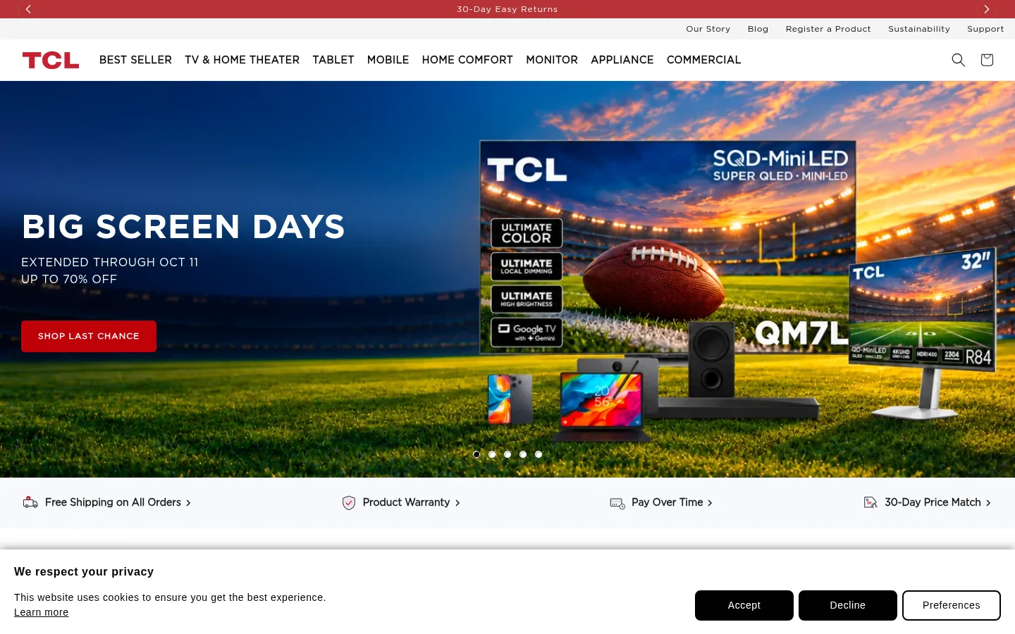
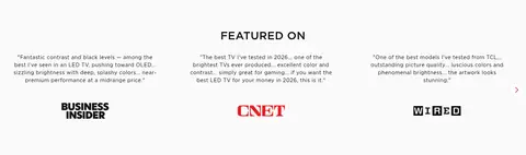
The page uses a bright white canvas and black text as a quiet frame for large, colorful product imagery. TCL red is reserved for the announcement strip, primary shopping actions, selected links, and compact highlights rather than broad background blocks. Gotham typography gives navigation and product content a precise retail character: headings are firm and prominent, while the light-weight body copy stays measured and readable. A full-width campaign hero leads into compact service benefits and centered product discovery, followed by wide image-led showcases and alternating editorial content. The layout shifts between open, centered sections and tightly packed product or story cards, with generous white gaps separating them. Thin pale borders define product cards and controls; imagery supplies most of the page’s contrast, color, and emotional impact. Lower sections broaden the experience with press quotes, social video tiles, and a structured footer.
Body text, navigation, buttons, captions, and eyebrow labels.
Aa 设计
Gotham-Medium
网络字体 · 字重 500 / 800 · 占比 14%
免费替代:Montserrat
Section headings, product titles, and prominent links.
Aa 设计
Gotham-Bold
网络字体 · 字重 500 · 占比 1%
免费替代:Montserrat
Primary hero headline.
角色
示例
字号
字重
行高
字距
一级标题
Primary campaign headline, such as the hero promotion.
TCL
48px
500
1.2
0.012em
二级标题
Major section headings and prominent showcase titles.
TCL
38px
500
1.2
0.016em
三级标题
Product and feature headlines within content sections.
TCL
30px
500
1.2
0.02em
四级标题
Supporting subheads in product and editorial blocks.
The quick brown fox 敏捷的狐狸
26px
500
1.2
0.023em
正文
Product descriptions, service messages, and editorial copy.
The quick brown fox 敏捷的狐狸
14px
400
1.5
0.043em
辅助文字
Dates, fine print, and supporting card metadata.
The quick brown fox 敏捷的狐狸
12px
400
1.5
0.05em
按钮
Compact uppercase shopping and action labels.
The quick brown fox 敏捷的狐狸
12px
600
1.3
0.083em
导航
Primary product navigation and header utility links.
The quick brown fox 敏捷的狐狸
14px
600
1.3
0.043em
链接
Product calls to action and editorial links.
The quick brown fox 敏捷的狐狸
16px
500
1.2
0.038em
眉题
Small uppercase section labels and introductory markers.
The quick brown fox 敏捷的狐狸
12px
600
1.3
0.083em
间距与布局
基准单位 4px · 密度:适中
80px版块间距
8px元素间距
—卡片内边距
1376px内容最大宽度
4px
5px
6px
8px
9px
10px
12px
15px
16px
20px
24px
28px
30px
32px
80px
The page moves from a slim announcement and utility area into a full-width navigation bar, then a full-bleed hero. Below, centered product discovery and campaign showcases alternate with split feature content and horizontal editorial and social card rows. Product areas use multi-column layouts; feature panels and stories use more open alignment. The measured content max width is 1376px, with a comfortable density and an 80px section-gap rhythm. Most sections sit on white, so spacing and imagery—not colored bands—signal transitions.
圆角与层次
按钮 · 5px
链接 · 4px
sm · card
inset · link
sm · card
The visual system is mostly flat. Pale hairline borders define product cards and small selection controls, while subtle shadows appear on a limited number of cards. Stronger depth comes from layered campaign media, image overlays, and the photographed products themselves—not from heavy UI shadows or rounded panels.
组件
下面的预览按实测的按钮、输入框、徽标、卡片样式重建(字体用替代字体)。
Primary navigation
White horizontal header with a red TCL wordmark, dark product-category labels, and compact search and bag icons.
Campaign hero
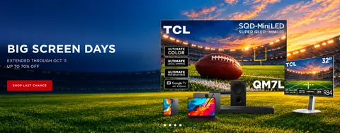
Full-bleed promotional image with a large white headline, compact supporting offer copy, and a red uppercase shopping button.
Service benefits strip
Pale horizontal band presenting shipping, warranty, payment, and price-match assurances with small icons.
Product cards
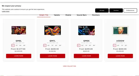
White product tiles with restrained outlines, product imagery, concise model and pricing details, and red CTA buttons.
Size selector
Compact outlined size links; the selected option uses #c72030 text and border with a subtle inset highlight.
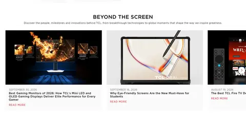
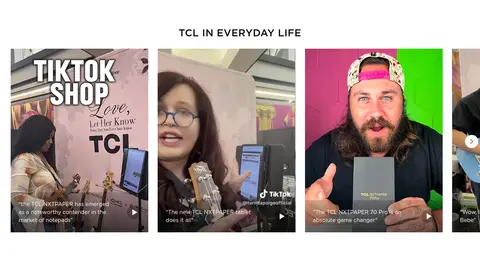
Editorial and social cards
Image-led article and creator-video cards with compact metadata, short headlines, and understated reading or playback cues.
Footer directory
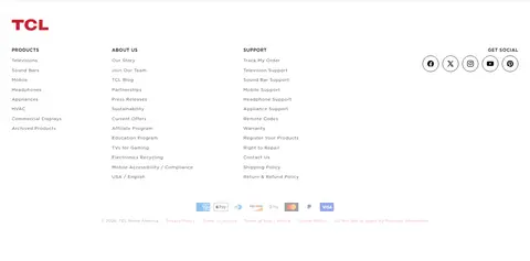
Open white footer with a TCL mark, grouped product, company, and support links, social icons, and payment details.
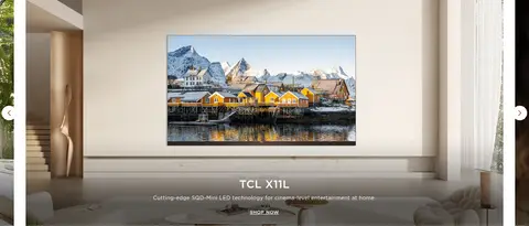
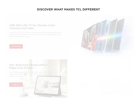
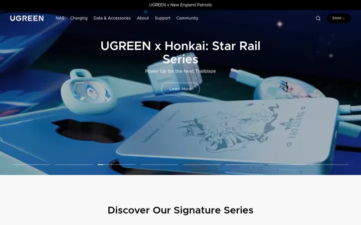
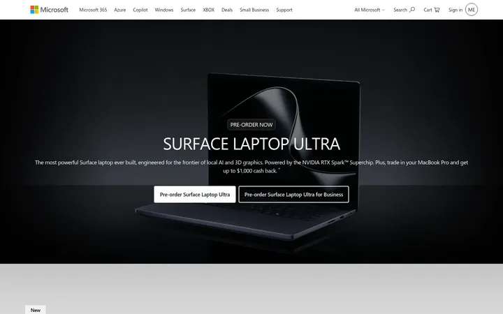
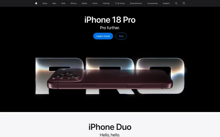
Imagery · Large campaign photography and product renders dominate the first screen, with dramatic sports and home-entertainment scenes supplying vivid color. Product cards pair device imagery with restrained copy and price details. Feature areas use wide lifestyle or technology visuals; lower editorial and social sections add article thumbnails and video-like creator portraits. Images are generally presented cleanly, with occasional dark overlays to keep text legible on campaign media.
Use white space as the default backdrop for shopping content.
Reserve TCL red for primary actions and selective emphasis.
Let campaign photography span the page when it is the focal point.
Keep product cards crisp, pale, and lightly outlined.
Use Gotham-like geometric sans-serif typography throughout.
Separate long content with generous, consistent section gaps.
✕ 不该做
Do not turn the page into a dark or heavily tinted interface.
Do not use red as a large, persistent section background.
Do not add heavy shadows or strongly rounded card containers.
Do not let product descriptions compete with the product images.
Do not invent decorative gradients as core brand surfaces.
Do not compress distinct homepage sections into one dense grid.
给 AI 的提示词
想快速出一个同风格的新页面,把这段话连同 DESIGN.md 一起发给 AI。
Build a new consumer-electronics retail page in TCL’s clean, image-led style. Use Gallery White (#ffffff) as the main canvas, Display Ink (#0a0a0a) for core text, and TCL Red (#bf0008) for primary actions and restrained brand accents. Use Signal Crimson (#c72030) for selected links or options, Cloud Gray (#e6e6e6) for subtle surfaces, and Border Mist (#dfdfe4) for fine outlines. Favor Gotham-like geometric sans-serif typography, with compact uppercase button labels and stronger headline weights. Establish a full-width image-led hero, then organize products, feature showcases, and editorial cards into clear sections with generous vertical breathing room. Keep product tiles light and quiet, with thin borders and minimal shadow. Prioritize product photography, readable contrast, concise copy, and straightforward shopping navigation.