North star · Make the typeface the hero, using warm open space and comic-bright panels to frame rather than compete with its letterforms.
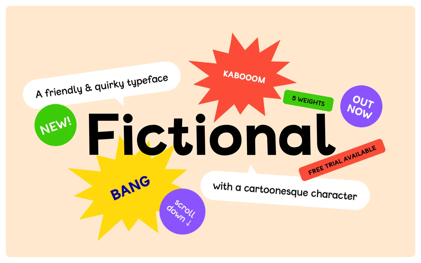
The page treats the typeface itself as the identity: Fictional’s distinctive rounded letterforms dominate the opening hero, while a warm peach canvas (#ffe9ce) keeps the composition inviting. Black (#000000) anchors the oversized wordmark and sample copy; white (#ffffff) speech-bubble panels provide clean contrast. Vivid red (#fd4b38), violet (#8a53ff), green (#3ccb09), and yellow (#ffd80c) appear as large, deliberately irregular comic accents and section fills, not as a restrained UI palette. The same custom Fictional webfont is used throughout, with exceptionally large display and heading styles and much quieter body text. Content is arranged as a vertical sequence of generous, rounded color blocks: hero, weight and description panels, a red character specimen, then a green licensing/contact panel and a burst-shaped purchase prompt. There is no conventional photography; typography, glyphs, and sticker-like graphics carry the storytelling. The overall impression is playful, handmade, and legible despite the energetic color.
The sole display and text face: wordmark, headings, copy, links, and glyph samples.
角色
示例
字号
字重
行高
字距
特大标题
Oversized Fictional wordmark in the hero.
Fictional
345.5px
400
1.2
0
一级标题
Primary hero lettering and prominent typeface presentation.
Fictional
201.5px
400
1.2
0
二级标题
Large section headings and specimen panel titles.
Fictional
72px
400
0.9
0
三级标题
Subheadings and expressive secondary messages.
Fictional
50.5px
400
1.71
0
四级标题
Smaller panel headings and supporting labels.
Fictional
47.5px
400
1.1
0
正文
Typeface description, licensing copy, and supporting text.
The quick brown fox 敏捷的狐狸
16px
400
1.4
0
按钮
Purchase, trial, and compact promotional calls to action.
The quick brown fox 敏捷的狐狸
21.5px
400
1.67
0
链接
Designer credit, studio link, and contact links.
The quick brown fox 敏捷的狐狸
16px
400
1.4
0
间距与布局
基准单位 1px · 密度:适中
58px版块间距
—元素间距
36px卡片内边距
864px内容最大宽度
12px
22px
29px
32px
36px
43px
49px
52px
58px
60px
108px
A single-column scroll page uses a broad, centered content area, with the measured page maximum width at 864px. The opening hero is a large peach field framed by narrow white margins; its central wordmark is surrounded by floating stickers, bursts, and speech bubbles rather than a rigid grid. Subsequent content alternates between paired color panels and a full-width red specimen band, then a green information panel beside a starburst CTA. Spacing feels comfortable and section breaks are clear, while the content itself stays compact and playful.
圆角与层次
按钮 · 5px
卡片 · 15px
hairline · button
The page is predominantly flat: color fields and irregular graphic shapes establish hierarchy instead of shadows. Rounded corners soften the larger panels, while speech bubbles and badges overlap the hero through placement. Keep borders restrained and avoid adding conventional card depth; the measured CTA highlight is a fine yellow-toned outline effect.
组件
下面的预览按实测的按钮、输入框、徽标、卡片样式重建(字体用替代字体)。
Comic hero
Warm peach canvas with a massive black Fictional wordmark, white speech bubbles, and scattered red, yellow, green, and violet callouts.
Weight list
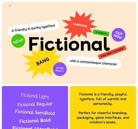
Violet panel listing Fictional Light through UltraBold in white, with each line demonstrating a different font weight.
Description panel
Yellow block with centered black explanatory copy and a minimal horizontal decorative control.
Glyph specimen
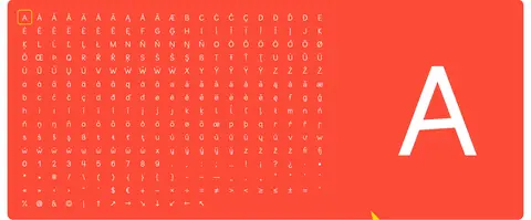
Red character-set field pairing a dense white glyph grid with one oversized white letter.
Licensing panel
Green rounded block with centered black trial, licensing, and email copy plus inline underlined links.
Burst purchase prompt
Yellow jagged starburst with bold dark-blue BUY NOW text, placed alongside the lower licensing panel.
Imagery · No photography or 3D product imagery is used. The hero is a typographic illustration assembled from the oversized word Fictional, jagged comic bursts, circular stickers, angled ribbons, and white speech bubbles. Lower sections use the font’s own character repertoire as the specimen, with glyphs arranged in a dense field and a large isolated letter. Keep these graphic elements flat, vivid, and deliberately sticker-like.
Use Peach Canvas (#ffe9ce) as the warm visual ground.
Frame copy with Speech Bubble (#ffffff) shapes.
Treat bright accents as comic panels and stickers.
Show real glyphs as both decoration and product proof.
Keep CTA and contact language visible within the scroll.
✕ 不该做
Do not replace the playful font with a neutral corporate sans.
Do not distribute every accent color uniformly across small UI controls.
Do not add photography or realistic product mockups.
Do not impose a conventional navigation-heavy SaaS layout.
Do not rely on gradients, heavy shadows, or dense borders.
Do not let supporting copy overpower the specimen lettering.
给 AI 的提示词
想快速出一个同风格的新页面,把这段话连同 DESIGN.md 一起发给 AI。
Build a new single-page typeface showcase in the Fictional style. Make oversized rounded display lettering the main event, set against Peach Canvas (#ffe9ce) with Typeface Ink (#000000) for strong type contrast. Use Speech Bubble (#ffffff) panels for short copy, and reserve Comic Tomato (#fd4b38), Electric Leaf (#3ccb09), Punchy Violet (#8a53ff), and Comic Lemon (#ffd80c) for bold flat panels, badges, ribbons, and jagged bursts. Keep the layout centered and scroll-led, with generous breathing room and clear color-blocked sections. Use a Fictional-like rounded font consistently, varying apparent weight for specimen examples. Include a glyph showcase and concise trial, licensing, or contact actions. Favor hand-arranged sticker compositions over rigid grids; keep surfaces flat, corners soft, and interface chrome minimal.