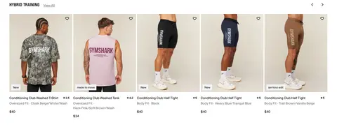
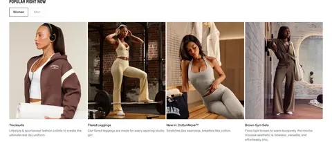
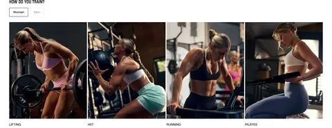
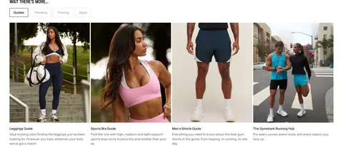
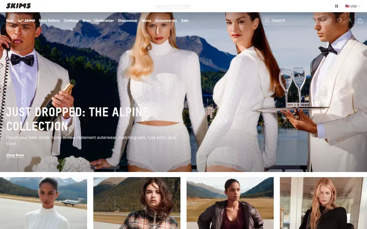
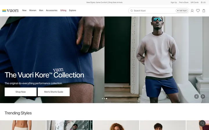
North star · Keep the commerce interface quiet and sharply structured so bold training photography and condensed headlines carry the energy.
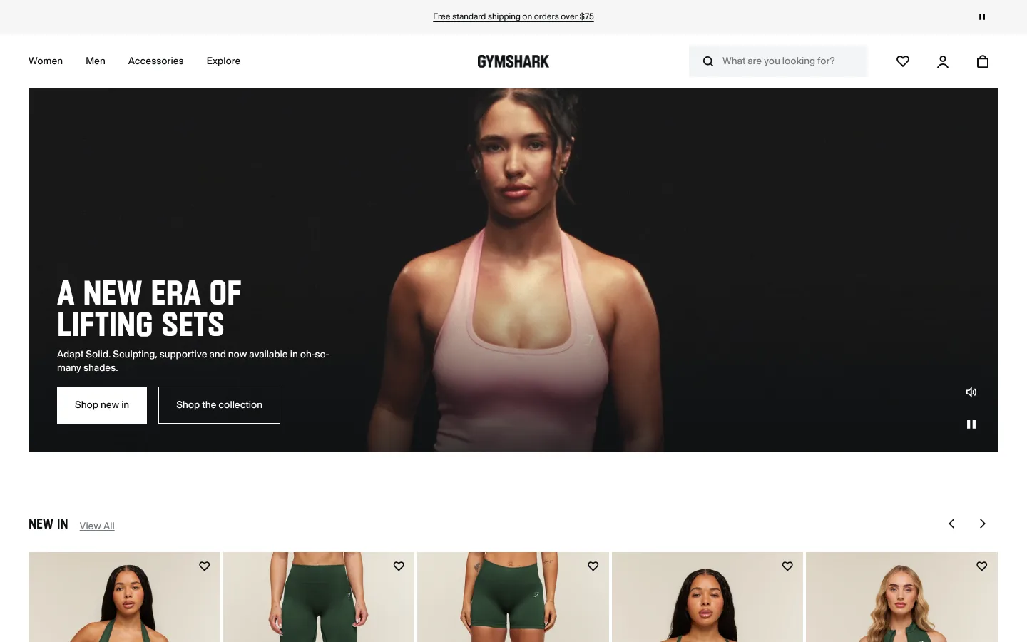
The page uses a white canvas as a quiet frame for near-black text, pale grey product surfaces, and campaign imagery that supplies most of the colour. Dark video heroes create immediate contrast, with white copy and outlined or filled rectangular calls to action placed over the footage. SN Skandia carries navigation, product details, and supporting copy; Plaak Gymshark gives major headlines a condensed, forceful silhouette. The layout alternates wide campaign panels with horizontal product carousels and four-column editorial image grids, then shifts into text-heavy discovery links and a structured footer. Spacing is generous around section headings and full-width media, while product information remains compact to support scanning. Hairline borders and square corners keep controls crisp and functional. The visual identity comes from the contrast between disciplined, low-chrome commerce UI and varied, human workout photography rather than from a bright accent colour.
Primary interface and commerce font for navigation, body copy, product names, captions, and buttons.
Aa 设计
Plaak Gymshark
网络字体 · 字重 500 / 800 · 占比 5%
免费替代:Oswald
Display face for the main campaign headline and compact section-level statements.
角色
示例
字号
字重
行高
字距
一级标题
Oversized condensed campaign headline over hero video.
Gymshark
48px
800
0.9
0
二级标题
Compact display-style section titles and campaign headings.
The quick brown fox 敏捷的狐狸
20px
500
0.94
0
三级标题
Editorial card titles and selected content headings.
The quick brown fox 敏捷的狐狸
18px
400
1.4
0
正文
Product information, descriptions, and supporting page copy.
The quick brown fox 敏捷的狐狸
14px
400
1.4
0
辅助文字
Small campaign notes, product labels, and footer details.
The quick brown fox 敏捷的狐狸
12px
400
1.3
0
按钮
Short, direct labels on shopping and category controls.
The quick brown fox 敏捷的狐狸
14px
400
1.4
0
导航
Primary navigation and utility links in the header.
The quick brown fox 敏捷的狐狸
14px
400
1.4
0
链接
Product names, view-all links, and content destinations.
The quick brown fox 敏捷的狐狸
14px
400
1.4
0
间距与布局
基准单位 4px · 密度:紧凑
40px版块间距
4px元素间距
84px卡片内边距
1360px内容最大宽度
1px
4px
5px
6px
8px
15px
16px
24px
40px
64px
Use a centered, wide desktop content area capped at the measured 1360px, with a compact header above a full-bleed-feeling hero inset within the page canvas. Alternate two-column campaign videos with horizontal product rails, then use four-column image grids for popular categories, training types, and guides. Keep headings left aligned and section transitions spacious; product names, prices, and filters are denser. Lower-page SEO links and footer columns provide a more compact finish.
圆角与层次
没有测到阴影:页面是扁平的,层次靠底色和描边区分。
The interface is predominantly flat, with no measured shadow system defining the page. Use square-edged panels, subtle grey hairlines, and pale card backgrounds to distinguish shopping surfaces. Layer white text and controls directly over dark video or image areas, using a restrained dark gradient only where needed for legibility.
组件
下面的预览按实测的按钮、输入框、徽标、卡片样式重建(字体用替代字体)。
Announcement strip
A slim, centered shipping message above the main navigation, presented as underlined text with a pause control.
Store header
Single-row navigation with category links at left, centered Gymshark wordmark, and search, wishlist, account, and bag utilities at right.
Campaign hero
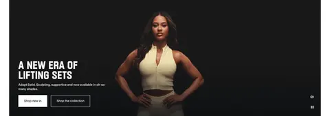
Wide video panel with a left-aligned Plaak Gymshark headline, short supporting copy, and adjacent filled and outlined rectangular CTAs.
Product carousel
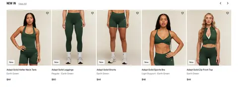
Horizontal product rail with a left-aligned heading, view-all link, carousel arrows, image-led cards, wishlist icons, and compact product details.
Editorial category grid
Four-column image-led tiles for popular categories, training types, and guides, with short titles and selected descriptions below.
Footer navigation
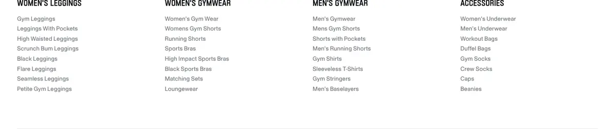
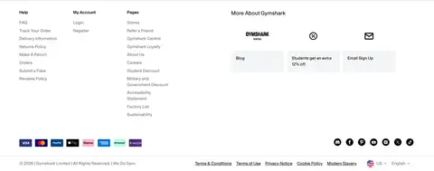
Compact multi-column help, account, and page links, followed by brand, signup, payment, social, and policy details.
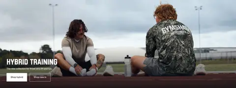
Imagery · Use real workout and apparel photography as the primary expressive layer: campaign video heroes, full-length model product images, and editorial training or lifestyle tiles. Frame products clearly against light, muted studio backgrounds, while campaign footage can use darker settings and natural outdoor scenes. Let photography retain its natural colours; avoid decorative illustration or 3D effects.
Keep the page canvas white and the interface palette restrained.
Use Training Ink for primary text and strong visual anchors.
Reserve condensed display type for prominent campaign statements.
Give campaign photography room to dominate its section.
Keep product names, prices, and supporting labels compact and scannable.
Use square-edged buttons and fine neutral borders.
✕ 不该做
Do not introduce unmeasured bright accent colours into the interface.
Do not add rounded, pill-shaped buttons where the page uses square corners.
Do not decorate product cards with heavy shadows.
Do not let long copy compete with campaign imagery.
Do not make the header visually louder than the hero.
Do not replace real apparel photography with illustration or 3D mockups.
给 AI 的提示词
想快速出一个同风格的新页面,把这段话连同 DESIGN.md 一起发给 AI。
Build a new Gymshark-style commerce page with a white Gallery White (#ffffff) canvas and restrained Training Ink (#0d1012) typography. Use Cool Alloy (#dee0e3) for card surfaces and hairlines, Muted Steel (#767a7f) for secondary labels, and Soft Mist (#f4f5f6) only as a quiet supporting surface. Set interface copy in SN Skandia or a close sans-serif substitute; use a bold condensed display face for campaign headlines. Structure the page with a slim announcement, clear utility header, wide image or video hero, and scannable product rails. Follow with editorial image grids, category discovery, compact informational copy, and a multi-column footer. Keep corners square, elevation minimal, and photography natural, human, and prominent. Use direct shopping labels and preserve generous separation between major sections.