North star · Make complex security products feel approachable through bright teal imagery, clear benefit-led hierarchy, and consistently rounded modules.
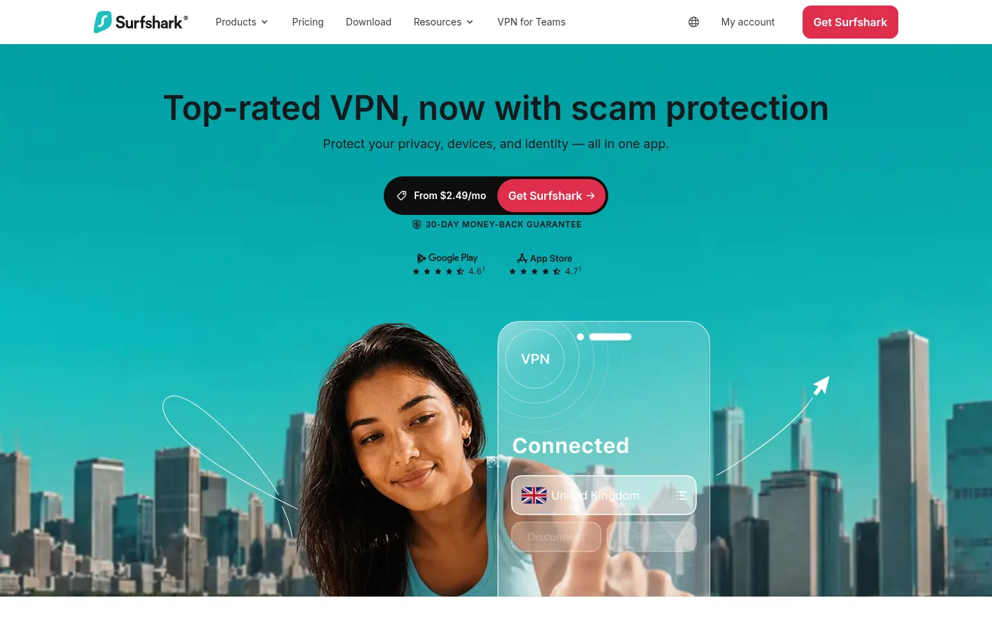
The page opens with a white navigation bar above a full-bleed teal hero, where dark centered headline text sits over lifestyle photography and a VPN interface visual. Coral-red buttons provide the clearest action contrast; black and charcoal text keep the content legible without competing with the imagery. Below, white and pale-gray section bands alternate to separate security topics, using rounded cards with compact explanations and photographic panels. Inter is used throughout, with strong, centered section headings and relatively small body copy that supports scanning. The layout stays centered within a measured 1200px maximum width, while the hero image spans the viewport. Spacious section breaks balance dense information, and card grids vary their columns to give larger feature stories room. Trust badges, statistics, customer reviews, and a dark footer extend the page from product explanation to reassurance.
配色
点色块复制色值。用途说明来自对页面的实测位置(背景、文字、描边、按钮)与截图判读。
品牌色
强调色
表层色
中性色
页面底色 · Gallery White表层 · Mist Gray表层 2 · Deep Ink表层 3 · Night Charcoal表层 4 · Blackout主文字 · Deep Ink次要文字 · Slate Copy弱文字 · Graphite描边 · Graphite强调 · Coral Signal强调 2 · Surf Teal强调 3 · Bright Current
Use a centered content area with a measured maximum width of 1200px, but let the hero photography run full bleed. Center the hero copy and section introductions; below, arrange feature cards in mixed-column grids and image-and-copy splits. Alternate white and pale-gray section bands for clear topic changes. The measured spacing system is based on an 8px unit, with a 64px section gap and 16px element gap. Keep card content comfortable and scannable rather than tightly packed.
圆角与层次
按钮 · 9999px
卡片 · 24px
图片 · 50%
导航 · 50%
链接 · 24px
没有测到阴影:页面是扁平的,层次靠底色和描边区分。
The design is largely flat: measured styles show no shadows. Separate cards through pale-gray fills, rounded corners, photography, and generous white space rather than raised effects. Dark CTA strips and footer surfaces create contrast through color blocking; use fine outlines selectively for secondary controls and links.
组件
下面的预览按实测的按钮、输入框、徽标、卡片样式重建(字体用替代字体)。
Header navigation
A white horizontal header with Surfshark branding, compact product and resource links, account controls, a language icon, and a coral primary CTA.
Hero offer
Full-bleed teal media beneath centered dark headline and supporting copy, followed by a dark pill-shaped offer control containing a coral Get Surfshark button.
Feature cards
Rounded pale-gray cards pair concise security benefit copy with photographic media; use 24px card radii and vary card proportions by content.
Trust statistics
Teal rounded blocks highlight adoption and recognition figures with white type, set beside concise reassurance content.
Dark CTA strip
Near-black, rounded promotional band pairs a short benefit statement with a coral pill CTA and compact money-back reassurance.
Review cards
White testimonial panels combine publisher or user identifiers, short review text, and ratings or platform marks on a pale-gray section.
Footer
A deep-charcoal footer organizes compact link columns, legal copy, platform icons, and subdued secondary text.
Imagery · Use polished lifestyle photography showing people using phones, laptops, and connected devices, alongside product-interface overlays that communicate VPN status or protection alerts. The hero is a full-width teal scene with a city backdrop and a person paired with a translucent app panel. Crop photos into rounded card panels; keep interface graphics and trust marks subordinate to the human subjects.
Use #02a0a2 as the signature teal for hero and selected feature media.
Reserve #de2e4c for prominent conversion actions.
Keep main content centered within the measured 1200px maximum width.
Alternate white and #f5f5f6 section bands to distinguish topics.
Use rounded cards and pill-shaped primary buttons.
Make product benefits easy to scan with short headings and compact copy.
✕ 不该做
Do not add unmeasured colors, spacing values, or radius values.
Do not use heavy drop shadows to create hierarchy.
Do not let decorative gradients overpower content or product photography.
Do not make every section a uniform card grid; preserve mixed layouts.
Do not use coral as a large background field.
Do not crowd the hero headline, offer, or trust details.
给 AI 的提示词
想快速出一个同风格的新页面,把这段话连同 DESIGN.md 一起发给 AI。
Build a new Surfshark-style cybersecurity page using Inter and a clean, consumer-friendly hierarchy. Use Gallery White (#ffffff) for the main canvas, Mist Gray (#f5f5f6) for alternating sections and cards, Deep Ink (#16191c) for headings, and Surf Teal (#02a0a2) for signature media surfaces. Keep Coral Signal (#de2e4c) exclusive to primary actions. Center content within the measured 1200px maximum width, while allowing hero imagery to span the viewport. Create clear section breaks, rounded feature cards, mixed-column image-and-copy layouts, concise benefit-led copy, and a dark footer. Favor real lifestyle photography with restrained app-interface overlays. Avoid shadows and invented measurements; use the measured spacing and radius system.