HoneyBook 首页以鲜明的编辑式字体和明快亲和的配色呈现小企业管理软件。产品界面预览、创业者实景照片和清晰的转化路径贯穿首屏、功能介绍与定价内容。
North star · Pair warm editorial storytelling with vivid, unmistakable product surfaces, keeping every section spacious, approachable, and easy to act on.
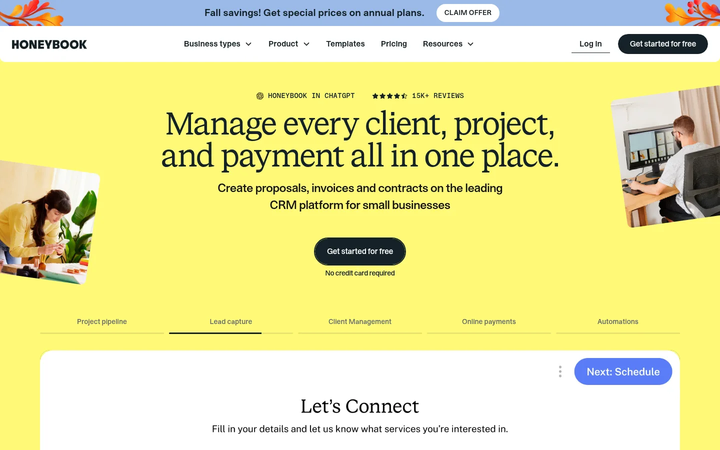
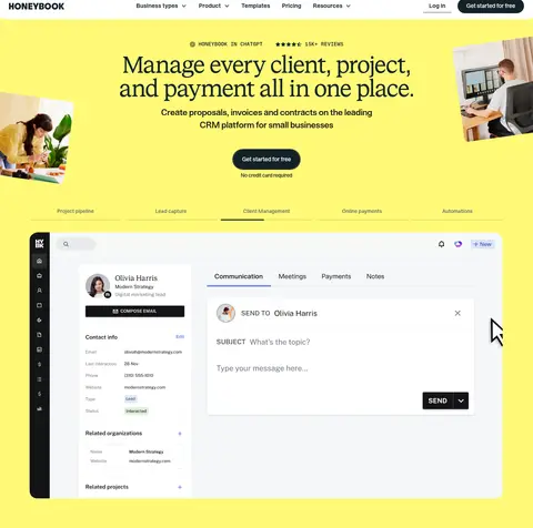
The visual identity balances a vivid lemon-yellow hero with calm white content areas and warm cream testimonial and product sections. Deep blue-black (#142127) anchors typography, navigation, buttons, and a full-width AI feature band; periwinkle and soft blue distinguish integrations and product accents, while mint appears in lower-page app promotion. Large centered serif headlines create an editorial voice, contrasted with compact sans-serif navigation, body copy, labels, and controls. The hero combines generous open space with cropped photographs and a broad product-interface preview. Further down, the layout alternates centered statements, two-column product stories, metric bands, image-led category cards, testimonials, integrations, editorial resources, and pricing. Rounded cards and pill CTAs keep the experience friendly. Fine borders separate controls and cards without making the page feel heavily elevated; most visual depth comes from photographs, interface mockups, and contrasting section colors.
配色 点色块复制色值。用途说明来自对页面的实测位置(背景、文字、描边、按钮)与截图判读。
品牌色
Deep Ink
#142127
Primary text, navigation, dark AI feature band, and high-contrast CTA fills.
Lemon Glow
#fffa77
Dominant hero and statistics-section background; creates the page’s signature bright opening.
强调色
Citrus Signal
#fffa56
Primary yellow CTA and selected promotional card or text accents.
Periwinkle Sky
#9ab9e8
Integrations section background and smaller navigational or section accents.
Powder Blue
#a8d0ef
Blue button and small product-interface accents.
Soft Mint
#99d3ac
Green app-promotion section background near the bottom of the page.
表层色
Gallery White
#ffffff
Main page canvas, content sections, testimonial cards, and product surfaces.
Warm Oat
#f4eae0
ChatGPT feature and customer testimonial section backgrounds.
中性色
Mist Border
#c7d5d9
Subtle outlines around controls, cards, and links.
Slate Edge
#343c40
Measured button-border color; use only for restrained control outlines.
Soft Graphite
#63696c
Secondary text measured in small amounts; use for subdued supporting copy.
Near Black
#131416
Minor text color from measured content, not a dominant surface or brand color.
功能色
Muted Gray
#7f7f7f
Appears in a measured section gradient; not a defining brand color in the screenshots.
文字 背景 对比度 WCAG #142127 Deep Ink#ffffff Gallery White16.45:1 AAA #142127 Deep Ink#f4eae0 Warm Oat13.86:1 AAA #142127 Deep Ink#9ab9e8 Periwinkle Sky8.21:1 AAA #ffffff Gallery White#f4eae0 Warm Oat1.19:1 不达标 #ffffff Gallery White#142127 Deep Ink16.45:1 AAA #ffffff Gallery White#9ab9e8 Periwinkle Sky2:1 不达标
字体 字号阶梯:Major Third(比例约 1.289,正文 18px)。示例用免费替代字体渲染,数值为实测。
Aa 设计
STK Bureau Sans 网络字体 · 字重 500 / 400 / 600 · 占比 88%
免费替代:DM Sans
Navigation, body copy, controls, captions, and most interface text.
Aa 设计
STK Bureau Serif 网络字体 · 字重 400 · 占比 11%
免费替代:DM Serif Display
Large editorial display and main section headlines.
Aa 设计
STK Gerhard 网络字体 · 字重 500 · 占比 2%
免费替代:Space Grotesk
Uppercase eyebrow labels.
角色 示例 字号 字重 行高 字距 特大标题 Oversized editorial statements and prominent hero-style headlines.
HoneyBook
64px 400 1 -0.031em 一级标题 Primary page headline and strongest section-level message.
HoneyBook
56px 400 1 -0.05em 二级标题 Major section headings, often centered over content.
HoneyBook
48px 400 1 -0.05em 三级标题 Feature, category, and testimonial-area headings.
HoneyBook
40px 400 1 -0.05em 四级标题 Smaller content or card headings in sans-serif.
HoneyBook
28px 400 1 -0.05em 正文 Supporting descriptions and product explanation copy.
The quick brown fox 敏捷的狐狸
18px 500 1.2 0 辅助文字 Compact helper text, card details, and secondary labels.
The quick brown fox 敏捷的狐狸
16px 500 1.2 -0.03em 按钮 Short CTA and interface control labels.
The quick brown fox 敏捷的狐狸
14px 500 1 0 导航 Header navigation links and menu labels.
The quick brown fox 敏捷的狐狸
16px 600 1.2 0 眉题 Small uppercase section identifiers above headings.
The quick brown fox 敏捷的狐狸
14px 500 1.2 0.071em
间距与布局 基准单位 8px · 密度:适中
80px 版块间距
16px 元素间距
20px 卡片内边距
1280px 内容最大宽度
1px
8px
11px
12px
16px
20px
24px
32px
40px
72px
80px
Use a wide, centered page frame with measured maximum width of 1280px. The homepage alternates full-width color bands with white content areas; inside them, use centered headline blocks, two-column feature splits, and multi-column cards. The opening hero is centered and generously open, with cropped photography at the sides and a large product preview below. Keep a comfortable density: the measured base spacing unit is 8px, with an 80px section gap and 16px element gap. Vary alignment by section rather than forcing every block into one template.
圆角与层次 没有测到阴影:页面是扁平的,层次靠底色和描边区分。
The measured system declares no shadows, and the screenshots read as largely flat. Create hierarchy with alternating full-width background colors, white cards, rounded corners, and fine Mist Border outlines. Product mockups and photos provide most visual depth; avoid strong drop shadows or stacked, floating surfaces.
组件 下面的预览按实测的按钮、输入框、徽标、卡片样式重建(字体用替代字体)。
Announcement strip A periwinkle top band carries a centered seasonal offer and compact white pill action above the main navigation.
Primary navigation White header with wordmark, centered category links, account access, and a dark rounded signup CTA.
Hero CTA Centered dark pill button on the lemon hero, supported by a short no-credit-card reassurance line.
Product preview Large rounded white UI mockup sits within the hero’s yellow field, introduced by compact workflow tabs.
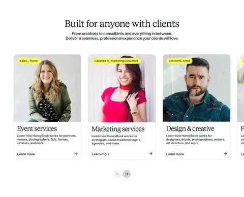
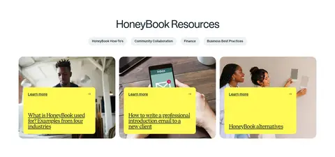
Feature cards Rounded white cards combine service photography, short category titles, concise explanations, and understated learn-more links.
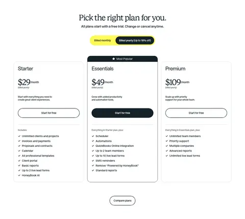
Pricing cards Three side-by-side white plan cards use clear price hierarchy, feature lists, outlined or dark pill actions, and a highlighted middle plan.
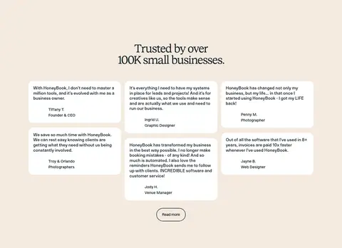
Testimonial cards Compact white quote cards sit in a loose multi-column arrangement on warm cream, with centered customer attribution.
Imagery · Use authentic small-business and client-facing service photography, cropped into rounded, editorial compositions. Pair photographs with large, recognizable product-interface screenshots and UI mockups rather than abstract illustration. Let hero images sit partially off-center around the headline; use cards and split layouts for later stories. Screenshots may include vivid interface colors, but the page’s brand palette should remain controlled by section backgrounds, text, and CTA surfaces.
页面版块 共 11 个版块,按页面从上到下排列,每个都标了类型、布局和交互套路。
该做与不该做 ✓ 该做 Use lemon yellow as a defining hero and metrics surface. Set major editorial headlines in a tightly tracked serif. Keep navigation, body copy, and controls in a clean sans-serif. Alternate white, cream, yellow, dark ink, and periwinkle section bands. Show real product UI alongside small-business photography. Use rounded cards and pill-shaped primary actions. Keep borders light and shadows minimal. ✕ 不该做 Do not replace the signature yellow hero with a generic gradient. Do not use serif typography for dense interface copy. Do not make every section a centered card grid. Do not add heavy shadows or thick outlines. Do not let colorful product mockups redefine the brand palette. Do not crowd the hero headline, imagery, or CTA. Do not turn the warm palette into an all-dark interface. 给 AI 的提示词 想快速出一个同风格的新页面,把这段话连同 DESIGN.md 一起发给 AI。
复制 Build a new HoneyBook-style SaaS page with an editorial, welcoming feel. Use Lemon Glow (#fffa77) for a standout hero or metric band, Deep Ink (#142127) for text and dark actions, Gallery White (#ffffff) for the main canvas, and Warm Oat (#f4eae0) for testimonial or feature sections. Reserve Periwinkle Sky (#9ab9e8), Powder Blue (#a8d0ef), and Soft Mint (#99d3ac) for selective accents and section bands. Use a tightly tracked serif for large headlines and a clean sans-serif for navigation, body, and controls. Build spacious full-width bands around a centered 1280px content frame, varying between centered statements, two-column feature stories, image-led cards, and practical pricing. Combine authentic small-business photography with crisp product-interface previews. Favor rounded cards, pill CTAs, subtle borders, and flat surfaces over shadows.
DESIGN.md Tailwind v4 CSS 变量 Design Tokens
---
title: "HoneyBook design system"
variant: extended
source: https://www.honeybook.com/
captured_at: 2026-10-12
theme: light
industry: saas
generator: Design DNA (https://four.wiralomi.com/style/honeybook-com)
ai_generated: true
ai_label: "本文件由 AI 辅助生成:数值取自公开网页的实测样式,命名、用途说明与建议为模型解读。商标归原所有者。 / AI-assisted content"
---
# HoneyBook · Design System
> Warm editorial storytelling for small-business software
**Theme:** light · **Industry:** saas · **Source:** https://www.honeybook.com/ · **Captured:** 2026-10-12 (1440×900 desktop)
_AI-assisted content: values are measured from the public page at capture time; names, roles and guidance are model-written interpretations. Trademarks belong to their owners._
HoneyBook’s homepage pairs expressive editorial typography with a bright, approachable SaaS palette. Product interface previews, small-business photography, and clear conversion paths carry the story from hero to pricing.
## North star
Pair warm editorial storytelling with vivid, unmistakable product surfaces, keeping every section spacious, approachable, and easy to act on.
## Overview
The visual identity balances a vivid lemon-yellow hero with calm white content areas and warm cream testimonial and product sections. Deep blue-black (## Colors
| Name | Hex | Token | Group | Role |
|---|---|---|---|---|
| Deep Ink | ` | `--color-deep-ink` | brand | Primary text, navigation, dark AI feature band, and high-contrast CTA fills. |
| Gallery White | ` | `--color-gallery-white` | surface | Main page canvas, content sections, testimonial cards, and product surfaces. |
| Muted Gray | ` | `--color-muted-gray` | semantic | Appears in a measured section gradient; not a defining brand color in the screenshots. |
| Lemon Glow | ` | `--color-lemon-glow` | brand | Dominant hero and statistics-section background; creates the page’s signature bright opening. |
| Warm Oat | ` | `--color-warm-oat` | surface | ChatGPT feature and customer testimonial section backgrounds. |
| Mist Border | ` | `--color-mist-border` | neutral | Subtle outlines around controls, cards, and links. |
| Citrus Signal | ` | `--color-citrus-signal` | accent | Primary yellow CTA and selected promotional card or text accents. |
| Periwinkle Sky | ` | `--color-periwinkle-sky` | accent | Integrations section background and smaller navigational or section accents. |
| Slate Edge | ` | `--color-slate-edge` | neutral | Measured button-border color; use only for restrained control outlines. |
| Powder Blue | ` | `--color-powder-blue` | accent | Blue button and small product-interface accents. |
| Soft Mint | ` | `--color-soft-mint` | accent | Green app-promotion section background near the bottom of the page. |
| Soft Graphite | ` | `--color-soft-graphite` | neutral | Secondary text measured in small amounts; use for subdued supporting copy. |
| Near Black | ` | `--color-near-black` | neutral | Minor text color from measured content, not a dominant surface or brand color. |
### Semantic aliases
`--color-canvas` → ` (Gallery White) · `--color-surface` → ` (Warm Oat) · `--color-surface-2` → ` (Deep Ink) · `--color-surface-3` → ` (Periwinkle Sky) · `--color-surface-4` → ` (Soft Mint) · `--color-text` → ` (Deep Ink) · `--color-text-muted` → ` (Gallery White) · `--color-border` → ` (Mist Border) · `--color-accent` → ` (Powder Blue) · `--color-accent-2` → ` (Periwinkle Sky) · `--color-accent-3` → ` (Soft Mint)
### Contrast (WCAG 2.x)
| Text | Background | Ratio | Level |
|---|---|---|---|
| ` | ` | 16.45:1 | AAA |
| ` | ` | 13.86:1 | AAA |
| ` | ` | 8.21:1 | AAA |
| ` | ` | 1.19:1 | fail |
| ` | ` | 16.45:1 | AAA |
| ` | ` | 2:1 | fail |
| ` | ` | 1.62:1 | fail |
| ` | ` | 1.37:1 | fail |
| ` | ` | 10.13:1 | AAA |
| ` | ` | 1.23:1 | fail |
### Gradients
- `linear-gradient(135deg, rgba(0, 0, 0, 0.5), rgba(0, 0, 0, 0))`
## Typography
| Family | Token | Source | Weights | Role | Free substitute |
|---|---|---|---|---|---|
| STK Bureau Sans | `--font-body` | webfont | 500, 400, 600 | Navigation, body copy, controls, captions, and most interface text. | DM Sans |
| STK Bureau Serif | `--font-display` | webfont | 400 | Large editorial display and main section headlines. | DM Serif Display |
| STK Gerhard | `--font-stk-gerhard` | webfont | 500 | Uppercase eyebrow labels. | Space Grotesk |
- **STK Bureau Sans:** Use measured medium and semibold weights for controls and navigation; keep body copy compact and untransformed.
- **STK Bureau Serif:** Regular weight, tight negative tracking, and short line lengths give headlines their distinctive editorial cadence.
- **STK Gerhard:** Use medium weight, uppercase treatment, and visibly expanded tracking for short category labels.
### Type scale — Major Third (ratio ≈ 1.289, base 18px)
| Role | Size | Weight | Line height | Letter spacing | Case | Family | Used for |
|---|---|---|---|---|---|---|---|
| display | 64px | 400 | 1 | -0.031em | — | STK Bureau Serif | Oversized editorial statements and prominent hero-style headlines. |
| h1 | 56px | 400 | 1 | -0.05em | — | STK Bureau Serif | Primary page headline and strongest section-level message. |
| h2 | 48px | 400 | 1 | -0.05em | — | STK Bureau Serif | Major section headings, often centered over content. |
| h3 | 40px | 400 | 1 | -0.05em | — | STK Bureau Serif | Feature, category, and testimonial-area headings. |
| h4 | 28px | 400 | 1 | -0.05em | — | STK Bureau Sans | Smaller content or card headings in sans-serif. |
| body | 18px | 500 | 1.2 | 0 | — | STK Bureau Sans | Supporting descriptions and product explanation copy. |
| caption | 16px | 500 | 1.2 | -0.03em | — | STK Bureau Sans | Compact helper text, card details, and secondary labels. |
| button | 14px | 500 | 1 | 0 | — | STK Bureau Sans | Short CTA and interface control labels. |
| nav | 16px | 600 | 1.2 | 0 | — | STK Bureau Sans | Header navigation links and menu labels. |
| eyebrow | 14px | 500 | 1.2 | 0.071em | uppercase | STK Gerhard | Small uppercase section identifiers above headings. |
## Spacing & layout
- Base unit **8px**, density **comfortable**.
- Scale (most used values): 1, 8, 11, 12, 16, 20, 24, 32, 40, 72, 80 px.
- Section rhythm 80px · element gap 16px · card padding 20px · max content width 1280px.
Use a wide, centered page frame with measured maximum width of 1280px. The homepage alternates full-width color bands with white content areas; inside them, use centered headline blocks, two-column feature splits, and multi-column cards. The opening hero is centered and generously open, with cropped photography at the sides and a large product preview below. Keep a comfortable density: the measured base spacing unit is 8px, with an 80px section gap and 16px element gap. Vary alignment by section rather than forcing every block into one template.
## Shape & elevation
- Radius: button `9999px` · card `20px` · media `50%` · nav `9999px` · link `10px` · xs `8px` · sm `10px` · md `20px` · pill `9999px`
- No box shadows measured: the page is flat.
- Motion: standard transition `0.22s ease` on interactive elements.
The measured system declares no shadows, and the screenshots read as largely flat. Create hierarchy with alternating full-width background colors, white cards, rounded corners, and fine Mist Border outlines. Product mockups and photos provide most visual depth; avoid strong drop shadows or stacked, floating surfaces.
## Imagery
Use authentic small-business and client-facing service photography, cropped into rounded, editorial compositions. Pair photographs with large, recognizable product-interface screenshots and UI mockups rather than abstract illustration. Let hero images sit partially off-center around the headline; use cards and split layouts for later stories. Screenshots may include vivid interface colors, but the page’s brand palette should remain controlled by section backgrounds, text, and CTA surfaces.
## Components
### Announcement strip
A periwinkle top band carries a centered seasonal offer and compact white pill action above the main navigation.
### Primary navigation
White header with wordmark, centered category links, account access, and a dark rounded signup CTA.
### Hero CTA
Centered dark pill button on the lemon hero, supported by a short no-credit-card reassurance line.
### Product preview
Large rounded white UI mockup sits within the hero’s yellow field, introduced by compact workflow tabs.
### Feature cards
Rounded white cards combine service photography, short category titles, concise explanations, and understated learn-more links.
### Pricing cards
Three side-by-side white plan cards use clear price hierarchy, feature lists, outlined or dark pill actions, and a highlighted middle plan.
### Testimonial cards
Compact white quote cards sit in a loose multi-column arrangement on warm cream, with centered customer attribution.
### Measured component styles
- **Primary button** (“Scheduler”): background ## Do
- Use lemon yellow as a defining hero and metrics surface.
- Set major editorial headlines in a tightly tracked serif.
- Keep navigation, body copy, and controls in a clean sans-serif.
- Alternate white, cream, yellow, dark ink, and periwinkle section bands.
- Show real product UI alongside small-business photography.
- Use rounded cards and pill-shaped primary actions.
- Keep borders light and shadows minimal.
## Don't
- Do not replace the signature yellow hero with a generic gradient.
- Do not use serif typography for dense interface copy.
- Do not make every section a centered card grid.
- Do not add heavy shadows or thick outlines.
- Do not let colorful product mockups redefine the brand palette.
- Do not crowd the hero headline, imagery, or CTA.
- Do not turn the warm palette into an all-dark interface.
## Agent prompt
Build a new HoneyBook-style SaaS page with an editorial, welcoming feel. Use Lemon Glow (## Page sections (top to bottom)
| # | Type | Layout | UX patterns | UI patterns |
|---|---|---|---|---|
| 1 | hero | Centered headline and CTA on yellow, framed by side photography and a wide product preview. | primary signup CTA, workflow tabs, social proof | lemon background, editorial serif headline, rounded UI preview |
| 2 | feature-split | Two columns pair a lifestyle image with a concise ChatGPT feature explanation. | feature explanation, try-it CTA | warm cream band, rounded photo, serif heading |
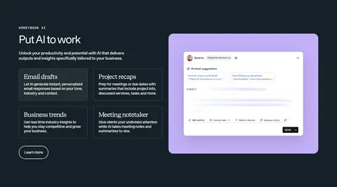
| 3 | feature-split | Text and four feature cards on the left, large software preview on the right. | feature exploration, learn-more action | dark full-width band, light text, rounded preview |
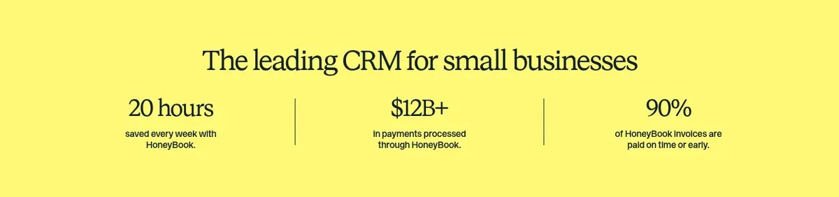
| 4 | stats | Centered statement above three evenly divided metric columns. | key metrics, proof of value | yellow band, vertical dividers, large serif figures |
| 5 | product-grid | Centered introduction above a horizontal row of image-led service category cards. | browse business types, learn-more links, carousel controls | white canvas, photo cards, rounded corners |
| 6 | testimonials | Centered heading above a loose multi-column arrangement of quote cards. | customer proof, read-more action | warm cream background, white quote cards, compact attribution |
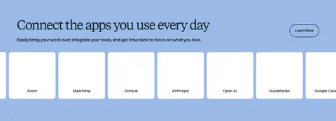
| 7 | integrations | Periwinkle full-width section with introductory text and a horizontal row of app tiles. | discover integrations, horizontal logo browsing | blue section band, white logo cards, rounded action |
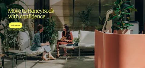
| 8 | cta | Full-bleed photographic campaign panel between integrations and resources. | start-free CTA, conversion reassurance | edge-to-edge photo, darkened image treatment, bright action button |
| 9 | content-feed | Centered resource heading and category links above three editorial image cards. | browse topics, learn-more links | white canvas, image-backed cards, yellow text panels |
| 10 | pricing | Billing selector above three aligned pricing cards and a centered comparison action. | monthly/yearly toggle, plan selection, compare plans | white cards, highlighted middle tier, pill CTAs |
| 11 | feature-split | Two-column app promotion with phone imagery opposite heading and supporting copy. | mobile app promotion, platform download links | mint section band, phone mockup, serif headline |
## Source CSS custom properties (selected)
```css
--global-style-guide-component-library_colors---link-color--link-primary: