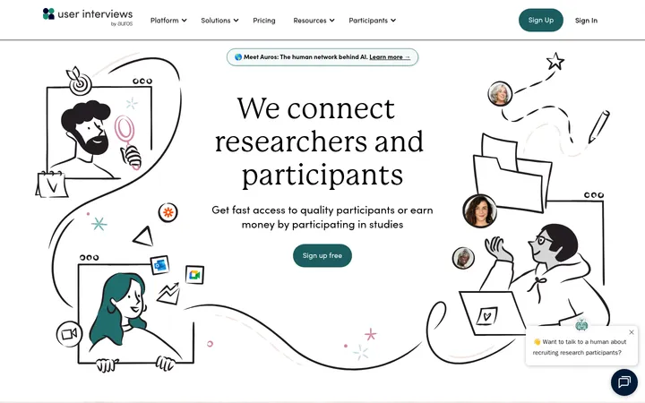
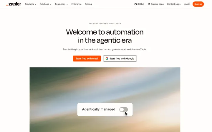
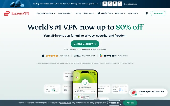
North star · Let warm editorial typography and generous breathing room make human community the focus, using dark CTAs as clear anchors.
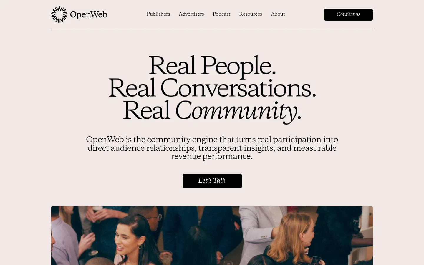
The page is grounded in a pale, warm canvas (#f1e9e7), with subtly differentiated off-white panels and near-black text creating contrast without a stark white-and-black feel. Copernicus serif typography defines the identity: oversized centered headlines establish an editorial voice, while smaller serif copy carries the narrative through feature sections and testimonials. DM Sans appears sparingly in lighter supporting roles. The layout is spacious and centered within a measured 1092px maximum content width, alternating broad text-led areas with grids, split product sections, and a restrained logo row. Photography of people and community activity gives the otherwise quiet page human texture; product imagery sits alongside explanatory copy rather than dominating the canvas. Black CTAs remain visually decisive, while blue marks selected links. Cards use pale fills and subtle rounding, with fine dark rules organizing navigation, testimonials, and article cards. The bright magenta measured border color is incidental noise, not a defining page treatment.
Display and editorial type across hero headlines, section headings, body copy, navigation, links, and CTAs.
Aa 设计
DM Sans
网络字体 · 字重 300 / 400 · 占比 12%
免费替代:DM Sans
Small supporting captions and lighter secondary labels.
角色
示例
字号
字重
行高
字距
特大标题
Large editorial hero headline and other prominent display statements.
OpenWeb
80px
400
1.05
-0.063em
一级标题
Primary page headline, centered and broken into expressive lines.
OpenWeb
78px
400
0.97
-0.064em
二级标题
Major section headings, including system, contact, and editorial introductions.
OpenWeb
42px
400
1.05
-0.06em
三级标题
Feature and subsection headings within product and information blocks.
OpenWeb
36px
400
1.1
-0.069em
四级标题
Smaller card and supporting section headings.
OpenWeb
30px
400
1.17
-0.047em
正文
Main explanatory paragraphs and narrative copy.
The quick brown fox 敏捷的狐狸
18px
400
normal
-0.01em
辅助文字
Small supporting labels, metadata, and secondary copy.
The quick brown fox 敏捷的狐狸
16px
300
1.1
-0.019em
导航
Header navigation and compact menu labels.
The quick brown fox 敏捷的狐狸
15px
400
normal
-0.012em
链接
Inline calls to action and publisher feature links.
The quick brown fox 敏捷的狐狸
18px
400
normal
-0.01em
间距与布局
基准单位 2px · 密度:宽松
120px版块间距
14px元素间距
35px卡片内边距
1092px内容最大宽度
3px
4px
6px
8px
9px
10px
12px
14px
18px
20px
21px
22px
24px
30px
31px
32px
Use a centered content frame with a measured maximum width of 1092px and generous outer margins. The page is spacious and primarily single-column, with centered hero and section introductions leading into two- and three-column feature, statistic, testimonial, and article arrangements. Alternate these with side-by-side product or contact layouts. Preserve the long-form scroll rhythm: sections have substantial separation, while related card content stays grouped. Use centered alignment for brand statements and grids; switch to left alignment for practical copy and form content.
圆角与层次
按钮 · 5px
卡片 · 5px
链接 · 5px
sm · other
Favor flat surfaces over pronounced shadow. Separate content with pale tonal shifts, thin dark rules, and modest rounded card corners rather than floating layers. Cards sit directly on the warm canvas, while imagery and product screenshots provide most of the visual depth. Keep borders quiet and avoid treating the measured magenta as a standard divider.
组件
下面的预览按实测的按钮、输入框、徽标、卡片样式重建(字体用替代字体)。
Header navigation
Place the OpenWeb mark and serif navigation on the warm canvas, separated from the page by a thin dark horizontal rule; finish with a compact black Contact us button.
Hero
Center a large, tightly tracked Copernicus headline, supporting paragraph, and black Let’s Talk CTA above a wide community image or video.
Proof-point cards
Show three concise metrics in a row of pale #f8f4f3 cards, each with a prominent number and smaller explanatory label.
Process panel
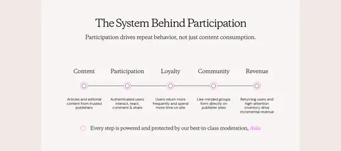
Present the participation journey inside a light panel, with a centered heading, short introduction, and a horizontally connected sequence of stages.
Publisher feature cards
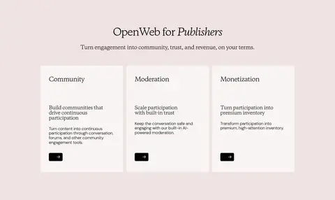
Use three evenly arranged pale cards with serif headings, short descriptive copy, and small black arrow buttons.
Testimonial columns
Set customer quotations in editorial columns with a thin dark rule, recognizable publication mark, and compact speaker attribution.
Contact form
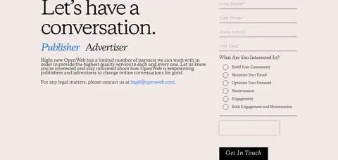
Pair a large serif invitation and audience selector with a straightforward form using understated underline-style inputs and a black submission CTA.
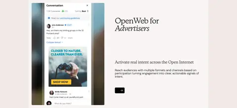
Imagery · Use genuine-looking photography of people talking, attending events, or participating in online communities. The hero uses a wide, rounded-corner video/photo area below the text-led introduction; later product imagery pairs a visible interface or campaign example with concise copy. Keep photos naturally colored rather than heavily stylized, and use image cards with restrained framing. Small logos and portraits support proof points and testimonials without competing with the editorial typography.
Keep the warm canvas as the dominant page surface.
Use Copernicus-style serif typography for the editorial voice.
Give major headings room to breathe and allow expressive line breaks.
Use black buttons for clear, high-contrast calls to action.
Reserve Signal Blue for selected links and small accents.
Use real community imagery to humanize the product story.
✕ 不该做
Do not replace the warm palette with stark white backgrounds.
Do not use magenta as a dominant brand accent.
Do not crowd sections or compress the generous vertical rhythm.
Do not make every section a card or add heavy drop shadows.
Do not let product screenshots overpower the people-focused story.
Do not use generic sans-serif styling for the main display headlines.
给 AI 的提示词
想快速出一个同风格的新页面,把这段话连同 DESIGN.md 一起发给 AI。
Build a new OpenWeb-style page as an editorial SaaS experience for community and media products. Use Warm Canvas (#f1e9e7) as the main background, Editorial Ink (#000000) for text and primary CTAs, and Soft Porcelain (#f8f4f3) for selected cards. Keep Blush Band (#efe3e1) and Muted Clay (#e8dcd6) as subtle surface variations; use Signal Blue (#0058fe) only for selective links. Choose a Copernicus-like serif for display, headings, navigation, and body copy, with restrained DM Sans-style captions. Center the main content within the measured 1092px maximum width. Create an oversized, line-broken hero, spacious section transitions, and a mix of editorial text, human community photography, simple grids, product splits, and testimonials. Favor thin rules and flat panels over shadows. Treat #ff3cfe as measurement noise, not a visual motif.