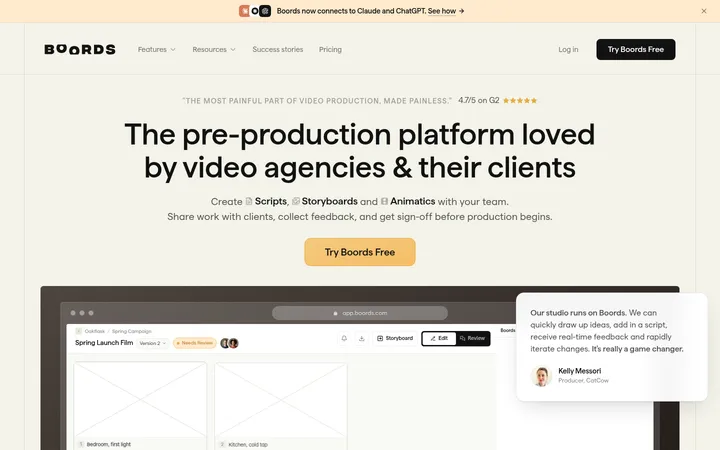
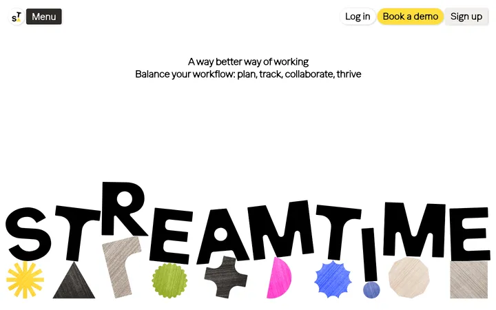
North star · Let warm neutral space and decisive black type lead, then use vivid blue, yellow, and rounded media panels as deliberate focal points.
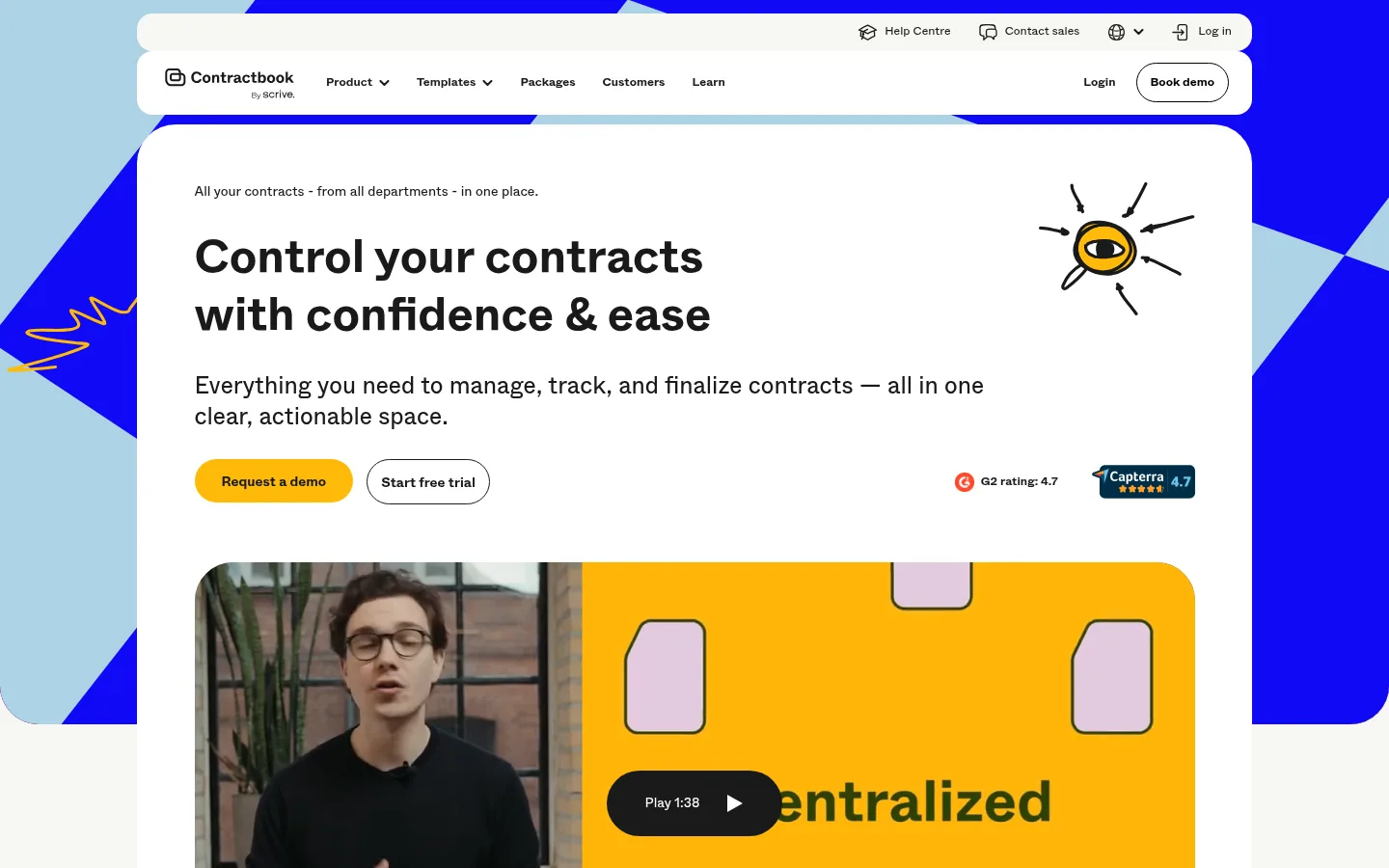
Contractbook builds a calm, spacious canvas from warm off-white #f7f7f3, with large white panels that separate content without heavy outlines. Near-black #1a1a1a carries navigation, headings, and much of the interface text; pure black is also measured in text and card content. Strong electric blue #1009f6 and sunny yellow #ffba09 create the page’s most recognizable contrast, appearing in the graphic backdrop, CTA buttons, and testimonial or feature panels. Pale blue and small green or lilac touches appear as supporting blocks and illustration details, rather than competing with the core palette. Abcwhyte is used throughout: bold, large, left-aligned headlines anchor sections, while compact navigation, captions, and body copy keep information legible. The layout favors a centered, constrained content area, generous section gaps, rounded cards, and broad two-column compositions. Product footage, customer portraits, logos, and playful hand-drawn motifs bring warmth to the otherwise restrained software interface.
Major section headlines and prominent customer-story statements.
Contractbook
32px
700
1.3
0
三级标题
Feature and content subsection headings.
Contractbook
31.5px
700
1.3
0
四级标题
Smaller feature or supporting card headings.
Contractbook
28px
700
1.3
0
正文
Hero description, feature explanations, and general paragraph copy.
The quick brown fox 敏捷的狐狸
16px
400
1.5
0
辅助文字
Compact supporting notes and form or media details.
The quick brown fox 敏捷的狐狸
14px
400
1.4
0
按钮
Bold labels on primary and outlined CTA buttons.
The quick brown fox 敏捷的狐狸
14px
700
1
0
导航
Compact bold labels in the primary site navigation.
The quick brown fox 敏捷的狐狸
12.5px
700
1
0
链接
Small inline and footer links.
The quick brown fox 敏捷的狐狸
12.5px
400
1.5
0
间距与布局
基准单位 2px · 密度:宽松
96px版块间距
14px元素间距
48px卡片内边距
1156px内容最大宽度
5px
6px
7px
9px
11px
12px
14px
16px
18px
21px
22px
24px
28px
42px
48px
56px
Use a centered content column with a measured maximum width of 1156px, generous 96px section rhythm, and a spacious overall density. The hero and many feature sections use two-column compositions; center selected section headings and testimonials. Keep the warm canvas visible around large rounded white panels. The footer switches to a dark, multi-column link layout. Preserve broad whitespace between content groups rather than compressing the long page into dense rows.
圆角与层次
按钮 · 9999px
输入框 · 4px
卡片 · 24px
图片 · 50%
徽标 · 11px
导航 · 9999px
链接 · 24px
hairline · other
The interface is primarily flat: large white and pale-gray panels sit directly on the warm canvas, with contrast and corner rounding defining their edges. A subtle measured hairline shadow appears only as a minor detail. Avoid strong drop shadows; dark borders are more characteristic on outlined pill buttons and navigation controls.
组件
下面的预览按实测的按钮、输入框、徽标、卡片样式重建(字体用替代字体)。
Pill CTA buttons
Rounded pill actions include a yellow #ffba09 demo button with dark text, an outlined dark-text trial button, and a blue #1009f6 demo CTA with white text.
Rounded content cards
Large cards use 24px corners and generous 48px padding; white and #f0f0ec surfaces support testimonials and feature content.
Form fields
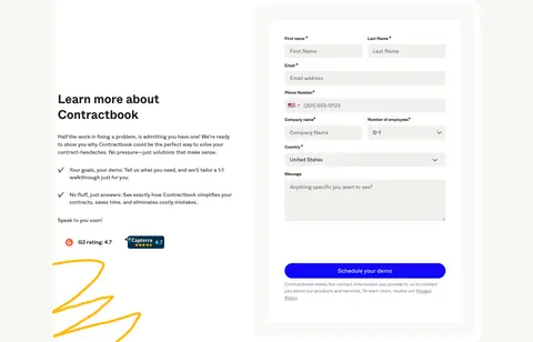
Inputs use #f0f0ec fills, dark text, and small roughly 4px corners, contrasting with the larger rounded form container.
Navigation pills
Compact bold navigation sits in rounded white bars; key actions are presented as a pill-shaped outlined or filled button.
Media panels
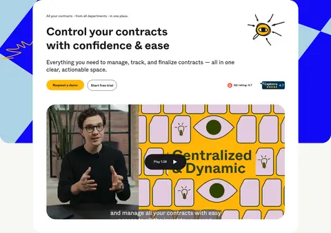
Video and imagery sit in rounded frames within split layouts, with small play controls over the footage.
Testimonial cards
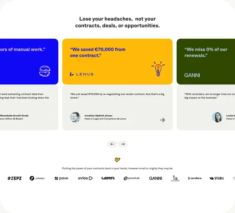
Customer quotes use muted, blue, or green card surfaces, with customer identity and compact supporting details.
Dark footer
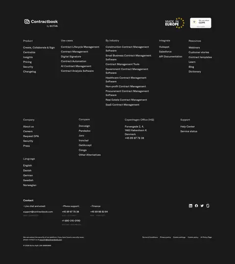
A full-width #1a1a1a footer groups numerous small, subdued links into multiple columns.
Imagery · Mix customer and spokesperson video stills with product-related visuals, customer portraits, and a logo strip. Use rounded media frames inside larger rounded panels. Hand-drawn eye, doodle, and line accents add an informal editorial quality. Bright illustrated yellow and blue surfaces can be vivid, but should remain contained within feature or media compositions rather than replacing the calm page canvas.
Set headings in bold Abcwhyte or a close sans-serif substitute.
Reserve #1009f6 and #ffba09 for decisive focal points.
Use generous whitespace between major sections.
Group content in large rounded cards and panels.
Keep forms and dense footer links visually quieter.
✕ 不该做
Do not make the entire page a saturated color field.
Do not use heavy shadows to separate every card.
Do not crowd the hero with dense copy or controls.
Do not treat illustration-only colors as core brand colors.
Do not replace the rounded CTA style with square buttons.
Do not use multiple competing display typefaces.
给 AI 的提示词
想快速出一个同风格的新页面,把这段话连同 DESIGN.md 一起发给 AI。
Build a new Contractbook-style SaaS page with Abcwhyte or Inter, using bold, clear headlines and compact, legible supporting text. Use Warm Canvas #f7f7f3 for the main background and Soft Ink #1a1a1a for navigation and headings. Create spacious centered content within a measured 1156px maximum width, using two-column feature layouts and broad section gaps. Make Paper White #ffffff and Misted Stone #f0f0ec rounded cards the main content containers. Use Electric Blue #1009f6 and Signal Yellow #ffba09 sparingly for strong CTA and feature-panel accents; Sky Panel #add3e5 can soften a blue feature area. Add rounded video or customer media, restrained hand-drawn details, and a logo strip. Keep elevation mostly flat, with pill buttons, subtle borders, and a dark multi-column footer.