North star · Keep the interface warm and spacious, and let real people and practical product evidence lead before adding visual decoration.
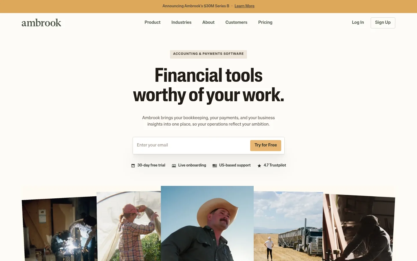
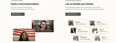
The page is built on a warm off-white canvas (#fdfbf7), with a measured, restrained palette that lets documentary imagery carry much of the colour. A muted golden accent (#e8b672) marks the announcement strip, primary signup buttons, and small calls to action; deep evergreen (#252a23) creates a deliberate contrast for the product story, timeline, final signup, and footer. Typography combines Lateral Display’s compact, weighty headlines with Lateral’s clear sans-serif body and interface text. Headings are centered in the introductory and transition sections, then align with product cards and feature copy as the page becomes more functional. Wide margins and generous vertical pauses separate long sections; content sits within a broad measured page width, with compact grids used for industries, resources, and footer links. Photos show farmers, ranchers, customers, and staff in real settings. Product screens and restrained line illustrations add evidence without displacing the human focus.
配色
点色块复制色值。用途说明来自对页面的实测位置(背景、文字、描边、按钮)与截图判读。
品牌色
强调色
表层色
中性色
功能色
页面底色 · Field Paper表层 · Deep Evergreen表层 2 · Oat Linen主文字 · Weathered Umber次要文字 · Field Paper弱文字 · Deep Evergreen描边 · Linen Rule强调 · Harvest Gold强调 2 · Soft Marigold
Primary sans-serif for body copy, navigation, buttons, captions, links, and eyebrow labels.
Aa 设计
Lateral Narrow
网络字体 · 字重 500 / 400 · 占比 14%
免费替代:Roboto Condensed
Narrow display treatment for selected section headings and compact headline layouts.
Aa 设计
Lateral Display
网络字体 · 字重 400 / 500 / 700 · 占比 8%
免费替代:DM Sans
Primary display face for the hero and major section headings.
角色
示例
字号
字重
行高
字距
特大标题
Largest emphasis headlines and high-impact display moments.
Ambrook
67.5px
700
1
-0.011em
一级标题
Hero headline and primary page-level message.
Ambrook
52.5px
400
1.14
-0.011em
二级标题
Major section headings and centered transitions.
Ambrook
37.5px
500
1.1
0
三级标题
Feature headings, product-story titles, and prominent card headings.
Ambrook
34px
500
1.4
-0.009em
四级标题
Smaller feature headings and nested content titles.
Ambrook
30px
500
1.4
-0.01em
正文
Main explanatory copy, card descriptions, and customer story text.
The quick brown fox 敏捷的狐狸
15px
400
1.5
0
辅助文字
Small supporting labels and image or customer captions.
The quick brown fox 敏捷的狐狸
13px
400
1.5
0
按钮
Primary and secondary action labels.
The quick brown fox 敏捷的狐狸
15px
500
1.5
0
导航
Main navigation links and menu labels.
The quick brown fox 敏捷的狐狸
15px
500
1.5
0
链接
Compact inline calls to action such as story and resource links.
The quick brown fox 敏捷的狐狸
13px
500
1.71
0
眉题
Uppercase section labels above headings.
The quick brown fox 敏捷的狐狸
13px
500
1.6
0.1em
间距与布局
基准单位 2px · 密度:适中
90px版块间距
8px元素间距
—卡片内边距
1290px内容最大宽度
2px
4px
8px
11px
15px
23px
30px
38px
45px
60px
113px
The measured page max width is 1290px, with a comfortable density and generous section spacing. The hero centers its headline, copy, and signup form above a broad photographic collage; the following sections alternate centered introductions with compact multi-column content. Product features use larger split or card-like layouts, while customer and resource areas use grids. The long dark product section groups content vertically, then places a light rounded setup panel within it. Preserve generous whitespace between blocks and align repeated content to consistent page edges.
圆角与层次
按钮 · 4px
输入框 · 4px
卡片 · 8px
导航 · 4px
链接 · 4px
xl · other
The design is mostly flat, using section colour changes, whitespace, and hairline borders rather than strong shadows. Cards are defined by softly contrasting Oat Linen surfaces and rounded corners. Product and testimonial media may layer over backgrounds, while inputs use restrained edges and the measured subtle shadow treatment is not a defining visual feature.
组件
下面的预览按实测的按钮、输入框、徽标、卡片样式重建(字体用替代字体)。
Signup form
A wide email input and Harvest Gold CTA sit together in a restrained outlined field; supporting trial, onboarding, and trust details form a compact row beneath.
Primary CTA
Use Harvest Gold (#e8b672) with Deep Evergreen (#252a23) text, medium Lateral weight, and the measured small rounded button treatment.
Industry category grid
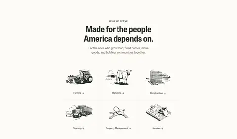
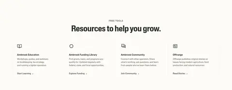
A compact multi-column set of hand-drawn line illustrations with short category labels and simple text links on Field Paper.
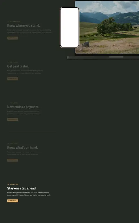
Product feature panels
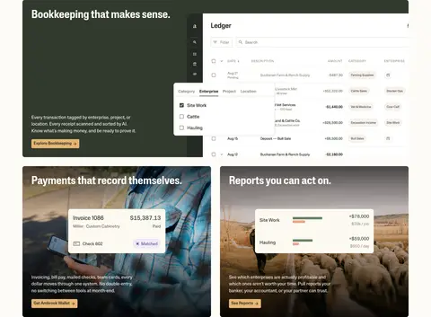
Combine concise feature copy and screenshots or contextual photography; alternate light and dark treatments, using Deep Evergreen for the main product-story band.
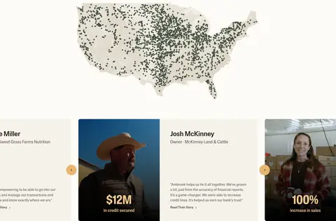
Customer story cards
Pair real customer imagery and short testimonial copy with Oat Linen surfaces, simple metrics, and understated story links.
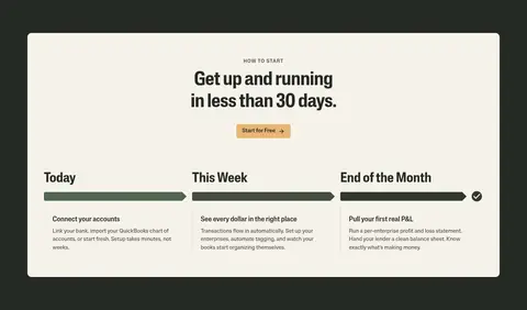
Setup timeline
Place a light rounded panel inside the dark section; present three progress stages in a horizontal row with green progress bars and short instructions.
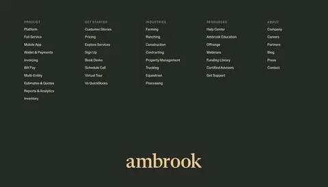
Footer link columns
Use a Deep Evergreen background, compact uppercase column labels, grouped text links, and the brand wordmark as a strong closing element.
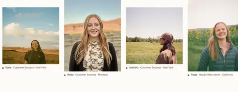
Imagery · Documentary photography of farmers, ranchers, customers, and support staff is central: wide hero portraits, customer stories, and staff imagery feel candid and place-specific. Product UI screenshots sit alongside feature copy and remain legible against contrasting panels. Hand-drawn industry illustrations appear as a supporting category-navigation device. Keep photos natural, with minimal graphic treatment; use overlays only where text must sit on media.
Reserve Harvest Gold (#e8b672) for clear actions and small emphasis.
Use Deep Evergreen (#252a23) for deliberate full-width contrast bands.
Let documentary customer and industry photography feel natural.
Pair major headings with generous whitespace and restrained copy.
Use thin rules and surface contrast instead of heavy card shadows.
✕ 不该做
Do not replace the warm canvas with stark white across the page.
Do not turn every section into a dark panel.
Do not add saturated colours outside the measured palette.
Do not crowd the hero or collapse the long section rhythm.
Do not make product screenshots more prominent than their explanation.
Do not apply decorative gradients as general page backgrounds.
给 AI 的提示词
想快速出一个同风格的新页面,把这段话连同 DESIGN.md 一起发给 AI。
Build a new Ambrook-style SaaS page with a warm, editorial agricultural-finance character. Use Field Paper (#fdfbf7) as the main canvas, Dark Soil (#211b15) or Weathered Umber (#60564c) for readable text, and Harvest Gold (#e8b672) for primary actions. Create one clear Deep Evergreen (#252a23) feature band for product evidence or a closing CTA, with Oat Linen (#f6f2eb) cards for contrast. Use a bold, tightly tracked display face for headings and a clean sans-serif for body and controls; keep eyebrow labels small, uppercase, and letter-spaced. Structure the page with a centered introduction, spacious feature blocks, real-world photography, and concise customer proof. Keep borders delicate, shadows quiet, and buttons modestly rounded. Follow measured widths and spacing only; do not invent unsupported token values.