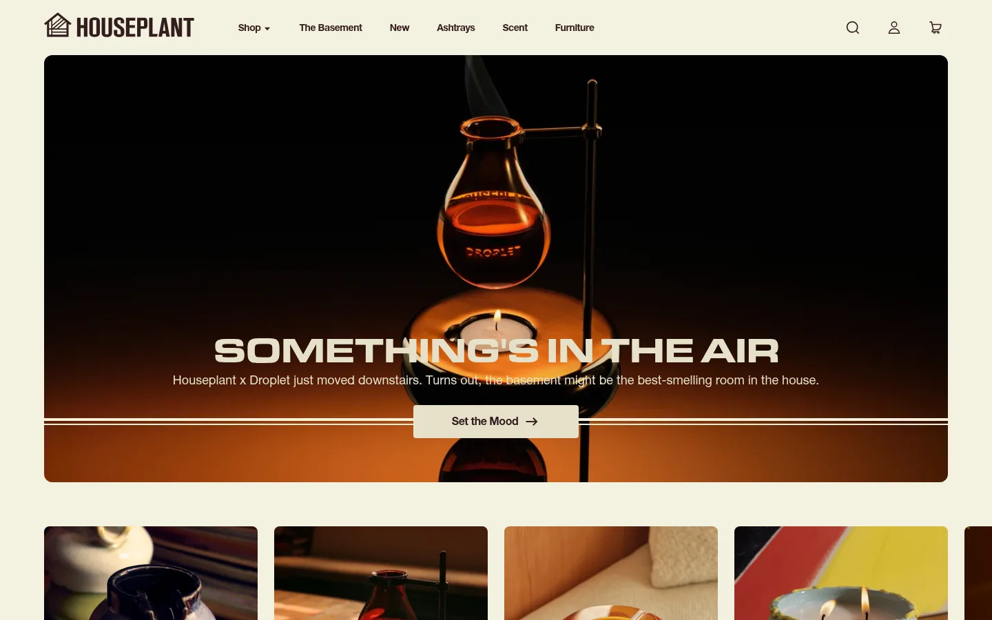
North star · Keep the warm cream-and-ink framework quiet and spacious so expressive product photography and bold editorial headlines lead.
The page is anchored by a creamy canvas (#f4f1e0) and dark, red-brown ink (#321e1e), with warm beige cards (#e5e0ca) supporting product discovery. Pale mint (#bbe7db) appears mainly as a fine divider or outlined accent, while the yellow highlight and saturated blue link are rare interface details rather than defining brand fields. Typography shifts from compact, confident sans-serif navigation and body copy to oversized condensed display lettering and occasional softer serif editorial moments. A wide, rounded hero image carries the strongest visual impact; subsequent category tiles, product photography, founder story, and collaboration cards form a varied but coherent sequence. The page uses comfortable whitespace and broad section breaks rather than dense decoration. Thin horizontal rules, subtle corners, and mostly flat surfaces keep the presentation tactile and calm, letting the rich, warm product photographs supply contrast and personality.
配色
点色块复制色值。用途说明来自对页面的实测位置(背景、文字、描边、按钮)与截图判读。
品牌色
强调色
表层色
中性色
功能色
页面底色 · Warm Porcelain表层 · Roasted Cocoa表层 2 · Oat Beige主文字 · Roasted Cocoa次要文字 · Oat Beige弱文字 · Warm Porcelain描边 · Pale Mint强调 · Link Blue
Primary navigation, body copy, buttons, links, and much of the headings.
Aa 设计
New Spirit
网络字体 · 字重 500 · 占比 8%
免费替代:DM Serif Display
Editorial headings and caption-style details.
Aa 设计
Houseplant
网络字体 · 字重 400 · 占比 2%
免费替代:Oswald
Brand display lettering and selected oversized section headlines.
角色
示例
字号
字重
行高
字距
特大标题
Large custom brand lettering and expressive display moments.
HOUSEPLANT
128px
400
0.9
-0.03em
一级标题
Oversized uppercase campaign headline over hero imagery.
HOUSEPLANT
51px
900
0.9
-0.05em
二级标题
Prominent section titles, including story and product areas.
HOUSEPLANT
50px
400
normal
0.012em
三级标题
Custom display heading for selected feature sections.
HOUSEPLANT
44px
400
1
0
四级标题
Editorial subheadings and supporting feature titles.
HOUSEPLANT
32px
500
1.25
-0.03em
正文
Product descriptions, explanatory copy, and supporting text.
The quick brown fox 敏捷的狐狸
14px
400
1.35
0
辅助文字
Small editorial notes, labels, and supporting details.
The quick brown fox 敏捷的狐狸
12px
500
1.8
-0.03em
按钮
Compact uppercase action labels and interface controls.
The quick brown fox 敏捷的狐狸
12px
600
1.2
0.2em
导航
Header navigation and primary shopping links.
The quick brown fox 敏捷的狐狸
14px
700
1.35
-0.03em
链接
Emphasized collection and collaboration links.
The quick brown fox 敏捷的狐狸
21px
700
1.25
-0.03em
眉题
Short uppercase section labels above a main heading.
The quick brown fox 敏捷的狐狸
12px
600
1.2
0.2em
间距与布局
基准单位 4px · 密度:适中
64px版块间距
8px元素间距
—卡片内边距
1312px内容最大宽度
1px
2px
3px
4px
6px
8px
9px
10px
12px
16px
24px
25px
40px
64px
A broad, centered desktop storefront uses a measured maximum content width of 1312px, with a compact header above a full-width, rounded hero. The page moves through a horizontal category rail, a two-column founder story, a four-column product grid, an image-led scent feature, and collaboration cards. Sections share a light canvas and are separated by generous measured 64px section gaps; inner elements use a comfortable rhythm. Most content aligns left, while campaign copy can center over imagery. The visual density stays moderate, with whitespace around product cards and clear transitions between content types.
圆角与层次
按钮 · 4px
卡片 · 8px
图片 · 8px
导航 · 4px
链接 · 4px
inset · other
inset · other
inset · link
hairline · button
The interface is largely flat, with little visible drop-shadow. Separation comes from the cream canvas, beige product surfaces, fine horizontal rules, and dark story or footer bands. Buttons, navigation, and cards use restrained rounded corners; measured inset outlines appear as subtle focus or interaction treatments rather than default card elevation.
组件
下面的预览按实测的按钮、输入框、徽标、卡片样式重建(字体用替代字体)。
Header navigation
Compact brand mark, shopping links, and utility icons sit in a single horizontal row on the warm canvas; navigation text is measured at 14px, bold.
Campaign hero
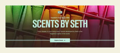
Wide, rounded photographic banner with centered uppercase display headline, a short supporting line, and a light action button crossing a fine horizontal rule.
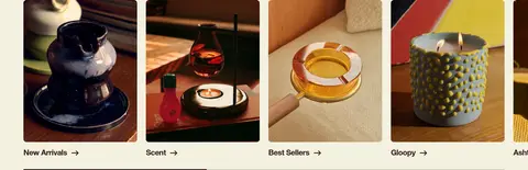
Category rail
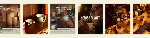
Side-by-side image tiles for shopping categories, each with a concise label and link treatment beneath the image.
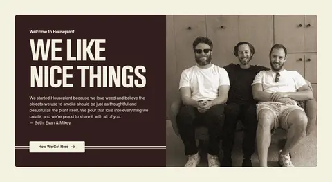
Founder story split
Two-column block pairs a dark cocoa text panel and large portrait; large condensed heading and light button create strong contrast.
Product cards
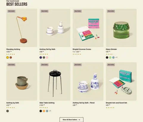
Four-column merchandise grid uses pale beige product surfaces, compact product information, rating details, and small Best Seller labels.
Collaboration cards
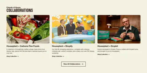
Three image-led partner cards combine photography, a bold linked title, concise copy, and a collection link.
Footer and newsletter
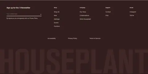
Dark cocoa footer gathers an email signup, grouped shopping and company links, social links, and oversized low-contrast brand lettering.
Imagery · Photography is central: cinematic hero imagery, lifestyle scenes, founder portraits, colorful scent visuals, and close product still lifes. Images are typically large and cleanly framed, with rounded corners on hero and card media. Product photography often sits on a pale background, while campaign imagery can be dark, saturated, or warmly lit. The images—not decorative illustration—provide most of the page’s texture and color variation.
Let product and lifestyle photography carry the strongest color.
Keep display lettering large, bold, and confined to headline moments.
Separate major sections with generous whitespace and fine rules.
Use rounded corners selectively on media, cards, and controls.
✕ 不该做
Do not introduce a new dominant color beyond the measured palette.
Do not turn rare blue or yellow accents into primary brand fields.
Do not make the page feel dense with stacked borders and shadows.
Do not use the display typeface for long body copy.
Do not force every section into the same centered layout.
Do not treat colors inside campaign photography as interface colors.
给 AI 的提示词
想快速出一个同风格的新页面,把这段话连同 DESIGN.md 一起发给 AI。
Build a new HOUSEPLANT-style storefront page with a warm, editorial retail feel. Use Warm Porcelain (#f4f1e0) for the main canvas and Roasted Cocoa (#321e1e) for text, navigation, dark story panels, and footer areas. Use Oat Beige (#e5e0ca) for product surfaces; reserve Pale Mint (#bbe7db) for fine rules or occasional details. Butter Highlight (#faeaa1) and Link Blue (#0000ee) should remain rare accents. Use a clean sans-serif for navigation and body, with bold custom-feeling display headlines and occasional editorial serif. Organize the page with a broad hero, category rail, split story, product grid, image-led campaign, and card-based editorial content. Keep spacing comfortable, imagery tactile and prominent, corners restrained, and elevation minimal.