North star · Let warm, story-led family photography lead, while keeping the shopping interface quiet, rounded, and easy to scan.
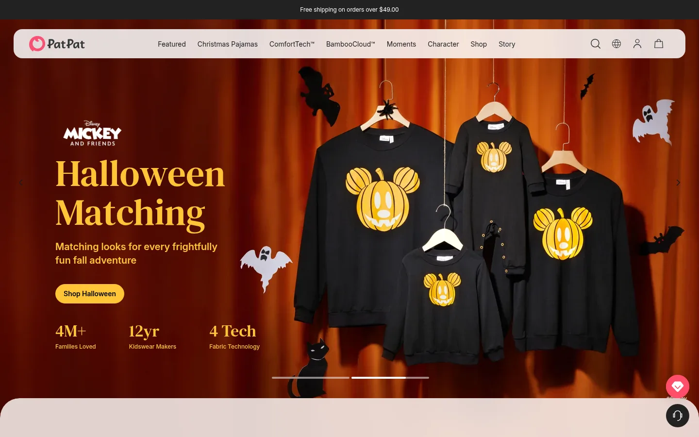
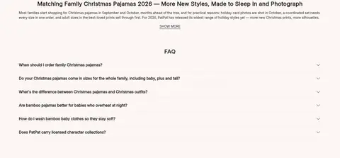
The page is anchored by a warm blush-white canvas (#fdf6f3), with a dark charcoal announcement strip and a matching charcoal footer giving the long page clear bookends. The first screen is dominated by a full-bleed Halloween campaign image; the brand’s colors in this area come largely from the photography, not the core interface palette. Serif display headlines bring an editorial, storybook quality, while the custom PatPat sans-serif keeps navigation, product details, and supporting copy direct and readable. Content alternates between broad image-led storytelling, compact feature cards, product tiles, and text-heavy FAQ content. Pale lavender appears as a distinct product-grid band, and white panels give the character feature and newsletter area contrast without adding strong shadows. Sections are generously separated, but cards and controls remain close enough to support shopping. Rounded navigation and pill-shaped actions soften otherwise crisp layouts and fine dividers.
Primary interface and body font for navigation, links, product information, and copy.
Aa 设计
patpat-SemiBold
网络字体 · 字重 400 · 占比 9%
免费替代:Nunito Sans
Emphasis for product badges and compact merchandising labels.
Aa 设计
patpat-Medium
网络字体 · 字重 400 · 占比 5%
免费替代:Nunito Sans
Button labels and concise action text.
Aa 设计
patpat-NewBold
网络字体 · 字重 400 · 占比 4%
免费替代:DM Serif Display
Large display and H1 campaign headlines.
Aa 设计
patpat-Moment
网络字体 · 字重 400 · 占比 1%
免费替代:Cormorant Garamond
Small decorative or moment-specific brand accent lettering.
角色
示例
字号
字重
行高
字距
特大标题
Large campaign-style display headline, most visible in the hero.
PatPat
76px
400
1.05
0
一级标题
Primary page or feature headline with editorial emphasis.
PatPat
52px
400
1.12
0
二级标题
Section headings, including feature and product-grid introductions.
The quick brown fox 敏捷的狐狸
24px
700
1.33
0.021em
三级标题
Secondary feature titles and supporting editorial headings.
The quick brown fox 敏捷的狐狸
22px
700
1.45
0
四级标题
Compact card headings and nested content titles.
The quick brown fox 敏捷的狐狸
20px
700
1.2
0
正文
Descriptions, product information, and general supporting copy.
The quick brown fox 敏捷的狐狸
14px
400
1.43
0
辅助文字
Small labels, product metadata, and utility notes.
The quick brown fox 敏捷的狐狸
12px
400
1.33
0
导航
Header navigation links and menu labels.
The quick brown fox 敏捷的狐狸
14px
400
1.5
0
链接
Prominent inline links and category or feature destinations.
The quick brown fox 敏捷的狐狸
17px
400
1.5
0
间距与布局
基准单位 4px · 密度:适中
88px版块间距
8px元素间距
8px卡片内边距
1280px内容最大宽度
1px
4px
5px
6px
7px
8px
9px
10px
12px
14px
16px
17px
20px
24px
28px
32px
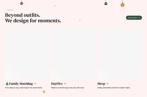
The homepage is a long, full-width storefront, with page content organized into broad visual bands and compact shopping grids. Its measured maximum content width is 1280px; the hero and story media can run full bleed, while later sections use inset panels and aligned card rows. A ten-column logo strip, four-part fabric feature, three-card moments row, split character panel, and twelve-column product grid create varied rhythms. Sections use generous vertical separation, with comfortable density and short gaps within card groups. Most headings and copy align to the left; the explanatory content block is centered.
圆角与层次
按钮 · 50%
输入框 · 9999px
徽标 · 9999px
导航 · 50%
链接 · 20px
inset · nav
lg · other
The interface is mostly flat, relying on background changes, image composition, and fine borders rather than layered card shadows. White panels and the lavender product band distinguish content groups from the blush canvas. Navigation and action controls use rounded silhouettes; a measured large shadow appears on a minor interface element, not as a pervasive card treatment.
组件
下面的预览按实测的按钮、输入框、徽标、卡片样式重建(字体用替代字体)。
Announcement and navigation
A narrow charcoal shipping announcement sits above a pale, pill-shaped navigation bar. The header contains the PatPat mark, compact category links, and utility icons.
Campaign hero
Full-bleed seasonal photography combines an oversized serif headline, short supporting copy, a rounded shopping CTA, and compact brand proof points.
Fabric feature cards
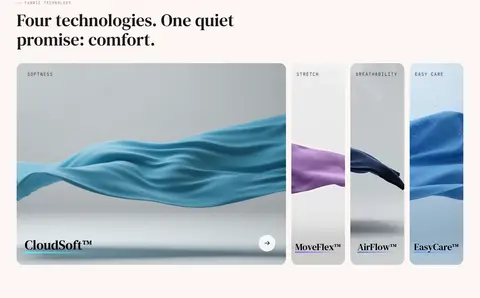
A broad lead fabric image sits beside three narrower material cards, with small uppercase category labels and serif product-tech names.
Story and feature panels
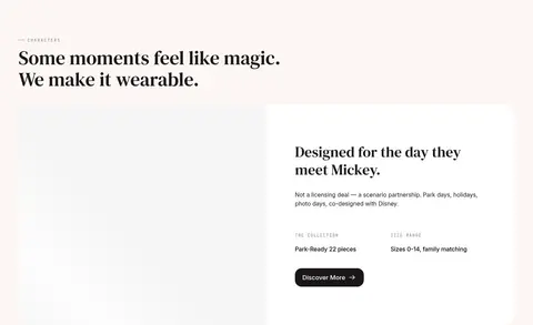
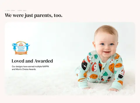
Editorial sections pair generous serif section titles with image-led cards, video, or a white information panel and compact dark CTA.
Best-seller product grid
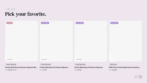
A pale lavender band holds product tiles, white image areas, concise product details, and small rounded sale or best-seller badges.
Newsletter signup
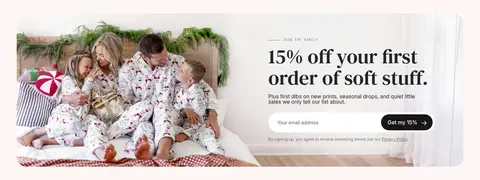
A wide family photograph sits beside a large serif offer headline, supporting copy, rounded email field, and dark pill-shaped submit action.
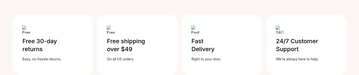
Service assurances
Four light cards summarize returns, shipping, delivery, and support with small icons, direct headings, and restrained secondary copy.
Imagery · Photography is the primary storytelling device: a dramatic Halloween family-pajama campaign fills the hero, while later lifestyle images show family moments and children wearing products. Product cards prioritize garment imagery over decoration. Fabric features use close-up, tactile-looking material visuals in a horizontal card arrangement, and the story section includes video. Seasonal artwork contains strong orange, red, and black hues; these belong to campaign media rather than the core interface palette.
Let campaign and family photography carry the seasonal color.
Pair expressive serif headlines with readable sans-serif interface copy.
Keep navigation and shopping actions softly rounded.
Use lavender as a contained product-grid section band.
Separate long sections with generous breathing room.
✕ 不该做
Do not turn the page into a dark interface.
Do not use campaign-art colors as broad interface backgrounds.
Do not add heavy shadows to every card.
Do not make labels or product information compete with imagery.
Do not replace the editorial headline style with generic geometric display type.
Do not crowd the full-width story sections with dense controls.
给 AI 的提示词
想快速出一个同风格的新页面,把这段话连同 DESIGN.md 一起发给 AI。
Build a family-fashion storefront page in PatPat’s warm editorial style. Use Blush Canvas (#fdf6f3) for the main page, Soft Charcoal (#22292d) for navigation and everyday text, and Gallery White (#ffffff) for clean panels. Keep Lilac Haze (#ede5ef) confined to a product-merchandising band; use Lavender Badge (#9c7aca) only for small product labels. Create a photo-led seasonal hero, then alternate broad editorial imagery, fabric or category cards, a compact product grid, newsletter signup, FAQ, and service assurances. Use expressive serif headlines with friendly sans-serif interface text, generous section breathing room, and rounded navigation and CTA controls. Keep borders subtle, shadows rare, and product details easy to scan. Treat orange, red, and black campaign colors as part of photography, not the site-wide UI palette.