North star · Use dramatic tonal contrast and oversized, tightly tracked editorial headlines, keeping everything else quiet and precise.
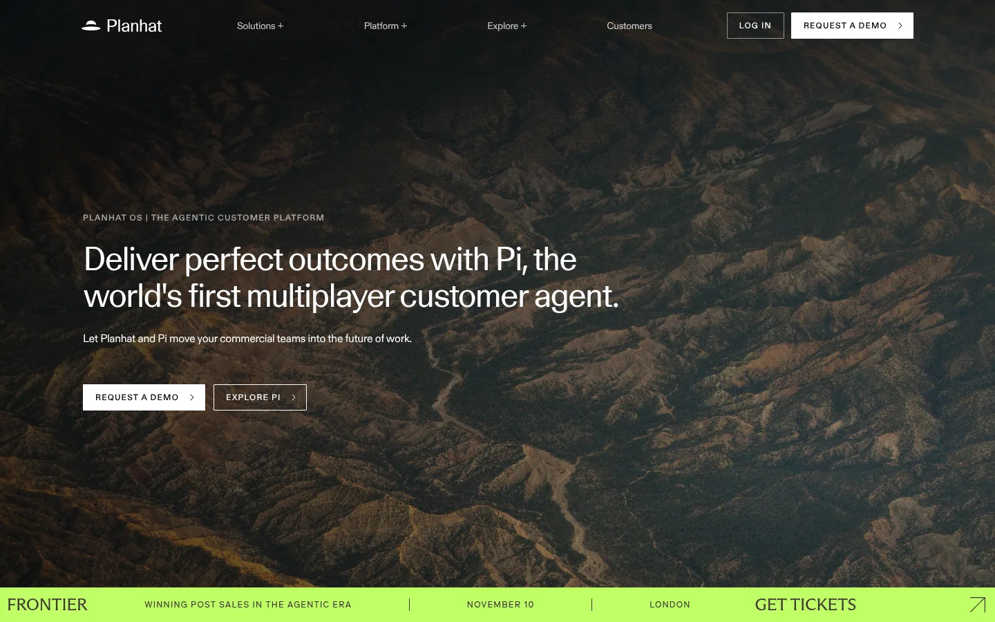
The page builds contrast through large, quiet fields of white and deep black, with #000000 also anchoring the hero’s darkened mountain photograph. White typography and controls sit cleanly against the image, while the vivid #c0ff66 event strip acts as a deliberately isolated signal rather than a recurring interface colour. Oversized, tightly tracked display headlines provide an editorial voice; compact ABC Diatype labels and body copy keep navigation, captions and supporting information efficient. Content is centered within a broad desktop frame, but text blocks and product diagrams retain generous surrounding white space. The long scroll alternates between open white sections and a substantial black platform section, creating clear chapter changes without ornamental effects. Fine rules and thin outlined grids organize logos, metrics and cards. The overall impression is precise and understated: let imagery, scale and tonal contrast carry the emphasis, and keep interface details small and functional.
配色
点色块复制色值。用途说明来自对页面的实测位置(背景、文字、描边、按钮)与截图判读。
品牌色
强调色
表层色
中性色
页面底色 · Gallery White表层 · Deep Ink表层 2 · Soft Mist主文字 · Deep Ink次要文字 · Gallery White强调 · Electric Lime
The desktop page uses a broad centered content frame, measured at a maximum width of 1200px, with compact overall density but generous whitespace around major content. Hero copy is left aligned over full-bleed photography; most following sections return to white backgrounds and structured columns. A long black platform chapter interrupts the white scroll with centered headings and sparse diagram content. Thin rules organize logo cells, metric panels and feature cards. Use measured spacing values rather than adding arbitrary gaps: the supplied scale ranges from 2px to 64px, with a 40px section gap.
圆角与层次
按钮 · 1px
图片 · 4px
链接 · 8px
没有测到阴影:页面是扁平的,层次靠底色和描边区分。
The design is largely flat: measured shadows are absent and decorative gradients are not a defining treatment. Separate content with fine hairlines, subtle outlined grids and clear shifts between white and black section backgrounds. Buttons are nearly square, with a measured 1px radius; avoid floating-card effects.
组件
下面的预览按实测的按钮、输入框、徽标、卡片样式重建(字体用替代字体)。
Hero
Full-bleed dark mountain image behind a compact top navigation and left-aligned white headline, supporting copy and paired CTAs.
Primary CTA
White button with black uppercase text; measured radius is 1px and padding is 10px 16px 10px 18px.
Outline CTA
Transparent button with a fine light outline, white uppercase label and directional arrow, paired with the filled demo CTA.
Event strip
Bright #c0ff66 full-width announcement immediately below the hero, divided into compact event, date, location and ticket link cells.
Logo grid
Customer marks arranged in a sparse, white panel with thin grid rules and substantial empty cells.
Dark platform section
Large black section using white headings and restrained diagram labels, with minimal linework and generous empty space.
Footer
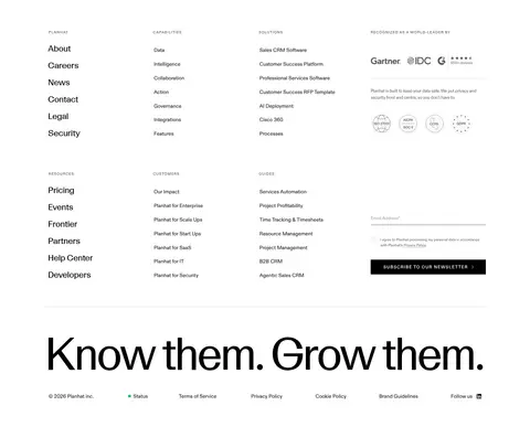
Multi-column link directory on white, using small uppercase group labels, compact text and a newsletter signup.
Imagery · The hero is dominated by full-bleed aerial mountain photography, darkened so white navigation, headline and CTA remain legible. Elsewhere, favor sparse product diagrams, interface imagery and quiet logo treatments on white or black. Keep imagery broad and atmospheric rather than decorative; the lime announcement band is a separate graphic-like strip, not part of the photograph.
Lead with a darkened, atmospheric landscape when using a photographic hero.
Keep display headlines oversized and tightly tracked.
Use black and white as the primary page-wide contrast.
Reserve Electric Lime #c0ff66 for a narrow, high-attention accent.
Use compact uppercase labels to distinguish section metadata.
Separate long page chapters with clear tonal shifts and generous whitespace.
✕ 不该做
Do not spread the lime accent across ordinary buttons or backgrounds.
Do not add drop shadows or glossy gradients.
Do not make every section a boxed card.
Do not crowd large headlines with nearby supporting elements.
Do not use bright imagery that competes with hero copy.
Do not replace fine rules with heavy borders.
给 AI 的提示词
想快速出一个同风格的新页面,把这段话连同 DESIGN.md 一起发给 AI。
Build a new Planhat-style page with a restrained editorial SaaS aesthetic. Use Gallery White (#ffffff) and Deep Ink (#000000) as the main canvas and text contrast; reserve Electric Lime (#c0ff66) for a single announcement or similarly exceptional accent. Set prominent headlines in a high-character display sans, with tight tracking and compact line-height, and use a clean neutral sans for small body copy and uppercase metadata. Favor a centered, broad content frame, left-aligned hero copy, generous whitespace, thin rules, and clear white-to-black chapter transitions. If using a hero photo, choose atmospheric landscape imagery and darken it enough for crisp white text. Keep CTAs nearly square, avoid shadows and decorative gradients, and make interface details quiet and functional.