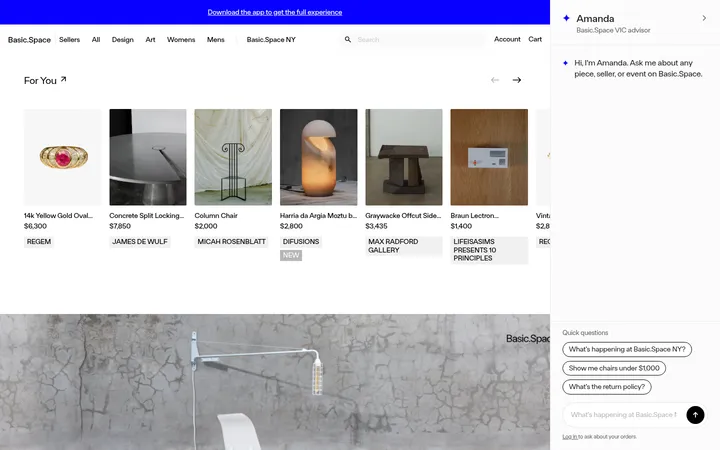
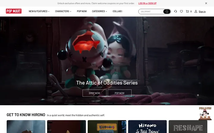
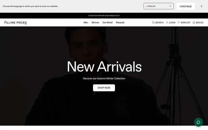
North star · Keep the interface nearly colorless and let immersive artist imagery and collectible objects carry the visual emphasis.
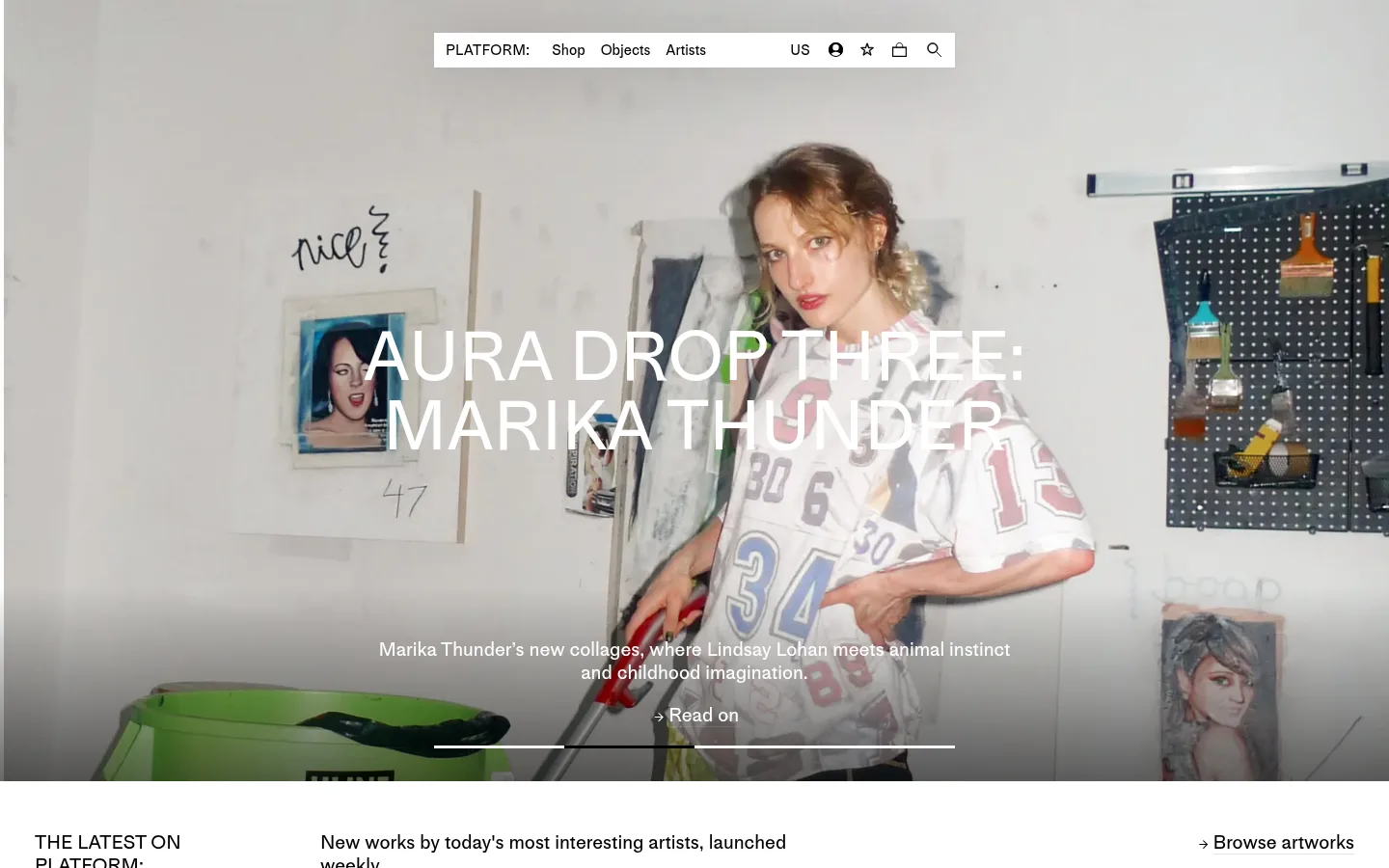
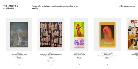
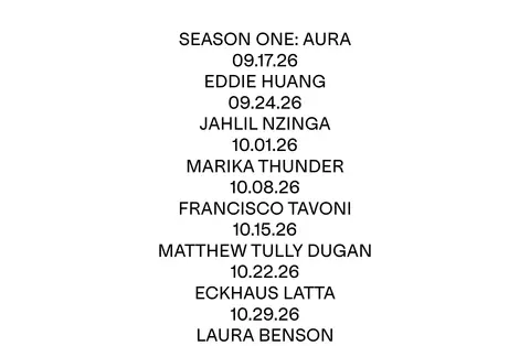
The visual identity rests on a white canvas and black typography, keeping attention on artwork and artist campaigns rather than decorative interface color. The first viewport is an edge-to-edge photographic hero with white campaign lettering and a subtle dark fade at the bottom for legibility; the navigation sits in a compact white floating bar. Below, small editorial headings and explanatory copy introduce a horizontal product feed, followed by a tall, centered season schedule and a collaboration merchandise grid. MediumLLWeb is used consistently across navigation, product metadata, headings, and calls to action, with larger display and heading styles reserved for campaign and section statements. Product imagery supplies the page’s changing color. Whitespace and section breaks keep the long page calm, while thin black outlines distinguish outlined actions and light gray rules organize the closing newsletter and footer.
Single sitewide sans-serif for display, headings, body copy, navigation, captions, links, and buttons.
角色
示例
字号
字重
行高
字距
特大标题
Oversized campaign headline over the full-bleed hero image.
PLATFORM
72px
500
1
0
一级标题
Primary section or campaign heading where a prominent standalone title is needed.
PLATFORM
48px
500
1.2
0
正文
Editorial descriptions and concise section introductions.
The quick brown fox 敏捷的狐狸
20px
500
1.2
0
辅助文字
Product names, artist attribution, dates, and supporting metadata.
The quick brown fox 敏捷的狐狸
12px
500
1.2
0.02em
按钮
Compact action labels, often outlined; some labels use uppercase.
The quick brown fox 敏捷的狐狸
0px
400
normal
0
导航
Top-level shop navigation and account or utility controls.
The quick brown fox 敏捷的狐狸
15px
500
1.2
0
链接
Product links and small secondary navigation actions.
The quick brown fox 敏捷的狐狸
12px
500
1.2
0.02em
间距与布局
基准单位 2px · 密度:紧凑
36px版块间距
4px元素间距
—卡片内边距
1368px内容最大宽度
1px
4px
6px
8px
9px
10px
18px
20px
30px
36px
46px
72px
A broad, centered desktop storefront with a measured page maximum width of 1368px and a compact density. The opening campaign uses full-bleed media; the navigation floats centered over it. Subsequent sections return to white, with a wide multi-column product feed, a narrow centered season list, then a multi-column collaboration grid. Headings align to the start of their content areas, while the schedule is deliberately centered. Section rhythm uses measured 36px gaps, with a larger visual pause around the schedule.
圆角与层次
xl · nav
Most of the page is flat: white canvas, black text, and no card shadows or rounded surfaces. Thin black outlines mark selected actions, while a light gray hairline divides the footer. The centered navigation is the notable elevated layer, using a soft, broad shadow; hero text layers directly over its image.
组件
下面的预览按实测的按钮、输入框、徽标、卡片样式重建(字体用替代字体)。
Floating navigation
Compact white navigation bar centered over the hero, with black 15px MediumLLWeb labels and utility icons; measured nav shadow adds gentle separation.
Campaign hero
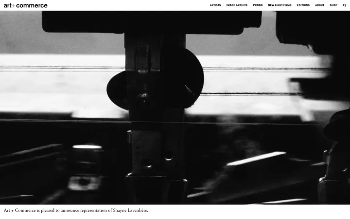
Full-bleed artist photography with a large white uppercase campaign title, short supporting copy, read-on link, and understated slide progress line.
Latest artwork feed
Editorial introduction paired with a horizontally arranged product listing; each artwork has an image, compact artist and work details, price, and small actions.
Season schedule
Single-column centered sequence of season, artist names, and dates, presented as large black text with generous surrounding white space.
Collaboration product grid
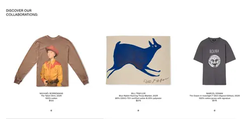
Multi-column merchandise showcase with isolated product imagery, centered captions, artist attribution, material details, and price.
Newsletter and footer
Compact email signup and outlined SIGN UP action above a thin divider, followed by grouped store, account, and policy links.
Imagery · Photography and artwork are the main source of color: the hero shows an artist in a studio, framed as a wide, immersive campaign image with centered white headline and supporting copy. Product cards use isolated artwork or merchandise images against pale backgrounds, with small captions below. Keep imagery crisp and largely untreated; use a subtle dark-to-transparent lower fade only where white hero text needs contrast.
Keep the page canvas white and interface text black.
Let campaign and product imagery supply most of the color.
Use full-bleed photography for the lead artist story.
Keep product metadata small and visually secondary.
Center the seasonal release list with ample surrounding whitespace.
Use thin outlines and rules rather than filled decoration.
✕ 不该做
Do not add a bright brand accent absent from the measured interface.
Do not place heavy card shadows behind product listings.
Do not round buttons or cards; measured corners are square.
Do not let navigation compete with the hero headline.
Do not crowd the centered schedule with extra interface elements.
Do not use illustration colors as sitewide interface colors.
给 AI 的提示词
想快速出一个同风格的新页面,把这段话连同 DESIGN.md 一起发给 AI。
Build a new PLATFORM-style art commerce page with a gallery-like, editorial restraint. Use Gallery White (#ffffff) as the canvas and Ink (#000000) for type, links, and fine button outlines. Use Rule Gray (#dddddd) only for subtle footer dividers and Caption Gray (#aaaaaa) for low-priority metadata. Keep the navigation compact and centered, floating over a full-bleed artist campaign image; place a large, clean white headline over the image and add a restrained dark fade for contrast. Below, organize artwork and merchandise into spacious multi-column image grids with small, precise captions. Use a centered release schedule as a typographic pause between commerce sections. Apply one consistent sans-serif similar to Inter, mostly regular or medium weight. Favor flat surfaces, square corners, thin rules, and generous white space; let the artwork provide color.