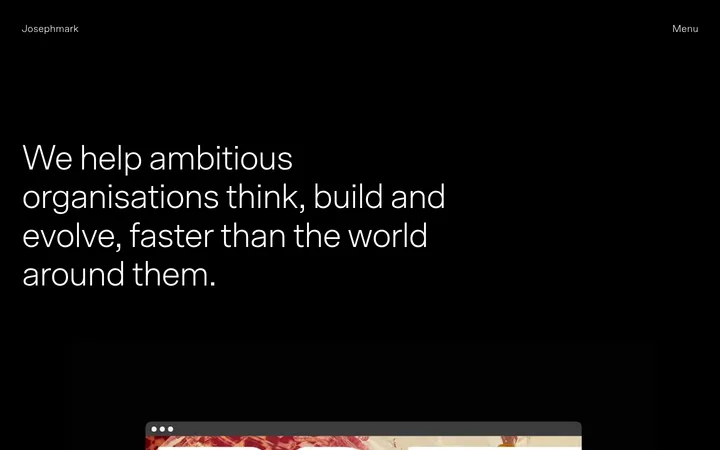
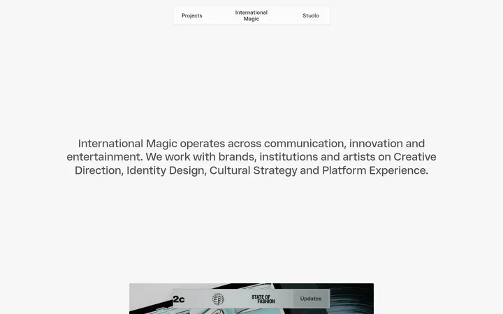
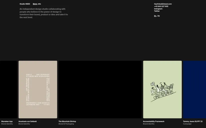
首页以深色底面呈现左右并列的 Creative Studio 与 Artist Bureau。明亮的小字标签置于大片留白之中,让两大业务成为视觉焦点。
North star · Let two restrained labels anchor a vast, uninterrupted dark canvas; add nothing that competes with their balance.
The opening screen is defined by a nearly black blue-green canvas, with two small, pale labels positioned far apart across a centered horizontal axis. The measured palette also includes an off-white surface and dark text, but the screenshot establishes the deep canvas and light type as the defining first-view treatment; avoid introducing extra accent colours. Söhne supplies a clean, compact sans-serif voice, with medium-weight labels providing just enough emphasis without turning them into oversized display headlines. The composition is deliberately spare: two balanced columns, broad negative space, and no visible imagery, cards, borders, or decorative controls. The text acts as the navigation-like entry point to each division. Preserve the quiet editorial quality by keeping the layout flat and allowing the empty canvas to carry as much visual weight as the labels. The first viewport offers no evidence for richer image treatments or additional components.
Measured headline style; no heading is detected in the visible opening screen.
The quick brown fox 敏捷的狐狸
24px
500
1.08
0
正文
Compact sans-serif text for the division labels and explanatory copy.
The quick brown fox 敏捷的狐狸
14px
400
1.29
0
间距与布局
基准单位 1px · 密度:适中
—版块间距
—元素间距
—卡片内边距
—内容最大宽度
21px
Use a full-viewport canvas with two equal-feeling columns and a wide central gap. Align each division label toward the inner portion of its column, balancing the left and right placements across the page. Keep the labels around the vertical midpoint, with substantial empty space above and below. The screenshot shows no constrained content container, section bands, or visible grid lines; preserve the open, edge-to-edge impression rather than adding a conventional header or stacked content blocks.
圆角与层次
没有测到阴影:页面是扁平的,层次靠底色和描边区分。
The visible composition is flat: no shadows, cards, borders, or layered surfaces are apparent. Keep the canvas uninterrupted and labels directly on the background. Although the measured data includes a pale surface colour, it does not appear as a raised panel or card in the screenshot.
组件
下面的预览按实测的按钮、输入框、徽标、卡片样式重建(字体用替代字体)。
Creative Studio entry
A compact, medium-weight light-text label on the left side of the split canvas; it serves as a division entry link.
Artist Bureau entry
A matching compact label on the right, balancing the Creative Studio entry across the open canvas.
Two-column opening
A sparse full-screen composition with two widely separated text anchors and no visible divider or card treatment.
Imagery · No photography, illustration, 3D, or video appears in the supplied first viewport. The design relies on typography and negative space rather than visual assets. Do not add decorative imagery to this opening composition; if later page content requires images, the measured evidence here does not establish a treatment or framing style.
Use Deep Fjord (#002233) as the dominant opening canvas.
Keep the two division labels widely separated and visually balanced.
Use Söhne or a close sans-serif substitute.
Keep label styling compact and restrained.
Preserve generous, uninterrupted negative space.
Use Quiet White (#ffffff) for high-contrast label text.
✕ 不该做
Do not add a prominent header absent from the screenshot.
Do not introduce bright accent colours.
Do not turn the labels into oversized display headlines.
Do not add cards, shadows, or decorative borders.
Do not fill the empty canvas with imagery or ornament.
Do not treat measured off-white as a visible opening section without evidence.
给 AI 的提示词
想快速出一个同风格的新页面,把这段话连同 DESIGN.md 一起发给 AI。
Build a new page in Studio & Marie’s restrained editorial style. Use Deep Fjord (#002233) as the dominant full-viewport canvas, with two balanced text-led entry points placed far apart across a simple split layout. Set labels in Söhne, or Inter as a free substitute, using compact sans-serif typography and restrained medium emphasis. Use Quiet White (#ffffff) for readable labels. Preserve broad negative space and keep the composition flat: no cards, shadows, borders, gradients, or decorative imagery. The measured palette also contains Gallery White (#f5f5f5) and Soft Ink (#1d1d1d), but neither defines the visible opening screen; use them only where later content clearly calls for a light surface or dark text. Prioritize symmetry, calm spacing, and legibility over added interface chrome.