North star · Keep the canvas open and typography bold, using rounded black controls and vivid color mainly to make app connections tangible.
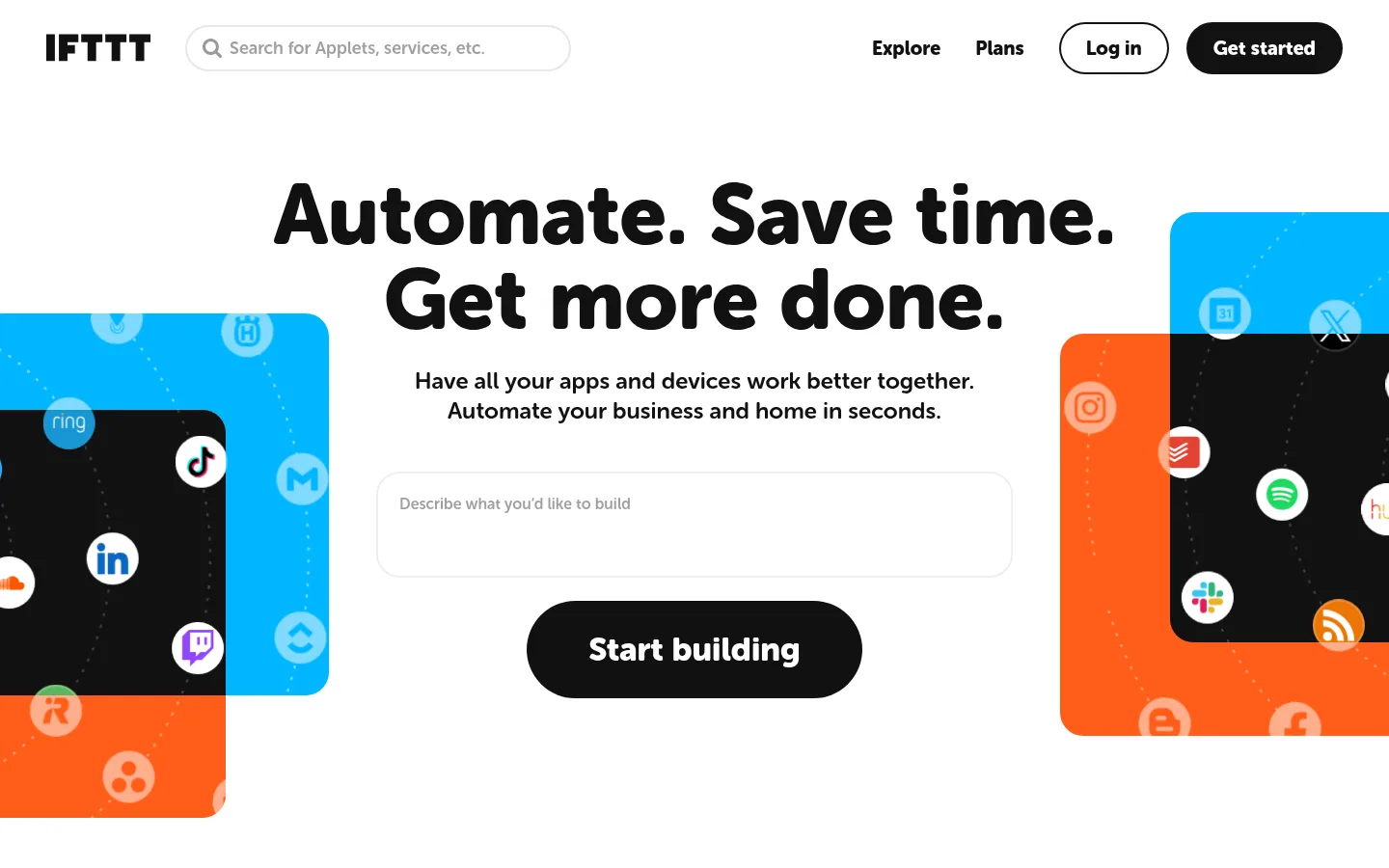
The page builds its identity from a white canvas, near-black typography, and rounded Museo Sans Rounded lettering. A centered hero headline and black pill CTA establish a strong first impression, while the app-search field and floating app tiles make automation tangible. Cyan and orange are prominent in the hero artwork and selected full-width bands; treat the vivid greens, pinks, purples, and blues as supporting app-example colors rather than a competing core palette. The layout alternates generous white explanatory sections with compact, colorful Applet cards and a dark subscription feature area. Large gaps and centered headings give the page room to breathe despite its length and dense content. Rounded controls and cards repeat throughout, with thin light-gray outlines for inputs and secondary elements. Keep text bold and legible, use color in purposeful blocks, and let product examples carry much of the visual variety.
Display headings, body copy, navigation, links, buttons, and controls throughout the page
角色
示例
字号
字重
行高
字距
特大标题
Oversized hero display headline.
IFTTT
88px
900
1
0
一级标题
Primary page and section headline treatment.
IFTTT
64px
900
1
0
二级标题
Major section headings, often centered.
IFTTT
50px
900
1
0
三级标题
Feature and content subsection headings.
IFTTT
34px
900
1.1
0
四级标题
Card and smaller feature headings.
IFTTT
28px
900
1.1
0
正文
Bold explanatory copy and supporting paragraphs.
The quick brown fox 敏捷的狐狸
16px
700
1.3
0
辅助文字
Small Applet labels, metadata, and compact supporting text.
The quick brown fox 敏捷的狐狸
14px
700
1.3
0
按钮
Large, bold text in primary pill calls to action.
IFTTT
28px
900
1.1
0
导航
Prominent header navigation labels.
The quick brown fox 敏捷的狐狸
20px
900
1.1
0
链接
Bold, easy-to-spot links within page sections.
The quick brown fox 敏捷的狐狸
20px
900
1.1
0
间距与布局
基准单位 8px · 密度:适中
48px版块间距
8px元素间距
32px卡片内边距
1344px内容最大宽度
4px
8px
11px
12px
16px
19px
20px
24px
32px
40px
48px
64px
80px
The page uses a wide, centered content frame measured at a 1344px maximum, with full-width color and dark bands breaking up the white canvas. The hero is centered, while explanatory content can split into aligned text and media columns; Applet examples form a compact multi-column grid. Sections follow a measured 48px rhythm, with comfortable density, generous open areas, and consistent 8px base spacing. Repeat centered headings and rounded cards to make the long page scannable.
圆角与层次
按钮 · 9999px
输入框 · 9999px
卡片 · 24px
图片 · 50%
导航 · 9999px
链接 · 24px
inset · other, media
sm · link
inset · nav
The interface is mostly flat: white space and solid section bands do the structural work. Use light-gray hairlines for search and control boundaries, rounded card edges, and restrained separation. A small shadow appears on individual example links; avoid broad, dramatic shadows. Dark panels and colorful illustrations provide layering without making the overall page feel raised.
组件
下面的预览按实测的按钮、输入框、徽标、卡片样式重建(字体用替代字体)。
Header navigation
Brand mark and rounded search field sit on the white header, with bold navigation links, an outlined Log in pill, and a black Get started pill.
Hero prompt
Center a large, heavy two-line headline above short supporting copy, a wide rounded prompt input with a pale outline, and a black pill CTA.
Applet example cards
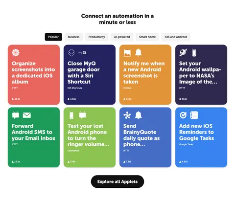
Show colorful rounded cards with white service icons, bold multiline titles, and compact attribution or usage metadata in a grid.
Dark feature band
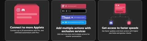
Use a near-black section with centered white heading, dark rounded feature cards, illustrative interface graphics, and a white trial CTA.
Search input
Use a white field with a light-gray border, fully rounded silhouette, muted prompt, and dark search icon.
Secondary button
Set compact actions in a pale neutral fill with dark bold text; the Business button uses a measured thin border.
Imagery · Imagery is primarily product illustration and app-service iconography rather than photography. The hero frames floating cyan, orange, and black app panels around its centered headline and prompt field. Applet examples use vivid individual card colors with white icons and concise text. Dark subscription cards show small product-interface illustrations. Keep imagery crisp, contained, and subordinate to clear headings.
Use Museo Sans Rounded or a close rounded sans substitute.
Keep headlines bold, dark, and immediately scannable.
Use white as the dominant canvas between colored bands.
Make primary actions black pills with white text.
Reserve cyan and orange blocks for strong visual accents.
Present app examples as colorful, rounded cards.
✕ 不该做
Do not turn the page into a dark-first interface.
Do not use thin, formal typography for major headings.
Do not spread illustration colors across every interface element.
Do not replace the generous white gaps with dense layouts.
Do not use sharp-cornered primary buttons or cards.
Do not add heavy shadows to ordinary content sections.
给 AI 的提示词
想快速出一个同风格的新页面,把这段话连同 DESIGN.md 一起发给 AI。
Build a new IFTTT-style SaaS page around a bright white canvas (#ffffff) and bold Carbon Ink (#111111) typography. Use a rounded sans such as Museo Sans Rounded or Nunito, with heavy headings and friendly compact copy. Create a simple header, a centered headline-led hero, and a strong black pill CTA. Use Signal Cyan (#01b6ff) and Applet Orange (#ff5e19) selectively for large accents and app-connection illustrations; let smaller service tiles introduce their own colors without redefining the UI palette. Organize content into spacious white sections, a clear multi-column example-card grid, and a near-black feature band. Use Quiet Line (#e7e7e7) for subtle control borders and large rounded corners for cards and controls. Keep shadows restrained and prioritize clear scan paths.