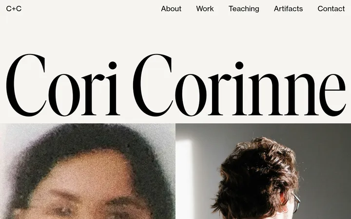
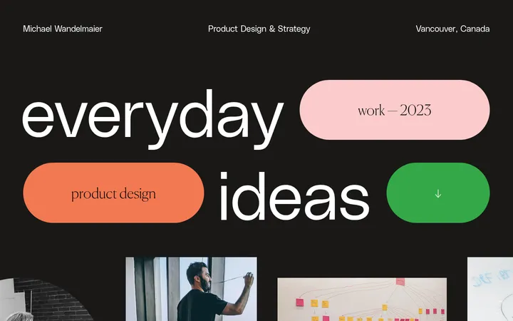
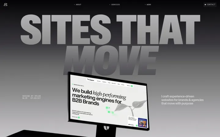
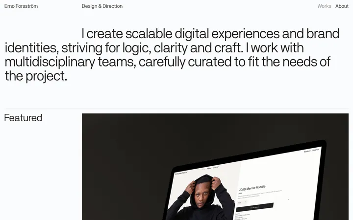
North star · Let monumental typography and generous white space frame the work; keep interface chrome quiet and let project imagery supply colour.
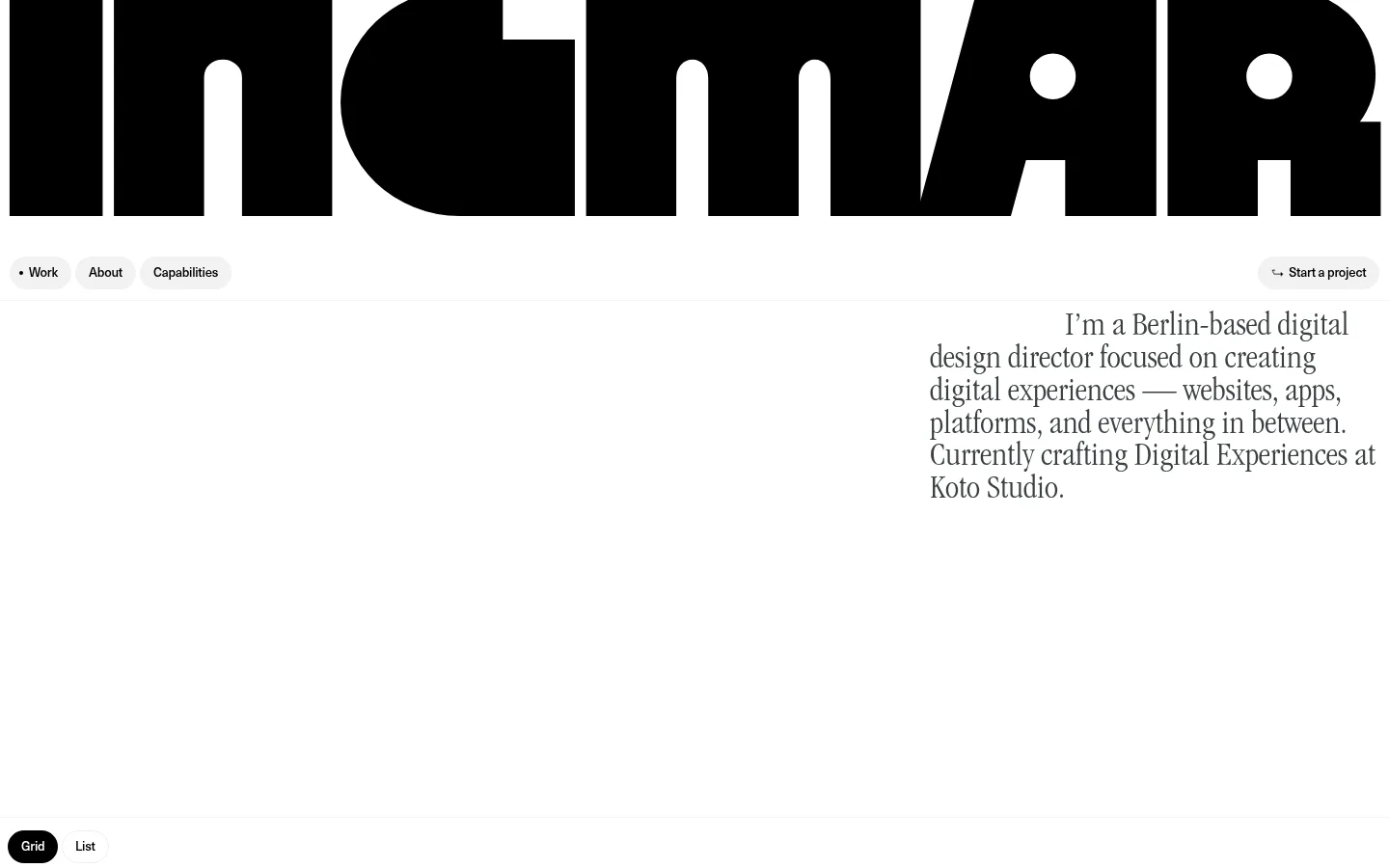
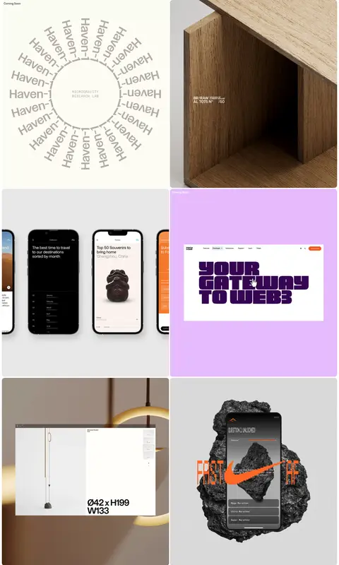
The visual strategy is built around contrast in scale rather than interface decoration. Pure white (#ffffff) dominates the canvas, while near-black (#000000) gives the oversized custom masthead and selected controls their weight. Muted charcoal (#3a4042) carries most links and supporting text; lighter measured greys (#919191 and #cccccc) appear as secondary text tones rather than prominent brand accents. Typography is the identity: a geometric display face creates an almost edge-to-edge nameplate, while a light condensed Garamond gives the introduction an editorial, literary voice. Compact sans-serif labels keep navigation and metadata practical. The opening is exceptionally spacious, with a small navigation row and right-aligned introduction set below the masthead. Projects then shift into a tightly joined two-column image grid, allowing photography, interface mockups, and motion work to bring colour. Rounded pale navigation pills and a black active view switch are restrained exceptions to the otherwise flat, borderless presentation.
Huge custom nameplate spanning the top of the portfolio.
Ingmar Coenen
295px
400
0.9
0
一级标题
Editorial serif introduction and prominent descriptive copy.
Ingmar Coenen
36px
400
0.94
0
正文
Compact navigation, project labels, and supporting text.
The quick brown fox 敏捷的狐狸
13px
400
1.1
-0.02em
辅助文字
Small project-status and metadata labels.
The quick brown fox 敏捷的狐狸
12px
400
1.1
-0.02em
链接
Compact navigation and arrow-style project links.
The quick brown fox 敏捷的狐狸
13px
400
1.1
-0.02em
间距与布局
基准单位 2px · 密度:宽松
320px版块间距
10px元素间距
—卡片内边距
1432px内容最大宽度
4px
8px
9px
10px
14px
20px
80px
120px
The page uses a spacious, near-full-width canvas with a measured maximum width of 1432px. A monumental wordmark spans the top, followed by a compact navigation row and a right-aligned serif introduction. Large areas of uninterrupted white separate the introduction from the work. The portfolio section becomes a two-column grid of closely adjacent, large project tiles, with labels kept small and unobtrusive. A compact Grid/List switch anchors the gallery boundary. The page closes with a sparse client-logo and contact area.
圆角与层次
按钮 · 9999px
图片 · 12px
链接 · 4px
没有测到阴影:页面是扁平的,层次靠底色和描边区分。
The interface reads as flat: measured data reports no shadows, and the white canvas has no defining bordered panels. Separation comes from generous whitespace and the edges between project images. Navigation uses pale pill-shaped fills, while the selected Grid control is solid black. Keep any layering limited to content embedded within project artwork.
组件
下面的预览按实测的按钮、输入框、徽标、卡片样式重建(字体用替代字体)。
Oversized wordmark
A custom, heavy black display name dominates the top edge and is cropped tightly by the viewport.
Pill navigation
Small pale-grey rounded controls hold Work, About, and Capabilities; the Start a project link sits separately at the right.
Editorial introduction
A narrow, right-aligned block of light condensed serif copy sits below the navigation row.
Project gallery
Large two-column media tiles show varied client projects with restrained labels and no card chrome.
View switch
Grid and List controls sit at the gallery start; Grid is the black active pill and List is light.
Project status
Small Coming Soon labels mark selected work without turning into prominent badges.
Footer contact and logos
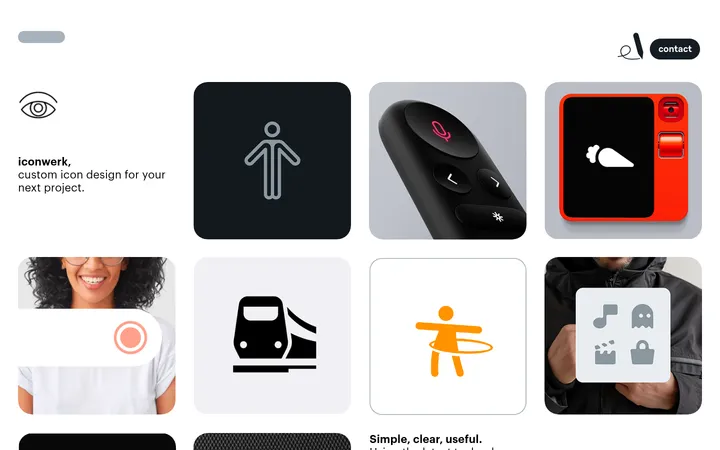
A low-density closing area pairs a client-logo row with enquiry details, social links, and legal links.
Imagery · Project imagery is the main source of colour: architectural and product photography, device and website mockups, graphic compositions, and video previews appear in large tiles. Preserve each project’s native visual treatment rather than applying a common tint. Frames are clean and closely arranged, with softly rounded corners visible on media; small status labels sit over or near the artwork.
Keep the canvas pure white and let whitespace carry the pacing.
Make the display wordmark dramatically larger than every other text element.
Pair the custom display with a light condensed editorial serif.
Keep navigation labels compact and controls visually quiet.
Use project artwork as the primary source of colour.
Align project tiles into a clean two-column gallery.
✕ 不该做
Do not add gradients or decorative colour bands to the site chrome.
Do not wrap every project in a bordered or shadowed card.
Do not crowd the hero with extra copy or controls.
Do not force project imagery into a uniform colour treatment.
Do not use large sans-serif body paragraphs.
Do not invent bright brand accents from colours inside project artwork.
给 AI 的提示词
想快速出一个同风格的新页面,把这段话连同 DESIGN.md 一起发给 AI。
Build a portfolio page in the Ingmar Coenen visual style. Use Gallery White (#ffffff) as the dominant canvas, Ink Black (#000000) for a huge custom display wordmark and active controls, and Soft Graphite (#3a4042) for muted links and supporting text. Set a compact sans-serif such as Inter for navigation and labels, and a light condensed editorial serif such as Cormorant Garamond for the introduction. Keep the hero sparse: oversized name first, then a small navigation row and a right-aligned intro, with generous empty space before the work. Present projects in a clean two-column gallery with large unfiltered image areas and minimal status labels. Use pale pill controls sparingly, avoid shadows and heavy borders, and finish with a restrained logo, contact, and legal footer. Let project assets—not interface chrome—supply colour.