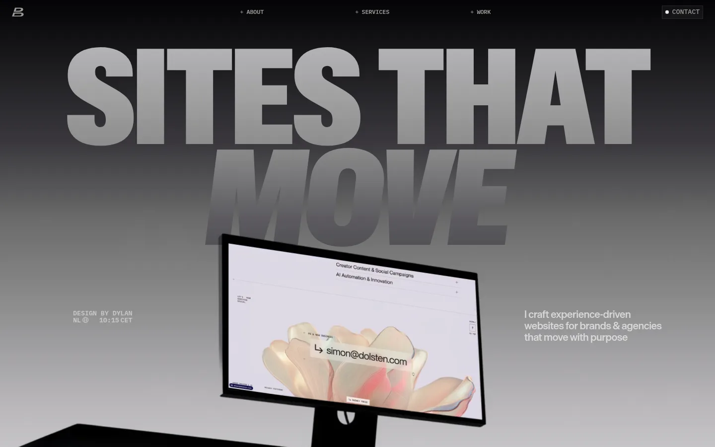
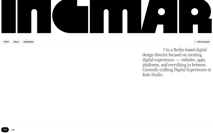
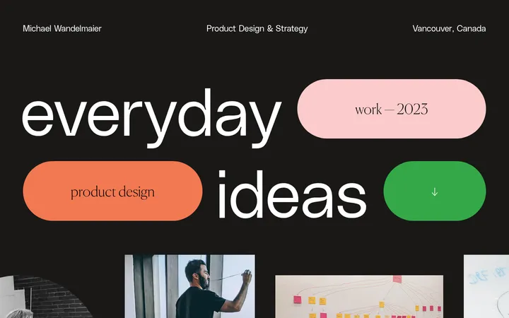
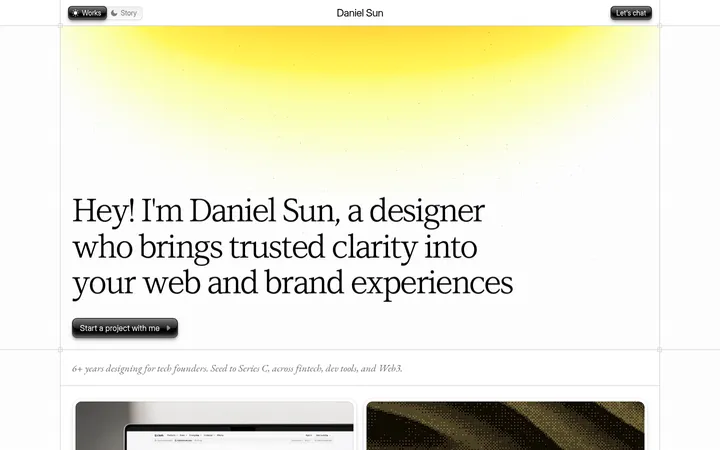
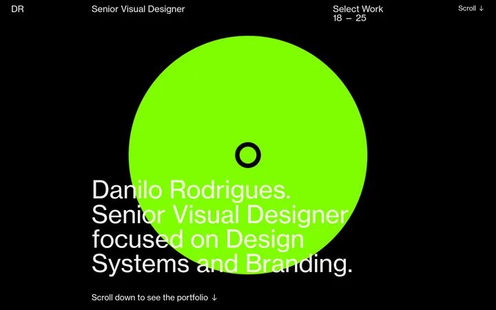
North star · Let oversized, tightly set typography and grayscale media lead, while keeping the interface quiet and the accent rare.
The page is built on a pale gray canvas (#f1f1f1), with broad areas of breathing room punctuated by charcoal-to-gray gradients and deep inverse sections. Typography provides the main visual force: ABC Gravity Variable forms huge uppercase display statements, while Die Grotesk B handles compact, readable body copy. IBM Plex Mono adds a technical editorial voice to small uppercase labels and navigation. Most text stays within a restrained gray range; vivid orange (#ff6436) appears sparingly in gradient or footer details rather than acting as a dominant CTA color. The layout moves from a dramatic, near full-screen hero into an expansive media-led portfolio, a collaboration logo strip, and a service-card grid. Project imagery is mixed in scale and positioned asymmetrically, giving the page a curated, art-directed feel. Fine white borders define cards against soft surfaces; the overall treatment remains flat, with gradients, scale, and overlap supplying depth instead of shadows.
配色
点色块复制色值。用途说明来自对页面的实测位置(背景、文字、描边、按钮)与截图判读。
品牌色
强调色
表层色
中性色
页面底色 · Gallery Mist表层 · Paper White表层 2 · Brown Black表层 3 · Card Chalk主文字 · Studio Ink次要文字 · Soft Graphite弱文字 · Haze Gray描边 · Paper White强调 · Signal Tangerine
Primary body, supporting headings, and much of the navigation and link text.
Aa 设计
IBM Plex Mono
网络字体 · 字重 500 / 600 · 占比 25%
免费替代:IBM Plex Mono
Small uppercase navigation, captions, metadata, and code-like labels.
Aa 设计
ABC Gravity Variable
网络字体 · 字重 400 / 500 · 占比 4%
免费替代:Bebas Neue
Oversized hero and section display headings.
角色
示例
字号
字重
行高
字距
特大标题
Monumental uppercase hero statement and oversized visual anchors.
Dylan Brouwer
288px
400
0.74
-0.01em
一级标题
Primary oversized uppercase heading in the opening hero.
Dylan Brouwer
274px
400
0.74
-0.02em
二级标题
Large uppercase section titles, including the services heading.
Dylan Brouwer
96px
400
0.74
-0.01em
三级标题
Prominent supporting headings within about and service content.
Dylan Brouwer
60px
500
1
-0.03em
四级标题
Secondary service or portfolio headings.
Dylan Brouwer
54px
500
1
-0.03em
正文
Designer introduction and explanatory service descriptions.
The quick brown fox 敏捷的狐狸
16.5px
500
1.3
-0.01em
辅助文字
Small uppercase project metadata and image labels.
The quick brown fox 敏捷的狐狸
12px
500
1
-0.01em
导航
Compact uppercase navigation and section links.
The quick brown fox 敏捷的狐狸
12px
600
1.3
-0.02em
代码
Terse uppercase detail labels with a technical editorial feel.
const style = 1;
12px
500
1
-0.01em
间距与布局
基准单位 2px · 密度:宽松
96px版块间距
6px元素间距
14px卡片内边距
1166px内容最大宽度
3px
5px
6px
7px
8px
10px
12px
18px
20px
24px
48px
60px
72px
96px
120px
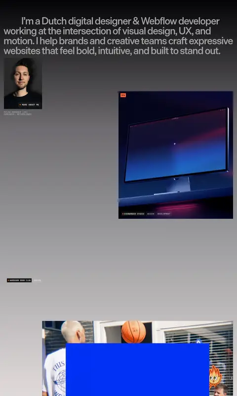
The page uses a spacious, editorial composition within a measured 1166px maximum content width, with selected media bleeding across the viewport. The hero centers attention on a huge statement and overlapping monitor image, while small side copy balances the composition. Portfolio content breaks the symmetry through staggered, varied-size imagery. A horizontal logo band leads into a two-column service area with three cards. Section spacing is generous and density stays low; compact monospace labels contrast with large display type.
圆角与层次
导航 · 50%
没有测到阴影:页面是扁平的,层次靠底色和描边区分。
The interface is largely flat: measured shadows are absent, and cards rely on pale fills and thin white borders. Depth comes from layered monitor mockups, image overlap, large type, and long grayscale gradients. Keep outlines subtle and avoid turning ordinary content into elevated, rounded dashboard panels.
组件
下面的预览按实测的按钮、输入框、徽标、卡片样式重建(字体用替代字体)。
Top navigation
A sparse row of uppercase links across the hero, with small plus-like markers and a compact outlined contact control.
Hero statement
Oversized uppercase display type sits over a dark-to-light grayscale field, layered with a large angled monitor preview.
Portfolio gallery
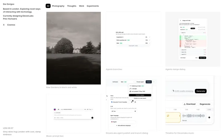
Project media appears in varied sizes and positions, with restrained caption and metadata labels.
Show all link
A bold, centered, underlined all-work link acts as a clear transition out of the project gallery.
Client logo strip
A horizontal run of partner marks sits on a light band beneath a compact collaboration heading.
Service cards
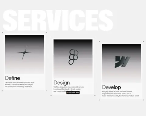
Three light cards use thin white borders, image-led tops, concise headings, and short explanatory copy.
Footer
A dark-to-gray footer uses compact link groups, a central device image, and a restrained orange gradient detail.
Imagery · Use real, art-directed project screenshots and photography, especially monitor and device mockups, rather than generic illustrations. Frame media at varied scales, sometimes overlapping the large typography or extending beyond the content area. Keep the page’s surrounding treatment grayscale and atmospheric; project previews may retain their own vivid colors. The hero’s screen imagery is a focal point, while service cards use restrained visual thumbnails.
Use the measured pale gray canvas as the dominant page background.
Make display headings huge, uppercase, and visually compressed.
Use grayscale gradients to give large media sections atmosphere.
Keep navigation and project metadata small and uppercase.
Arrange project imagery asymmetrically with deliberate overlap.
Reserve orange for sparse accents rather than broad interface fills.
✕ 不该做
Do not add heavy shadows to cards or navigation.
Do not make every section a uniform centered text block.
Do not let bright project imagery redefine the site-wide palette.
Do not use rounded dashboard-style cards.
Do not enlarge captions or navigation to compete with the display type.
Do not introduce extra colors beyond measured palette values.
给 AI 的提示词
想快速出一个同风格的新页面,把这段话连同 DESIGN.md 一起发给 AI。
Build a new portfolio page in this visual language. Use Gallery Mist (#f1f1f1) as the main canvas, Studio Ink (#3c3a3e) for readable text, and Paper White (#ffffff) for fine card edges. Lead with an oversized uppercase headline in a condensed display face, layered over a grayscale gradient that moves from Near Void (#040305) through Slate Fade (#6e6c70). Set body copy in a clean grotesk and use IBM Plex Mono-style uppercase labels for navigation and metadata. Compose a spacious editorial layout with a dramatic hero, staggered project imagery, a horizontal client-mark band, and a simple three-card service area. Keep shadows absent, borders fine, and card corners restrained. Use Signal Tangerine (#ff6436) only as a rare gradient detail; let project imagery provide any stronger color.