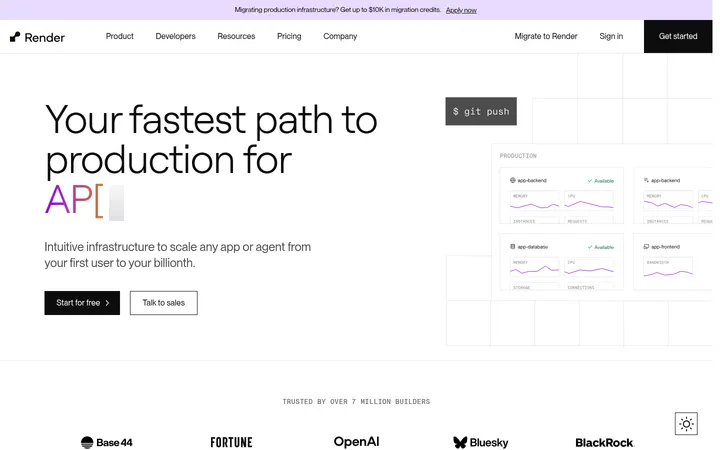
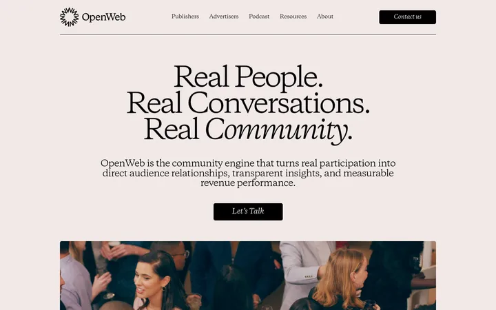
North star · Build a deliberate alternation of warm paper and dark technical surfaces, letting product UI and concise typography carry the story.
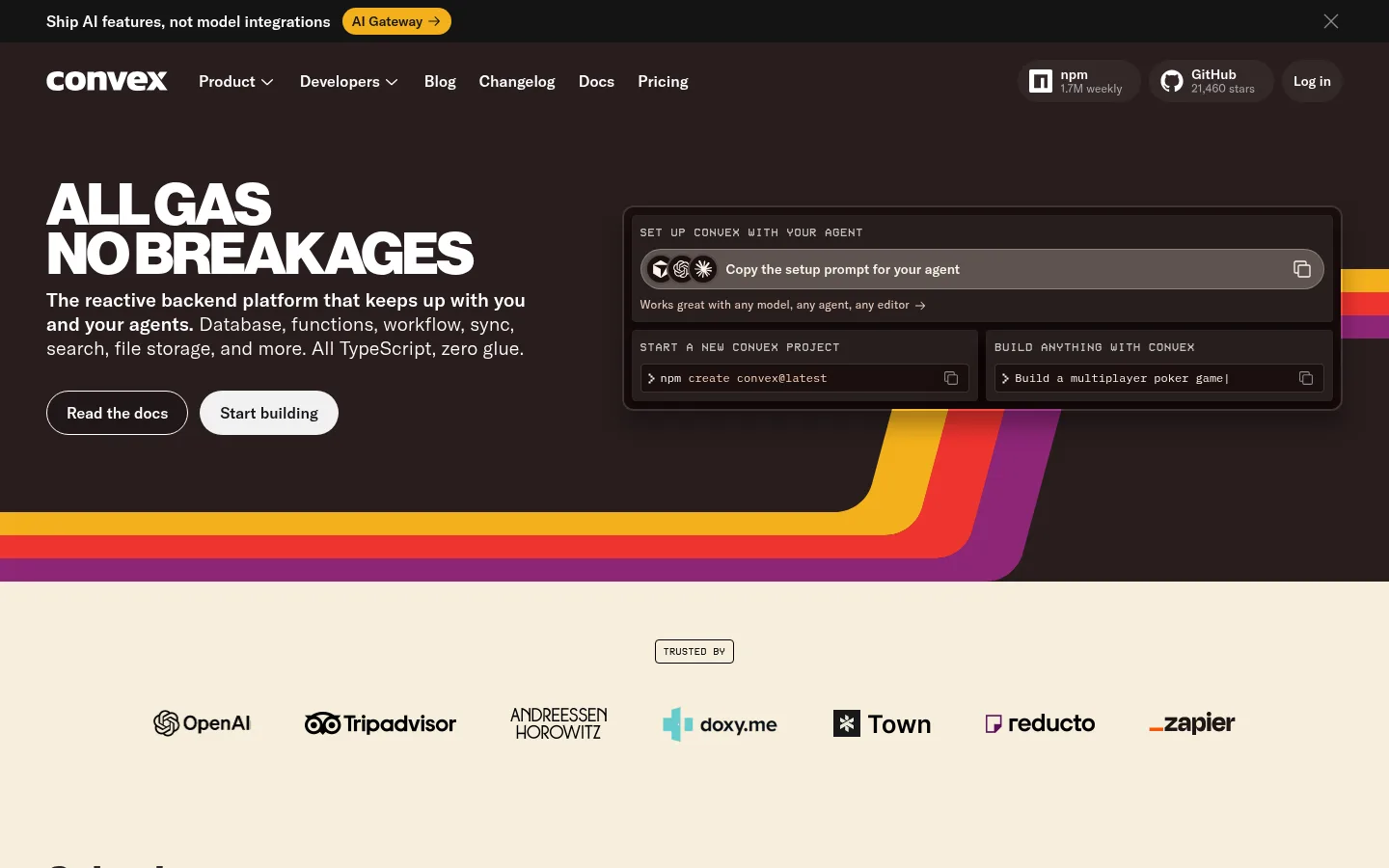
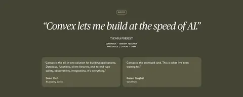
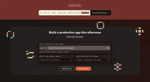
The page alternates warm parchment and deep charcoal-brown fields rather than relying on one continuous background. The opening hero is a dark, two-column band: compact, forceful white sans-serif copy sits opposite a framed developer setup interface, with saturated ribbon graphics tracing the lower edge. A pale trust band and the following solved-problems section restore contrast and breathing room. Later dark product sections, muted olive testimonials, and rust-toned enterprise content create a deliberate sequence of color-blocked chapters. GT America carries navigation, body copy, and most headings; the oversized hero message is condensed by line breaks and bold weight, while Publico gives the testimonial quote an editorial voice. VCR and IBM Plex Mono are reserved for technical labels and code-like details. Layouts combine broad section fields with aligned content columns, compact cards, logo rows, and framed interface mockups. Borders and restrained shadows define layers without making the page feel glossy.
Primary sans-serif for navigation, headings, body copy, and buttons.
Aa 设计
IBM Plex Mono
网络字体 · 字重 400 / 500 · 占比 8%
免费替代:IBM Plex Mono
Code snippets and compact technical labels.
Aa 设计
vcr
网络字体 · 字重 400 · 占比 6%
免费替代:Space Mono
Eyebrows, product badges, and technical section labels.
Aa 设计
publico
网络字体 · 字重 400 / 500 · 占比 2%
免费替代:Lora
Large testimonial quote display.
角色
示例
字号
字重
行高
字距
特大标题
Large editorial testimonial quotation.
Convex
60px
400
1
-0.025em
一级标题
Primary hero headline and major page statements.
Convex
40px
700
1
-0.02em
二级标题
Section titles such as solved and enterprise messaging.
Convex
28px
700
1.1
0
三级标题
Supporting card and subsection headings.
The quick brown fox 敏捷的狐狸
20px
300
1.25
0
正文
Hero explanation, feature details, and longer descriptions.
The quick brown fox 敏捷的狐狸
16px
400
1.5
0
辅助文字
Compact supporting copy and card details.
The quick brown fox 敏捷的狐狸
14px
400
1.25
0
按钮
Primary and secondary CTA labels.
The quick brown fox 敏捷的狐狸
16px
500
1.5
0
导航
Main navigation labels and footer navigation.
The quick brown fox 敏捷的狐狸
14px
400
1.25
0
链接
Small secondary links and supporting references.
The quick brown fox 敏捷的狐狸
12px
400
1.38
0.018em
眉题
Uppercase technical labels and section markers.
The quick brown fox 敏捷的狐狸
12px
400
1.5
0.08em
代码
Command snippets and developer-facing interface text.
const style = 1;
12px
400
1.63
0
间距与布局
基准单位 4px · 密度:适中
48px版块间距
8px元素间距
14px卡片内边距
946px内容最大宽度
4px
8px
10px
12px
16px
20px
24px
32px
48px
60px
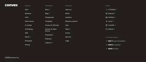
The page uses a sequence of broad, full-width color bands with content organized into two-column hero and feature layouts, a seven-mark logo row, multi-column cards, and a four-column footer. The measured content max width is 946px, with comfortable density and clear separation between sections. Most headings align to the start of their content; the founders section centers its statement. Keep cards and interface demonstrations grouped into compact, readable clusters, using generous open areas in the pale sections to balance denser dark showcases.
圆角与层次
按钮 · 9999px
卡片 · 16px
图片 · 22px
徽标 · 4px
导航 · 8px
md · button, card
xl · other, card
md · card
The design relies more on flat color fields and thin borders than on pronounced elevation. Dark product cards and command panels use layered charcoal surfaces, subtle outlines, and restrained shadows to separate interface layers from the background. Rounded card and media corners soften the technical framing; avoid floating everything on large glossy shadows.
组件
下面的预览按实测的按钮、输入框、徽标、卡片样式重建(字体用替代字体)。
Announcement strip
A narrow near-black top band with concise white launch copy and a Marigold Signal #f3b01c AI Gateway pill.
Primary CTA
A rounded Ember Orange #de5d33 button with white medium-weight text; pair it with a light outlined secondary action.
Developer setup panel
A dark framed interface mockup with monospaced uppercase labels, nested charcoal fields, copy affordances, and compact command rows.
Trust logo row
Centered small trust eyebrow above a horizontal seven-brand logo row on Warm Parchment #f6eedb.
Feature card
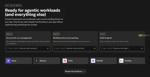
Graphite Panel #292929 cards with concise descriptions, technical labels, and command-like details, arranged as a compact grid.
Testimonial block
Large Publico-style white quote on muted Olive Smoke #444435, with smaller attribution and supporting quote cards.
Footer link columns
A deep Charcoal Roast #221f1d footer with the wordmark, several compact navigation columns, and small muted links.
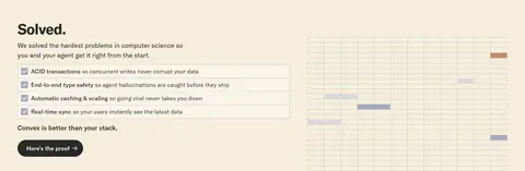
Imagery · Product UI is the defining visual: framed command panels and developer setup flows appear in the hero and enterprise area. Logo marks form a compact trust row, while founder portraits are small supporting photos rather than a dominant photographic system. The solved-problems area includes a light grid-style technical visualization. Saturated ribbon shapes in the hero and small geometric accents near the enterprise showcase act as decorative graphics, not the core brand palette.
Alternate warm parchment and dark section fields with clear purpose.
Keep the hero headline bold, white, and broken into short lines.
Use product interfaces as framed, legible demonstrations.
Reserve monospaced uppercase styling for technical labels.
Let testimonial quotes provide the main serif moment.
Use accent colors as signals, not broad decoration.
✕ 不该做
Do not turn every section into the same dark panel.
Do not use gradients as a general page background.
Do not let product mockups become unreadable decoration.
Do not use serif typography for ordinary body copy.
Do not add heavy shadows to every card.
Do not introduce extra colors outside the measured palette.
给 AI 的提示词
想快速出一个同风格的新页面,把这段话连同 DESIGN.md 一起发给 AI。
Build a new Convex-style developer SaaS page using a strong rhythm of Warm Parchment #f6eedb and dark surfaces such as Charcoal Roast #221f1d, Near Black #191919, and Black Cherry #2a1b1b. Use Ember Orange #de5d33 for the primary action and Marigold Signal #f3b01c only for a small announcement accent. Set navigation and body in a GT America-like sans, technical labels and code in monospace, and reserve a serif display face for a featured quote. Organize content in broad full-width bands with aligned columns, compact dark cards, and framed product UI. Favor clean hairlines, restrained shadows, and readable interface mockups. Keep spacing comfortable and section transitions purposeful; do not invent extra palette colors or decorative effects.