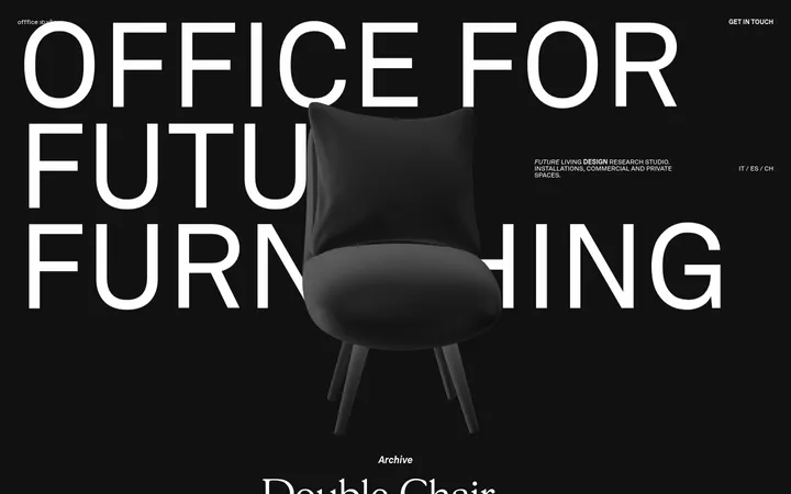
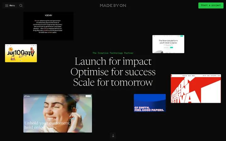
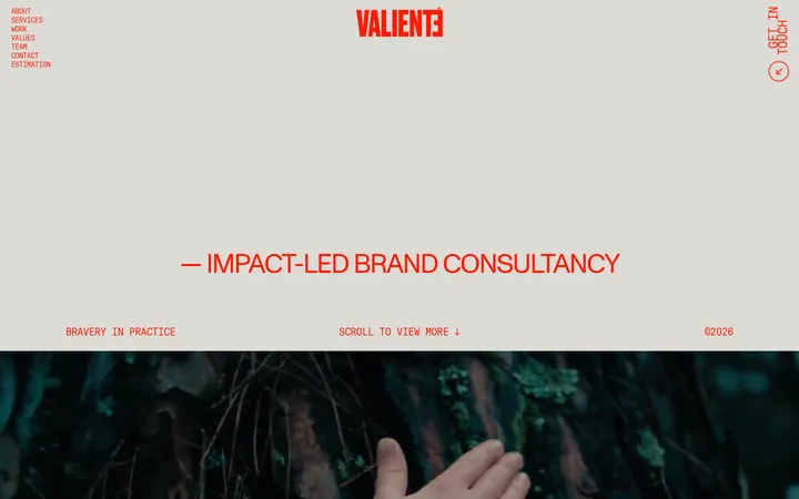
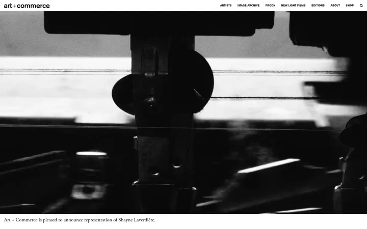
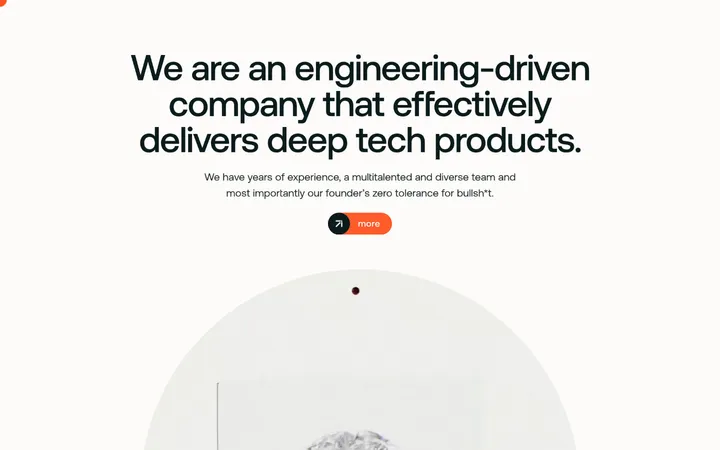
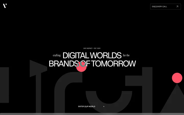
North star · Keep the interface quiet and spacious so oversized typography and vivid creative work carry the visual impact.
The visual system holds a steady warm-gray canvas (#e5e4e0) across the page, letting dense project imagery provide most of the color and contrast. Near-black (#1d1d1d) uppercase display text is the main navigation through the long page: oversized phrases overlap the dimensional hero object, while smaller uppercase copy handles studio information and labels. A single measured sans-serif family keeps the typographic voice consistent. Sections favor asymmetry and open space: client marks sit in a ruled grid, featured work forms a two-column tile field, and awards are arranged as spare horizontal rows. White appears as a rare surface or within the hero’s gradient rather than as a broad alternate canvas. Yellow, pink, and blue are measured accents, but the screenshot suggests they belong chiefly to gradients and creative imagery, not persistent interface controls. Borders are fine and functional; elevation stays flat.
配色
点色块复制色值。用途说明来自对页面的实测位置(背景、文字、描边、按钮)与截图判读。
品牌色
强调色
表层色
中性色
页面底色 · Studio Greige表层 · Gallery White主文字 · Studio Ink次要文字 · Studio Greige描边 · Soft Graphite强调 · Signal Marigold强调 2 · Creative Pink强调 3 · Digital Sky
Display headings, section titles, body copy, labels, and navigation across the page.
角色
示例
字号
字重
行高
字距
特大标题
Oversized uppercase hero and marquee-style brand statements.
OFF+BRAND.
103px
400
1
0
一级标题
Primary hero statement and dominant page-level heading.
OFF+BRAND.
76px
400
1
0
二级标题
Large section headlines and prominent editorial statements.
OFF+BRAND.
70px
400
0.8
0
三级标题
Uppercase feature and project section headings.
OFF+BRAND.
45.5px
400
1
0
四级标题
Supporting uppercase subheads and service labels.
OFF+BRAND.
34.5px
400
1.4
0.006em
正文
Compact uppercase studio descriptions and supporting copy.
The quick brown fox 敏捷的狐狸
15px
400
1.4
0.013em
辅助文字
Small project labels, metadata, and award details.
The quick brown fox 敏捷的狐狸
11.5px
400
1
0.017em
眉题
Tracked uppercase section identifiers and short introductory labels.
The quick brown fox 敏捷的狐狸
15px
400
1
0.05em
间距与布局
基准单位 2px · 密度:适中
76px版块间距
8px元素间距
—卡片内边距
1402px内容最大宽度
5px
8px
15px
19px
24px
30px
32px
46px
76px
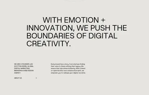
A broad single-page composition uses a measured maximum content width of 1402px, with generous open canvas and a comfortable density. Sections are separated by substantial vertical breathing room rather than contrasting background bands. Content alternates between two-column editorial arrangements, a five-column client-logo region, and a two-column project grid; the services area uses a wider multi-column visual field. Headings align to the left, while individual hero words shift position for deliberate asymmetry. Fine rules define grids and award rows.
圆角与层次
链接 · 10px
hairline · section
The interface is predominantly flat: there are no prominent measured shadows or raised UI surfaces. Thin gray rules structure logo cells and award rows, while project imagery supplies its own depth, contrast, and layering. Rounded project corners are visible in screenshots, but measured component radius evidence is limited.
组件
下面的预览按实测的按钮、输入框、徽标、卡片样式重建(字体用替代字体)。
Editorial hero
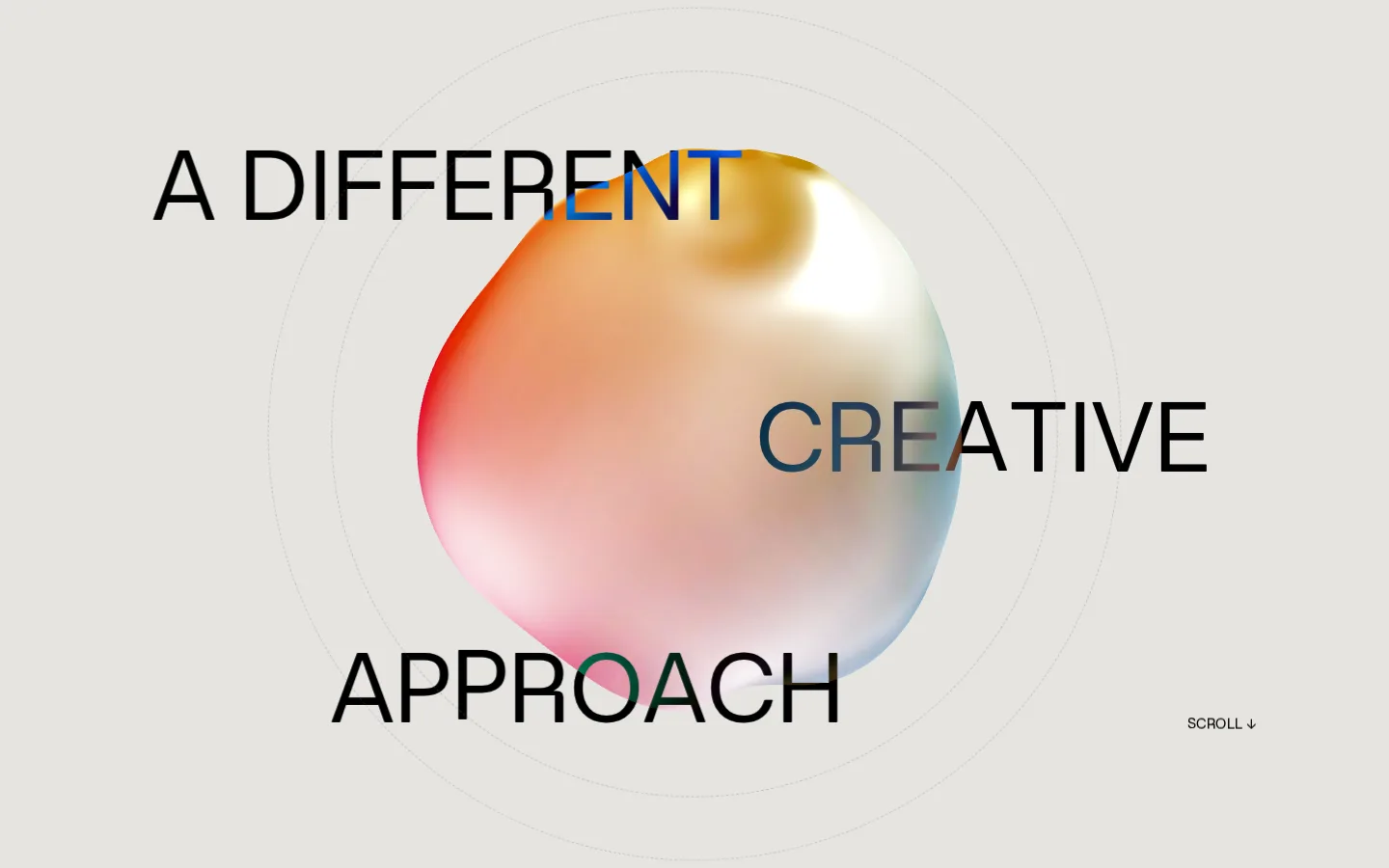
Warm-gray canvas, sculptural gradient 3D object, oversized black uppercase words placed at offset positions, and a small scroll cue.
Client logo grid
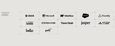
Client marks arranged in ruled cells with fine gray dividers, compact labels, and a flexible multi-column layout.
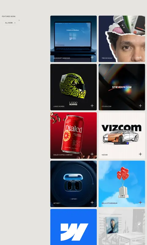
Featured project tiles
Two-column image-led portfolio tiles with small uppercase client or project labels and plus-style affordances.
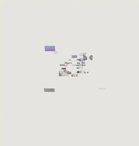
Service visual field
Wide, sparse arrangement of video and image fragments alongside short uppercase service names.
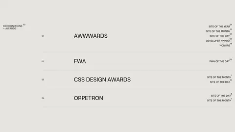
Awards list
Minimal horizontal rows pairing award platform names with small right-aligned recognition details and hairline separators.
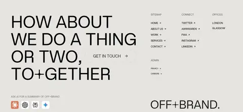
Contact footer
Large multiline invitation at left, compact sitemap and social links alongside, and a prominent brand wordmark near the base.
Imagery · The hero centers a soft, iridescent 3D form against the quiet canvas, with large text crossing its silhouette. Portfolio cards use varied client artwork, photography, product imagery, and graphic treatments, kept within consistent tiled frames. A later services area relies on video snippets and visual fragments. Imagery can be vivid or dark, but the surrounding interface remains neutral so each project retains its own palette.
Use Studio Greige (#e5e4e0) as the continuous page canvas.
Let large uppercase typography establish hierarchy before adding decoration.
Use Studio Ink (#1d1d1d) for core text and headings.
Keep sections open and allow asymmetric headline placement.
Use fine gray rules to organize logos and award information.
Reserve yellow, pink, and blue for creative imagery or restrained accents.
✕ 不该做
Do not introduce large contrasting section bands without evidence.
Do not turn measured gradient accents into repeated button fills.
Do not crowd the canvas with dense cards or unnecessary controls.
Do not add heavy shadows or elevated dashboard-style panels.
Do not standardize every section into a centered layout.
Do not let project imagery obscure labels or editorial hierarchy.
给 AI 的提示词
想快速出一个同风格的新页面,把这段话连同 DESIGN.md 一起发给 AI。
Build a new page in the OFF+BRAND. visual style: use Studio Greige (#e5e4e0) as a calm, continuous canvas and Studio Ink (#1d1d1d) for crisp uppercase typography. Use a single geometric sans-serif voice, with oversized display statements and small tracked labels. Keep the composition editorial and asymmetric, with generous open space and clear left-aligned content. Structure dense information with thin Soft Graphite (#bfbebe) rules rather than cards or shadows. Let photography, video, and occasional dimensional artwork supply visual richness; use Signal Marigold (#facb0e), Creative Pink (#f06ba8), and Digital Sky (#78bae6) as artwork accents, not routine UI fills. Build flexible grids for logos or projects, and finish with a bold, spacious contact area. Preserve a flat, tactile studio feel.