North star · Let oversized white typography and a near-black canvas lead; use red as a rare signal and project work as the main color variation.
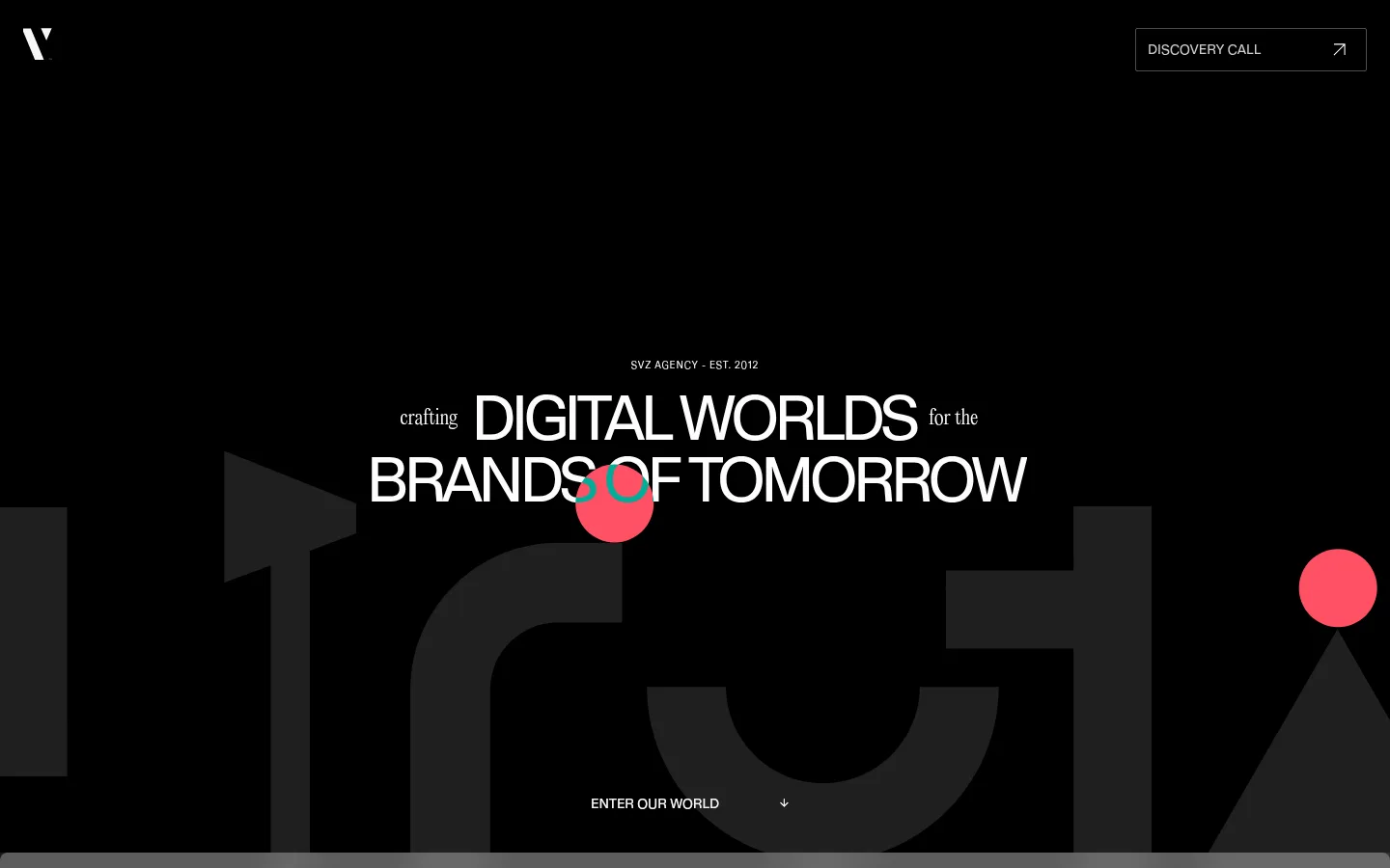
The page is anchored by a nearly black canvas, with subtle shifts to pure black and charcoal creating section changes without conventional color-heavy panels. White uppercase display type carries the hero and major statements; small, lighter editorial text sits alongside it for contrast and hierarchy. The red accent is used sparingly as a bright visual signal, including in the hero’s animated-looking shapes and selected portfolio artwork, rather than as a broad interface fill. A large pale gallery interrupts the dark sequence and frames project thumbnails as a distinct portfolio surface. Layout favors spacious, cinematic full-width moments, centered headline compositions, and a compact multi-card portfolio grid. The page has generous areas of negative space, while the measured content width and comfortable spacing keep text and card information controlled. Thin dark borders define cards; restrained inset highlights add a subtle dimensional cue without relying on large shadows.
配色
点色块复制色值。用途说明来自对页面的实测位置(背景、文字、描边、按钮)与截图判读。
强调色
表层色
中性色
页面底色 · Canvas Black表层 · Pure Black表层 2 · Gallery Ivory表层 3 · Studio Gray表层 4 · Panel Black主文字 · Studio White次要文字 · Soft Silver描边 · Hairline Charcoal强调 · Signal Red
Short explanatory copy and supporting editorial text.
The quick brown fox 敏捷的狐狸
14px
300
1
0
辅助文字
Small metadata, portfolio labels, and card details.
The quick brown fox 敏捷的狐狸
12px
400
1.5
0
导航
Header links and discovery-call interface text.
The quick brown fox 敏捷的狐狸
14px
400
1
0
间距与布局
基准单位 8px · 密度:适中
48px版块间距
8px元素间距
12px卡片内边距
792px内容最大宽度
2px
3px
4px
8px
12px
16px
24px
29px
32px
48px
Use broad, immersive bands with considerable negative space, then concentrate portfolio work into a tightly arranged card grid. The hero and credibility statements are centered, while portfolio tiles vary in size and composition. Keep copy constrained to a measured maximum content width of 792px, with comfortable spacing and clear separation between blocks. The measured base spacing unit is 8px; use its supplied scale for rhythm rather than introducing new spacing values. Dark bands dominate, with a pale portfolio gallery acting as a major visual pause.
圆角与层次
按钮 · 2px
卡片 · 14px
链接 · 8px
inset · card
The interface is mostly flat: section changes come from tonal shifts and large areas of color, not stacked shadows. Define portfolio cards with fine charcoal borders and use restrained layering or dark fades to support labels over imagery. The measured inset white highlight on cards is subtle; avoid adding broad drop shadows or raised UI surfaces.
组件
下面的预览按实测的按钮、输入框、徽标、卡片样式重建(字体用替代字体)。
Header and discovery CTA
Minimal dark header with a small white brand mark and a right-aligned outlined DISCOVERY CALL button; use a thin #535353 border and restrained interface typography.
Hero statement
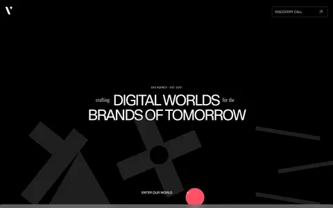
Center the short agency identifier above a two-line, oversized uppercase headline. Pair the geometric sans with smaller editorial words, and use atmospheric dark forms with sparse red accents.
Brand transition band
A full-width gray visual interlude carries a large, high-contrast brand graphic; keep supporting interface elements out of the way.
Portfolio gallery
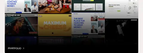
Place project tiles on a #f3efef gallery surface, using a compact, varied grid of image-led previews with clear labels and restrained borders.
Portfolio links
Use concise uppercase labels such as PORTFOLIO and HOW WE WORK over dark surfaces or image fades; keep link treatments visually quiet.
Credibility statement
Center a short uppercase claim on a pure-black band, with small editorial framing words and ample surrounding negative space.
Investor metric cards
Arrange four outlined dark cards in a row, with a compact value, investor identity, and small portfolio-company caption.
Imagery · Treat project work as the main source of visual variety: use a collage of real brand and web-design previews, including interface screens and expressive campaign artwork. Preserve varied image color and composition inside the portfolio tiles rather than forcing the entire page into a uniform tint. The hero uses oversized, low-contrast geometric forms and vivid red circular accents as graphic atmosphere. Keep imagery cropped to feel immersive, with labels anchored clearly over or beside it.
Keep the main canvas near black and let white type carry the hierarchy.
Use uppercase geometric sans for major statements and navigation.
Pair large sans headlines with restrained editorial supporting text.
Reserve red for occasional visual signals and selected artwork.
Use the pale gallery as a deliberate break in the dark sequence.
Separate cards with fine borders instead of strong shadows.
✕ 不该做
Do not fill every section with the accent red.
Do not replace the dark canvas with a generic light interface.
Do not make every heading the same size or typographic voice.
Do not flatten portfolio artwork into a single monochrome treatment.
Do not crowd the hero with navigation, copy, or interface controls.
Do not add heavy shadows, glossy effects, or decorative UI clutter.
给 AI 的提示词
想快速出一个同风格的新页面,把这段话连同 DESIGN.md 一起发给 AI。
Build a new SVZ-style agency page around a near-black #080808 canvas with pure-black #000000 bands and restrained #0d0d0d panels. Use Studio White #ffffff for oversized uppercase geometric sans headlines, tight tracking, and crisp navigation; pair it with light editorial supporting copy. Keep Signal Red #fe1e34 rare—an accent in a small graphic, link, or selected project detail, not a large interface fill. Create generous cinematic sections, centered statements, and a varied image-led portfolio grid. A Gallery Ivory #f3efef block can break the dark rhythm and frame project previews. Use Hairline Charcoal #1f1f1f borders, simple outlined calls to action, and subtle card layering. Preserve open negative space, keep content widths controlled, and let real project imagery provide most of the page’s color and texture.