Made by ON 以近乎纯黑的宽阔画布,搭配精致的编辑式字体和醒目的绿色行动按钮。项目案例、客户背书、观点文章与联系表单依次展开,整体克制而有鲜明对比。
North star · Let the near-black canvas and generous negative space frame delicate editorial type, using green only to signal action or emphasis.
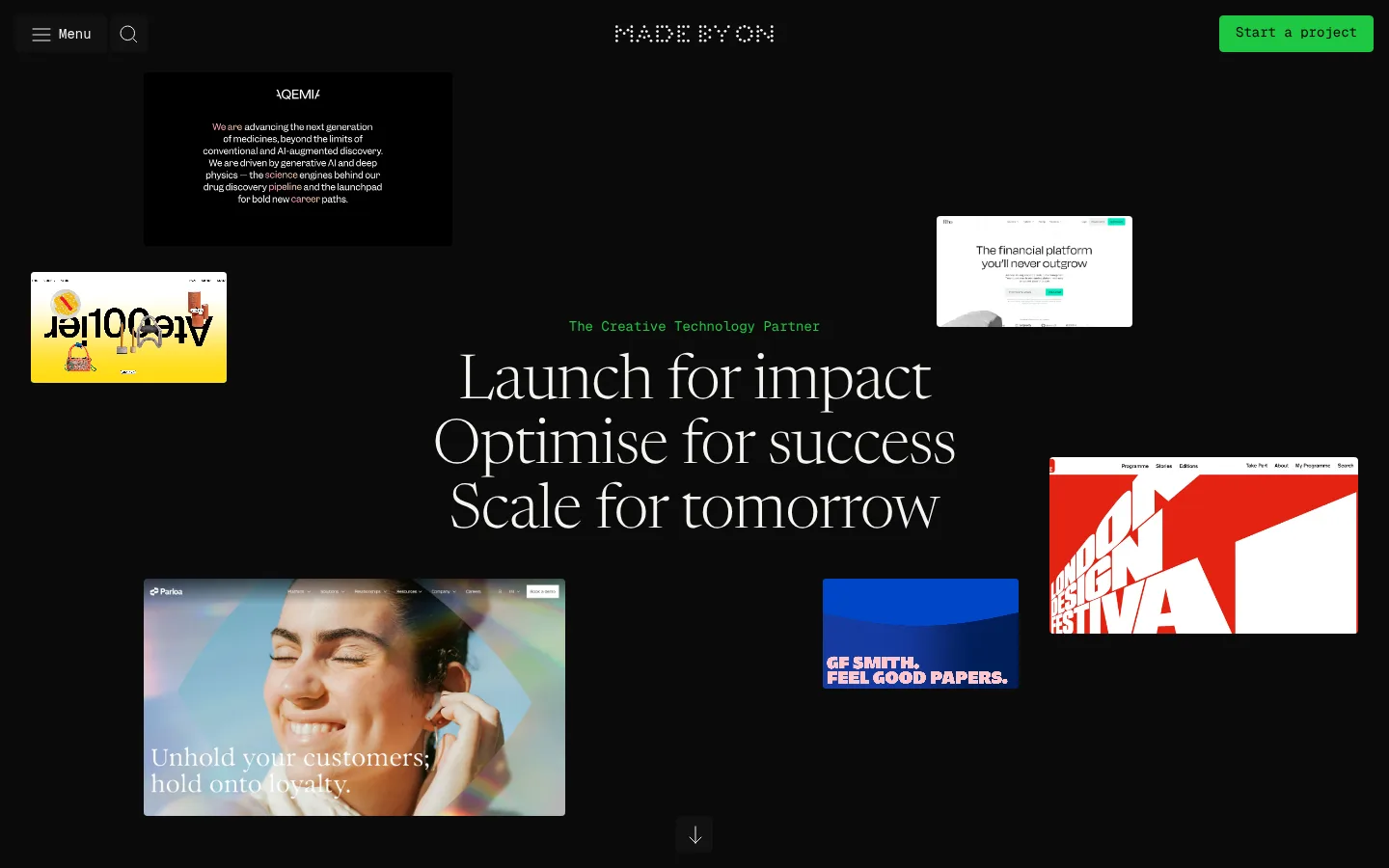
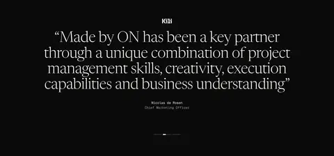
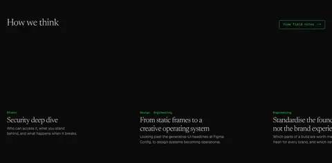
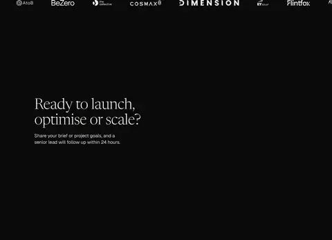
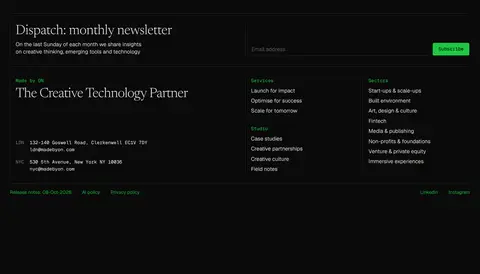
The page is built on a nearly uninterrupted #0a0a0a canvas, making negative space a defining part of the identity rather than a gap between content. Warm off-white #f5f4f0 carries the large, light editorial headlines and essential copy; muted grays keep supporting details quiet. Bright #1fc742 marks primary actions, small eyebrow text, and selected links, while the paler green #9aefab appears as a secondary action treatment. Large headlines use a delicate serif-like Geist Arrow, contrasted with Geist sans-serif body text and Geist Mono navigation and buttons. The opening hero centers its message among floating portfolio previews, then the page shifts into case studies, a testimonial, field notes, a client strip, a contact form, and a compact newsletter/footer. Thin dark rules and restrained outlines separate elements without adding card-heavy elevation. Spacious section breaks preserve a calm, cinematic rhythm.
配色
点色块复制色值。用途说明来自对页面的实测位置(背景、文字、描边、按钮)与截图判读。
强调色
表层色
中性色
功能色
页面底色 · Carbon Canvas主文字 · Warm Porcelain次要文字 · Quiet Ash弱文字 · Carbon Canvas描边 · Graphite Rule强调 · Electric Leaf强调 2 · Mint Signal
Display and heading typography, including hero and testimonial statements.
Aa 设计
Geist Mono
网络字体 · 字重 400 / 500 · 占比 17%
免费替代:IBM Plex Mono
Navigation, buttons, and code-like interface labels.
角色
示例
字号
字重
行高
字距
特大标题
Oversized hero statement and prominent editorial moments.
Made by ON
64px
300
1.05
-0.016em
一级标题
Primary page headline and major section headings.
Made by ON
56px
300
1.05
-0.01em
二级标题
Section titles and prominent testimonial or contact headings.
Made by ON
40px
300
1.05
-0.01em
三级标题
Case study and field-note titles.
Made by ON
32px
300
1.15
-0.031em
四级标题
Smaller subsection headings and supporting content titles.
The quick brown fox 敏捷的狐狸
24px
300
1.2
0
正文
Introductory and descriptive paragraphs.
The quick brown fox 敏捷的狐狸
20px
340
1.4
0
辅助文字
Supporting descriptions, attribution, and compact content.
The quick brown fox 敏捷的狐狸
16px
340
1.4
0
按钮
Monospaced CTA and form action labels.
The quick brown fox 敏捷的狐狸
14px
400
1.5
0
导航
Compact monospaced navigation labels.
The quick brown fox 敏捷的狐狸
14px
400
1.5
0
链接
Small inline links, including footer policy links.
The quick brown fox 敏捷的狐狸
12px
340
1.5
0
代码
Monospaced utility or code-like interface text.
const style = 1;
14px
400
1.5
0
间距与布局
基准单位 8px · 密度:适中
80px版块间距
16px元素间距
—卡片内边距
1142px内容最大宽度
1px
2px
4px
7px
8px
12px
16px
30px
32px
80px
The measured content width is capped at 1142px, with a comfortable density and an 8px-based spacing system. The hero is centered in a full-width dark field, with project previews distributed around its headline. Subsequent areas alternate between multi-column case-study and field-note compositions, centered testimonial and partner messaging, and single-column contact content. The section rhythm is notably spacious, with an 80px measured section gap; small text and controls remain compact. Footer content resolves into a two-column newsletter and link layout.
圆角与层次
按钮 · 4px
输入框 · 4px
没有测到阴影:页面是扁平的,层次靠底色和描边区分。
The interface is mostly flat: the near-black canvas carries content without visible card shadows or layered panels. Thin graphite borders and occasional outlined green actions provide separation. Measured controls use a subtle 4px radius where specified, while some browser-like input details are not part of the brand treatment. Media previews supply most of the visual depth.
组件
下面的预览按实测的按钮、输入框、徽标、卡片样式重建(字体用替代字体)。
Primary project CTA
Solid #1fc742 button with black text, Geist Mono label, and a measured 4px radius.
Outlined action link
Transparent dark fill with a 1px #1fc742 border and green monospaced label.
Hero portfolio previews
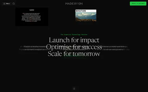
Floating, differently sized client-site thumbnails distributed around the centered editorial headline.
Case study link
Light text link paired with a project title and short description; keep the composition open rather than card-heavy.
Contact form
Single-column lead form with six measured inputs, light text, and restrained control styling.
Newsletter signup
Footer signup area with short editorial introduction, email field, and pale-green submit button.
Footer
Dark, rule-divided information area with brand statement, service and sector links, contact details, and small policy links.
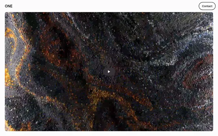
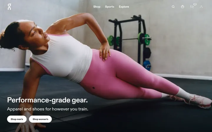
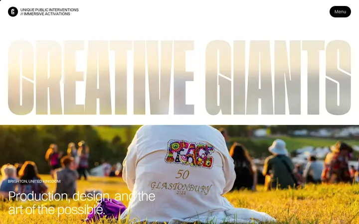
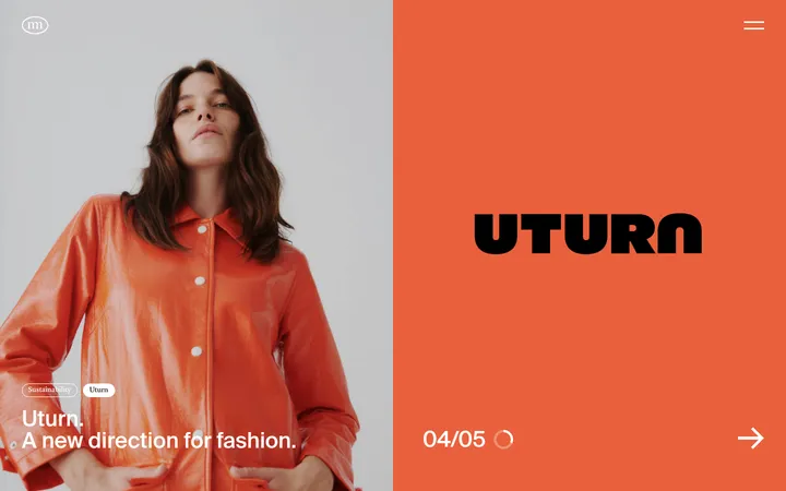
Imagery · The hero uses floating, cropped previews of real client work, including web interfaces and campaign imagery, rather than decorative illustrations. Preview tiles vary in scale and position around the centered headline, with much of the surrounding canvas left empty. Later sections include project and editorial thumbnails, a client-logo strip, and limited video content. Colourful media is allowed to retain its own palette; it reads as portfolio work, not as the site's core colour system.
Keep headlines light, editorial, and visually prominent.
Reserve #1fc742 for actionable or deliberately emphasized elements.
Use generous empty space between major sections.
Let project imagery retain its own colours.
Use monospaced styling for compact navigation and buttons.
✕ 不该做
Do not introduce bright section backgrounds.
Do not turn every content group into a bordered card.
Do not use green as a large decorative field.
Do not crowd the hero with dense copy or interface chrome.
Do not add shadows or prominent elevation.
Do not treat portfolio-thumbnail colours as the brand palette.
给 AI 的提示词
想快速出一个同风格的新页面,把这段话连同 DESIGN.md 一起发给 AI。
Build a new agency page in Made by ON's restrained visual language. Use Carbon Canvas (#0a0a0a) across the page, Warm Porcelain (#f5f4f0) for editorial headlines and primary copy, and Quiet Ash (#a3a3a3) for secondary text. Keep Electric Leaf (#1fc742) focused on key actions, links, and small emphasis; use Mint Signal (#9aefab) sparingly for secondary submit treatment. Set large headings in a light editorial serif-like face such as Newsreader, body text in a clean sans such as Inter, and controls in IBM Plex Mono. Favor a centered hero, open negative space, asymmetrical portfolio imagery, and clear section breaks. Use restrained graphite rules, minimal borders, and no visible shadow-heavy cards. Keep form and footer areas compact, legible, and consistent with the dark canvas.