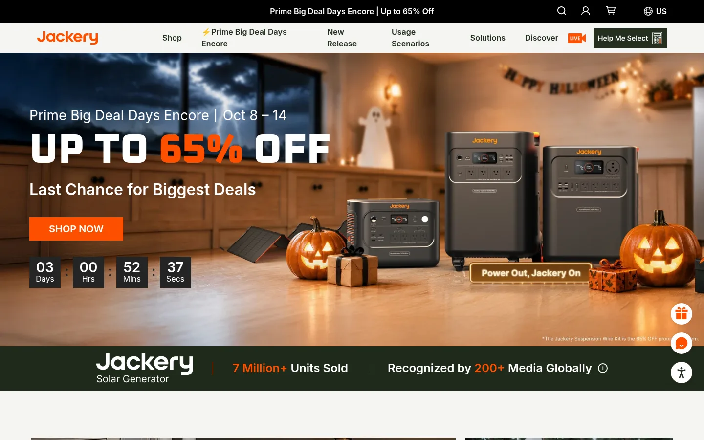
Jackery 首页以明亮简洁的店铺界面搭配富有氛围的生活方式摄影,并用醒目的橙色按钮引导购买。粗重的大写标题、实用的产品卡片和深绿色版块,将户外出行与家庭备用电源串联起来。
North star · Let cinematic energy imagery set the mood while a restrained, legible storefront and orange actions make shopping effortless.
Build the page around Gallery White (#ffffff) and soft warm-gray panels (#f5f5f3), with deep Forest Green (#242f20) bands for brand proof and footer content. Signal Orange (#fd5000) is a compact, high-contrast action color for buttons, sale emphasis, and small highlights—not a general background. Inter carries navigation, product detail, and body copy; Oxanium makes oversized, uppercase display headlines feel technical and energetic. Alternate full-bleed lifestyle campaigns with calm, carefully aligned category and product modules. Product cards stay functional and information-rich, using restrained rules and compact specs rather than decorative framing. Photography supplies most of the page’s color and emotion, while the interface remains light, flat, and legible. Keep section changes clear through image scale, background bands, and whitespace, not heavy shadows.
配色 点色块复制色值。用途说明来自对页面的实测位置(背景、文字、描边、按钮)与截图判读。
品牌色
Forest Green
#242f20
Brand-toned proof strip, dark footer surfaces, and inverse text or controls.
强调色
Signal Orange
#fd5000
Primary purchase buttons, sale-price emphasis, logo accents, and small promotional highlights.
表层色
Gallery White
#ffffff
Main canvas, white product cards, and reverse text on dark campaign bands.
Warm Mist
#f5f5f3
Soft neutral section and media panels that distinguish shopping areas from the white canvas.
Campaign Black
#000000
High-contrast promotional and video-section backgrounds, especially behind white display text.
中性色
Carbon Ink
#181818
Primary heading and interface text on light backgrounds.
Pale Stone
#e8e8e5
Subtle footer and supporting interface details; secondary to the white and warm-gray surfaces.
Near Black
#222222
Dark input text and minor footer or interface details.
Slate Ink
#333333
Product-card titles and standard supporting interface copy.
Smoke Gray
#5c5c5c
Secondary text details, including subdued labels.
功能色
Soft Graphite
#565655
Muted supporting copy and secondary control text.
Rule Gray
#d9d9d9
Fine dividers and light interface borders.
Card Edge
#c6c7c8
Measured outline color on product comparison or solution panels.
Mid Graphite
#626262
Occasional muted text and footer details; not a defining brand color.
Sage Gray
#929790
Minor muted footer text; a supporting interface tone rather than a prominent surface.
Quiet Silver
#d0d0cf
Occasional fine rules and low-emphasis interface borders.
文字 背景 对比度 WCAG #181818 Carbon Ink#ffffff Gallery White17.76:1 AAA #181818 Carbon Ink#f5f5f3 Warm Mist16.27:1 AAA #181818 Carbon Ink#242f20 Forest Green1.27:1 不达标 #181818 Carbon Ink#000000 Campaign Black1.18:1 不达标 #ffffff Gallery White#f5f5f3 Warm Mist1.09:1 不达标 #ffffff Gallery White#242f20 Forest Green13.98:1 AAA
字体 字号阶梯:Augmented Fourth(比例约 1.431,正文 14px)。示例用免费替代字体渲染,数值为实测。
Aa 设计
Inter 网络字体 · 字重 400 / 600 / 500 / 900 / 700 · 占比 95%
免费替代:Roboto
Navigation, body copy, product detail, captions, links, and most interface text.
Aa 设计
Oxanium 网络字体 · 字重 800 / 900 · 占比 5%
免费替代:Audiowide
Display headlines and large campaign or section titles.
角色 示例 字号 字重 行高 字距 特大标题 Oversized uppercase campaign and brand-story headlines.
Jackery
84px 800 1.1 0 一级标题 Primary campaign headlines and major page-level messages.
Jackery
72px 800 1.1 0 二级标题 Large uppercase section titles such as backup and story headings.
Jackery
48px 800 1.1 0 三级标题 Solution, featured-product, and editorial subheadings.
Jackery
32px 600 1.1 0 四级标题 Product and smaller module headings.
The quick brown fox 敏捷的狐狸
24px 600 1.1 0 正文 Navigation, descriptions, product details, and supporting copy.
The quick brown fox 敏捷的狐狸
14px 400 1.4 0 辅助文字 Compact product specs, labels, and secondary annotations.
The quick brown fox 敏捷的狐狸
12px 600 1.33 0 链接 Prominent shopping and section links.
The quick brown fox 敏捷的狐狸
20px 600 1.4 0
间距与布局 基准单位 8px · 密度:紧凑
40px 版块间距
8px 元素间距
— 卡片内边距
1320px 内容最大宽度
4px
8px
12px
14px
16px
20px
24px
40px
The desktop page uses a centered storefront system with a measured maximum content width of 1320px. It mixes full-bleed campaign imagery with inset modules: two-column lifestyle and solution areas, five-column category navigation, and multi-column product grids. Headings are frequently centered over shopping sections, while campaign copy aligns left over its image. Keep the measured compact density, with an 8px base unit and clear section breaks; use broad image-led bands and quieter neutral intervals to maintain rhythm.
圆角与层次 sm · button
xl · other
md · footer
The interface is predominantly flat, with section color and photography providing depth. Product panels use restrained borders rather than pronounced card shadows; measured product-card outlines use #c6c7c8. Keep controls visually direct, use subtle button shadow only where appropriate, and reserve deeper layering for photo overlays or the footer.
组件 下面的预览按实测的按钮、输入框、徽标、卡片样式重建(字体用替代字体)。
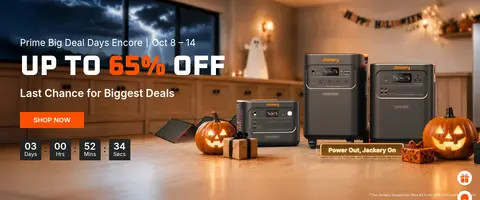
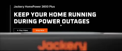
Campaign hero Full-bleed seasonal image with left-aligned copy, uppercase Oxanium offer headline, orange CTA, and compact dark countdown tiles.
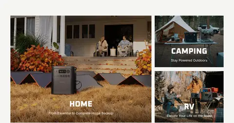
Category tiles Image-led home, camping, and RV links arranged as a larger feature tile beside smaller stacked tiles.
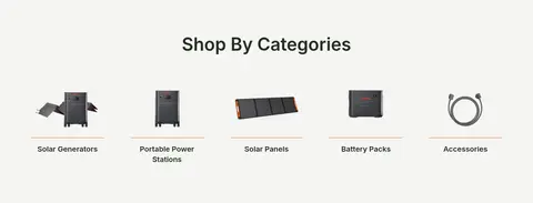
Category navigation Centered heading followed by a five-column row of product cutouts, labels, and shopping links.
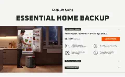
Solution comparison Two-column home-backup module pairing lifestyle imagery with product solutions, prices, key specs, and an orange action.
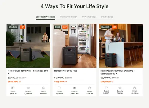
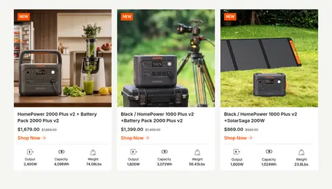
Product card White, minimally framed card with product photography, compact title and pricing, orange shopping link, and concise output, capacity, and weight details.
Proof strip Deep green horizontal brand band combining the Jackery mark with sales and recognition proof points.
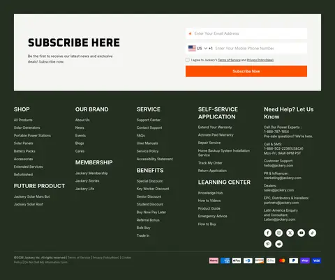
Newsletter and footer Light newsletter form sits within a dark green footer, above tightly organized link columns, support details, and payment marks.
Imagery · Use large lifestyle photographs of home backup, camping, and travel as the emotional anchor, often edge-to-edge with text layered over darker or legible areas. Product imagery is crisp and grounded in real domestic or outdoor settings, with cards showing the power station clearly alongside compact specs. Awards and editorial stories use smaller image modules. The measured page also includes video-led campaign sections; avoid decorative illustration as a substitute for product photography.
页面版块 共 14 个版块,按页面从上到下排列,每个都标了类型、布局和交互套路。
该做与不该做 ✓ 该做 Use Oxanium for oversized uppercase display headlines. Keep Inter for navigation, product details, and body text. Reserve Signal Orange (#fd5000) for actions and deliberate highlights. Use Forest Green (#242f20) for brand proof and dark footer surfaces. Let product photography carry color and communicate real use. Separate shopping modules with measured neutral surfaces and clear whitespace. ✕ 不该做 Do not turn the interface into an orange-dominant page. Do not use display type for dense product descriptions. Do not add heavy shadows to ordinary product cards. Do not replace real product and lifestyle photography with generic illustrations. Do not crowd product cards with oversized copy or decorative framing. Do not make every section a full-bleed image. 给 AI 的提示词 想快速出一个同风格的新页面,把这段话连同 DESIGN.md 一起发给 AI。
复制 Create a responsive Jackery-style ecommerce page with a clean shopping interface and cinematic energy-product photography. Use Gallery White (#ffffff) as the main canvas, Warm Mist (#f5f5f3) for calm section panels, Forest Green (#242f20) for proof and footer bands, and Signal Orange (#fd5000) sparingly for primary actions and sale emphasis. Set major headlines in heavy uppercase Oxanium, with Inter for navigation, body copy, and product details. Alternate wide lifestyle campaigns with aligned category rows and practical product grids. Keep product cards light and information-rich: photo, concise title, price, clear shopping link, and compact specs. Favor restrained borders, compact spacing, clear contrast, and direct shopping flows; avoid decorative shadows or invented interface flourishes.
DESIGN.md Tailwind v4 CSS 变量 Design Tokens
---
title: "Jackery design system"
variant: extended
source: https://www.jackery.com/
captured_at: 2026-10-12
theme: light
industry: consumer-electronics
generator: Design DNA (https://four.wiralomi.com/style/jackery-com)
ai_generated: true
ai_label: "本文件由 AI 辅助生成:数值取自公开网页的实测样式,命名、用途说明与建议为模型解读。商标归原所有者。 / AI-assisted content"
---
# Jackery · Design System
> Adventure-ready power, grounded in a bold, practical grid
**Theme:** light · **Industry:** consumer-electronics · **Source:** https://www.jackery.com/ · **Captured:** 2026-10-12 (1440×900 desktop)
_AI-assisted content: values are measured from the public page at capture time; names, roles and guidance are model-written interpretations. Trademarks belong to their owners._
Jackery’s homepage pairs a clean, light storefront with cinematic lifestyle photography and unmistakable orange calls to action. Heavy uppercase display headlines, practical product cards, and deep green bands connect outdoor adventure with dependable home backup.
## North star
Let cinematic energy imagery set the mood while a restrained, legible storefront and orange actions make shopping effortless.
## Overview
Build the page around Gallery White (## Colors
| Name | Hex | Token | Group | Role |
|---|---|---|---|---|
| Gallery White | ` | `--color-gallery-white` | surface | Main canvas, white product cards, and reverse text on dark campaign bands. |
| Warm Mist | ` | `--color-warm-mist` | surface | Soft neutral section and media panels that distinguish shopping areas from the white canvas. |
| Signal Orange | ` | `--color-signal-orange` | accent | Primary purchase buttons, sale-price emphasis, logo accents, and small promotional highlights. |
| Carbon Ink | ` | `--color-carbon-ink` | neutral | Primary heading and interface text on light backgrounds. |
| Forest Green | ` | `--color-forest-green` | brand | Brand-toned proof strip, dark footer surfaces, and inverse text or controls. |
| Pale Stone | ` | `--color-pale-stone` | neutral | Subtle footer and supporting interface details; secondary to the white and warm-gray surfaces. |
| Soft Graphite | ` | `--color-soft-graphite` | semantic | Muted supporting copy and secondary control text. |
| Campaign Black | ` | `--color-campaign-black` | surface | High-contrast promotional and video-section backgrounds, especially behind white display text. |
| Rule Gray | ` | `--color-rule-gray` | semantic | Fine dividers and light interface borders. |
| Card Edge | ` | `--color-card-edge` | semantic | Measured outline color on product comparison or solution panels. |
| Near Black | ` | `--color-near-black` | neutral | Dark input text and minor footer or interface details. |
| Mid Graphite | ` | `--color-mid-graphite` | semantic | Occasional muted text and footer details; not a defining brand color. |
| Slate Ink | ` | `--color-slate-ink` | neutral | Product-card titles and standard supporting interface copy. |
| Smoke Gray | ` | `--color-smoke-gray` | neutral | Secondary text details, including subdued labels. |
| Sage Gray | ` | `--color-sage-gray` | semantic | Minor muted footer text; a supporting interface tone rather than a prominent surface. |
| Quiet Silver | ` | `--color-quiet-silver` | semantic | Occasional fine rules and low-emphasis interface borders. |
### Semantic aliases
`--color-canvas` → ` (Gallery White) · `--color-surface` → ` (Warm Mist) · `--color-surface-2` → ` (Forest Green) · `--color-surface-3` → ` (Campaign Black) · `--color-text` → ` (Carbon Ink) · `--color-text-muted` → ` (Gallery White) · `--color-text-subtle` → ` (Soft Graphite) · `--color-border` → ` (Rule Gray) · `--color-accent` → ` (Signal Orange) · `--color-on-accent` → ` (Gallery White)
### Contrast (WCAG 2.x)
| Text | Background | Ratio | Level |
|---|---|---|---|
| ` | ` | 17.76:1 | AAA |
| ` | ` | 16.27:1 | AAA |
| ` | ` | 1.27:1 | fail |
| ` | ` | 1.18:1 | fail |
| ` | ` | 1.09:1 | fail |
| ` | ` | 13.98:1 | AAA |
| ` | ` | 21:1 | AAA |
| ` | ` | 7.35:1 | AAA |
| ` | ` | 6.73:1 | AA |
| ` | ` | 1.9:1 | fail |
### Gradients
- `linear-gradient(310deg, rgb(245, 245, 243), rgb(245, 245, 243) 100%)`
## Typography
| Family | Token | Source | Weights | Role | Free substitute |
|---|---|---|---|---|---|
| Inter | `--font-body` | webfont | 400, 600, 500, 900, 700 | Navigation, body copy, product detail, captions, links, and most interface text. | Roboto |
| Oxanium | `--font-display` | webfont | 800, 900 | Display headlines and large campaign or section titles. | Audiowide |
- **Inter:** Use measured weights from 400 to 900; keep body copy practical and readable, with normal case except button or campaign labels.
- **Oxanium:** Use heavy 800–900 weights, uppercase transformation, and compact line-height for a bold technical display voice.
### Type scale — Augmented Fourth (ratio ≈ 1.431, base 14px)
| Role | Size | Weight | Line height | Letter spacing | Case | Family | Used for |
|---|---|---|---|---|---|---|---|
| display | 84px | 800 | 1.1 | 0 | uppercase | Oxanium | Oversized uppercase campaign and brand-story headlines. |
| h1 | 72px | 800 | 1.1 | 0 | uppercase | Oxanium | Primary campaign headlines and major page-level messages. |
| h2 | 48px | 800 | 1.1 | 0 | uppercase | Oxanium | Large uppercase section titles such as backup and story headings. |
| h3 | 32px | 600 | 1.1 | 0 | — | Inter | Solution, featured-product, and editorial subheadings. |
| h4 | 24px | 600 | 1.1 | 0 | — | Inter | Product and smaller module headings. |
| body | 14px | 400 | 1.4 | 0 | — | Inter | Navigation, descriptions, product details, and supporting copy. |
| caption | 12px | 600 | 1.33 | 0 | — | Inter | Compact product specs, labels, and secondary annotations. |
| link | 20px | 600 | 1.4 | 0 | — | Inter | Prominent shopping and section links. |
## Spacing & layout
- Base unit **8px**, density **compact**.
- Scale (most used values): 4, 8, 12, 14, 16, 20, 24, 40 px.
- Section rhythm 40px · element gap 8px · card padding — · max content width 1320px.
The desktop page uses a centered storefront system with a measured maximum content width of 1320px. It mixes full-bleed campaign imagery with inset modules: two-column lifestyle and solution areas, five-column category navigation, and multi-column product grids. Headings are frequently centered over shopping sections, while campaign copy aligns left over its image. Keep the measured compact density, with an 8px base unit and clear section breaks; use broad image-led bands and quieter neutral intervals to maintain rhythm.
## Shape & elevation
- Radius: button `50%` · media `50%` · xs `4px` · sm `8px`
- Shadow `sm` (button): `rgba(0, 0, 0, 0) 0px 0px 0px 0px, rgba(0, 0, 0, 0) 0px 0px 0px 0px, rgba(0, 0, 0, 0.1) 0px 2px 8px 0px`
- Shadow `xl` (other): `rgba(255, 255, 255, 0.8) 0px 30px 50px 0px`
- Shadow `md` (footer): `rgba(0, 0, 0, 0.2) 0px 0px 10px 0px`
- Motion: standard transition `0.24s ease` on interactive elements.
The interface is predominantly flat, with section color and photography providing depth. Product panels use restrained borders rather than pronounced card shadows; measured product-card outlines use ## Imagery
Use large lifestyle photographs of home backup, camping, and travel as the emotional anchor, often edge-to-edge with text layered over darker or legible areas. Product imagery is crisp and grounded in real domestic or outdoor settings, with cards showing the power station clearly alongside compact specs. Awards and editorial stories use smaller image modules. The measured page also includes video-led campaign sections; avoid decorative illustration as a substitute for product photography.
## Components
### Campaign hero
Full-bleed seasonal image with left-aligned copy, uppercase Oxanium offer headline, orange CTA, and compact dark countdown tiles.
### Category tiles
Image-led home, camping, and RV links arranged as a larger feature tile beside smaller stacked tiles.
### Category navigation
Centered heading followed by a five-column row of product cutouts, labels, and shopping links.
### Solution comparison
Two-column home-backup module pairing lifestyle imagery with product solutions, prices, key specs, and an orange action.
### Product card
White, minimally framed card with product photography, compact title and pricing, orange shopping link, and concise output, capacity, and weight details.
### Proof strip
Deep green horizontal brand band combining the Jackery mark with sales and recognition proof points.
### Newsletter and footer
Light newsletter form sits within a dark green footer, above tightly organized link columns, support details, and payment marks.
### Measured component styles
- **Primary button** (“LEARN MORE”): background ## Do
- Use Oxanium for oversized uppercase display headlines.
- Keep Inter for navigation, product details, and body text.
- Reserve Signal Orange (## Don't
- Do not turn the interface into an orange-dominant page.
- Do not use display type for dense product descriptions.
- Do not add heavy shadows to ordinary product cards.
- Do not replace real product and lifestyle photography with generic illustrations.
- Do not crowd product cards with oversized copy or decorative framing.
- Do not make every section a full-bleed image.
## Agent prompt
Create a responsive Jackery-style ecommerce page with a clean shopping interface and cinematic energy-product photography. Use Gallery White (## Page sections (top to bottom)
| # | Type | Layout | UX patterns | UI patterns |
|---|---|---|---|---|
| 1 | hero | Full-bleed campaign image with left-aligned offer copy, CTA, and countdown. | seasonal promotion, countdown urgency, primary shop action | full-bleed photography, uppercase display headline, orange button, dark countdown tiles |
| 2 | category-nav | One large home image beside two smaller stacked lifestyle tiles. | shop by use case, linked scene selection | asymmetric image grid, centered tile labels, photographic links |
| 3 | category-nav | Centered heading above a five-column category row. | browse product categories, direct category links | product cutout images, compact labels, subtle separators |
| 4 | comparison | Centered section heading above a two-column image and solution comparison. | compare solution tiers, show prices and specs, learn more action | lifestyle product image, accordion-like options, orange CTA |
| 5 | video | Full-bleed video campaign with left-aligned headline and controls. | play video, shop product | dark image treatment, uppercase headline, contrasting buttons |
| 6 | product-grid | Centered title and tabs above a four-column product-card grid. | switch lifestyle tabs, compare products, shop from cards | product photography, compact specs, status badges |
| 7 | logo-cloud | Centered display heading above four award marks. | establish product credibility | award logos, thin dividers, spacious horizontal row |
| 8 | cta | Narrow full-width image band with centered prompt and button. | guided product selection, single focused action | landscape background, centered white copy, orange CTA |
| 9 | product-grid | Three-column product grid with cards on a light section surface. | browse outdoor picks, compare price and specs, shop now | new badges, white cards, product cutouts and lifestyle images |
| 10 | stats | Two-column brand-stat band with concise visual metrics. | scan brand proof | dark green surface, large numeric emphasis, simple icons |
| 11 | feature-grid | Five-column row of compact feature or benefit items. | scan product benefits | small icons, short labels, aligned columns |
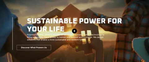
| 12 | video | Full-bleed video image with left-aligned copy and play affordance. | discover brand mission, play brand video | cinematic outdoor imagery, large uppercase heading, outlined secondary action |
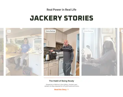
| 13 | testimonials | Centered title above a horizontally browsable story-card gallery. | browse customer stories, filter story topics, read featured story | portrait and home photography, topic labels, carousel cards |
| 14 | footer | Newsletter form above dense multi-column footer links and support details. | email signup, country and phone entry, browse support and store links | dark green footer, light form panel, orange subscribe action, payment marks |
## Source CSS custom properties (selected)
```css
--jds-custom-color-primary: