North star · Let cinematic product imagery carry the emotion while a quiet, spacious interface keeps navigation and actions unmistakably clear.
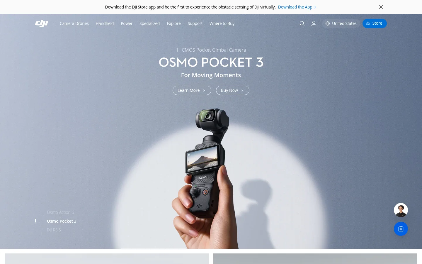
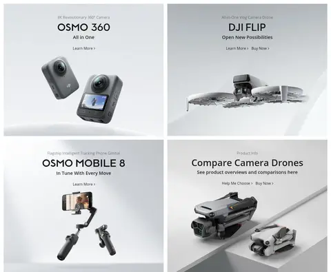
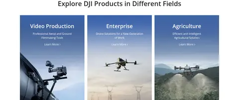
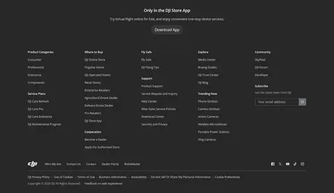
The page uses a predominantly white canvas, with pale gray bands and cards separating product modules without heavy framing. Charcoal anchors the footer and provides the main dark text; bright blue is reserved for high-attention actions such as the store button and select links. Open Sans supplies a consistent, contemporary voice: medium-weight centered headings introduce products, while lighter supporting copy and compact navigation stay secondary. The layout alternates a large cinematic hero, two-column product panels, full-bleed video, editorial feature cards, and a three-column category showcase. Product imagery does most of the visual work: crisp device renders sit against quiet pale backgrounds, while lifestyle photography and video bring texture and motion. Generous white space around sections keeps the long homepage calm, even as the footer shifts to a dense, multi-column directory. Rounded pill actions and sparse hairlines finish the interface without making it feel ornamental.
Site-wide interface, navigation, headings, product labels, links, and body copy.
角色
示例
字号
字重
行高
字距
一级标题
Primary hero product title.
DJI
40px
500
1.1
0
二级标题
Major feature and section headings.
DJI
32px
600
1.25
0
三级标题
Product-panel and editorial feature headings.
The quick brown fox 敏捷的狐狸
24px
500
1.5
0
四级标题
Compact card or supporting section headings.
The quick brown fox 敏捷的狐狸
20px
500
1.2
0
正文
Product descriptions, explanatory copy, and standard page text.
The quick brown fox 敏捷的狐狸
16px
400
1.5
0
辅助文字
Small labels, metadata, and footer details.
The quick brown fox 敏捷的狐狸
12px
400
2
0
按钮
Store and other compact action labels.
The quick brown fox 敏捷的狐狸
14px
400
1
-0.02em
导航
Top-level navigation and menu items.
The quick brown fox 敏捷的狐狸
14px
400
1.43
-0.02em
链接
Light-weight inline calls to action and text links.
The quick brown fox 敏捷的狐狸
14px
300
normal
0
间距与布局
基准单位 8px · 密度:宽松
112px版块间距
—元素间距
—卡片内边距
1392px内容最大宽度
1px
4px
5px
6px
8px
9px
12px
16px
24px
32px
40px
48px
64px
112px
A spacious long-scroll homepage uses a broad desktop canvas, with measured page max width of 1392px and a section rhythm of 112px. The opening feature fills the width; below it, product panels form a two-column grid, followed by a full-bleed video carousel. Editorial cards return to a centered two-column arrangement, then a three-column category row. Centered headlines and product copy give way to a pale three-link service band and a dense, left-aligned multi-column footer. Keep transitions airy rather than adding visual separators everywhere.
圆角与层次
按钮 · 9999px
输入框 · 4px
导航 · 50%
链接 · 9999px
md · nav, other
sm · nav
lg · button
The page is largely flat: white and pale gray section surfaces, clean card edges, and little ornamental depth. Measured navigation and buttons can use restrained soft shadows, but product cards are not dependent on shadows for separation. Prefer whitespace and background contrast; use thin gray rules sparingly, especially for input and footer divisions.
组件
下面的预览按实测的按钮、输入框、徽标、卡片样式重建(字体用替代字体)。
Announcement strip
A slim white notice above the main navigation, with centered copy, a blue app link, and a dismiss control.
Hero navigation
Transparent, overlaid navigation with a white logo and links on the photographic hero; the Store action is a bright blue pill.
Featured product panels
Two-column product tiles use pale imagery, centered product names, brief subtitles, and compact text-link actions.
Video showcase
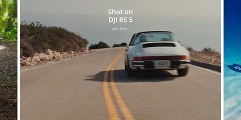
A horizontally framed, full-bleed video carousel centers a featured clip and overlays its title and a learn-more link.
Editorial cards
Two large innovation stories pair concise centered headings and links with immersive photographic imagery.
Category tiles
Three tall photographic tiles introduce product fields with centered white text and a short link.
Footer directory
A charcoal footer combines app promotion, dense multi-column product and support links, newsletter inputs, and a compact legal row.
Imagery · Large product renders and photography are the primary visual language, not decorative illustrations. The opening hero uses a cinematic lifestyle image with centered product messaging over the scene. Product cards isolate devices against pale backgrounds; the video carousel uses full-width lifestyle footage. Later editorial and category tiles combine short copy with photographic scenes. Keep imagery crisp, immersive, and naturally colored.
Use white space to separate major homepage sections.
Keep product titles and short calls to action centered over featured imagery.
Reserve DJI Blue for prominent actions and select links.
Use pale gray surfaces to distinguish product panels from the white canvas.
Make lifestyle imagery and product photography the dominant content.
Shift to charcoal and compact columns for the footer.
✕ 不该做
Do not add bright accent colors beyond the measured blue palette.
Do not surround every panel with borders or shadows.
Do not crowd the hero with secondary controls or explanatory copy.
Do not use decorative gradients as a substitute for product imagery.
Do not make all page sections dark; the page is predominantly light.
Do not style the dense footer like the spacious product showcase.
给 AI 的提示词
想快速出一个同风格的新页面,把这段话连同 DESIGN.md 一起发给 AI。
Build a new DJI-style consumer electronics page with a broad white canvas and generous section breathing room. Use Open Sans, centered medium-weight product headings, and quieter supporting text. Keep Gallery White (#ffffff) as the main surface, Cloud Panel (#ededed) for selected product bands, Carbon (#272727) for the footer, and DJI Blue (#0070d5) for the primary store or conversion action. Organize the page as a cinematic hero, modular product imagery, a wide video or editorial feature, category tiles, practical service links, and a compact multi-column footer. Favor authentic product photography and lifestyle footage over decorative graphics. Keep card edges clean, use pill-shaped actions sparingly, and reserve subtle borders or shadows for controls rather than content panels.